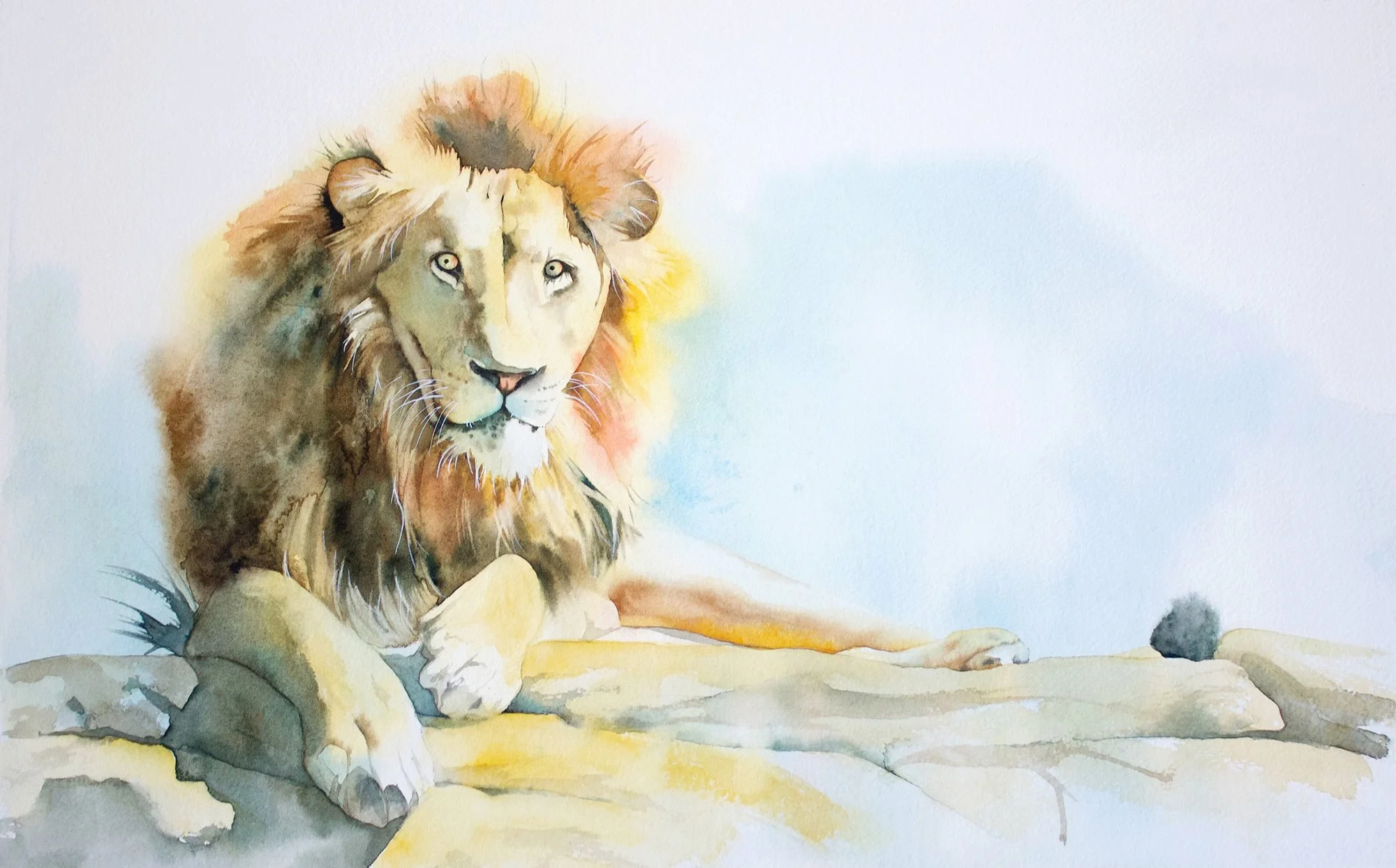
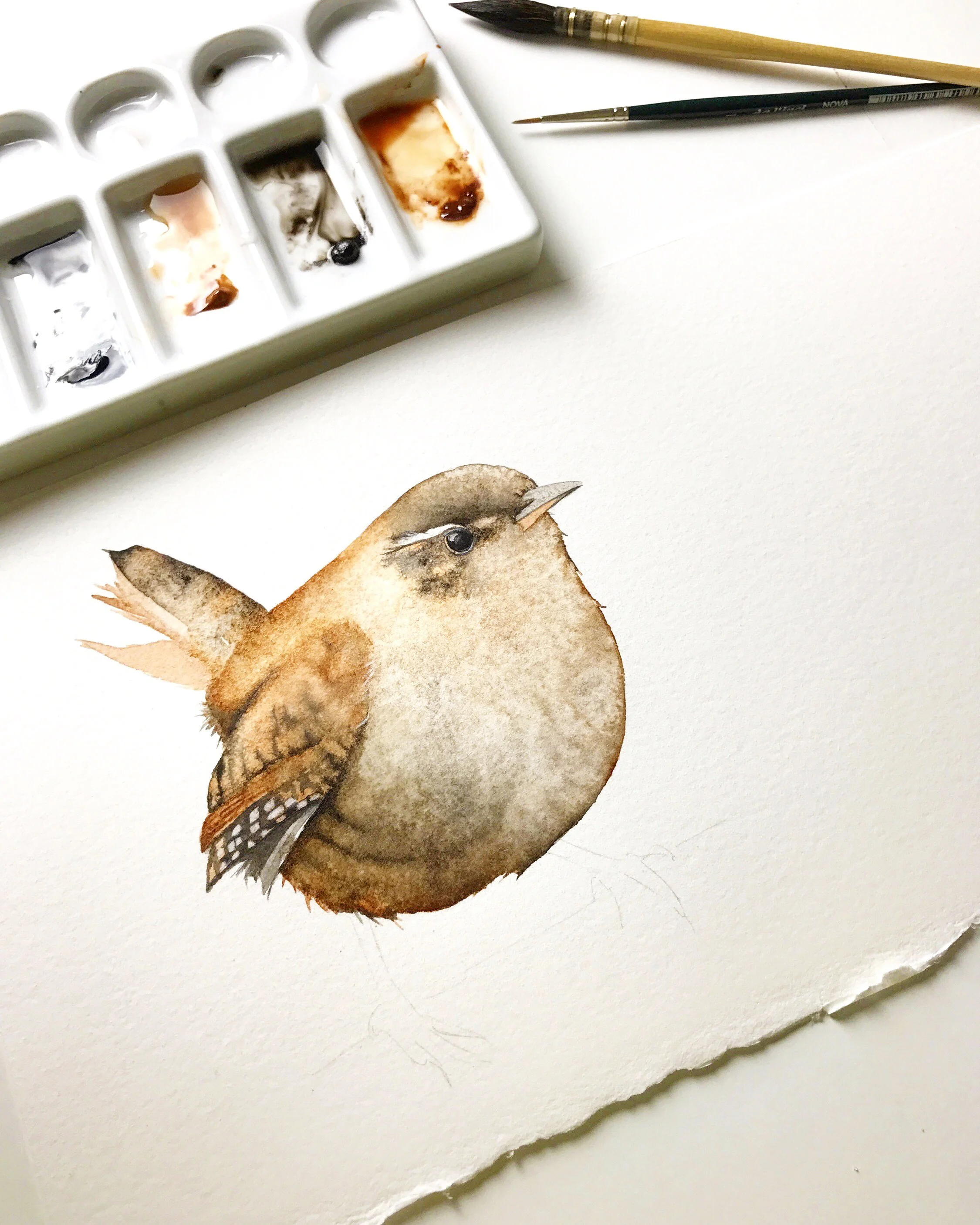
A Simplified Painting from a Detailed Subject
I've painted a lot of white Cockatoos in watercolour over the years. Some of my paintings turned out ok and others left me feeling underwhelmed. Thankfully, my latest Cockatoo painting has left me genuinely pleased, and I'll tell you why in this blog.

Cockatoo on Arches watercolour paper.
Simplify the Reference Photo

Some reference photos are highly detailed like this photo of a white Cockatoo.
This is my reference photo.
When I paint, I don't want to replicate the photo, I want to create an original piece of art.
There's a lot of information in my reference photo. The background is really busy and the Cockatoo has a lot of feather detail so I recognised the need to simplify to achieve a successful painting.
The photograph created the initial spark for the painting but it is merely a starting point to help convey the essence of the scene.
Eliminate Background Clutter
I needed to remove or minimise the unnecessary elements in the background that didn't contribute to the main focus of the painting. All those pine needles and extra branches behind the Cockatoo weren't important and they distracted from the main subject. Ok - great, I don't have the patience to paint them anyway! Adios pine needles and extra branches.
Step 1 - Create a Thumbnail Sketch

It's helpful to create a thumbnail sketch before you start painting.
I drew an initial sketch of my painting in my art journal. It was a quick thumbnail sketch that enabled me to map out the key shapes and work out what I was going to do with the background. I eliminated all of the clutter, I reduced the detail and I could work out where I would include negative space. It gave me a simple road map that I could use when I started my painting.
Step 2 - Decide on Colours
To help with colour harmony, I like to limit my colour palette. For this painting, I used just 4 colours and a tiny bit of Lamp Black on the eye and beak.

I used a limited color palette of just four colours when I painted the Cockatoo.
The Cockatoo's comb is yellow and there are a few subtle yellow markings here and there on the white feathers. I loved the blue/violet colour of the sky as well, so that led me to decide on the complementary colour scheme of yellow and violet.
The yellow was easy to choose. I used Schmincke's Pure Yellow (PY154) which is a cool, single pigment, transparent yellow.
I had to decide how I would mix violet. To create a vibrant violet you need a cool red and a warm blue, so I chose Schmincke's Cobalt Blue Light (PB28) and Ruby Red (PV19). That gave me the colour I used for the background.
I needed a grey as well, because too much violet would have been overwhelming. Complementary colours mix together to create grey. So I could have used yellow and violet to make grey.
But I was using red and blue to make violet. That meant that I'd have to mix together 3 pigments to make grey: red, yellow and blue and I don't find it easy to get the ratio of each colour right when I use 3 pigments.
I thought it would be easier to mix a grey if I introduced Transparent Sienna (PR101) to my palette. That way I could mix two pigments together to make grey instead of three: Transparent Sienna and Cobalt Blue Light.

My paints. Simplifying your colour palette helps to make the entire painting harmonious.
Step 3 - Begin the Painting Process
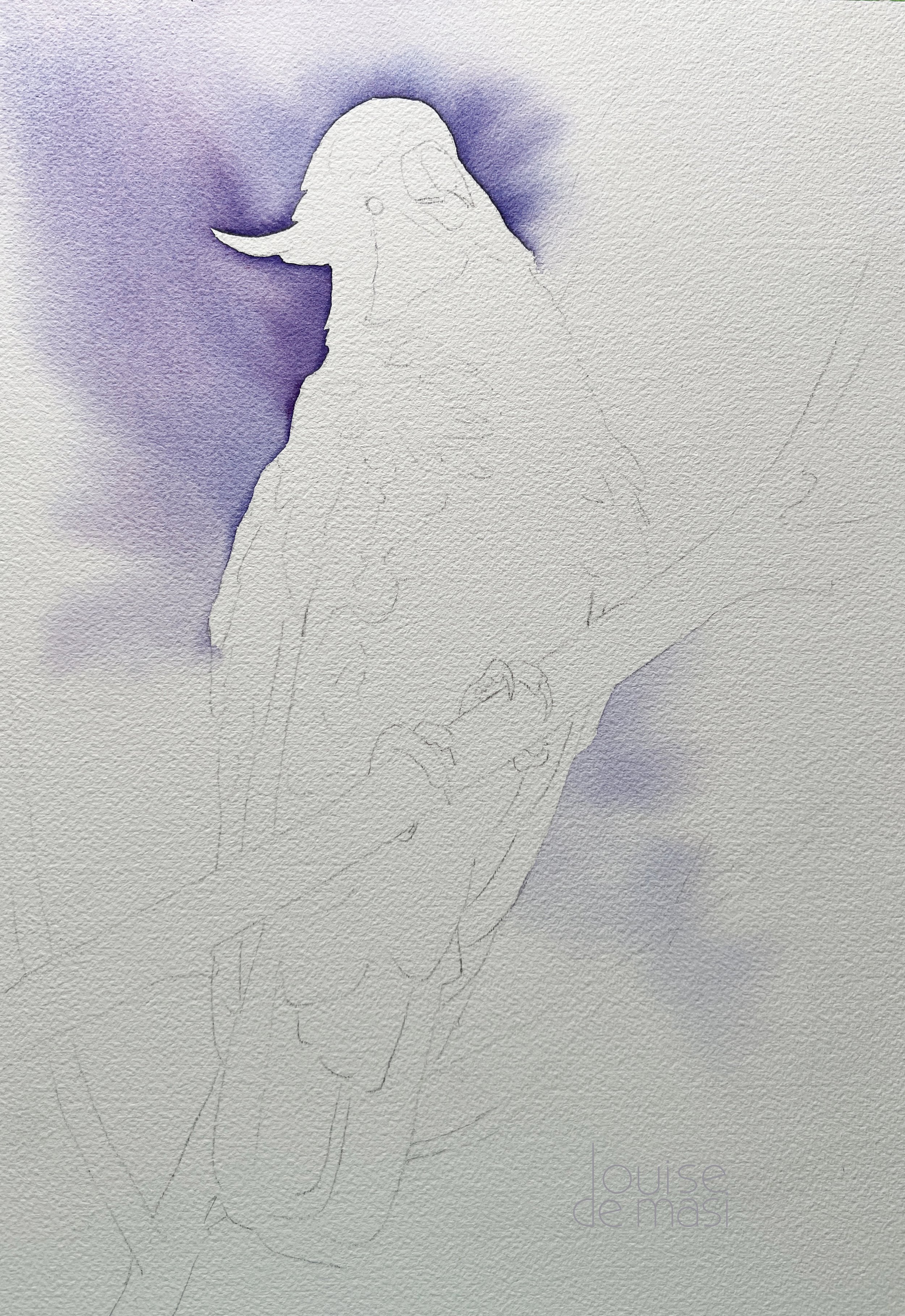
The painting process started with a wet on wet wash of violet on the background.
My first step was to paint some colour on the background. I decided to paint the colour on those areas of the painting where the feathers of the bird were the lightest. In this case, down the left hand side and across the top of the head. The colour there would help to define the edges of the feathers and also add contrast around the focal point. I thought to myself that I should place the darkest dark against the lightest light.
I knew the beautiful violet colour (mixed from Ruby Red and Cobalt Blue Light) would radiate against the yellow of the comb as well.
I didn't want hard edges so I worked wet on wet. I worked upside down and I tilted the paper to allow the paint to flow up to the top left corner. I made sure the colour I mixed was dark enough because I didn't want to have to paint another layer over the top of the first- remember - the first wash is always the freshest.
Once the top area was finished I painted some violet, lighter this time, on the right hand side of the Cockatoo, lower down to add some balance.
Simplify the Feather Details

I didn't want to paint all the details of the feathers so I simplified what I saw and only painted what I thought was necessary.
Before you start a painting ask yourself what it is that inspires you about your chosen subject. For me, it wasn't the feathers in their entirety that intrigued me; rather, it was the interplay of sunlight and shadows, forming distinct shapes on the feathers, that captured my attention and inspired my painting.
When I painted the shadow areas on the feathers I painted them all in at once. I had my board on an angle and the paint was quite wet. I worked the bead of paint down the paper. I didn't want to add too much detail so I simplified the shadow areas into key shapes.
I painted the left side of the Cockatoo first on dry paper.
Then I painted in the shadow area on the body. I wet the paper here because it was a large area and I didn't want the paper to dry before I had completed it. I used the grey that I mixed from Cobalt Blue and Transparent Sienna and I charged in some yellow and also some of the violet here and there to add interest. I chose a large round brush (#7) to minimise the amount of brush strokes I used.

I avoided painting more detail here and opted instead to paint the entire shadow on the body in one go.

After these washes were dry I started to add detail.
Then I painted the lower section of the Cockatoo wet on wet. Here I started with yellow and I let that flow over the paper. While that was wet, I painted on the grey areas and I charged in some more violet.
When all of that was dry I painted the beak, the comb and the eye and then I started to add a little detail to the right wing. I worked wet on wet there with a small brush and I suggested some of the feather shapes.

When all of that was dry I painted the beak, the comb and the eye.

I was starting to feel pleased with my painting at this stage.
I defined some of the edges on the tail feathers to bring out those shapes more and I also painted a small amount of feather detail on the left wing. I worked wet on wet where I wanted soft edges and wet on dry where I wanted hard edges.
Now, it was time to bring the branches to life. Staying consistent with the paint colours I'd been using for the Cockatoo, I used the wet on wet technique to paint the branches behind the bird. Using the grey mixture, I charged subtle hints of the other colours in a few spots. I maintained a relatively light value for the colours to prevent the branches from overshadowing the Cockatoo or pushing too prominently forward.
For the main branch, I introduced a touch of warmth by blending more Transparent Sienna into the grey mixture. I used the wet-on-wet method once again but I heightened the value on this particular branch. The intention was to create visual depth, making it appear closer to the viewer, while also ensuring a deliberate contrast with the hues of the Cockatoo.

Cockatoo in a tree painting almost completed and you can see the minimal detail.
When I had finished I was really pleased with it.

The finished painting. Time frame to paint - about 4 hours from start to finish.

Completed watercolour painting of the cockatoo in a tree.
Other Techniques to Help with Success
I used a limited palette and I went for a simplified approach in my painting. This strategy, along with refraining from additional washes, contributed to the success of the painting. As well as that, I used a few other techniques to enhance the overall result.
One such technique was embracing the principle of dominance. I chose violet as the dominant colour and prioritised cool temperatures throughout the composition. This deliberate choice added cohesion to the painting.
To streamline the process, I used a large brush whenever possible, minimising the number of brush strokes required to complete the painting. This forced me to paint with confidence. Confidence is crucial in watercolour, as hesitancy or uncertainty tends to be noticeable in the final piece. Watercolour demands boldness and conviction.
With this painting it was all about finding the sweet spot between simplicity and vibrancy. Ditching the background noise and simplifying those feather details opened the door to a dance of sunlight and shadows. Violet took the lead, cool tones set the mood, and a big brush added that dash of confidence to the mix. This resulted in a lively Cockatoo and a painting I'm really happy with.
Happy Painting!
If you are interested in learning to paint in watercolour, I have over 170 online, voiced over watercolour tutorials for all skill levels.
Prints of the cockatoo painting are available in the shop.