4 Characteristics of Watercolour Paints

Watercolour paints have a range of characteristics that influence the appearance and behaviour of the paint when applied to paper. These characteristics are important for you to understand because they greatly impact how colours interact and how a painting turns out.
I wasn't aware of the different characteristics of the paint I was using when I first started painting and if I had known about them I would have made different paint choices. Let's just say, maybe I wouldn't have chosen a granulating violet for a delicate rose that I once painted.
So let's have a look at the different characteristics and why it's important to understand them.

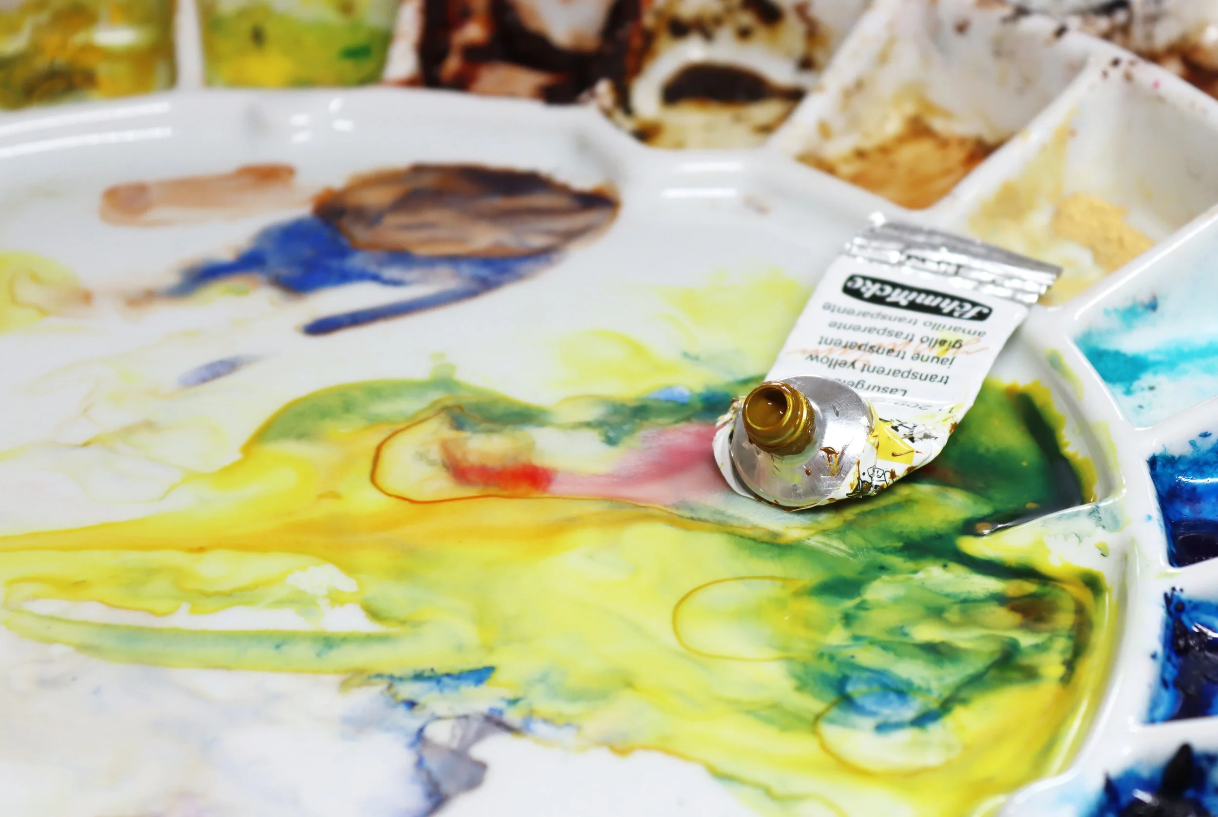
A selection of watercolour paints stored in a plastic container.
1. Translucency
Transparent Colour and Opaque Colour
Watercolour pigments vary in their translucency from transparent through to opaque.
Transparent pigments are excellent for layering and glazing techniques because they allow underlying colours to shine through. They create vibrant, luminous effects when multiple layers are applied, making them essential for creating depth and luminosity in watercolour paintings.

I used transparent pigments with excellent lightfastness for this rose painting.
Transparency is also important when mixing colours. Transparent pigments mix together to create luminous darks.
In the image below I mixed together French Ultramarine and Burnt Sienna which are both transparent pigments. They combine together to create a luminous dark.

Opaque pigments have the tendency to muddy paint mixtures so it's important to understand which pigments are opaque and which are transparent. They are useful for covering minor mistakes, creating strong contrasts, and adding emphasis to certain areas in a painting. However, they might lack the luminosity that you can achieve with transparent pigments.
The darks mixed from opaque colours don't have the same depth as darks mixed from transparent colours.
In the image below I have mixed French Ultramarine with Mahogany Brown. Mahogany Brown is an opaque pigment and the dark mixed from the two colours appears more 'muddy' than the dark I made with French Ultramarine and Burnt Sienna.

Opaque paints generally have heavier particles than transparent paints which effects the way the paint moves over wet paper. Transparent pigments move easily over wet paper, whereas opaque pigments tend to move more slowly. So if you are painting wet on wet and you want the pigment to stay in place, rather than spread over the paper, an opaque pigment might be useful.
In the image below I painted Transparent Yellow and Naples Yellow (which is opaque) onto wet paper. The paint was the same consistency but you can see how little the opaque pigment spread over the paper in comparison to the transparent yellow. It stayed in place on the wet paper.

Opacity is affected by dilution
Opacity is influenced by the degree of dilution in watercolour paints. Water is used for diluting watercolour paint, and the extent of dilution directly impacts the tonal value of the paint colour. It's worth noting that transparent pigments, when applied to the paper at their full intensity (with minimal water added), can appear opaque. On the other hand, when water is used to thin down opaque pigments, they can show a more transparent quality.
In the image below I have painted Cadmium Red Deep in the top rectangle. Cadmium Red Deep is an opaque pigment but because I have diluted it with water it looks transparent.
The second rectangle is Quinacridone Red which is a transparent pigment. I haven't diluted it with water and here it looks opaque.

Reading paint labels for translucency.
Paint manufacturers label their paint tubes to show the characteristic of translucency.
Winsor & Newton and Schmincke use a square and Daniel Smith use a circle to indicate this characteristic.
A square that is not filled in indicates transparency.
A square with a diagonal line through it indicates that the pigment is semi transparent.
A square that is half filled in indicates a semi opaque pigment.
And a square that is completely solid indicates an opaque pigment.

If you don't see these symbols on your watercolour paint tubes, check the paint manufacturers' websites for more information.
Another way to check whether a pigment you are using is transparent or opaque is to get some clean water and rinse out your brush. Opaque pigments tend to look cloudy in water. Thank you to Hazel Soan and her book, 'Art of the Limited Palette' for this tip.
In the photograph below I rinsed some Transparent Yellow out of my brush in the jar on the left and in the jar on the right I rinsed Naples Yellow out of my brush. Naples Yellow is an opaque pigment and it has made the rinsing water appear cloudy.

Opaque pigments and their heavier particles tend to make the water cloudy and paint mixtures muddy.
2. Staining colours and non staining colours
Staining watercolor paints penetrate the surface of the paper and can be challenging to lift or remove once they've dried. They are known for their vibrancy and ability to maintain their intensity on the paper so it's advisable to use them sparingly in your watercolour paintings and dilute them with water.
If you use them undiluted they can create brilliant darks that will add contrast to your paintings.
Staining pigments are suitable for glazing and layering, as the previously applied layers will not be disturbed by subsequent layers but it can be challenging to correct mistakes or adjust colours once staining pigments are applied.
Non staining colours are easier to lift. They are useful for artists who want more control over colour application and for those who prefer to make adjustments and corrections during the painting process.
Non staining colours are ideal for for creating delicate washes and smooth transitions but if you are after intense colour they may require more layers compared to staining pigments.
Phthalo Blue PB15 is a staining colour with great covering ability. When used at its full intensity it is a very strong colour. I love to use it when it has been diluted with water.

Phthalo Blue is a vibrant and cool staining blue.
Reading paint labels for staining properties.
Schmincke conveniently place a triangular symbol on their tube paints to indicate whether a pigment is staining, non-staining or semi-staining.

The blackened triangle indicates a staining pigment. The empty triangle indicates a non staining pigment and the half blackened triangle indicates a semi staining pigment.
Check individual paint manufacturers' websites for staining classifications or purchase paint colour dot charts. The dot charts have the information printed on them.

Daniel Smith indicate staining pigments with a number.
1= Non Staining
2 = Low Staining
3 = Medium Staining
4 = High Staining
Winsor & Newton indicate staining pigments with the letters 'St'.
3. Granulating Paints
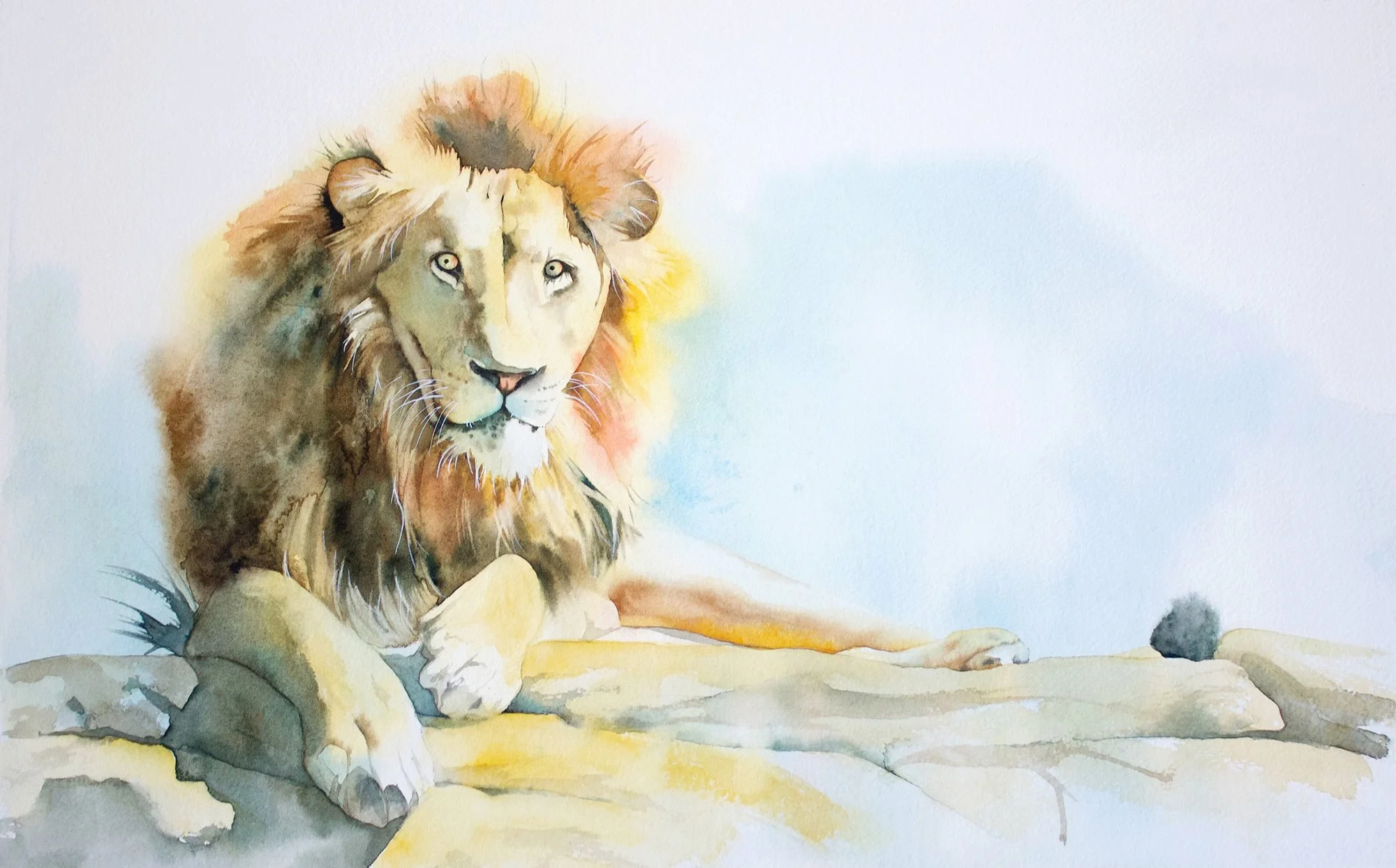
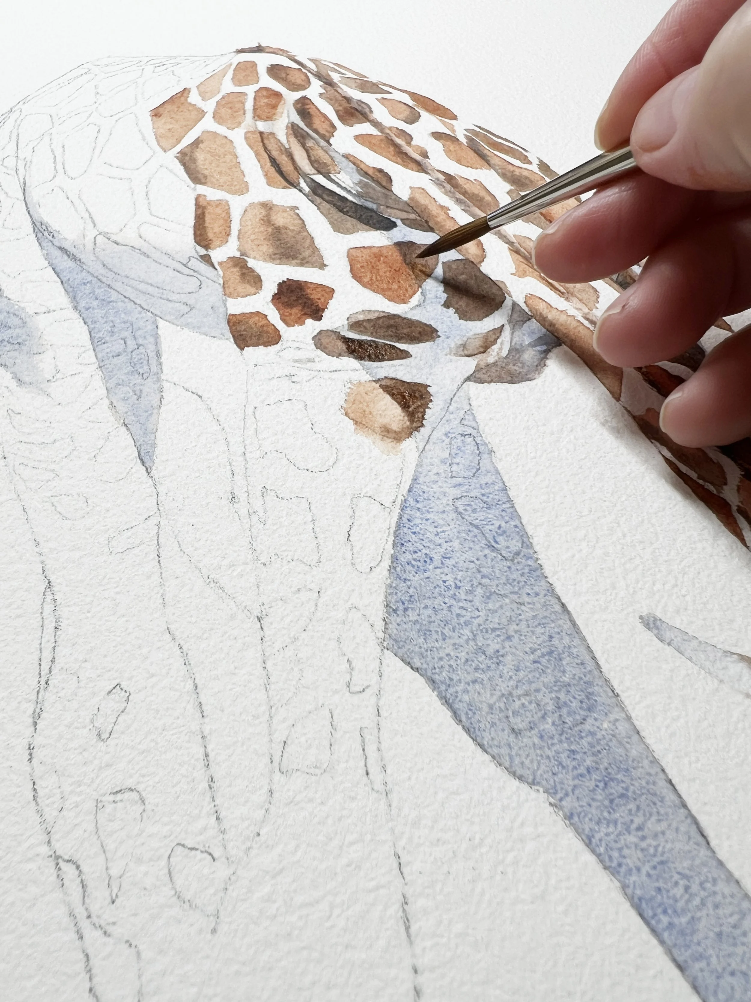
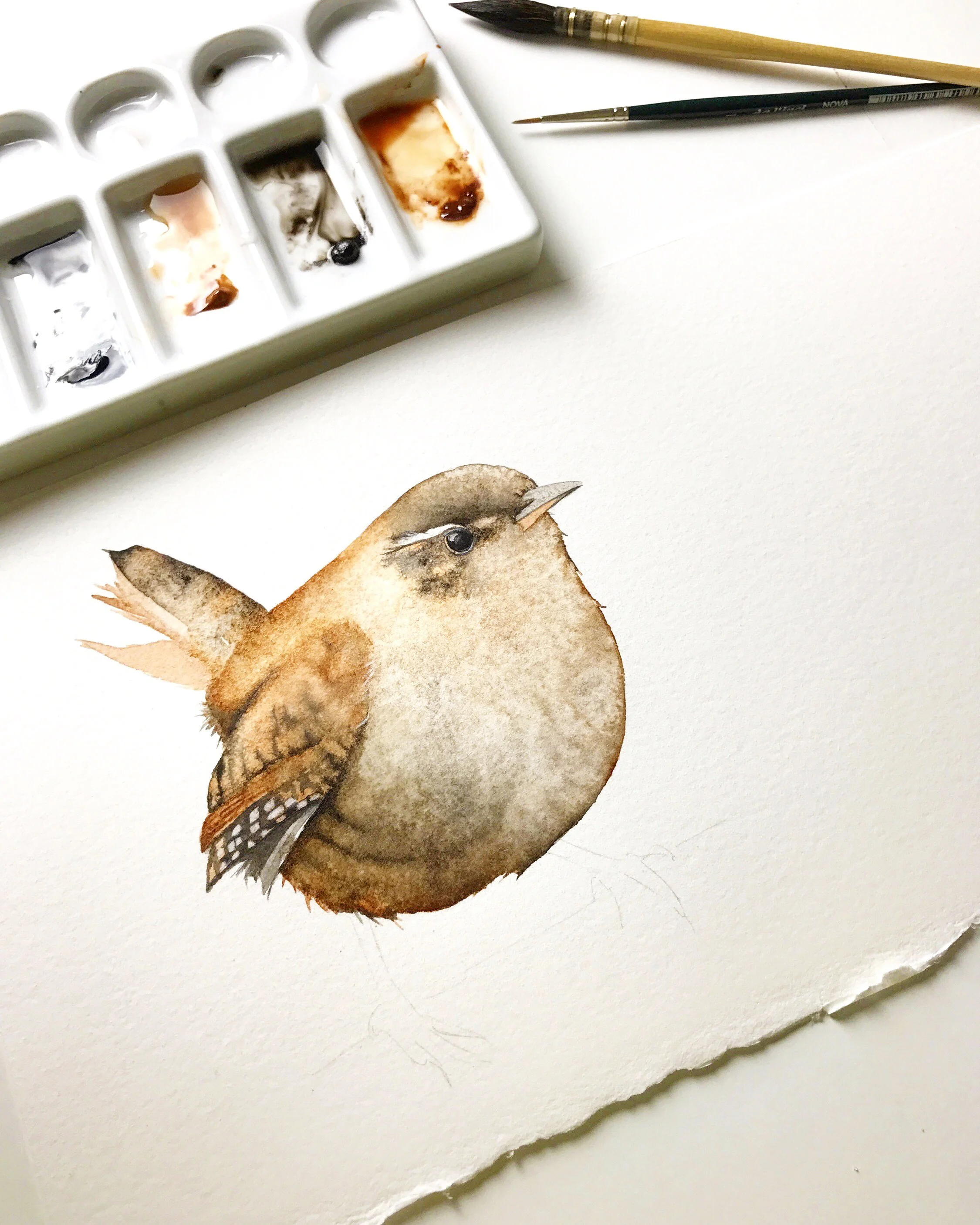
Some pigments are granulating. They have heavier particles that settle into the valleys of the watercolour paper. When they dry, they create a speckled effect on the surface. They are useful when you are painting something that may require the appearance of texture such as, landscapes, architectural details, natural elements or textured objects like this Lioness below.

Granulating pigments add texture to your paintings.
Some paint manufacturers label their granulating paints with a 'G' and others may use the letters 'N' for no, it doesn't granulate or 'Y' for yes, it does granulate. Check the labels on the tubes of paint or look on the manufacturer's website to determine if the paint you have chosen is granulating or not.
4. Colourfastness
Colorfastness is a term used to describe the resistance of colours to fading over time. The American Society for Testing and Materials (ASTM) develops standards for various products, including art materials. An ASTM colourfast rating indicates the permanence or lightfastness of the pigments used in the paints.
For the most accurate and up-to-date information on ASTM colourfast ratings, I recommend checking the latest ASTM standards or contacting the manufacturer of the specific paints you use. Manufacturers often provide information about the lightfastness or permanence of their products based on testing and adherence to industry standards.
When choosing paint colours, look for colours with higher ASTM ratings to ensure that your paintings maintain their original colours and vibrancy over time.
Schmincke label their paint tubes with black stars.
5 stars indicate that the pigment is extremely lightfast.
4 stars indicate good lightfastness.
3 stars indicate that the pigment is lightfast.
2 starts indicate limited lightfastness.

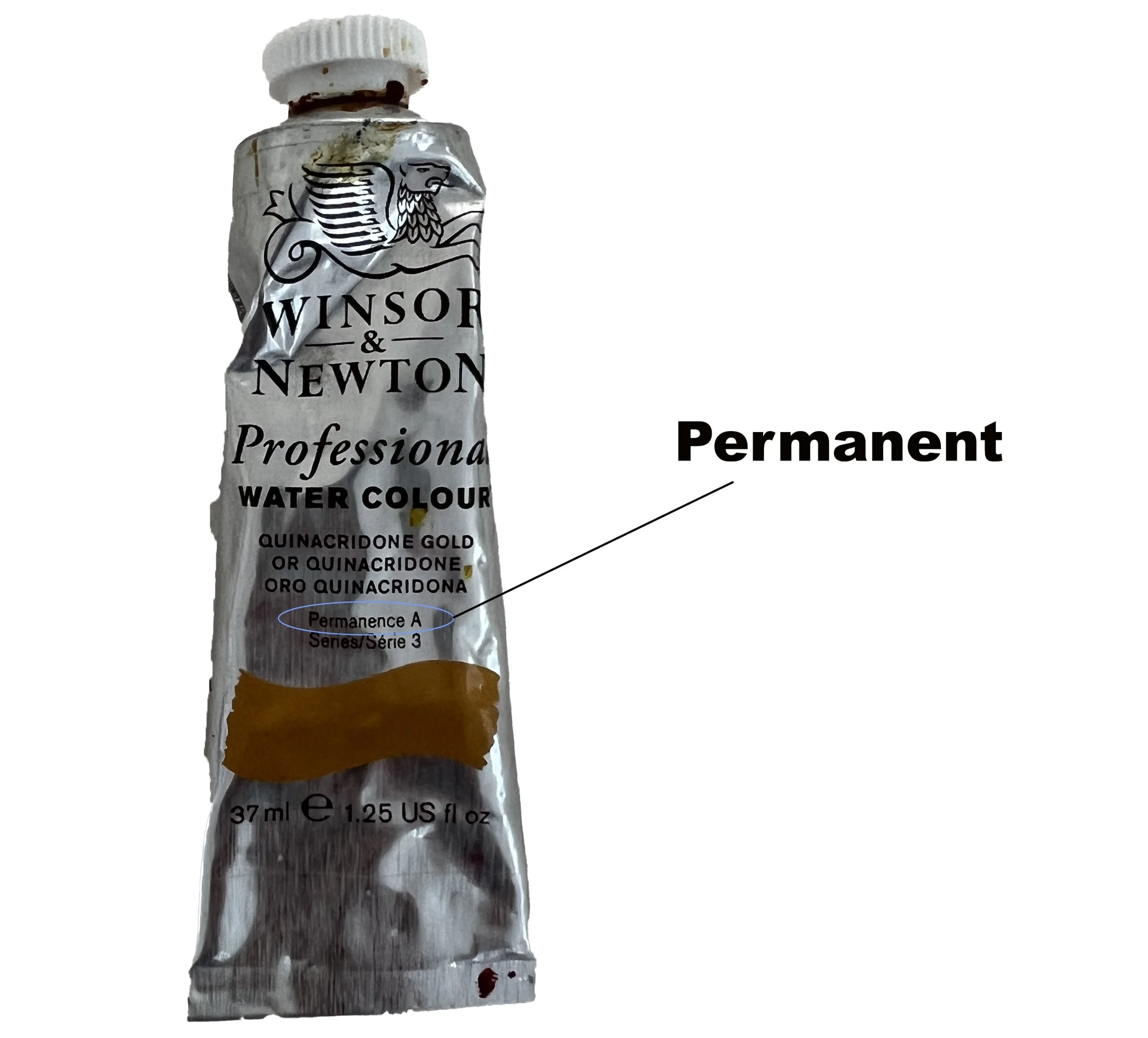
Winsor & Newton label their paint tubes with letters.
AA indicates extremely permanent
A indicates permanent
B indicates moderately durable
Daniel Smith label their paint tubes with Roman Numerals.
l indicates excellent
ll indicates very good
lll indicates fair
IV indicates a fugitive pigment (non lightfast)
NR indicates that it hasn't been rated.

It's clear that understanding the paint’s transparency, staining power, whether it granulates, and if it is colourfast will help you make more informed decisions about your colour choices. I encourage you to experiment with your pigments and keep a colour mixing journal to deepen your understanding which will help you to make more intentional and informed artistic choices.
If you are interested in learning to paint in watercolour, I have over 170 online, voiced over watercolour tutorials for all skill levels.
The lioness is available to purchase as a print in the shop.
Further reading: 9 Watercolour Texture Techniques