How to Paint Chrysanthemums in Watercolour
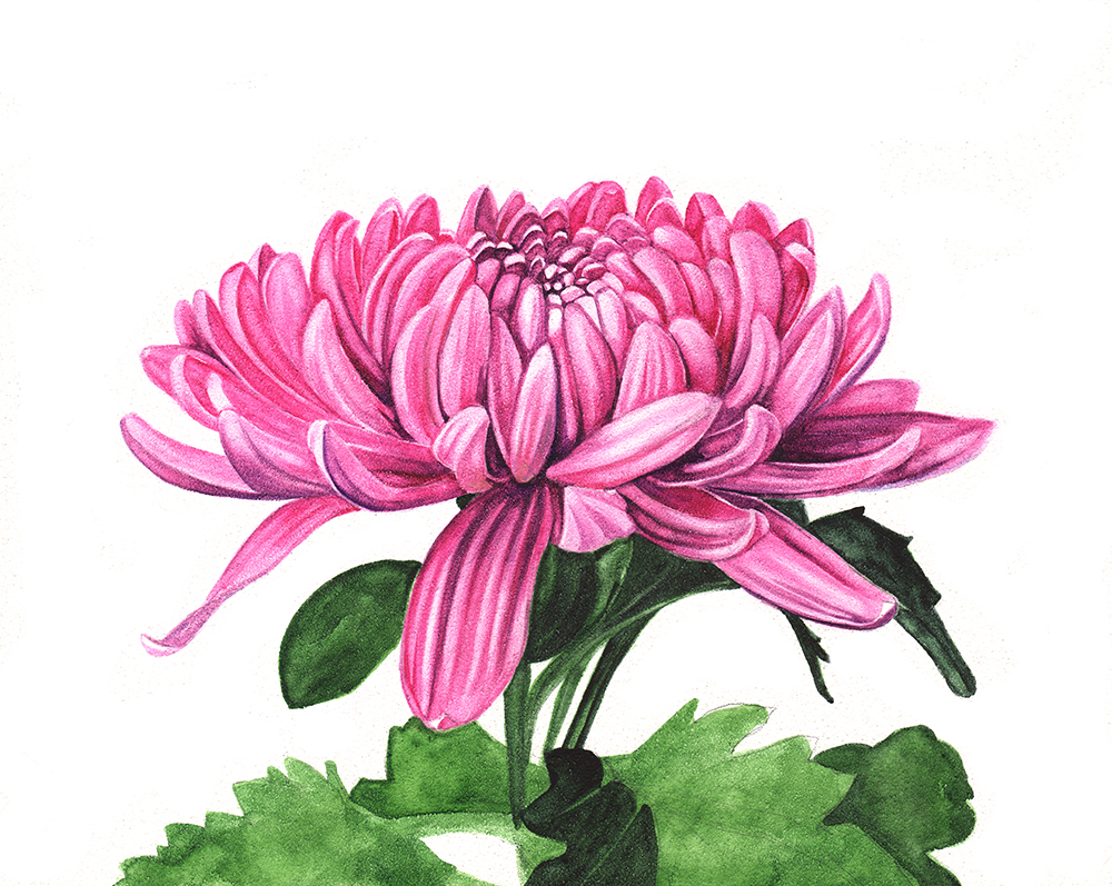
I recently tried painting a Chrysanthemum on Ampersand's Aquabord. Aquabord has a textured clay surface. The finished painting is varnished and doesn't need to be displayed behind glass. It's quite different from painting on watercolour paper. It gives you the ability to lift underlying layers off easily to create highlights.

Chrysanthemum- watercolour on Aquabord.
I share the different stages of my painting below.
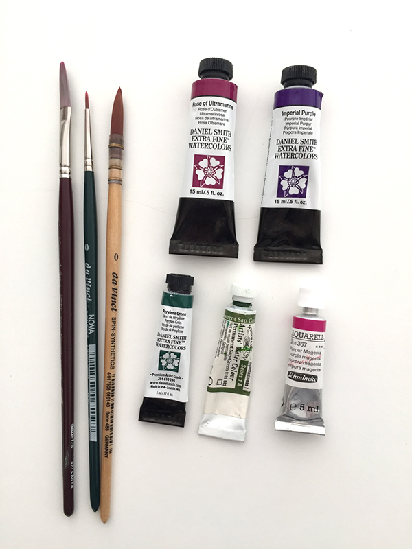
The paints and brushes I used.

In this first stage I wash over the petals with Schmincke's Purple Magenta. The paint doesn't seem to absorb into the surface like it does when I paint on paper. So I'm careful not to disturb the wash too much. I don't want to leave holes in the paint anywhere.
When the first wash is dry I use some more Purple Magenta and a fine round brush to start adding some darker areas to the petals. This time there is more pigment in my mix. I add the darkest areas with Daniel Smith's Rose of Ultramarine.
I decide that I need to lighten some of my highlights so I I take a clean wet brush and a tissue and I wet the areas where I want the highlights to be lighter. I dab with my tissue to remove the paint. This is where Aquabord comes into its own. Removing highlights is quite easy but you do have to be careful that you don't disturb the areas where you do want colour. It takes some getting used to and a little patience.
I start to paint the foliage with Winsor & Newton's Permanent Sap Green. When the Sap Green is dry I paint some Daniel Smith's Perylene Green over the top to darken.
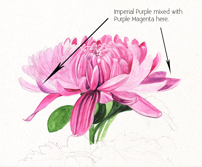
I continue with Purple Magenta. I use my small round brush to continue to paint darker areas. I add a little bit of Daniel Smith's Imperial Purple to Purple Magenta and I paint the petals on the right side of the flower. This is the messy stage of the painting. It's the time where I start to doubt myself. I use my hairdryer to dry off the paint and then I take an eraser and try to remove some of my pencil lines. I find that I actually smooth out and remove some of the paint a little with the eraser. I know I have many more layers to paint so I'm not too worried.
I have everything washed over now and I have removed my pencil lines. Now I start to bring in my darks on the petals using Rose of Ultramarine.

I continue to further define the petals using Purple Magenta and Rose of Ultramarine. I add highlights where I need to with a clean damp brush and a tissue. I'm working on the right side of the flower. I haven't touched the left side since I erased all my pencil marks. This scan of the flower shows me that I need to lighten some of the darker areas at the back.
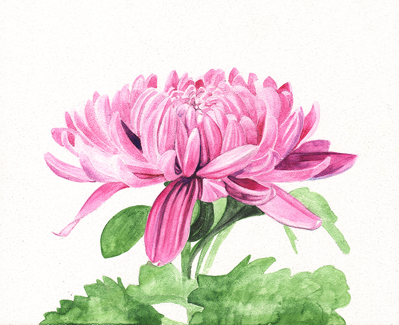
I have nearly finished the petals now. I continue to add colour with Purple Magenta and I use Rose of Ultramarine in the darkest areas. I remove colour to add highlights with my clean damp brush and a tissue. I am finding the clay surface very different to painting on paper. When I use paper I dampen the surface and then drop the paint in and let the water disperse the pigment. I haven't been able to do that with this surface. I will leave the petals for now and move onto the leaves. I'll come back to the petals when I am happy with the leaves.
I paint over the dark areas of the leaves with Perylene Green. I leave the lighter areas where I want Sap Green to show through untouched.

All done! The colours are vibrant and beautiful.
I will spray it with some varnish in a few days. The original painting has been sold, however, archival prints of another Chrysanthemum are available here and in the link below.

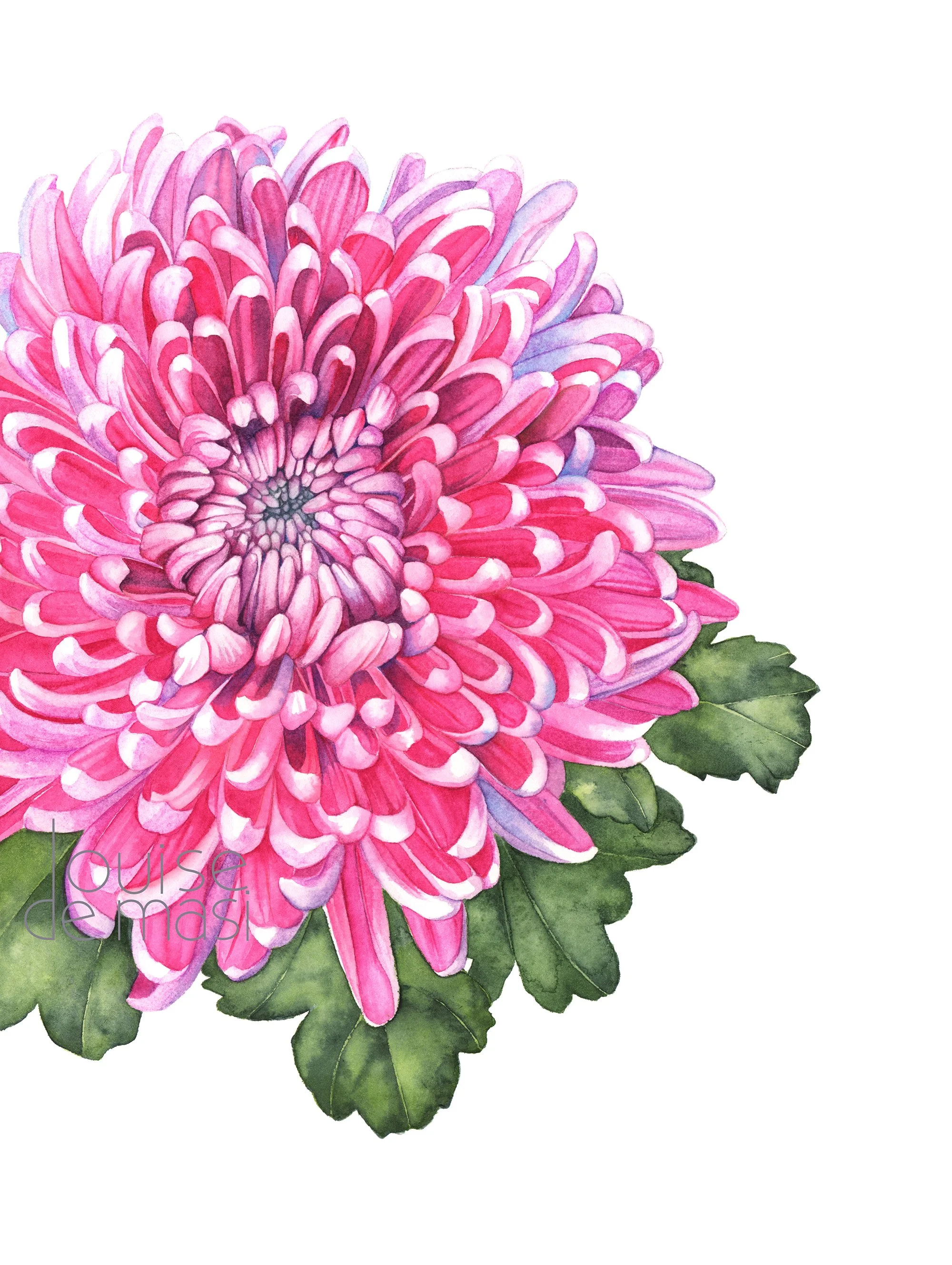
Description: "Radiant Bloom" by Louise De Masi captures the intricate layers of a chrysanthemum in a vibrant display of pink and purple hues. Each petal is lovingly detailed, revealing the complexity and symmetry of nature's design.
colour Scheme: Vivid pinks and subtle purples dominate the palette, complemented by rich greens, presenting a lively and joyful visual feast.
Styling Scheme: This art piece would complement a contemporary or minimalist decor, bringing a burst of colour and organic form to an understated space.
The print is in portrait orientation and is not framed.
Be sure to frame this gorgeous print behind glass when you receive it.
This art print is printed on demand when you place an order. Packing and shipping will be around 3-4 days.
Here is a video of the other Chrysanthemum I painted. It’s a 3 part “work in progress”. Enjoy.