
Index to Blog Posts
Watercolour Tips
Journal
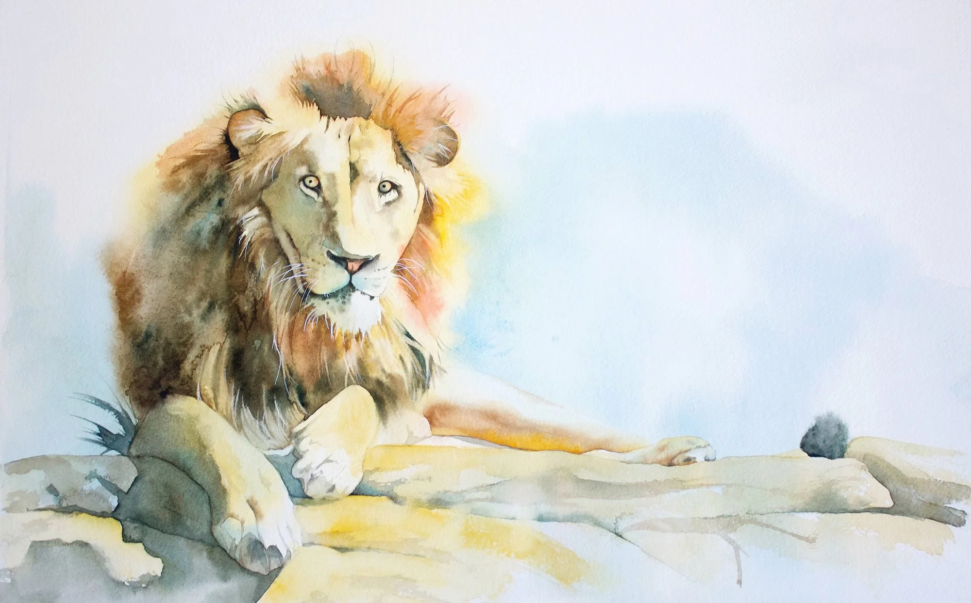
Every watercolour painting goes through an awkward middle stage.
The shapes may look disjointed. The colours may feel uncertain. At this point many painters assume the painting has failed and stop working on it.
In reality, this stage is completely normal.
Once darker values are added and the painting develops further, many paintings begin to come together.
What often looks like failure is simply the middle of the process.
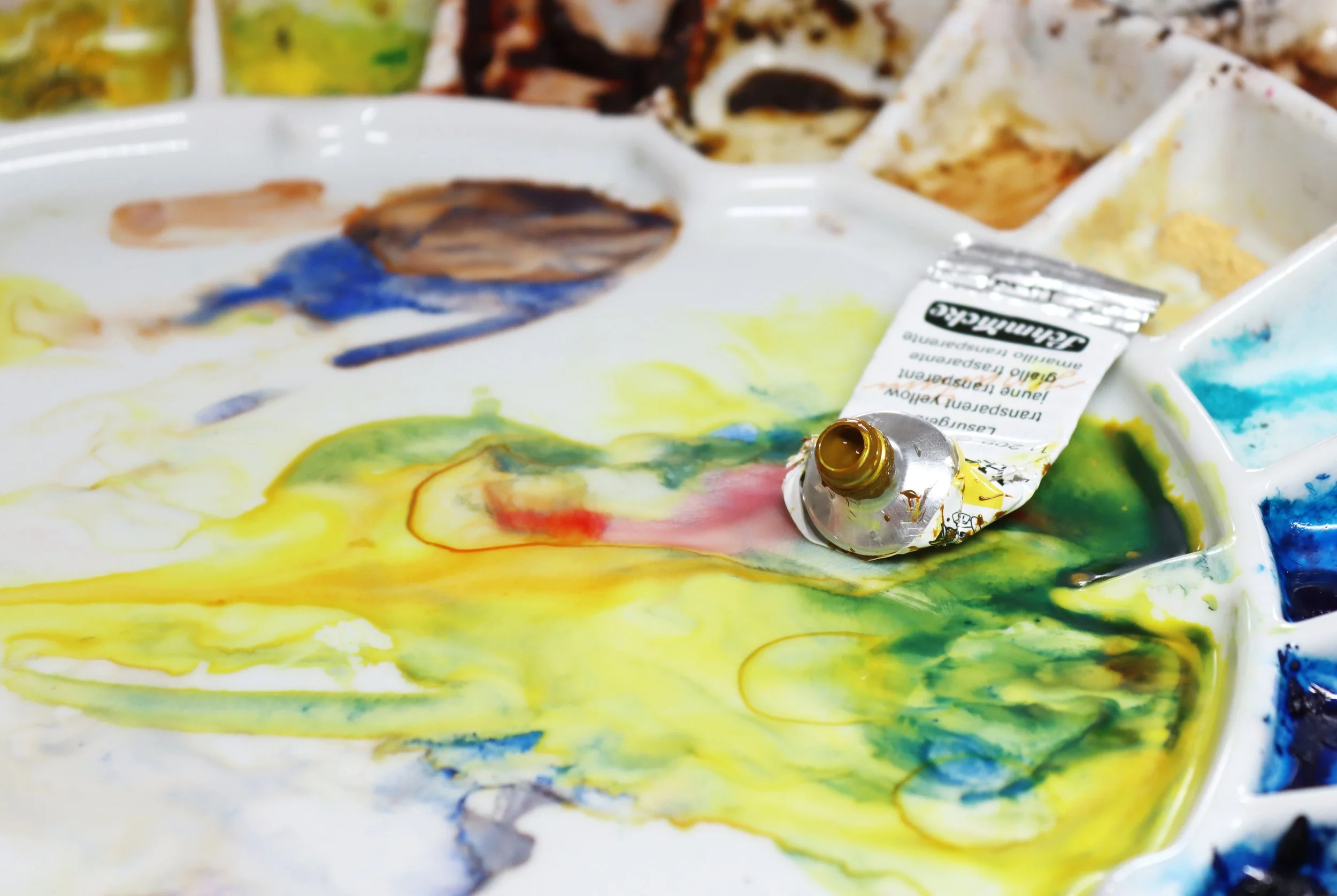
Watercolour is responsive. The paper surface holds pigment delicately, and repeated brushing disturbs that balance.
When we scrub, rework, or keep adjusting an area that has already begun to settle, we break the surface of the paper. Pigment lifts unevenly. Texture becomes patchy. What was once fresh begins to look tired.
Often this happens not because we lack skill, but because we hesitate. We add one more stroke. Then another. And slowly, clarity disappears.
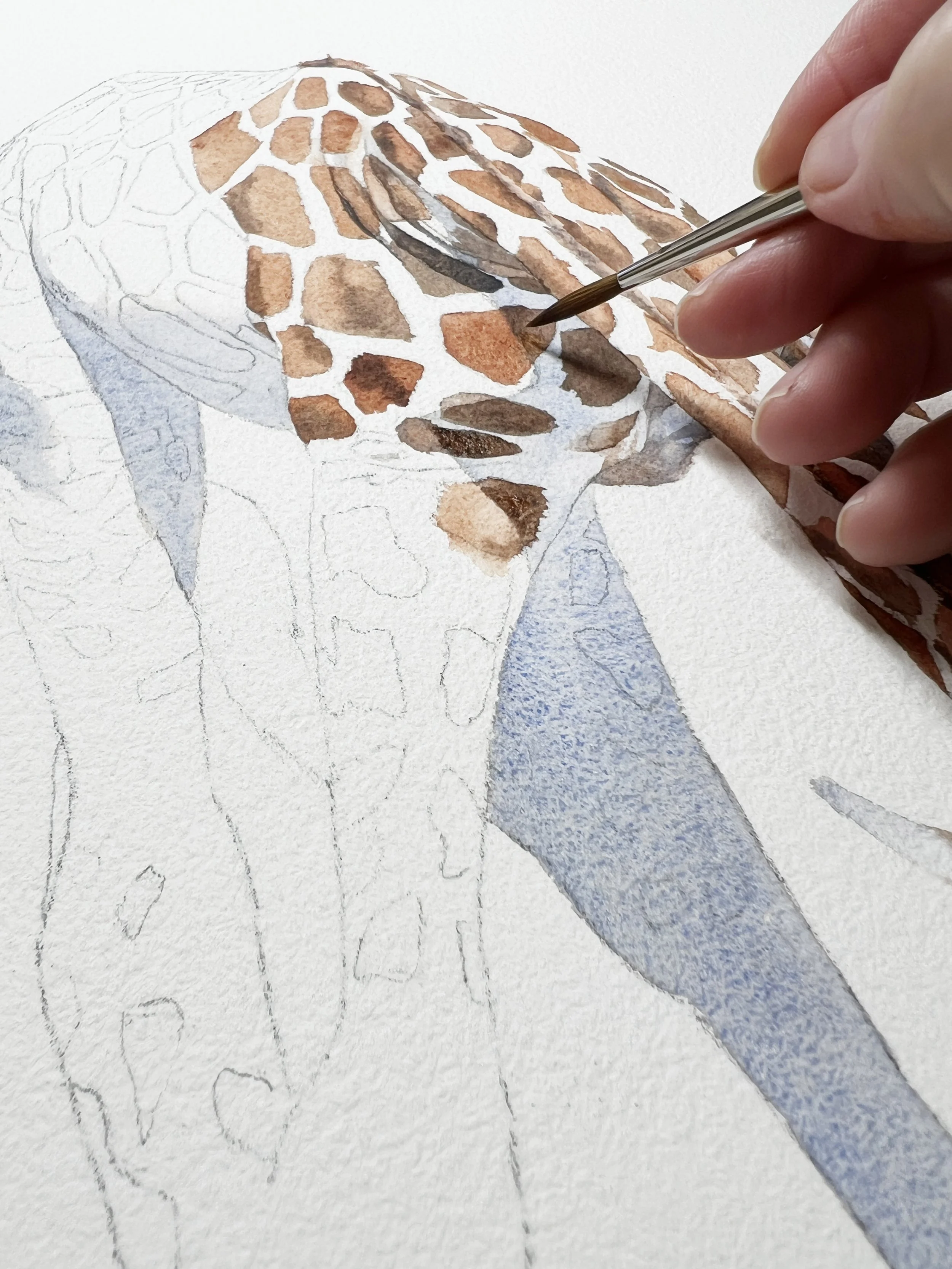
The key to wet on wet is timing. Watch the sheen on the paper rather than relying on instinct alone. Too wet, and the paint will spread uncontrollably; too dry, and edges will become harder than intended. Less brush movement often leads to better results. You can practice wet-on-wet by painting graded washes or flat washes. A spray bottle can help keep the paper evenly wet without introducing too much water, although I prefer thoroughly wetting my paper and if necessary I take the excess amount of water off with a damp brush.
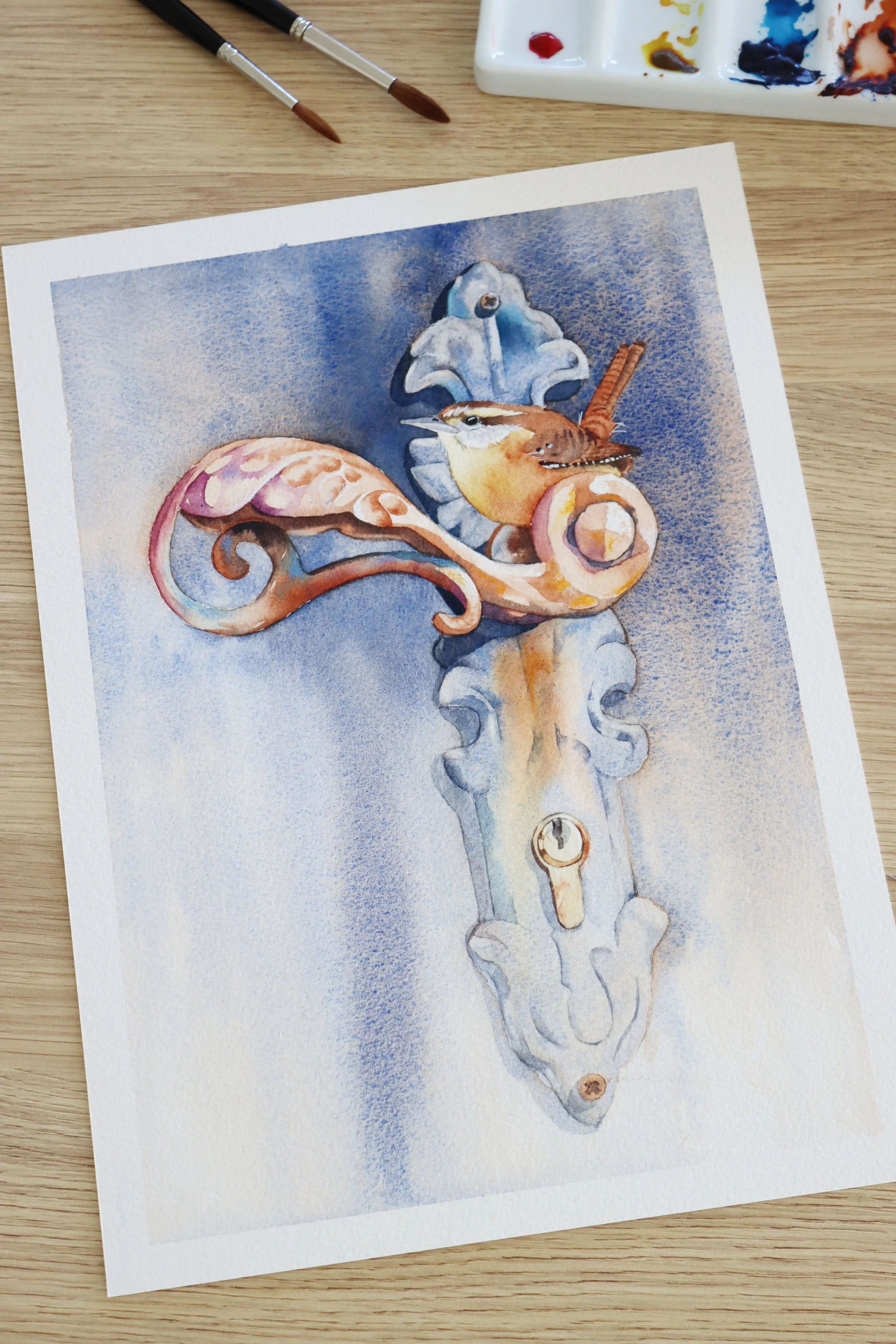
What makes a focal point work isn’t detail on its own. It’s the contrast around it that allows the important element to stand out.
High contrast areas naturally attract the viewer’s attention. Strong light against dark, hard edges beside soft edges, and clear shapes set against quieter background areas all help establish a visual hierarchy. Without this contrast, even carefully painted detail can disappear into the rest of the painting.
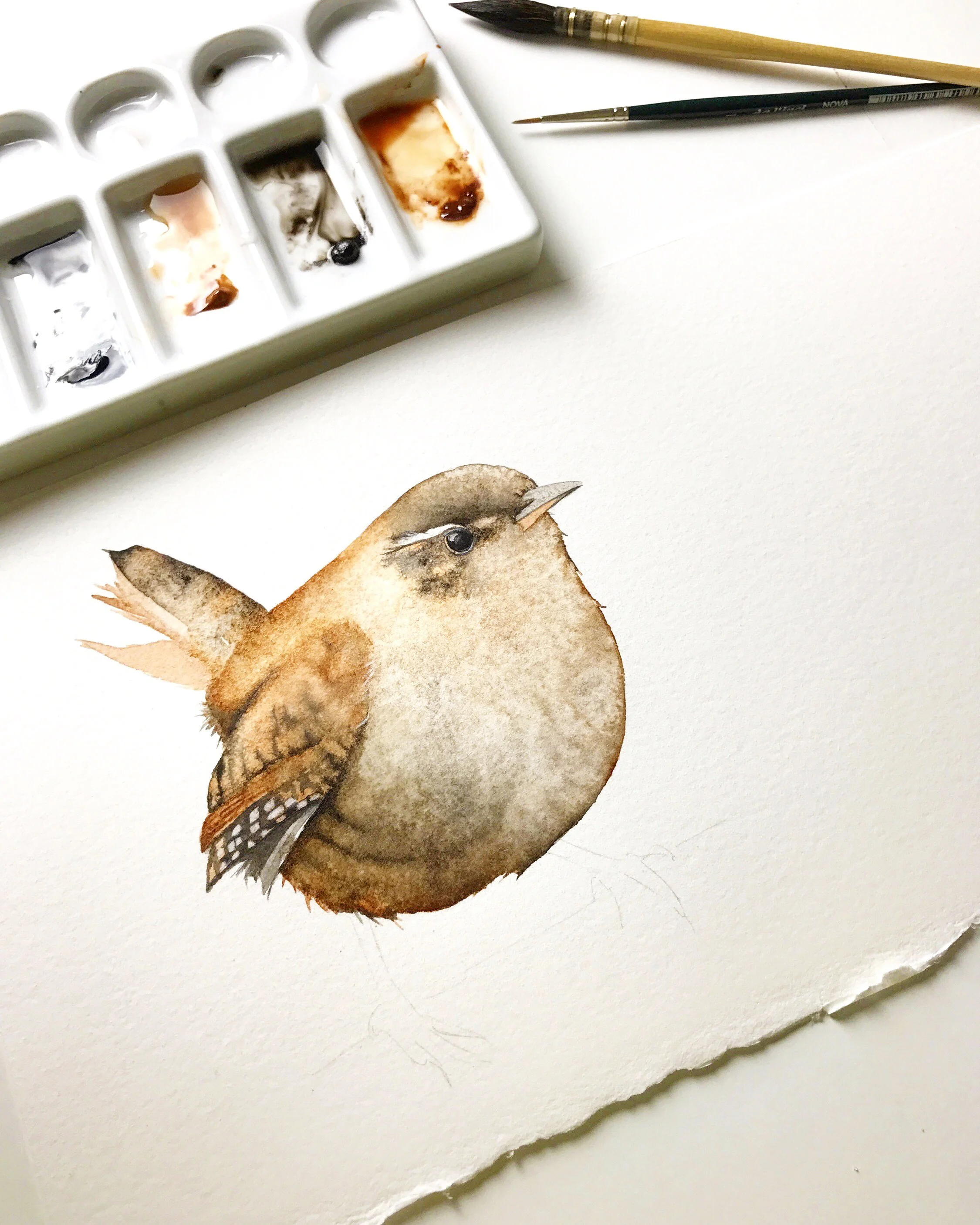
For many watercolour painters, the idea of practising every day brings up pressure rather than motivation. There is the fear of wasting paper. The fear of doing it wrong. The fear that every session needs to end with a finished painting.
But daily art practice is not about proving anything.
It is about showing up in a way that feels manageable, safe, and repeatable.
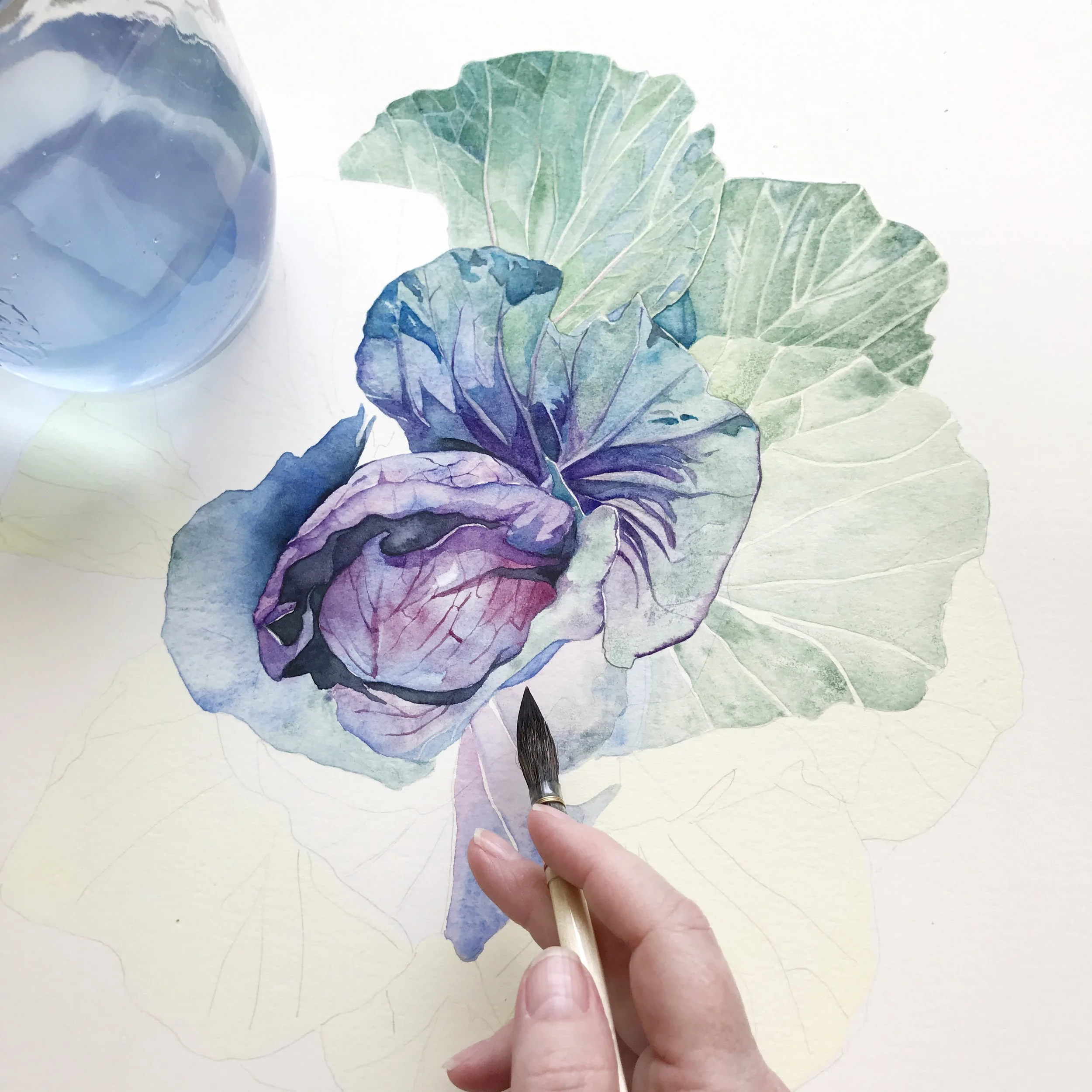
Watercolour has a reputation for being difficult. Not because it lacks beauty, quite the opposite, but because it asks for a particular kind of attention. It responds immediately. It records every choice you make, whether intentional or not. Where other mediums allow for correction and revision, watercolour asks for awareness, patience, and trust.
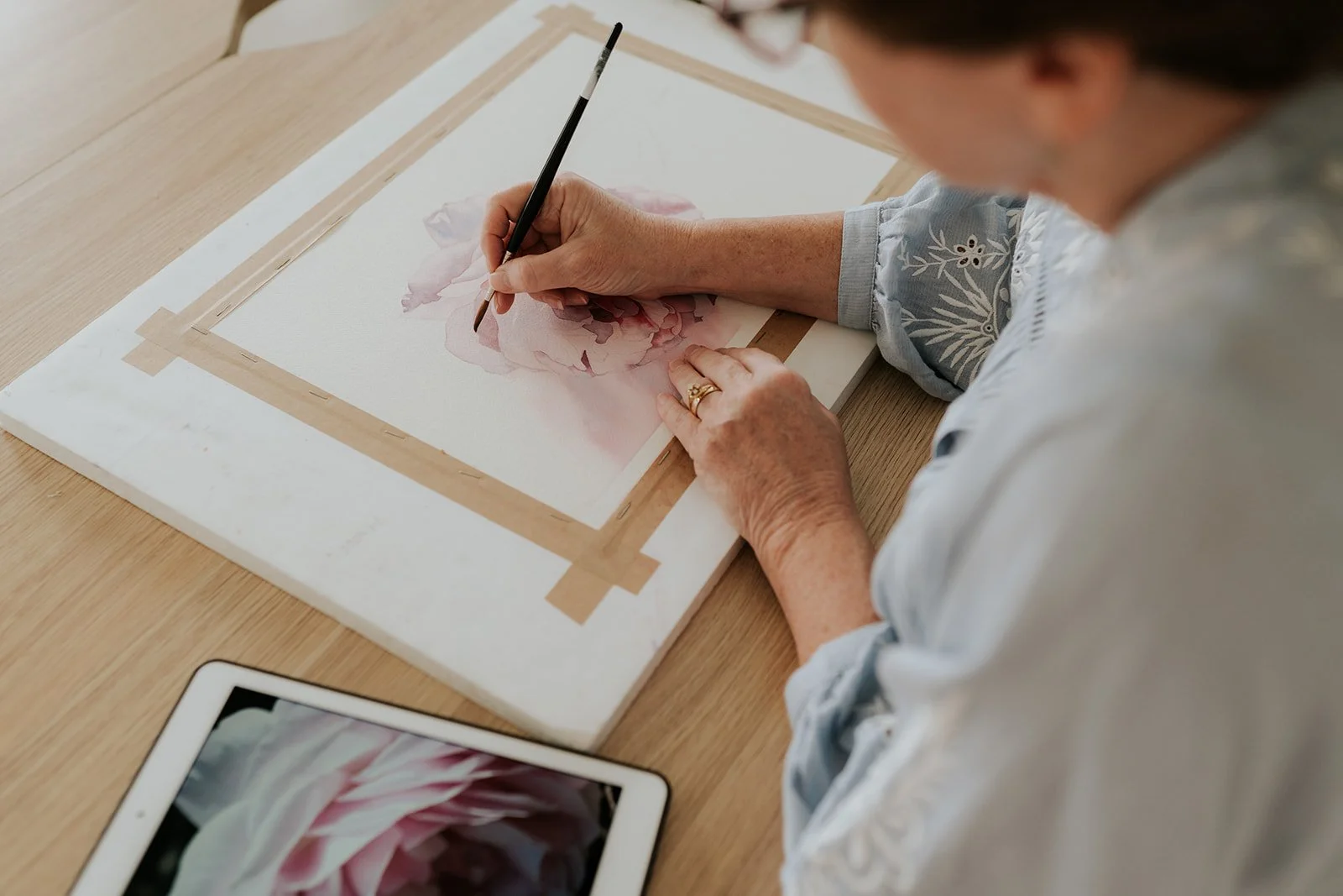
As a professional artist, I don’t always have the luxury of waiting until motivation returns. I still need to create new work, even on days when I’m not in the mood. When that’s the case, I often start with a study rather than a finished painting, and I do it without cameras on. Taking away the pressure to perform allows me to experiment, make mistakes, and explore ideas more freely.
Sometimes that study leads naturally into the final painting. Other times I’ll try again, or scrap it entirely and begin something new. Letting go of the need for every piece to succeed is often what makes it possible to keep painting at all.
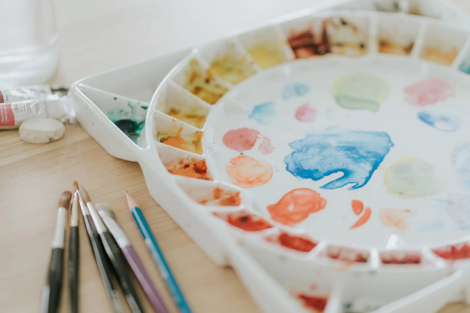
Over the years, I have found myself returning to a handful of mixes again and again. Some began as small experiments, others solved very specific painting problems, but all of them earned a permanent place on my palette.
Today I am sharing some of those mixes with you, simple combinations that create beautiful natural colours. They are not my everyday choices anymore (apart from my beloved grey mixed from French Ultramarine and Burnt Sienna), but they were once central to what I considered my ultimate mixing palette, and they are still worth knowing.
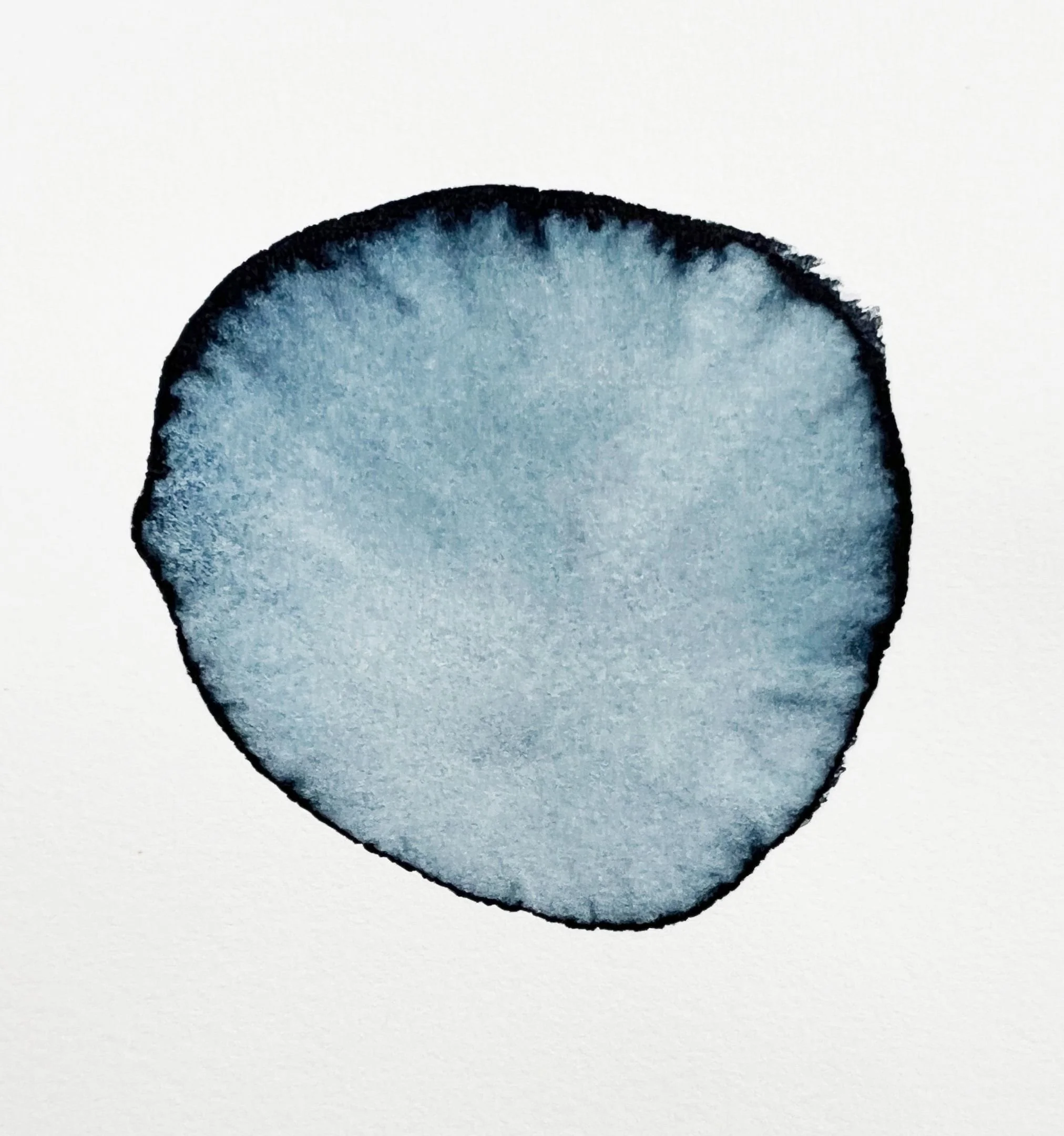
A very wet, diluted mix can easily create a puddle on the paper, and that’s when dark edges form. When there’s too much water in the wash (and on the paper), it spreads out across the wet area as it dries and carries the pigment with it, leaving that darker ring around the outside. Using a slightly stronger mix when you apply paint gives you much more control and helps your washes dry evenly.
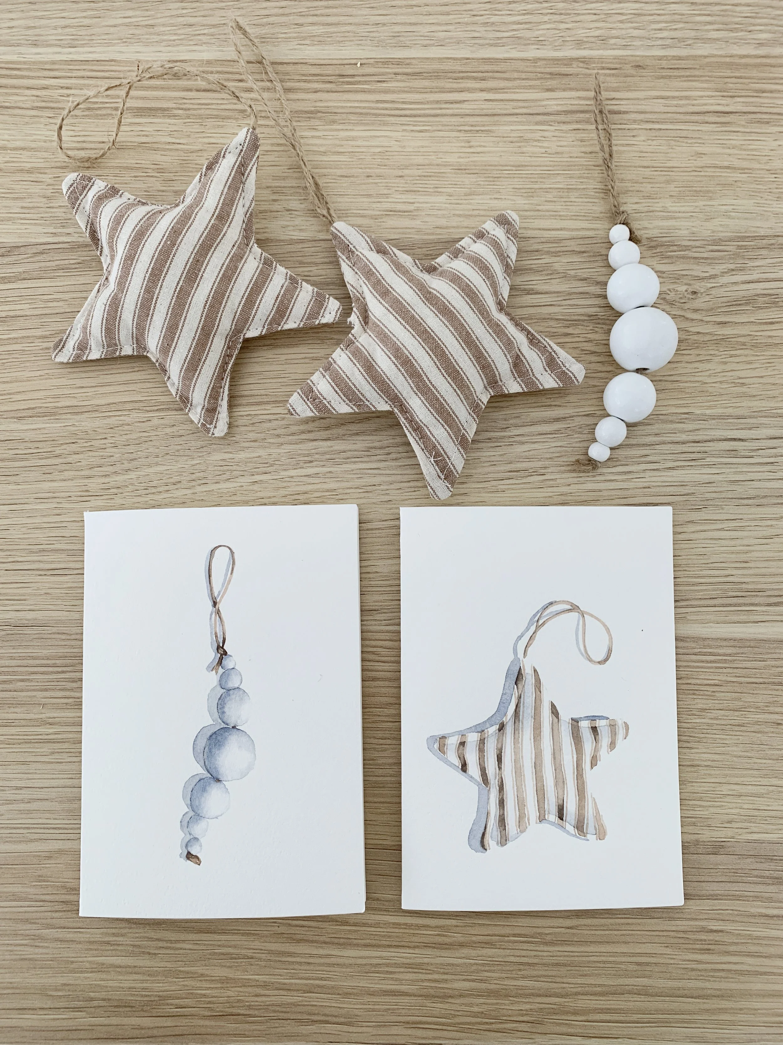
As the holiday season approaches, I love going back to small, calming projects. The ones that need only a few materials but still leave you with something beautiful and personal to give away, like your own watercolour Christmas cards. Even if you are short on time right up until Christmas, these cards are so quick to paint that you can make them as a last minute DIY present.

There’s an almost magical shift that happens when you see how two pigments combine. A transparent yellow suddenly turns into olive when it meets a touch of French Ultramarine; a pretty violet emerges from a whisper of Ruby Red and French Ultramarine. When you understand those relationships, you no longer guess - you choose your colours with confidence.

Before you start painting on an Aquabord panel it's important to wet the surface with some water to release any trapped air bubbles. I use a large flat brush and paint clean water onto the surface. I let it dry naturally and then I transferred my line drawing onto the panel using some saral transfer paper.
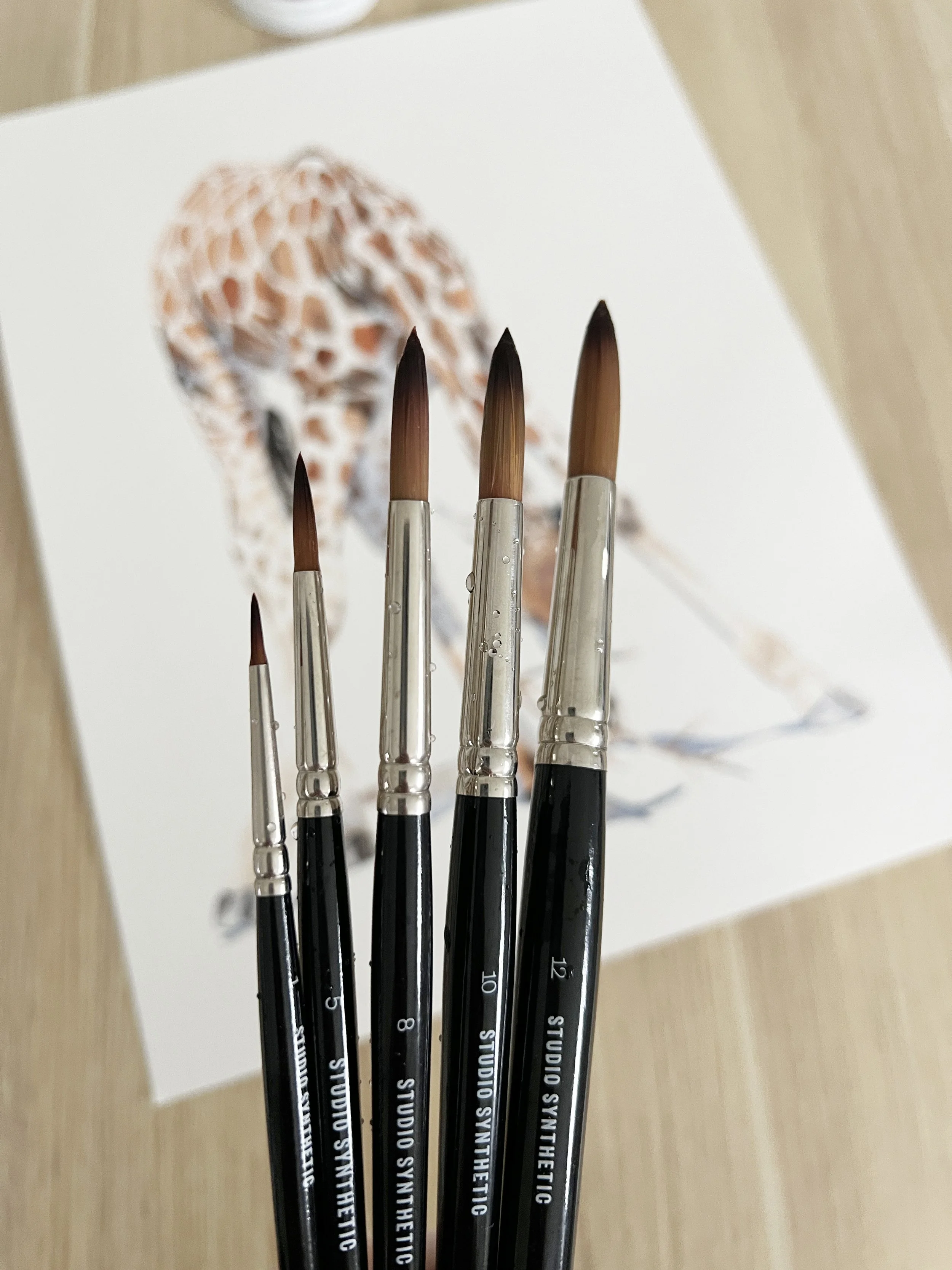
There’s something so rewarding about watching my students grow as painters. Each painting tells its own story of curiosity, courage, and those little discoveries that quietly change the way we paint forever.
Recently, while looking through some of my students’ paintings, I noticed something interesting. A few of them were struggling with uneven washes and edges that looked a little soft or overworked. As I studied their work, it dawned on me that many of them were simply using brushes that were far too big for the level of control they needed.

At first, I thought I’d leave the water droplets out. But as the painting progressed, I decided to add them in, and I’m so glad I did. They gave the flower sparkle, depth, and a feeling of freshness, as though it had just been kissed by the morning dew. I always look for new and exciting watercolour painting ideas.

At first glance, a watercolour pencil looks just like an ordinary coloured pencil. The magic happens when water touches the pigment. Suddenly, the dry strokes transform into fluid, paint-like washes. You can use them dry for detailed line work, or you can activate them with a damp brush for soft, flowing colour. They’re a wonderful bridge between drawing and painting.
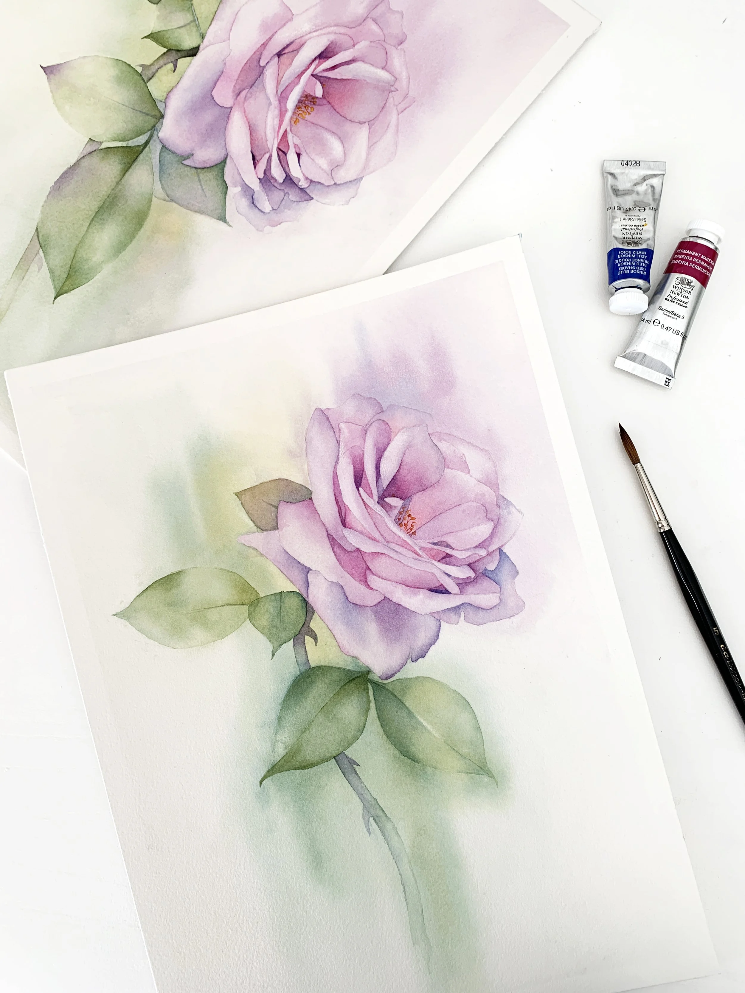
It’s one of the most common questions beginners ask – and for good reason. Watercolour has a mind of its own, and once the paint hits the paper, there’s no going back. Knowing where to start can save a lot of heartache (and paper).
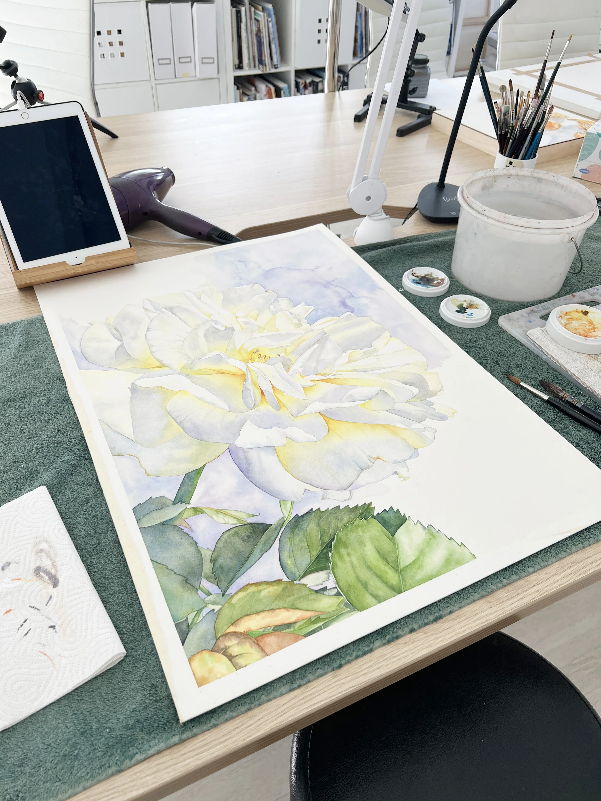
One of the most daunting things about painting large is exactly that - it’s large! The paper feels endless, and the temptation to cover everything at once can be strong. But here’s a little secret: you don’t have to paint everything in one go. In fact, you’ll often get better results if you take it step by step.

One of the biggest advantages of using Procreate for planning is that it saves paper and materials. You can test countless colour combinations and compositions without committing them to paper until you’re sure.
For example, I created a digital illustration of a happy little girl, which I plan to recreate on a larger scale using watercolours. The app can help me decide on colours and compositions before I even touch my paper.
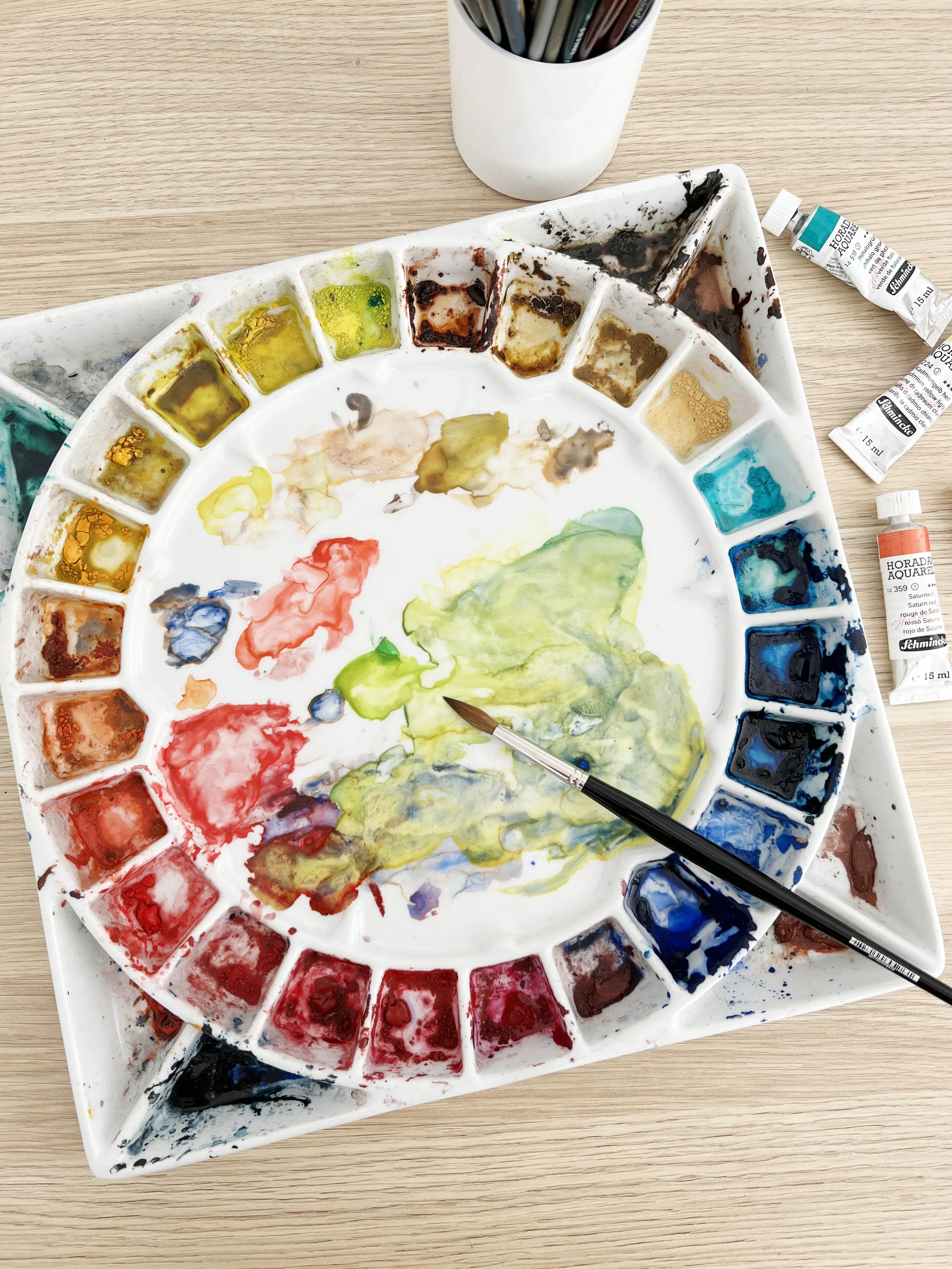
Sometimes when you're looking at a reference photo, it can be hard to figure out exactly what colour you're seeing. Is that shadow a grey? A purple? A cool green?
When I’m unsure, I open the image in Photoshop and use the eyedropper tool to grab the colour I’m trying to identify. Then I paste it onto a blank canvas so I can see it on its own, without being influenced by the surrounding colours. It really helps to isolate the colour and understand what’s actually there.
This is especially handy if you’re trying to figure out subtle tones in a shadow, fur, or petal - areas where the colours can be more complex than they first appear.
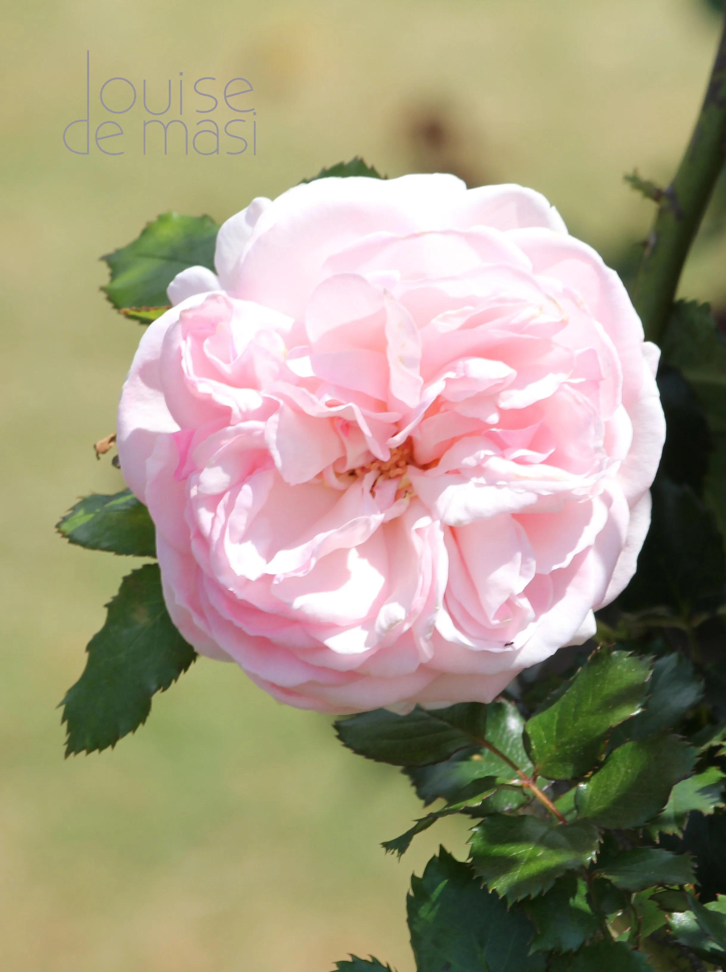
A strong painting needs a focal point - something that draws the viewer’s eye and gives the composition a sense of purpose. So when you’re choosing a photo, ask yourself: What is the star of the show?
It might be the eye of an animal, the curve of a petal, or the way the light hits a glass bottle, that fills you with inspiration. But there has to be something that grabs you. If a photo is too evenly detailed across the whole image, it can be difficult to know what to focus on in your painting.
Personally, I often find myself drawn to reference photos that have a bit of drama - a close-up angle, an expressive pose, or a little sparkle of light that adds interest. Once I’ve identified that focal point, I build the rest of the surrounding composition, supporting it rather than competing with it.

A big part of how your edges behave comes down to one simple but powerful thing: your water-to-paint ratio. If your brush is loaded with too much water, the pigment will pool and drift unpredictably. If it’s too dry, you’ll get scratchy, uneven marks.
The sweet spot lies in understanding the relationship between water and pigment - how they dance together on the page.

One of the biggest challenges in painting white objects is maintaining soft edges, especially in areas where light gradually transitions into shadow. To achieve this, I use a damp brush to soften the edges of my shadows immediately after applying them. This technique helps the transitions look seamless and natural.

These days I almost always mix my own violets because it helps me stick to a limited palette, which naturally creates better colour harmony across the whole painting. I also paint wet on wet a lot, and there's something beautiful about watching the pigments separate on the paper when you mix violet yourself - especially with granulating colours like Ultramarine.
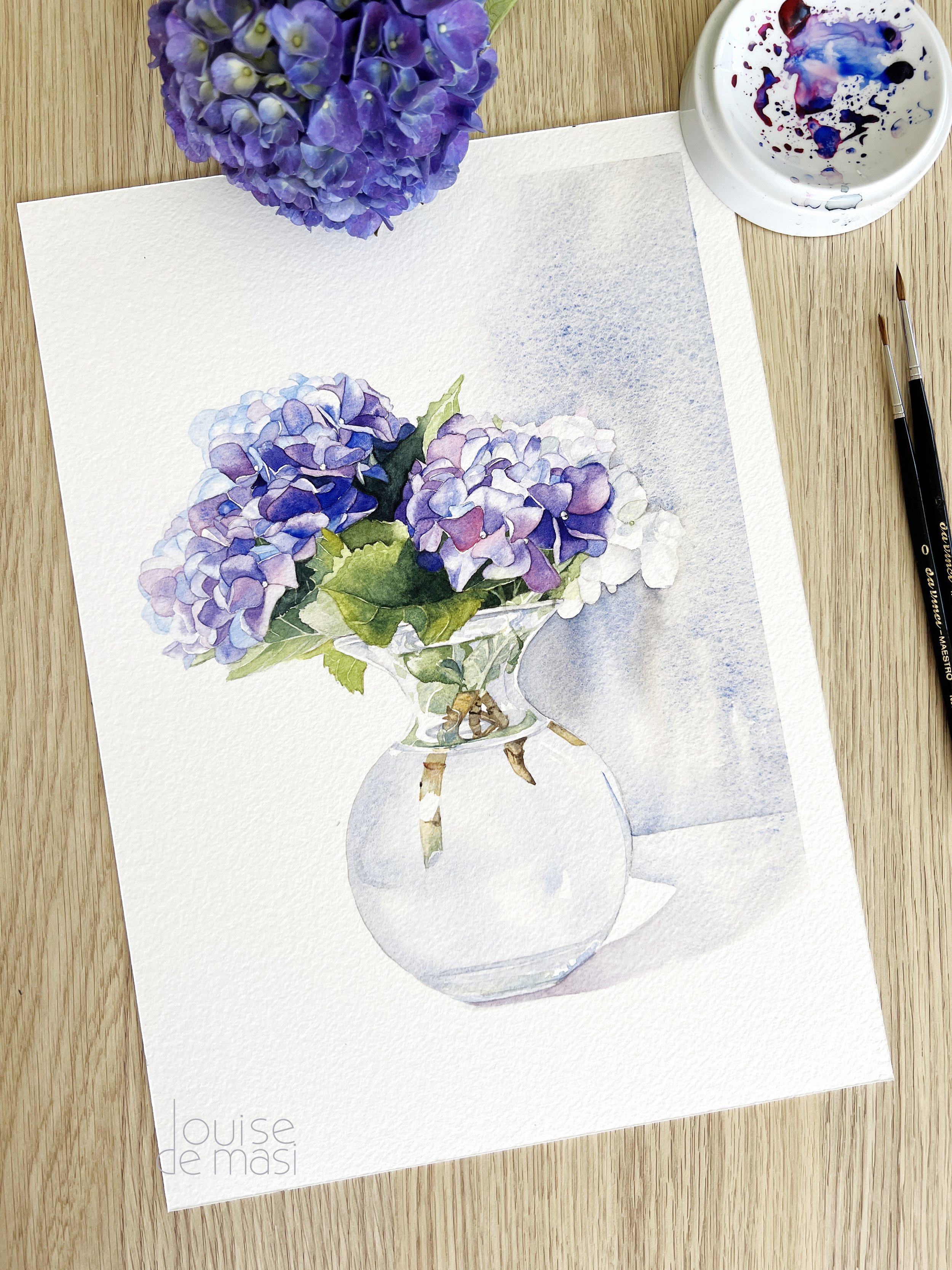
There’s something so beautiful about the hydrangea flower - the full, delicate blooms, the shifting colours, and the way they fill a space with softness. I have a few hydrangea bushes growing in my garden, and when they’re in bloom, I always feel inspired to bring them indoors and start painting. This watercolour hydrangea piece came together after I popped a few freshly cut stems into a glass vase and decided it was the perfect moment for painting flowers.

I’ve learned the hard way that Louise’s first layers always look way darker in the video than they actually are. Determined to remember this, I mix a watery paint.
I’ve also learned that if your paper is too wet and your paint is too watery, the pigment will migrate to the edges, leaving behind an unwanted harsh line. So, keeping all this in mind, I put paint on the paper—only to immediately want to quit.
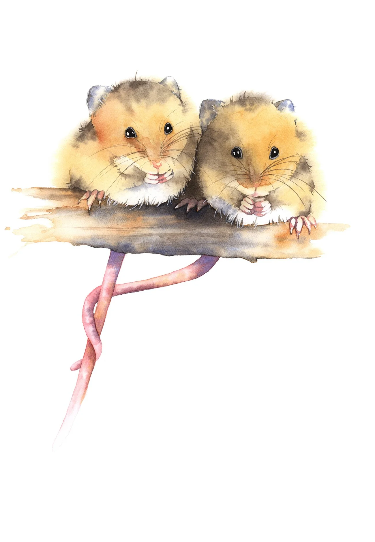
Tidelines are a common challenge in your watercolour journey, but they don’t have to be a frustration. Whether you embrace them as part of the painting’s texture or correct them with care, every mistake is an opportunity to learn and improve your technique. With practice, you’ll gain more control while still allowing watercolour to do what it does best - flow naturally.
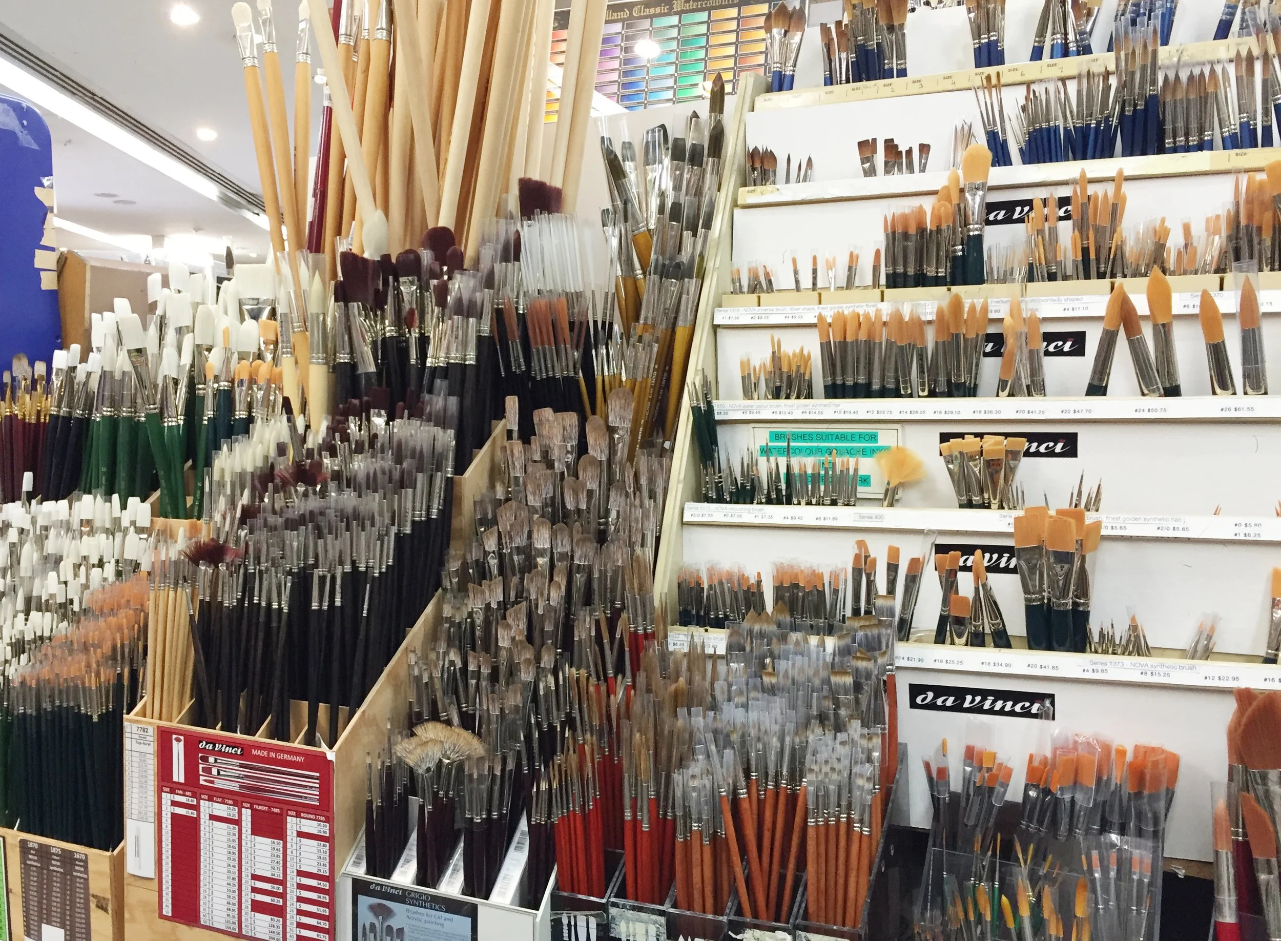
If I had to choose just one brush to take with me to a deserted island (assuming there’s watercolour paper on this island, of course), it would be a round brush. These brushes are the workhorses of watercolour painting, and for good reason. With their tapered shape and pointed tip, they offer an incredible range of mark-making possibilities.
You can create everything from whisper-thin lines to broad, sweeping strokes - all with a single brush! The trick is to adjust the pressure: light pressure for fine details, and heavier pressure for broader strokes. Round brushes are fantastic for general painting, detailed work, and fluid line variation. If you’re just starting out, investing in a high-quality round brush with a fine point will serve you well for years to come. Trust me, this is one brush you don’t want to be without!

When you watch my tutorials, I want you to think of them as a jumping-off point. Don’t feel like you need to replicate every step exactly. Instead, start experimenting by making small changes. For instance, you could swap out the colours I use and choose a palette that resonates with you.
If I’m painting a bird, maybe you’ll add your own background - a loose wash of colour or some foliage to give it your unique flair. Another idea is to combine techniques or elements from different tutorials to create something entirely your own.

I always begin my floral paintings with a wet-on-wet technique for the initial wash, embracing the unpredictability and softness it brings. This stage is about capturing the ephemeral qualities of petals- their delicacy and the gentle interplay of light and shadow. I wet the paper first, allowing the paint to flow freely, blending seamlessly into the damp surface. Sometimes, I paint each petal individually, while other times I apply a wash over the entire flower at once. It depends on the flower and the level of colour or value variation within each petal.
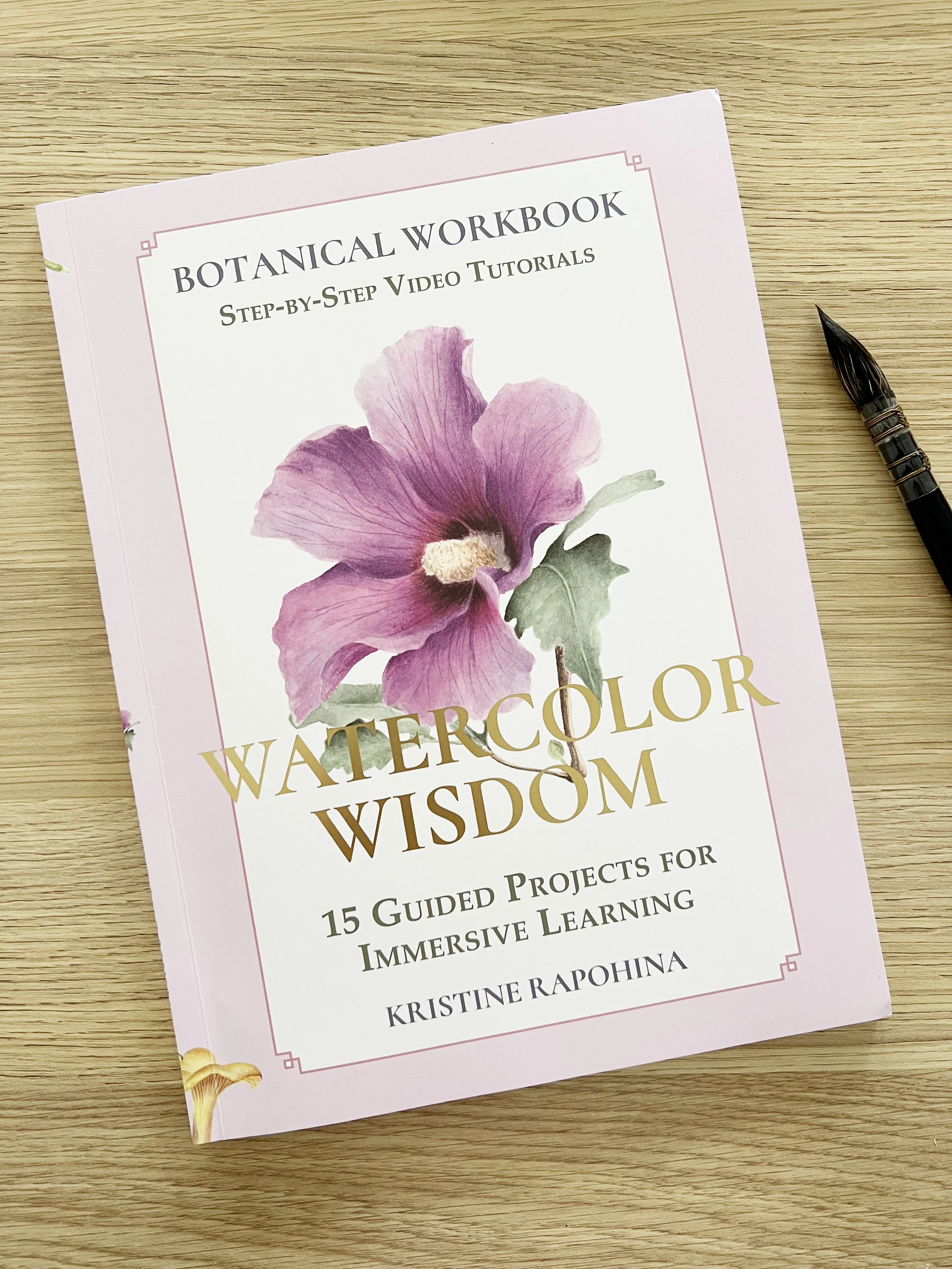
“Watercolor Wisdom offers a fresh and accessible way to learn botanical illustration through painting. It’s thoughtfully laid out, with plenty of room for hands-on practice and exploration… If you’re after a guided, project-based approach to painting flowers in watercolour, this is a lovely book to add to your collection.”
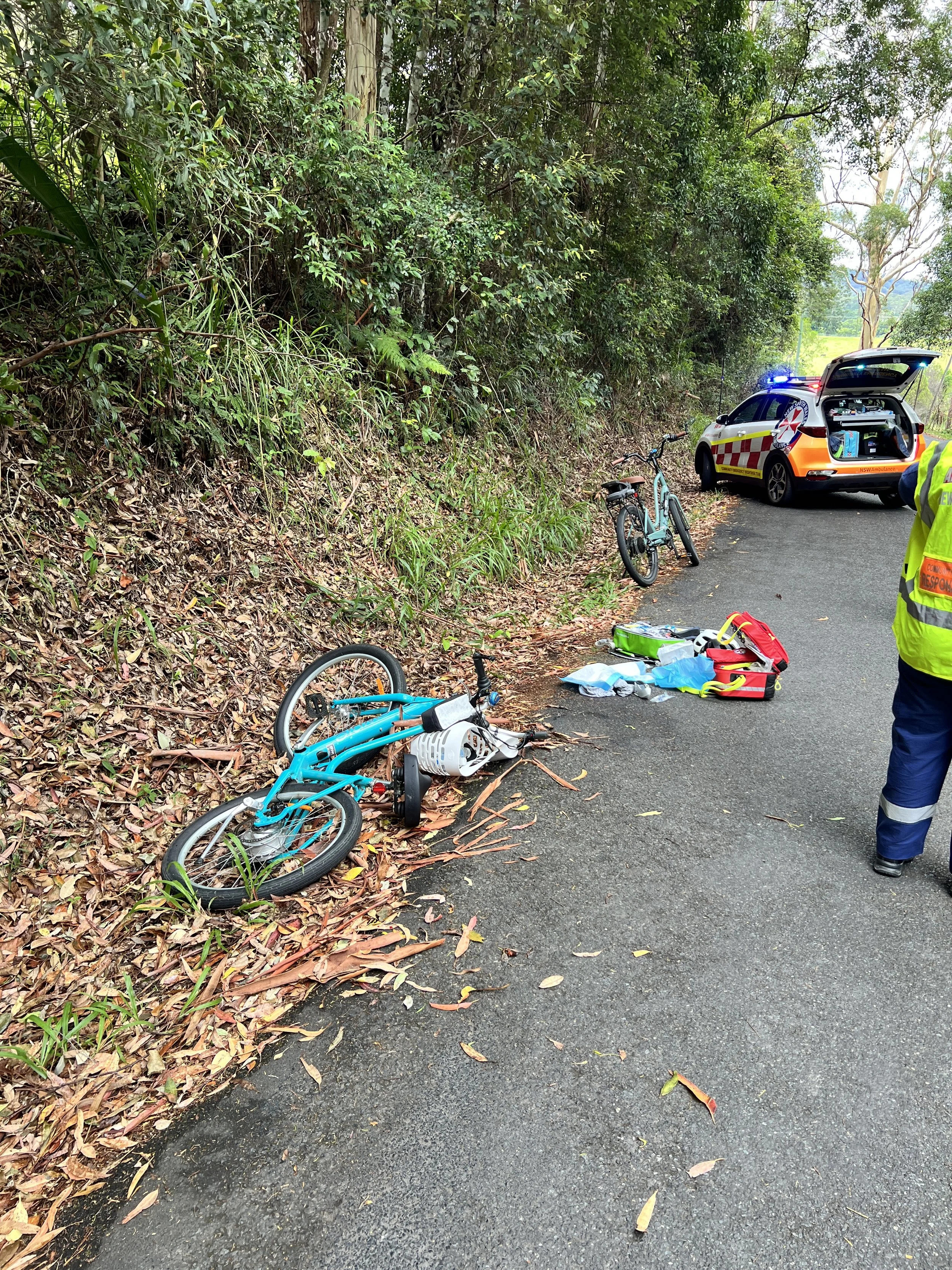
While I’m incredibly thankful it wasn’t worse, the recovery process has been a struggle. Wearing a cast in the middle of summer is uncomfortable enough, but I didn’t anticipate just how much it would affect my daily life - even though it’s on my non-painting hand. Simple tasks have become challenging, and I’ve felt disconnected from my usual routines, including painting.

I chose tube paints over pan paints because I find it easier to mix with freshly squeezed paint, which gives me more control over the consistency and vibrancy of my colours. My 12-colour palette strikes the perfect balance between being compact and versatile. With just these 12 colours, you can tackle a wide variety of subjects and techniques, from detailed botanicals to African wildlife. Each colour has been carefully selected not only for its individual beauty but also for its ability to mix effortlessly with the others, allowing you to create an almost infinite range of hues.

In June, our daughter celebrated her wedding, and she had a special request for me: to create a watercolour floral design for her invitations and menus. She envisioned a simple yet elegant bouquet of white roses accented with eucalyptus leaves for her special day. Excited by the challenge, I dove into my collection of reference photos, seeking the perfect white rose to bring her vision to life.

"Following Louise’s videos on YouTube made me feel I was painting. After a long time, I wrote Louise on Facebook and unexpectedly got an answer! She invited me to enjoy Discord, where I met beautiful, enthusiastic painters. At some point, it clicked! My heart was full of joy! Now, Susi, paint! So, I followed a tutorial, painting for the first time in my painting life!" - Susi

Our session began in the studio, where Julia worked magic with lighting and angles. The atmosphere was relaxed, and Julia’s expertise put me at ease, making the whole process feel natural and enjoyable. A personal branding photographer like Julia excels in creating imagery that captures the essence and experience of an individual's brand, reflecting their personality and story in a personalised and authentic way.

This dream led me to university, where I completed a Bachelor of Education with first-class honours and a university medal. Not that my success at uni helped me secure a full-time teaching job, though. It was difficult to get full-time work as a teacher after I had finished. I did a lot of casual teaching work, where you put your name down at schools and wait for them to call you. During that time of waiting for the phone to ring- I taught myself to paint in watercolour. Then I got a few full-time temporary teaching positions, and I no longer had time to paint. Teaching in schools is really hard work, and eventually I had lost my passion for it.

Have you ever woken up with a sense of dread, feeling as though the weight of the world rests on your shoulders, anticipating a mountain of problems awaiting your attention? That was my reality every morning. Opening my email, I was greeted not with the promise of a new day, but with a heavy sense of foreboding.

I'll be honest, those early days were filled with frustration. Watercolour, with its own set of rules and techniques, was a tough teacher and progress was slow. The lessons of light to dark, the permanence of each stroke, and the acceptance of "happy accidents" were hard-learned. I found myself creating pieces that, well, let's just say they wouldn't have made it to the fridge door.

Creating a successful painting by following a tutorial is one thing, but being able to replicate that success independently, drawing upon the skills and knowledge acquired from those tutorials is another.
I'm happy to share that a significant number of my students are able to achieve precisely that. In fact, I am consistently impressed and extremely proud of the artwork they produce on their own. They, too, take great pride in their achievements, and rightfully so.

To save you from these pitfalls and help you achieve better results, I've compiled a guide that focuses on the five most common mistakes that I have come across when painting in watercolour. The guide is completely free when you subscribe to my newsletter.
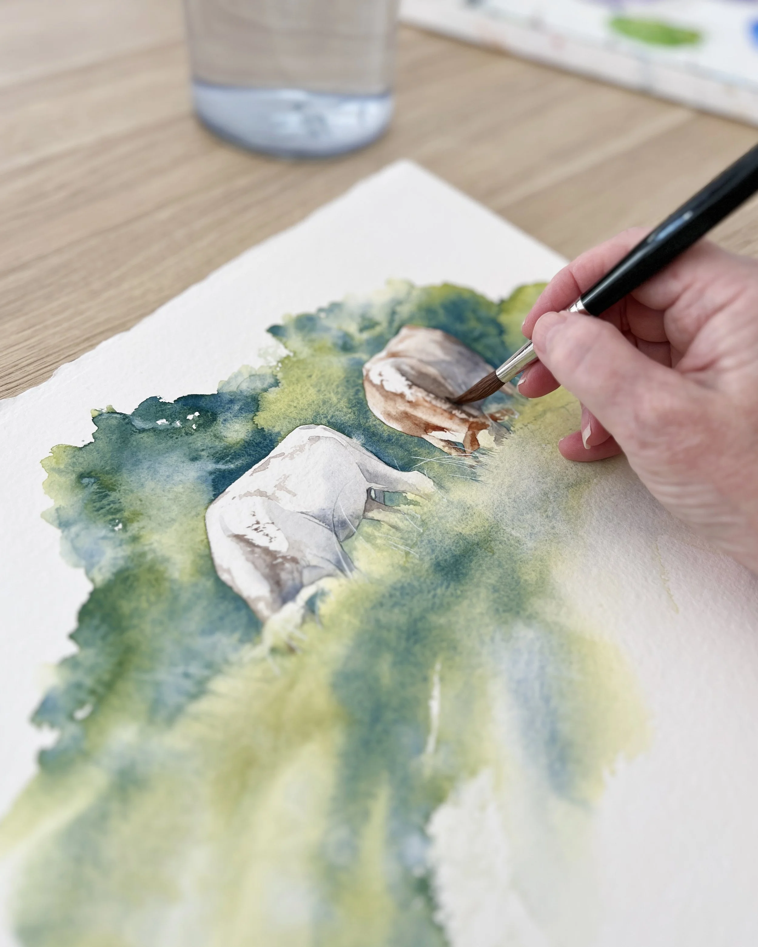
I spent two days painting some cows in a paddock. Now don’t get me wrong, I like the cows but the landscape part of the reference photo……..meh.
As a result, I ended up with 5 overworked, muddy and poorly composed paintings. The only part of each painting that I liked was the area around the cows.

I was very happy to receive an email from The Art of Watercolour Magazine’s editorial staff saying they wanted to feature my work in their upcoming issue.
The editor sent me a list of questions to answer, which would be featured in the magazine alongside my artwork. Answering the questions was a great opportunity for me to reflect on my journey as an artist and share my insights with the readers of the magazine.

We’ve moved back home! After four years of living in Sydney, Dom and I have come back to our house in the country. I am amazed I lasted that long in the city.
Art Insights
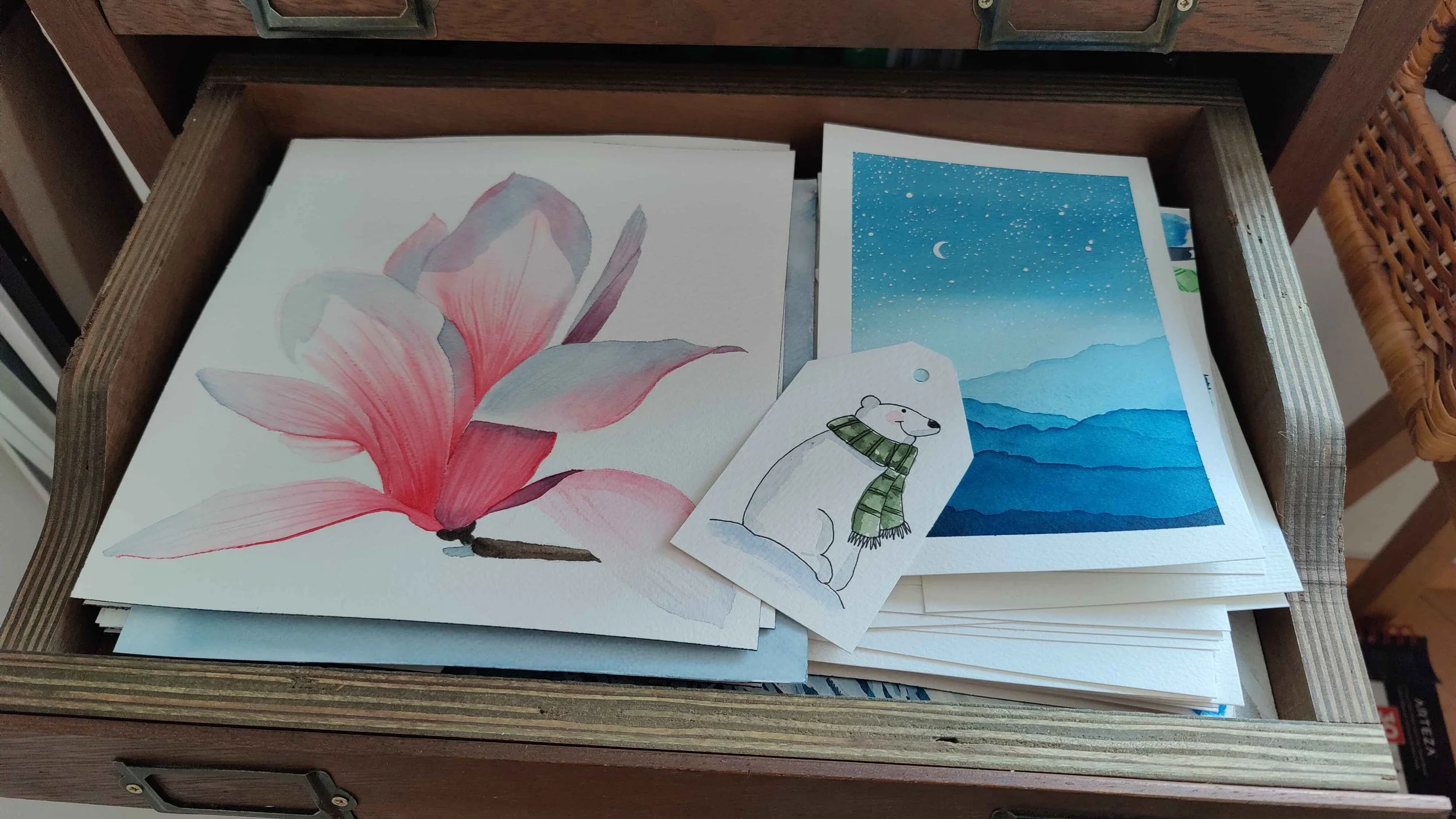
You see, I am quite the perfectionist. Everything I do has to be perfect, or I feel imperfection settling over me like a heavy blanket. My expectations are so high that I cannot possibly live up to them. This fear of failure is irrational — and absolutely exhausting. It has kept me from doing many things. And while I have been diligently working on loosening its grip over the past few years, it has reared its ugly head again in recent months. It’s time to do something about it.
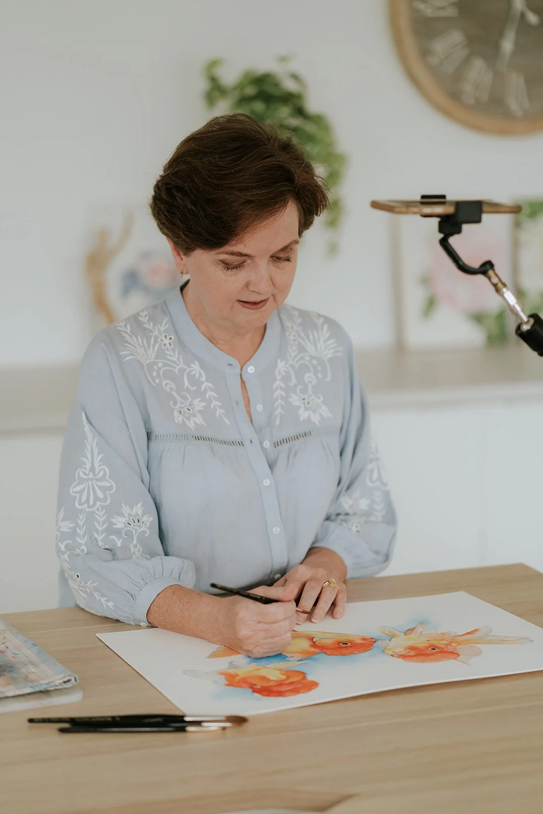
The fear of the blank page (or blank canvas) is one of the most common forms of artist anxiety. That untouched sheet of watercolour paper can feel intimidating precisely because of what it represents - possibility, expectation, and the pressure to “get it right.”
Very quickly, the mind starts filling the silence:
What if I ruin it? What if I don’t know where to begin? What if this painting fails before it even starts?

And then… crash. The next day I couldn’t sit down to paint. That mental block lasted until day 16. I felt stressed every day, like a complete failure. How was it possible that I couldn’t do the thing I love most? Why was that blockade in my mind so strong? I got a lot of support during this time from my friends over on Discord. It's a good feeling to not be alone. Know that you aren't alone. Many of my painterly pals felt the same as me with time, life, or doubt invading.

In this article, I’ll guide you through some of the best scanners available today for artists, focusing primarily on A4 and A3 flatbed scanners. Since I personally haven’t used all these scanners myself (we currently use the 2400N A3 Mustek scanner below) most of the recommendations and pros/cons are drawn from research, detailed reviews, and real-world experiences shared by other artists worldwide.

If you're creating class content, preparing a commission, or simply working on a series of paintings, organising your sketches, reference images, and notes digitally can save you a lot of time and keep your process feeling streamlined. I keep folders for each project, with everything from my digital sketches to palette ideas and colour swatches stored in one place.

Printing your watercolour artwork at home can be incredibly rewarding, whether you’re selling prints, making gifts, or just preserving your work. But if you want professional-quality results, you need the right printer, ink, and paper, otherwise your colours won’t be accurate, details will get lost, and prints might fade over time.

I found Louise through a recommendation from an artist I followed on YouTube, and I was instantly hooked! My boyfriend later gifted me a Patreon subscription, and the rest is history. But I haven’t come here just to rave about Louise (though I could for days, honestly—just ask me!). I want to share a great experience I had attending my first in-person watercolour masterclass.

Creating art prints is one of the most empowering ways for artists to share their work with a broader audience, making your art more accessible, impactful, and sustainable. While the artistic process is often deeply personal, prints allow your creations to reach more people, enhancing both your artistic journey and your professional growth. Here are some compelling reasons to consider making prints of your work.

One of the greatest perks of watercolour? Every “mistake” can be passed off as an artistic decision. Smudge? Intentional atmospheric effect. Drip? A touch of spontaneity. The freedom to turn mishaps into masterpieces is a liberating experience. Next time someone asks about that odd blotch, just smile and say, “Oh, you wouldn’t get it.”

Value contrast refers to the difference in lightness and darkness between colours. It is one of the most critical aspects of colour contrast because our eyes are highly sensitive to variations in value. High value contrast can create a striking effect, drawing attention to particular areas of an artwork.
For instance, a dark object against a light background will stand out prominently, making it the focal point of the composition. This principle is often used in chiaroscuro, a technique that employs strong contrasts between light and dark to give the illusion of volume in modelling three-dimensional objects and figures.

Consider this your go-to resource, a foundational pillar to bookmark and return to time and again as you delve into the vivid world of colour theory. This guide is like a beacon, illuminating the path through the landscape of hues and shades that form the basis of all visual arts. Ready to unlock the full spectrum of possibilities in your creative endeavours?

Incorporate a variety of shades and tones to add depth and interest. Using darker shades can create balance and tone down the intensity of the base colour.
Use texture and patterns to enhance the visual appeal of your monochromatic compositions.
Monochromatic schemes work beautifully for creating mood and atmosphere, allowing you to focus on the emotional resonance of your artwork.

The easiest way to tell whether a watercolour pigment is granulating is to look at a colour chart of the paints you use. The paint manufacturers indicate on their charts whether a pigment is granulating or not. You can buy the charts or you can go online and download them from the paint manufacturer's website.

By mastering analogous colour schemes, you can enhance the emotional depth of your art, creating compositions that soothe and resonate with viewers. This knowledge complements our ongoing journey through colour theory, equipping you with the skills to craft harmonious and cohesive artworks.

Imagine a red Waratah surrounded by lush green leaves. This combination of contrasting colours doesn’t just draw the eye; it evokes feelings of vitality and passion. The red symbolises energy and life, while the green offers a grounding balance, making this pair perfect for capturing the essence of nature's exuberance.
A few years ago, I looked back at some of my older paintings and found one of a tulip that I had overworked.
It was a useful painting to look at because I could see exactly what I had been doing wrong.
I'd used too many colours and too many layers. I'd tried to record almost everything I could see in my reference photo. I'd worked and reworked areas until the paint had lost its transparency and luminosity.