Colour Value in Watercolour Painting
In the delicate dance of watercolour painting, understanding the nuances of colour value can transform simple strokes into a symphony of light and shadow. As watercolourists, we often find ourselves chasing the elusive qualities that make our paintings breathe and pulse with life. Today, we focus on colour value - the spectrum of lightness to darkness that each hue can exhibit.

Understanding the Three Components of Colour: Value, Saturation, and Hue
Colour is a fascinating and complex element of our visual experience, defined by its three fundamental characteristics: hue, value, and saturation. These elements are perceived through the way light interacts with objects and the human eye, a phenomenon that not only captures the physical properties of light but also the subjective responses of the observer. Each component plays a critical role in giving a colour its unique character and emotional impact, making colour a powerful tool in both natural perception and artistic expression.

Value refers to the lightness or darkness of a colour, a crucial aspect that determines depth, form, and emphasis within an artwork. It is the backbone of visual perception, defining the shadows and highlights that give objects weight and space.

The same hue showing different values.
Saturation describes the overall intensity or purity of a colour. Higher saturation means the colour appears more vivid and pure, while low saturation results in a more muted and grayish tone. The emotional impact of saturation is significant in visual arts. Colours with high saturation are often associated with energy and vibrancy and can evoke strong emotional responses such as excitement or passion. They are typically used to draw attention or highlight important features within a piece. Conversely, desaturated colours tend to be perceived as more relaxing and calming. Saturated colours can help create a sense of space and depth, offering a backdrop that allows more vibrant colours to stand out.
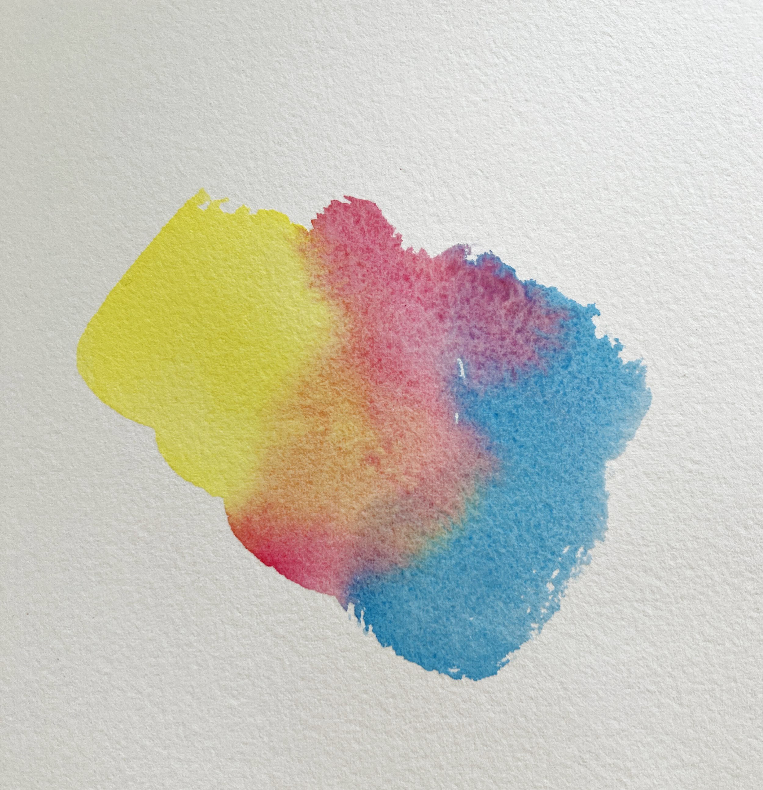
Three colours at high satutation or intensity.
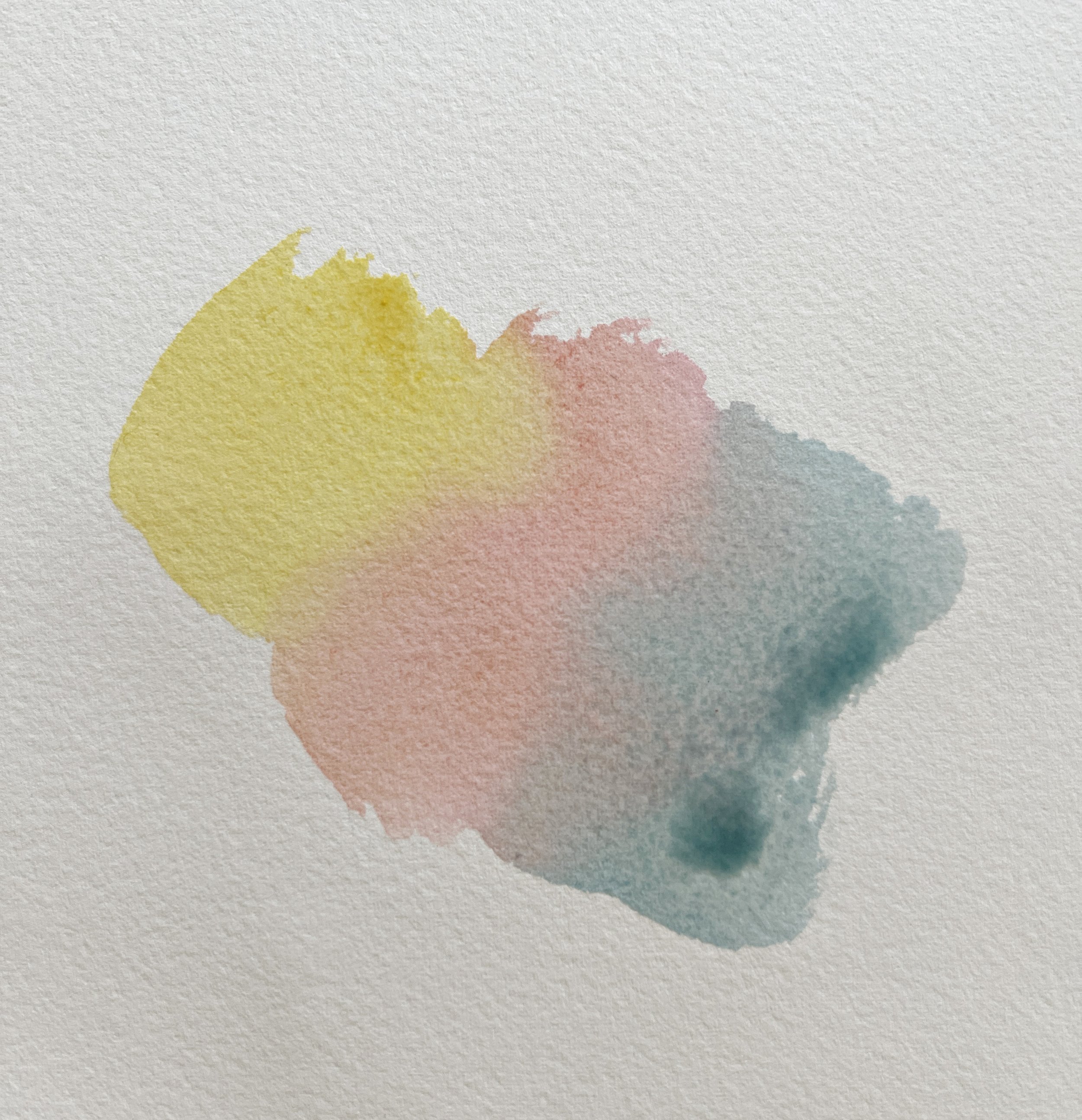
The same three colours with their saturation or intensity lowered by mixing an earth colour (Raw Sienna) with them.
Hue is simply the colour itself - the blues, reds, greens, and yellows we recognise and name. It is the first impression of colour that strikes the eye, the surface attribute that tells stories of warmth and coolness, proximity, and distance.
Together, these three components form the fundamental language of colour in art, each playing a distinct role in how colours are perceived and utilised to convey a spectrum of artistic expressions.
The Foundation of Colour Value

Colour value, in its essence, refers to the lightness or darkness of a colour. In watercolour painting, where the medium's transparency plays a crucial role, value becomes a powerful tool. It's not just about choosing the right colours but understanding their inherent lightness or darkness and how they interact on paper. This interaction is what ultimately shapes the mood, depth, and realism of our work.
Value vs. Hue: Defining the Palette
While value deals with the lightness or darkness of a colour, hue refers to the colour itself - the pure spectrum colours that we identify by names like red, blue, green, etc. Understanding the distinction between value and hue is pivotal for watercolour artists, as it shapes the way we perceive and utilise colours in our compositions.
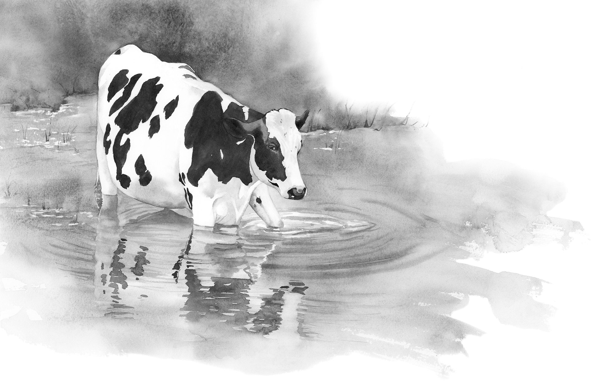
Hue gives a painting its character, but value brings it to life. Think of a pure hue as the identity of the colour, the aspect that tells us it’s a lemon yellow or a cobalt blue. Value, on the other hand, tells us about the colour’s brightness or depth. It is possible to have two very different hues with a similar value; for example, a deep violet and a dark green might share a similar darkness even though their colours are distinctly different.
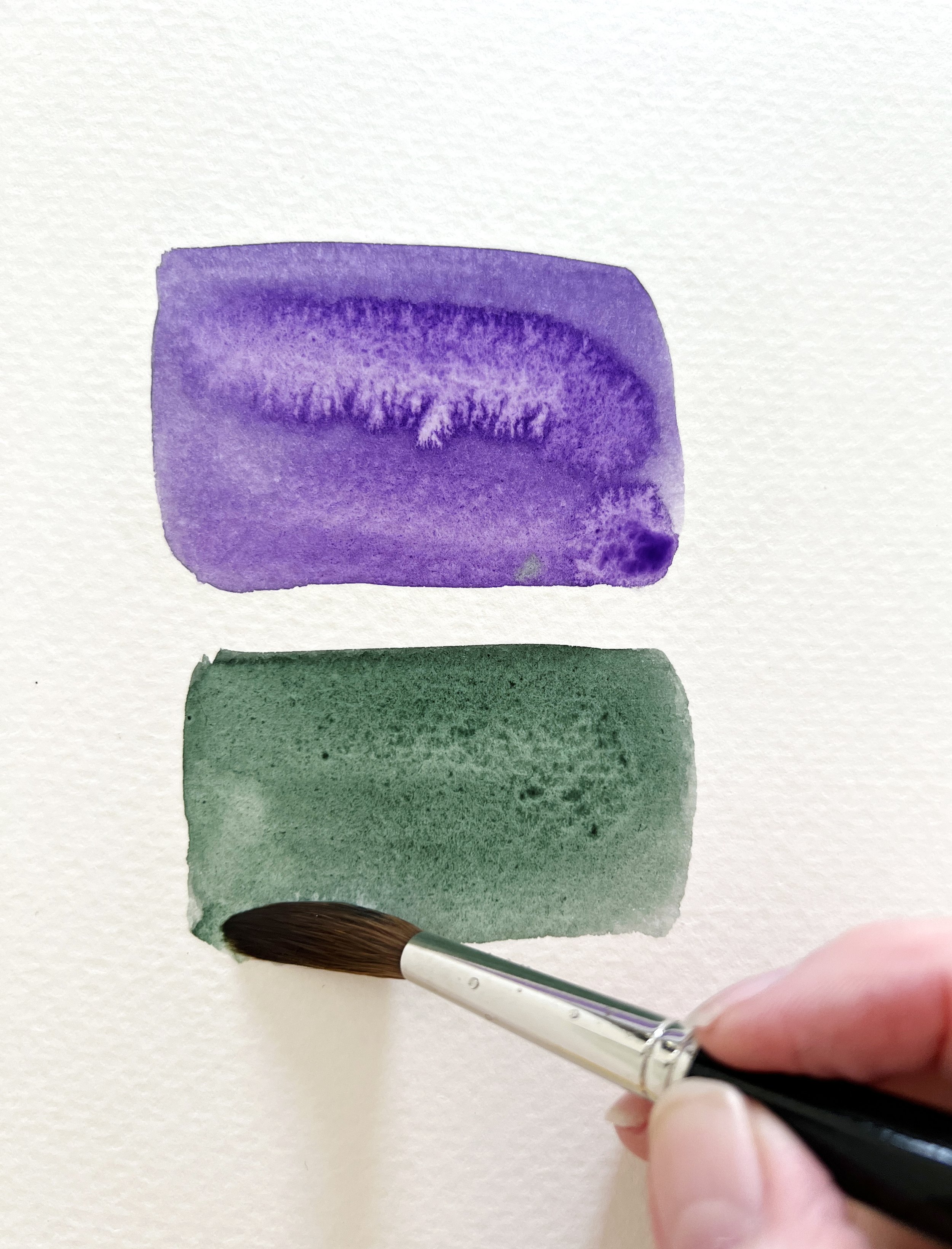
Winsor Violet and Perylene Green - two very different hues with similar values.
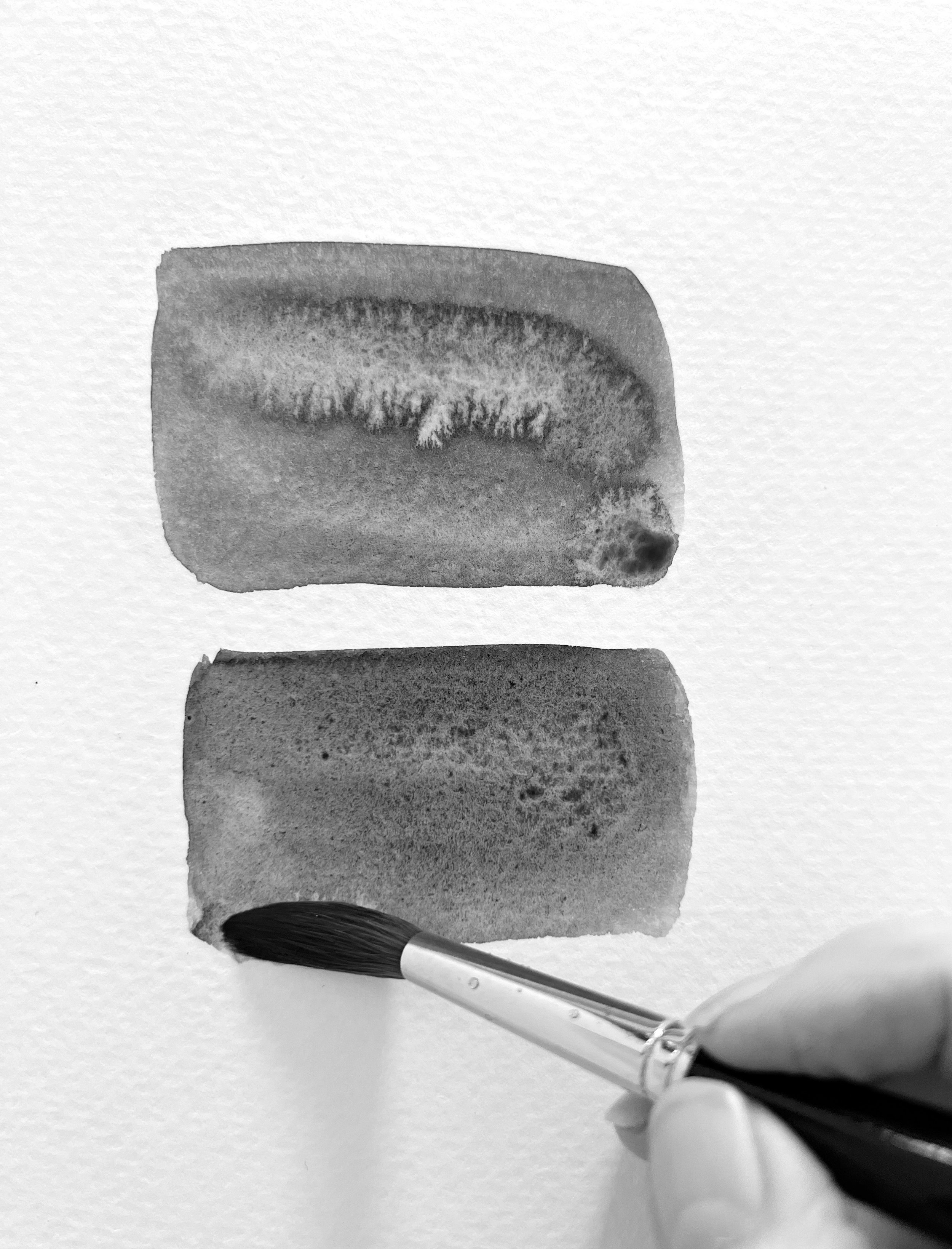
Here is the same photo in black and white so you can see the similar values.

A colour wheel can help you mix colours.
A hue wheel, commonly known as a colour wheel, is a circular diagram that illustrates the relationships between different colours. It is used by artists and designers to understand and organize colours visually.
The basic colour wheel includes the primary colours (red, yellow, blue), secondary colours (green, orange, violet), which are created by mixing primary colours, and tertiary colours, which are combinations of primary and secondary colours.
The colour wheel serves several functions:
Colour Harmony: It helps in creating visually appealing colour schemes by showing how different colours relate to each other.
Colour Contrast: It can be used to find contrasting colours that stand out when used together, such as colours that are opposite each other on the wheel.
Colour Temperature: It often separates cool colours (blues, greens) from warm colours (reds, yellows), aiding in mood setting in art and design.
Overall, the colour wheel is a fundamental tool in the visual arts, aiding in the selection of the colour range and combination of colours to achieve desired aesthetic and emotional effects.

My boat on water painting.
In the realm of watercolour, this distinction is crucial because the transparency of watercolours can affect both hue and value. Water dilutes the hue, increasing its relative lightness, but it can also shift the value, making the colour appear lighter on paper. Balancing hue and value is a delicate act that requires careful planning and execution. When a painter masters this balance, the hues do not just fill spaces on the paper; they interact dynamically, influenced by their values to create a sense of light, depth, and emotion.
Understanding the interaction between hue and value can elevate an artist's work from simple colour applications to a more sophisticated portrayal of scenes and subjects. It's not just about choosing colours that match or contrast well, but about selecting hues that compliment the values you need to make your painting resonate on a visual and emotional level.
Creating Value Scales: A Watercolourist’s Map
The journey into mastering values starts with creating value scales - a practice I cannot emphasise enough. These scales involve diluting a single pigment from its darkest manifestation to its lightest by adding varying amounts of water. The process not only familiarises you with the pigment's capabilities but also serves as a vital reference for maintaining consistency and harmony in your paintings.
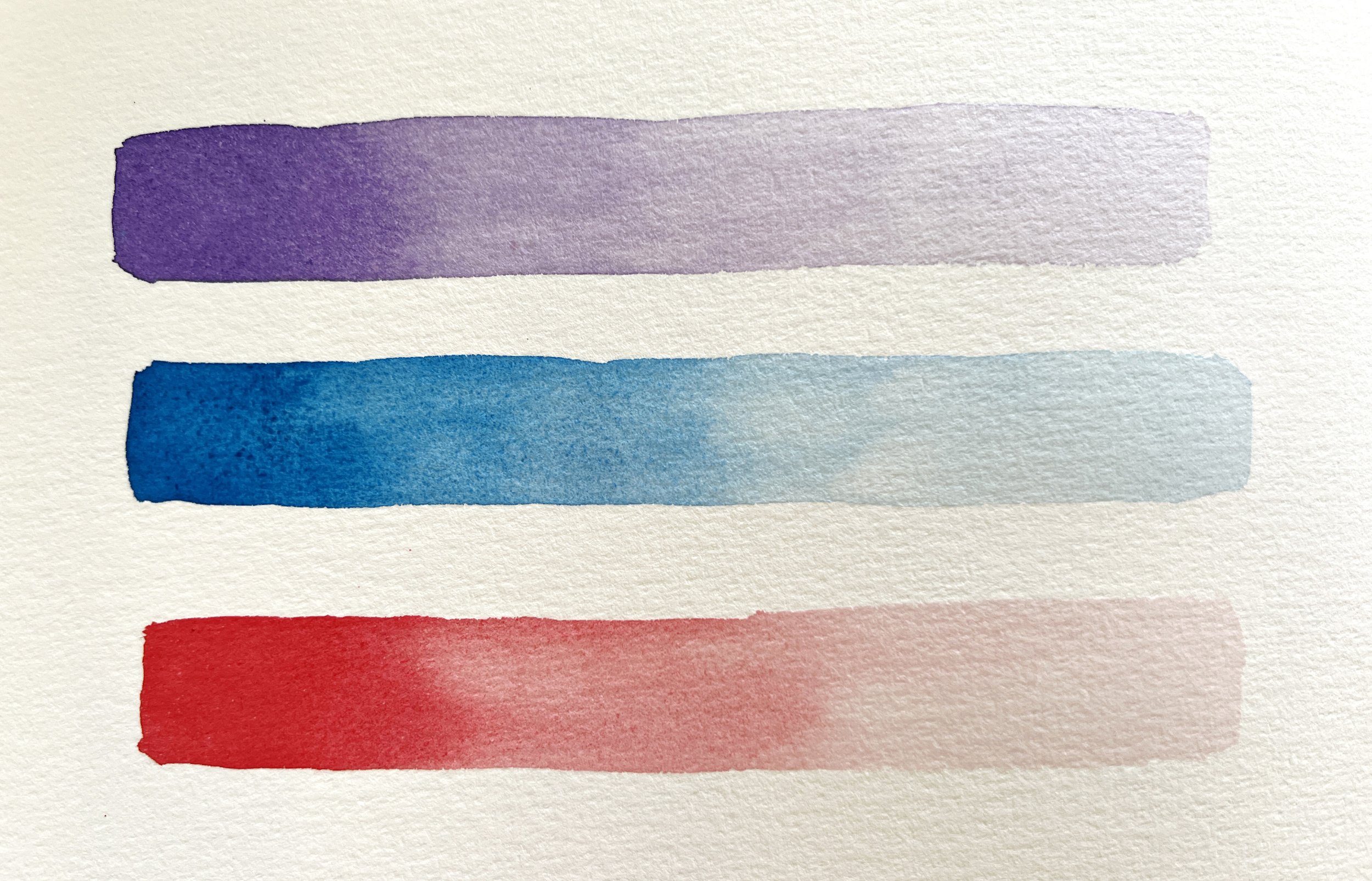
Create your own value scales in a visual diary so you can refer to them when you are planning your paintings.
To begin, select a pigment and paint a gradient from pure, undiluted colour down to a pale wash. This exercise should be repeated with different pigments to understand each colour's unique range from dark to light. Such an approach is invaluable, especially in watercolour painting, where the dilution controls the value.
Visualizing Value with Monochrome Filters
One transformative technique I've adopted is using monochrome filters to view my paintings in grayscale. This method strips away the distractions of colour, allowing you to see the painting through the lens of value alone. It's like looking at a black and white photo from a century ago - no colours, just a value scale. It’s a simple yet effective way to assess whether your values are working harmoniously to direct the viewer's eye and convey the intended atmosphere.


Practical Applications in Painting Scenarios
In practice, manipulating colour value can guide the viewer’s eye to the focal points of your artwork. Light values can suggest distance or create a luminous, airy feel, while dark values can suggest solidity, shadow, and depth. For example, in a landscape painting, lighter values can be used to depict distant elements like far-off mountains or sky, gradually deepening the values to bring focus to the foreground.
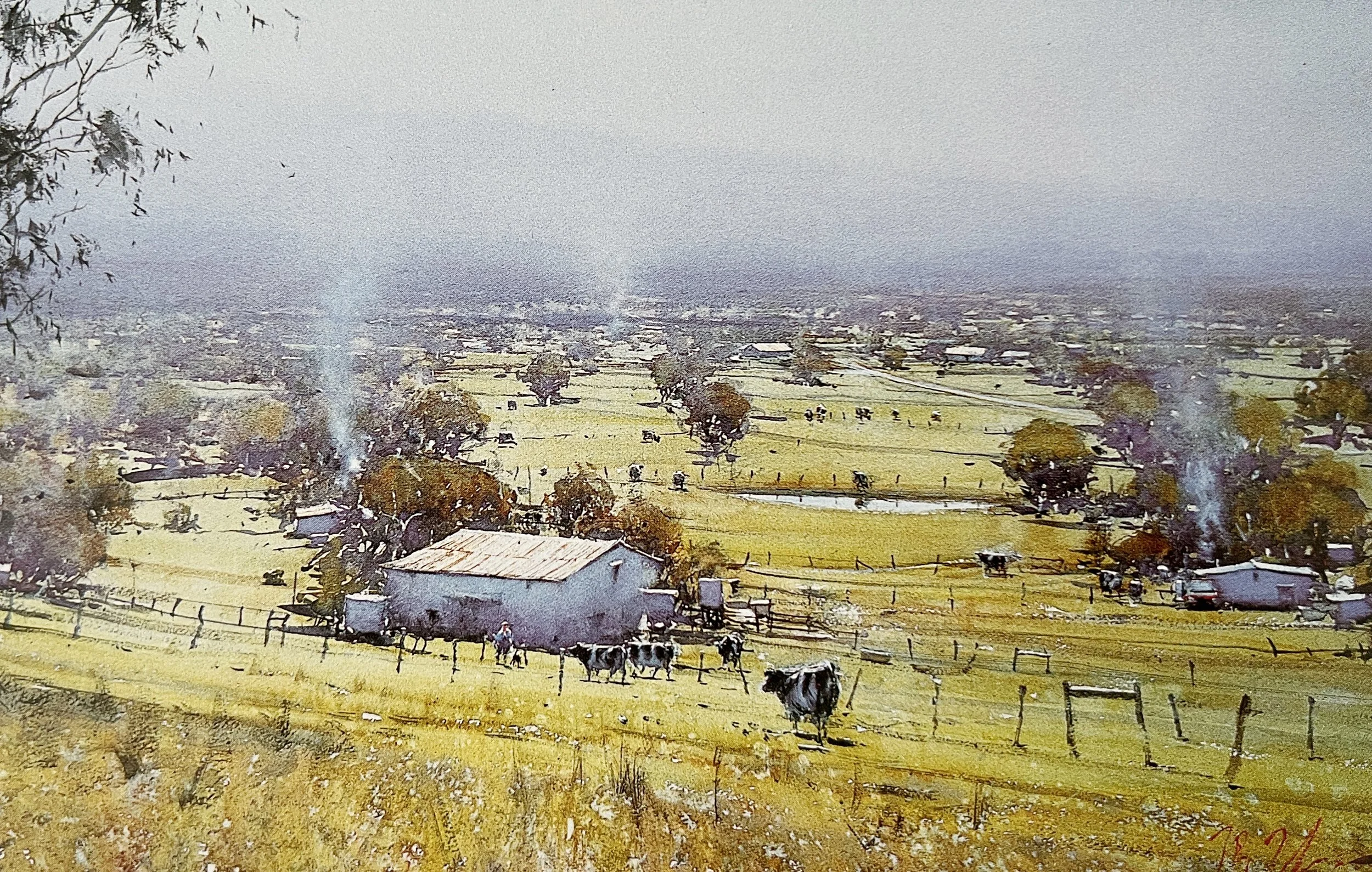
Joseph Zbukvic's painting beautifully depicts a sunny afternoon in the Yarra Valley.
The Emotional Impact of Value
Values do more than just define form; they convey emotion. A painting with a narrow range of mid-tones might evoke a soft, serene feeling, while a painting that employs a stark contrast between light and dark may stir drama and tension. As artists, our choice in how we deploy these values allows us to speak without words, using hues and gradients to stir the hearts of those who gaze upon our works.
Interaction of Colour

This is Schmincke's Pure Yellow. I painted some Winsor Violet around the lower yellow shape to make it appear more vibrant.
Josef Albers' theories on the interaction of colour present a fascinating lens through which to view our use of hues and values in watercolour painting. According to Albers, adjacent colours can dramatically affect our perception of each other, a concept that holds profound implications for watercolourists. By strategically placing complementary or contrasting colours next to one another, an artist can manipulate how each appears in terms of brightness and depth. For instance, a bright yellow next to a deep violet may appear even brighter, illustrating how colours can be used not just for their individual qualities but for their collective impact.
As watercolour artists, when we place one colour next to another, we are not simply laying pigment on paper; we are setting the stage for a dynamic interaction where each colour alters how we perceive its neighbor. This interaction can make a hue appear lighter or darker, depending on its context, which is crucial for effective value manipulation in our artworks. Thus, understanding this complex relationship enables us to more skillfully orchestrate the values within our paintings, enhancing the narrative and emotional resonance of our work. Through this lens, our palette becomes not just a collection of colours but a sophisticated tool for visual storytelling, where each brushstroke contributes to a larger dialogue of light and shadow, depth and emphasis.
Mastering colour value in watercolour is not merely a technical skill—it's a form of visual poetry, where each shade and tint plays a crucial note. By understanding and manipulating these values, we can elevate our paintings from simple colour sketches to deeply expressive works that resonate with vibrancy and life. This journey of learning and observation is continuous, with each painting offering a new lesson on the delicate balance of light and shadow.
In your artistic endeavours, I encourage you to delve deep into the world of colour values. Create those value scales, experiment with monochrome filters, and always strive to understand the subtle yet profound language of lightness and darkness in your palette. It’s a path that leads to greater expressiveness and, ultimately, more fulfilling artistry.
May your palette be ever bold and your values deep, as you colour the world with your own unique vision.
Louise
If you are interested in learning to paint in watercolour, I have over 170 online, voiced over watercolour tutorials for all skill levels.


