Watercolour Tips
Watercolour tips and techniques to help you improve your painting skills.
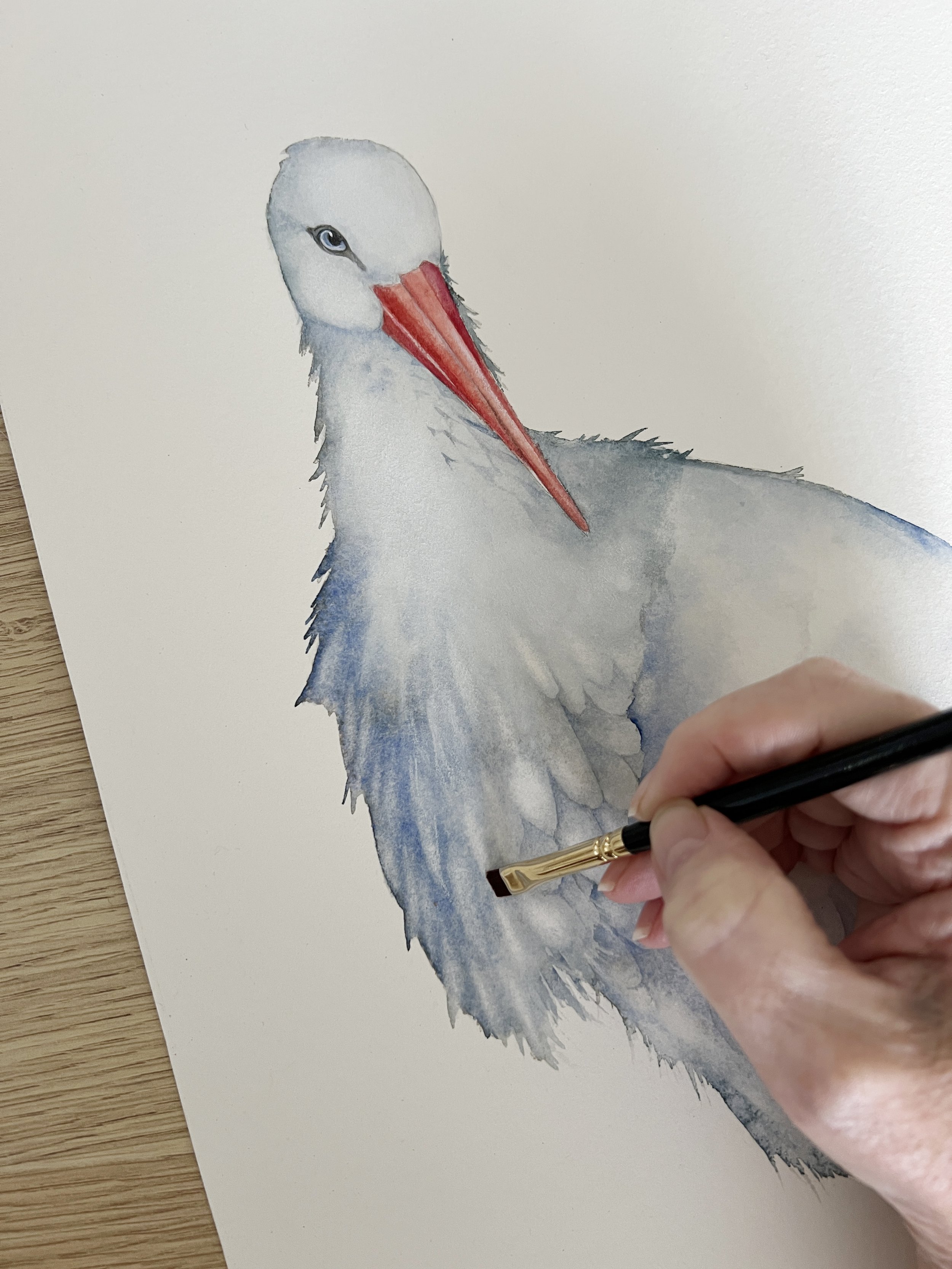
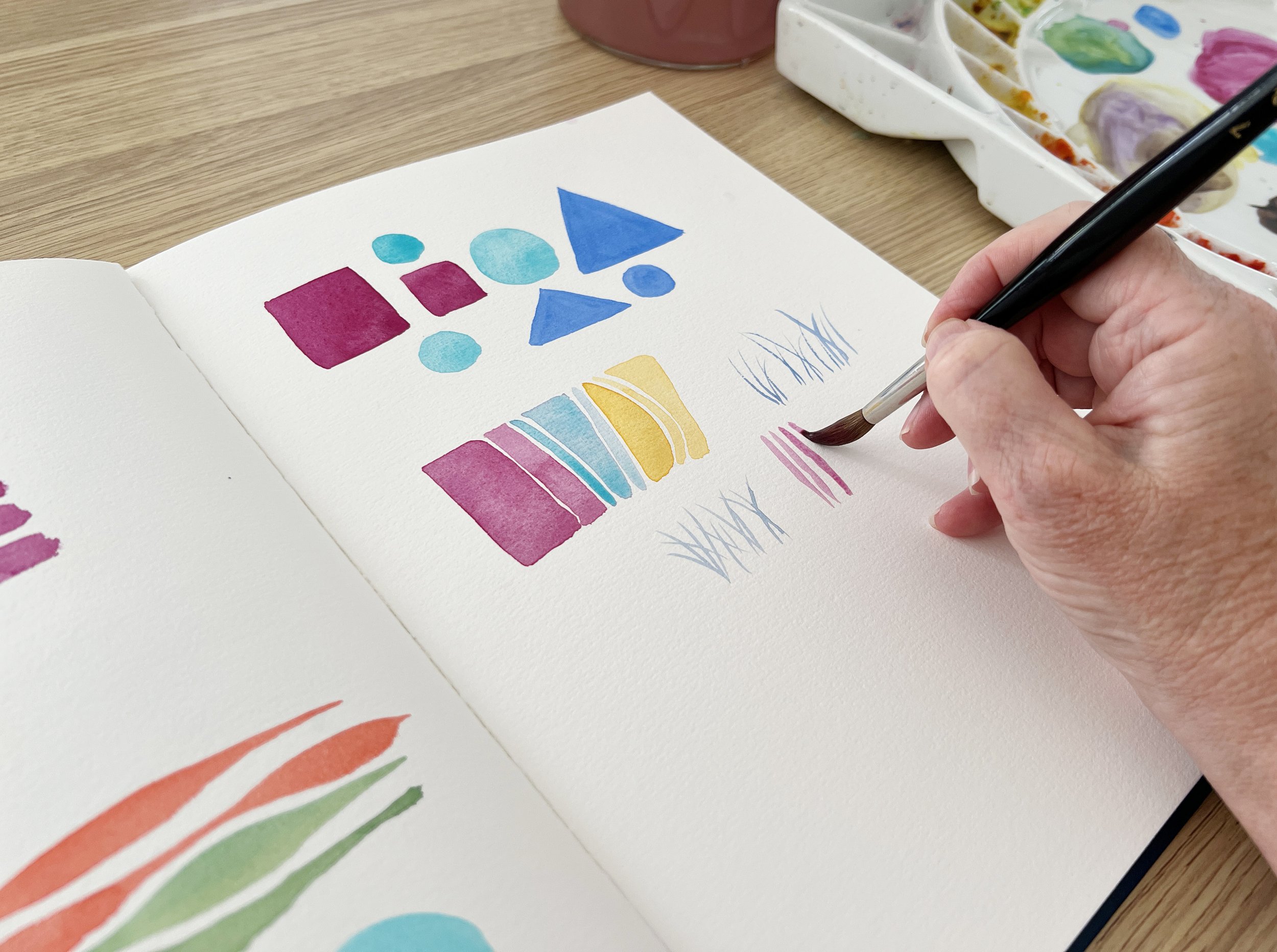
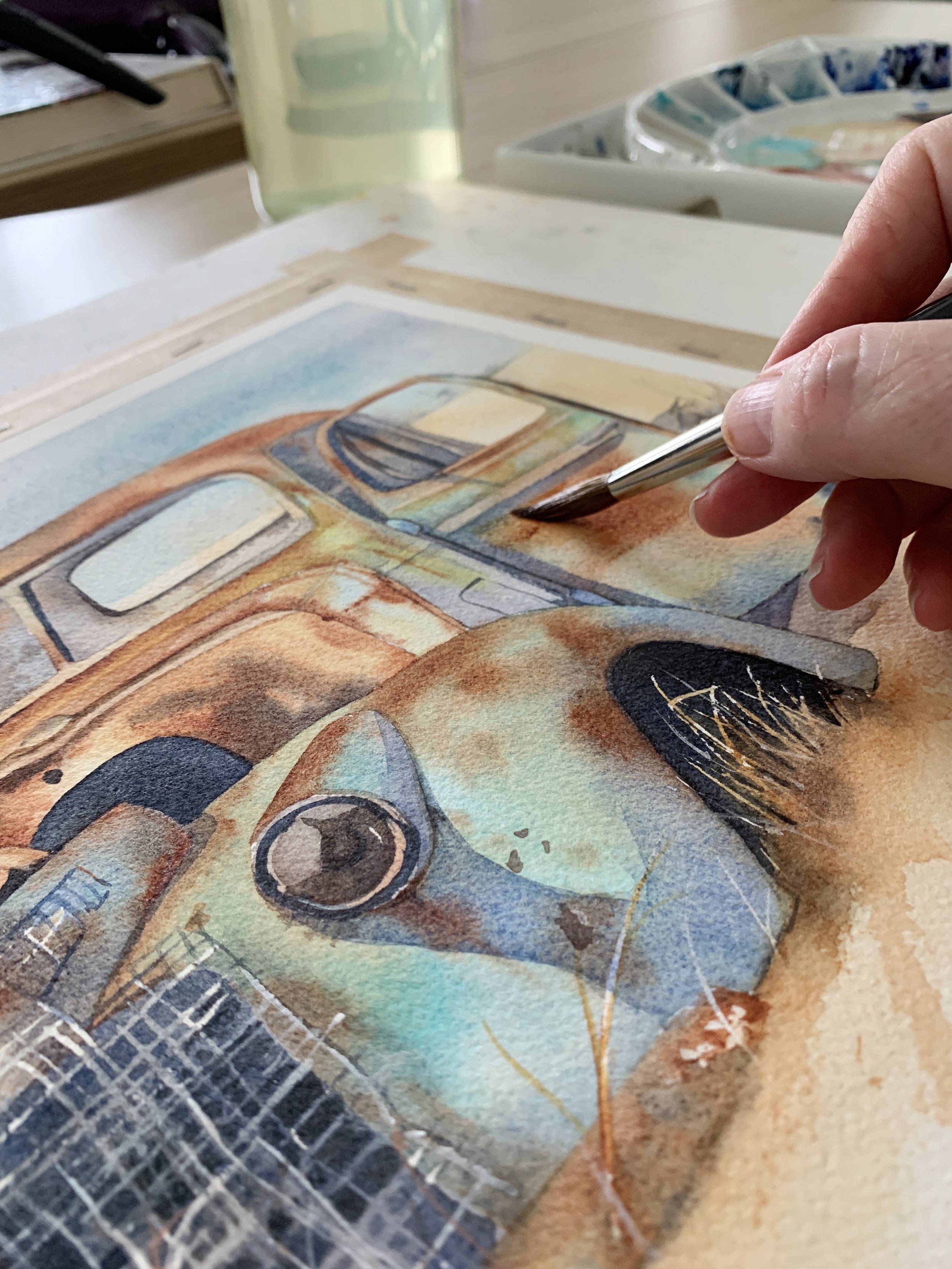
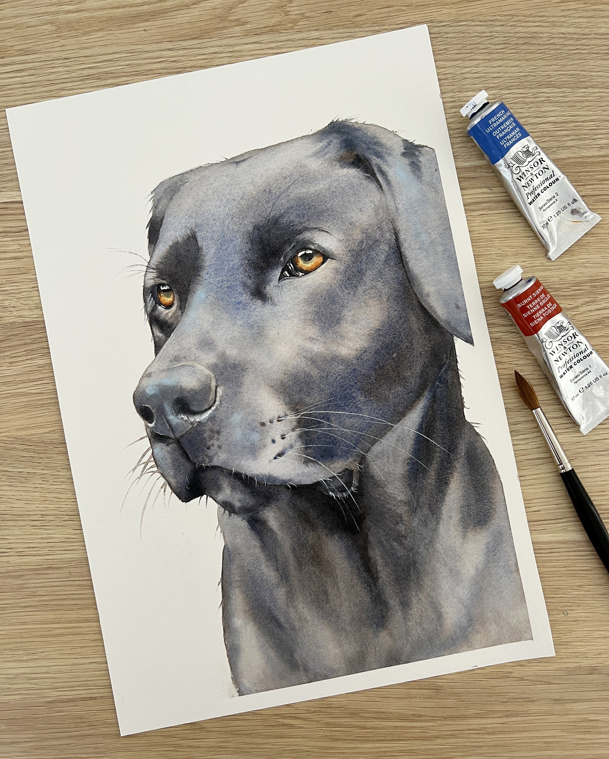
Welcome to my watercolour painting tips page! You've stumbled upon my secret lair where I share my top-secret tips for mastering the art of watercolour. Just kidding, it's not a secret lair, but it is the perfect place for you to brush up on your painting skills (pun intended). As a professional watercolour artist, I'll be sharing all the juicy details on how to create stunning watercolour masterpieces. So whether you are a beginner or a seasoned watercolour artist, go and grab a cup of tea, your brushes and your paints, and let's create some magic together!
P.S. Click on the button below to see an index of all blog posts or search for a specific post in the search bar.
P.P.S. If you have an RSS feeder and would like to add this blog, click on the Watercolour Tips RSS feed below.