How to Identify and Use Warm and Cool Colours in Watercolour
Embarking on a journey through the colourful landscape of watercolour can be both exhilarating and daunting. The mastery of colour, particularly understanding its temperature, plays a pivotal role in enhancing the quality of your art.
In this post, we’ll delve into practical methods for discerning colour temperatures without relying on a colour wheel, advocating for a study-driven approach and discuss the significance of warm colours or cold colours in the watercolour medium, especially in relation to mixing colours.
Understanding Cool and Warm colours
In the realm of art, colours are often described as either warm or cool based on their position in the colour spectrum and the visual impact they have. This is a part of colour theory, which is not just about choosing pleasing combinations but understanding the relationships between colours and how they interact on both a visual and psychological level.
Warm colours include hues like red, orange, and yellow, which evoke feelings of warmth and energy because they remind us of things like the sun or fire. Cool colours, such as blue, green, and violet, suggest calmness and are reminiscent of elements like water, sky, or foliage.

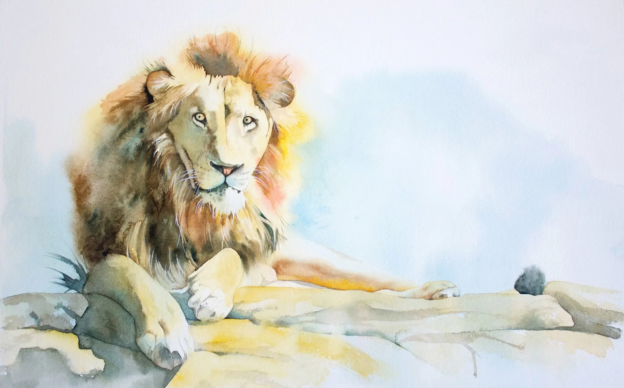
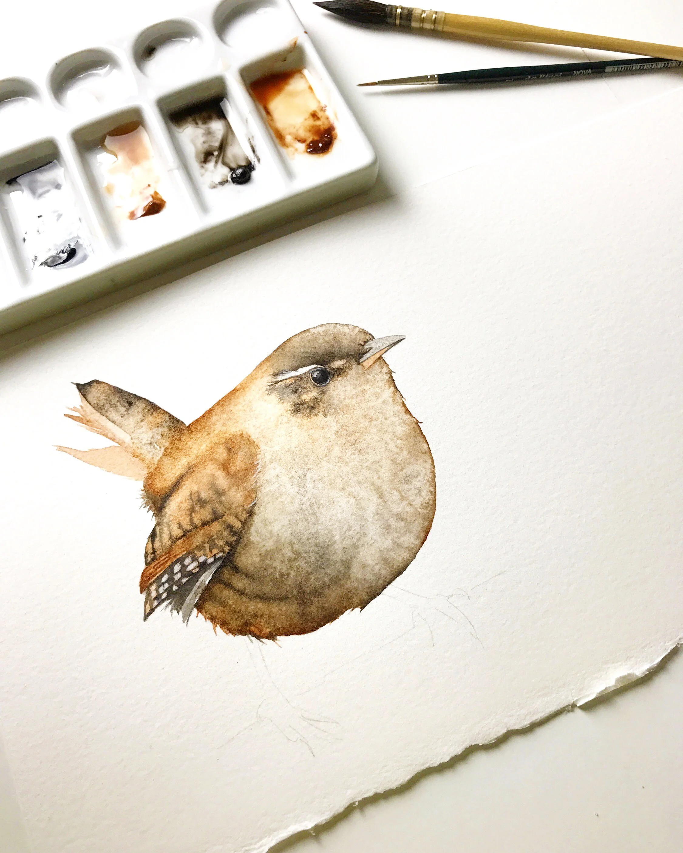
I used beautiful Prussian Blue for this painting - a beautiful cool colour.
Traditionally, artists identify these temperatures using a colour wheel, where warm colours are on one half and cool colours on the other. This tool helps in understanding complementary colours and the visual impact of colour combinations. However, the colour wheel can be somewhat abstract, and its practical application in painting, particularly in watercolour, often requires a deeper, more intuitive understanding.

A colour wheel is a useful tool but I find it not very useful in helping me determine what temperature a particular colour is.
The Importance of colour Temperature
Colour temperature is crucial because it influences mood, depth, and the realism of your paintings. Warm colours (reds, oranges, yellows) can evoke feelings of warmth and excitement, while cool colours (blues, greens, violets) often convey calm and distance. Recognising whether a colour leans warm or cool can dramatically affect your painting’s outcome.

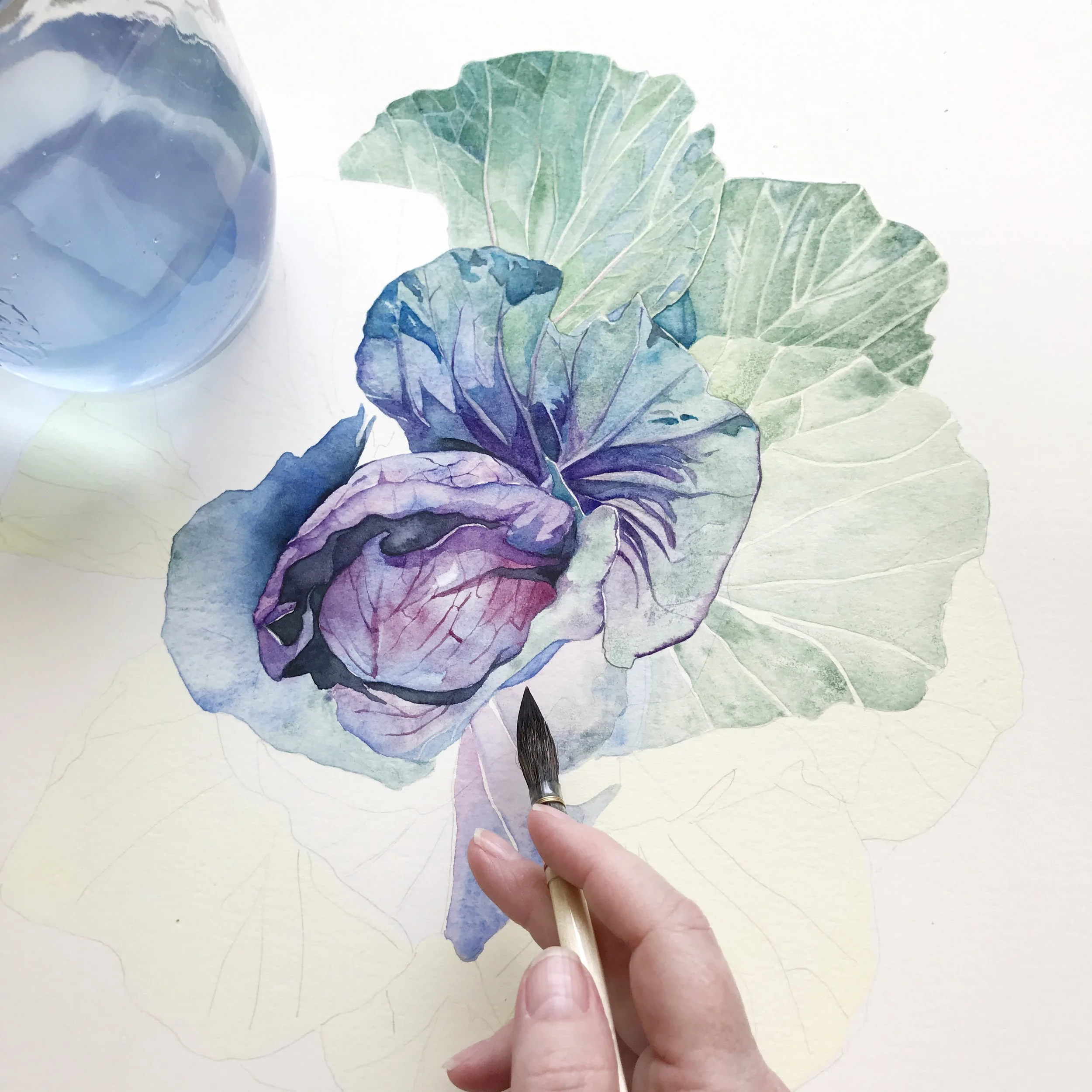
Red is a warm colour but different red pigments can be cool and others can be warm. Here I've used a cool red.
Colour temperature plays a crucial role in watercolour painting for several reasons:
Mood and Atmosphere
Warm colours can make a painting feel cheerful and inviting, while cool colours can impart a sense of serenity and distance. The choice of warm or cool colours can significantly alter the emotional tone of a piece.
Depth and Perspective
Warm colours tend to advance towards the viewer, making them excellent for highlights and focal points, whereas cool colours recede, helping to create depth and background in landscape painting.
Colour Mixing
Understanding the temperature of colours is crucial when mixing paints to achieve the desired hue and vibrancy. Mixed colours can often become muddy or vibrant, depending on the temperature of the colours combined.
My Favourite 2 Ways to Identify Warm and Cool Colours
Many beginners find colour wheels confusing and not very intuitive. Instead, I recommend a more straightforward approach and easy trick: utilising the online resources of reputable paint manufacturers like Winsor and Newton, Daniel Smith, or Schmincke. These companies organise their colours not just by hue but by temperature, which can be immensely helpful.
1. Utilising Manufacturer’s colour Charts
For example, when you visit Winsor and Newton’s website and explore their professional watercolour colour chart, you’ll notice that colours are grouped by temperature bias. Cooler colours like cool yellows are listed first, transitioning gradually to warm colours as they approach oranges and reds.

On the Winsor & Newton colour chart the cool yellows are listed before the warm yellows.
This layout is replicated across the spectrum, with cool and warm versions of each colour family clearly delineated. Observing these charts can give you a solid grounding in identifying colour temperatures based on professional standards.
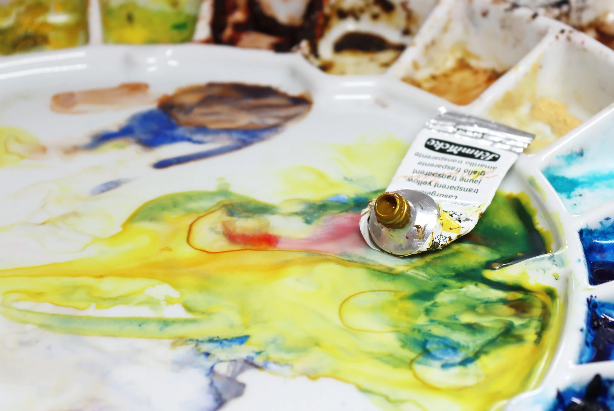
2. Experiment Through Colour Mixing
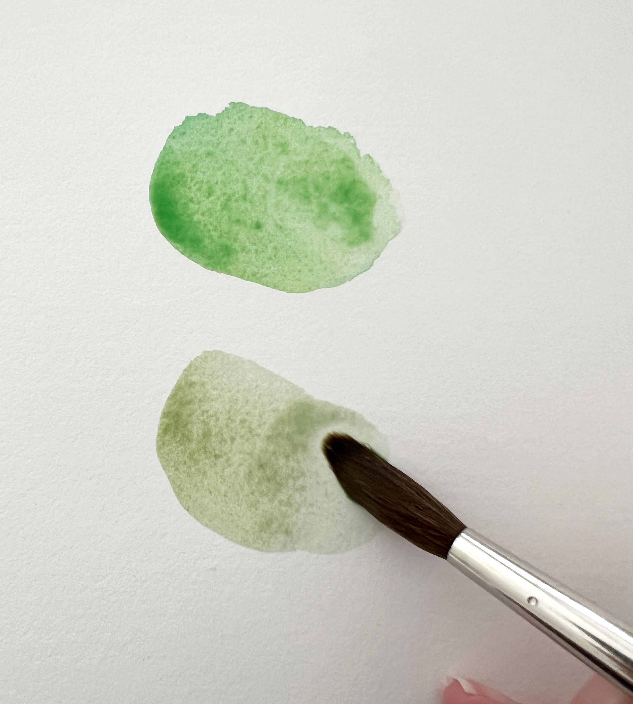
I mixed two Schmincke cool colors - Cadmium yellow Light with Phthalo Blue for the top swatch. For the bottom swatch I swapped the Phthalo Blue for French Ultramarine which is a warm blue. You can see the green is much more muted and earthy looking.
The second method involves hands-on experimentation. Mix colours to see how they interact. For instance, mixing a cool yellow with a cool blue should result in a vibrant green, indicating both paints are cool-toned. Conversely, if the green appears muted, one or both of the colours might lean warm.
This process of mixing and observing the results is not just about understanding colour theory but also about engaging deeply with your materials. Each experiment teaches you more about your palette and refines your ability to predict how colours will behave when combined.
Watch my video at the bottom of the blog post to see more examples of experimentation through colour mixing.
The Role of Study, Persistence, and Repetition
Learning to accurately identify and use colour temperatures doesn't happen overnight. It requires study - not just casual observation, but an ongoing engagement with educational resources like online charts and tutorials.
Persistence is key, especially when experiments yield unexpected or confusing results. Each challenge is an opportunity to learn more and improve.
Repetition, too, plays a critical role. The more you practice mixing colours and applying them in your artwork, the more intuitive these processes will become. Over time, you'll find that you can predict colour behaviour more accurately, which will make your painting process smoother and more creative.

Get to know your paints. Experiment mixing warm and cool colours.
Warm or cool colour?
Red is a warm colour but this red - Cadmium Red Deep- is a cool red. 🤔
Some examples of Cool colours from Winsor & Newton
Please visit my blog post about colour substitutes, if you want to find similar colours from other suppliers.
1. Cool Blue:
Winsor Blue (Green Shade) PB15 - This blue has a green bias, making it a cooler shade, perfect for depicting clear skies or cool, shadowy water.
Antwerp Blue PB27- Known for its slightly greenish undertones, this blue is vibrant and clear, excellent for creating cool atmospheric effects and depth in water scenes.

2. Cool Red:
Permanent Alizarin Crimson PR206- A deep, transparent red with bluish undertones, making it ideal for cooler red elements like flowers in shaded areas or subtle shadows in red objects.
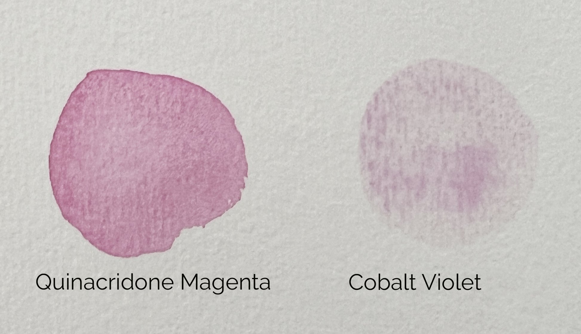
Quinacridone Magenta PR122- A vibrant magenta with a bluish cast, this colour is useful for cooler red effects, such as brilliant sunsets or cool-toned flowers.

3. Cool Yellow:
Lemon Yellow (Nickel Titanate) PY53- A bright, clean yellow with a slight greenish cast, making it perfect for depicting light hitting greenery or creating vibrant, cool light effects.
Winsor Lemon PY175- Another bright and pure yellow, leaning slightly towards the green side, ideal for lively, spring-like scenes and cool, luminous highlights.

4. Cool Green:
Winsor Green (Blue Shade) PG7 - A pure, modern green with a blue undertone, perfect for cool, shadowed foliage or vivid northern lights.
Viridian PG18 A transparent, slightly blue-tinged green, ideal for depicting cool, reflective water surfaces or glass.

5. Cool Neutrals:
Davy’s Gray PBk19, PBk6, PG17, PW5 - A light, cool grey-brown that is subtle and neutral, perfect for cool, stony surfaces and understated backgrounds.
Raw Umber PBr7 - Naturally cool with a slight greenish undertone, this brown is excellent for painting the cool, shadowy parts of wood or stones.

Some examples of warm colours from Winsor & Newton
1. Warm Blue:
French Ultramarine PB29 - Known for its slight red bias, this deep blue offers a warmth that is perfect for warm, rich shadows and contributing to lush, warm greens when mixed.
Cerulean Blue red shade PB35- While often considered a cooler tone, the version that leans towards red can impart a warm, inviting feel, reminiscent of tropical waters.

2. Warm Red:
Cadmium Red PR108 - A strong, opaque red that leans towards orange, providing a warm, vibrant hue suitable for objects in direct light or autumn leaves.
Scarlet Lake PR188- A bright, slightly orange red, excellent for capturing the warm glow of lights or the fiery tones in a sunset.

3. Warm Yellow:
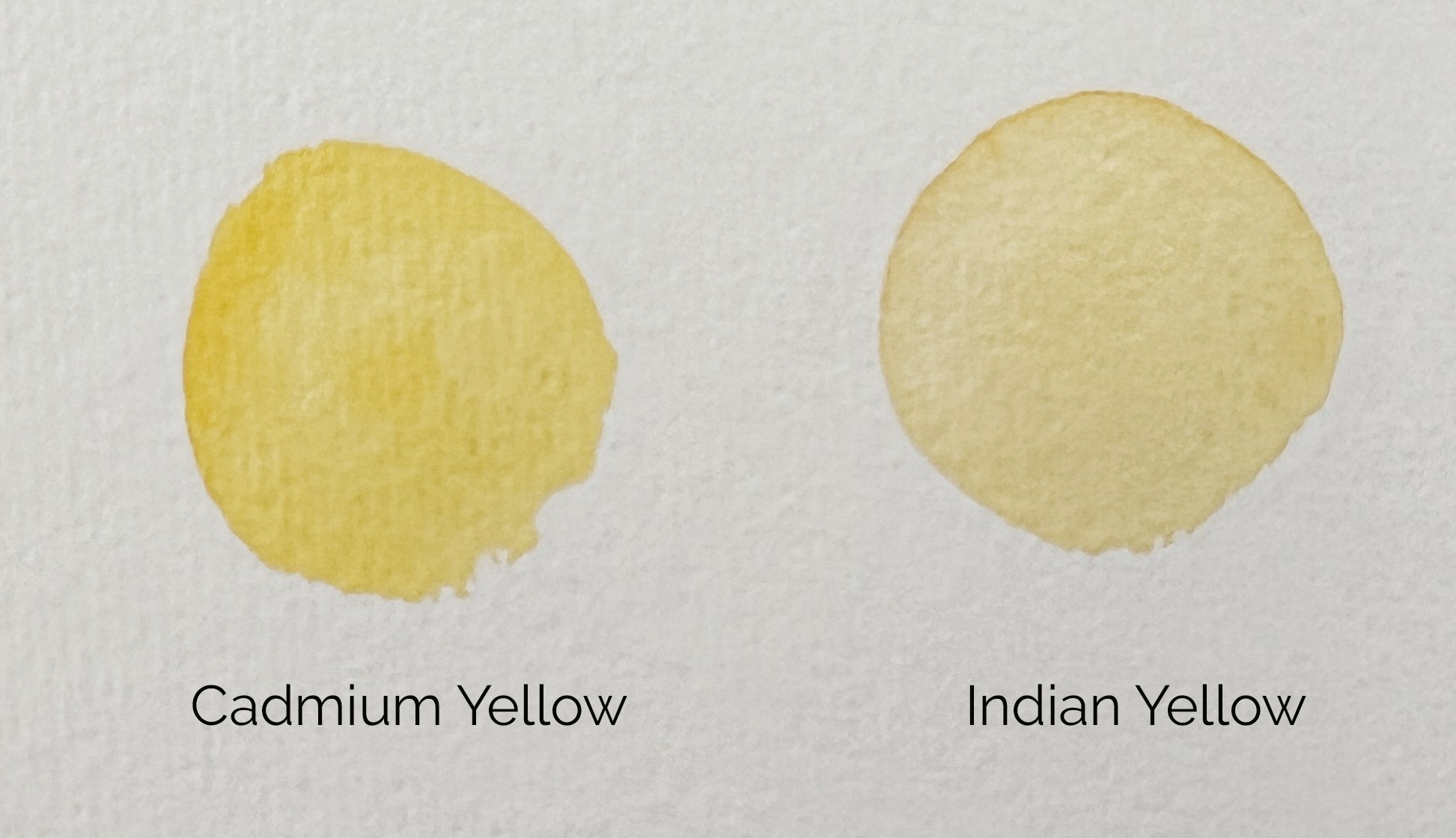
Cadmium Yellow PO20, PY35- A classic, rich yellow that tends towards the red side, ideal for warm, sunny highlights and vibrant summer scenes.
Indian Yellow PO62, PY139 - A deep, golden yellow that radiates warmth, perfect for effects of sunlight or rich, warm shadows in a composition.
4. Warm Green:
Winsor Green yellow shade PG36 - a vibrant, slightly yellow-tinged green pigment that offers a fresh, lively hue ideal for depicting nature and landscapes.

5. Warm Purple:
Quinacridone Magenta PR122- While listed under reds, when mixed with the right blues, it can create warm, rich purples ideal for warm, vibrant effects.
Cobalt Violet PV14 - A soft, reddish-purple that imparts a sense of warmth and delicacy, suitable for flowers in sunlight or colourful, warm skies.
6. Warm Brown:
Burnt Sienna PR101 - A reddish-brown that’s warm and earthy, ideal for painting autumn landscapes, brickwork, or warm animal fur.
Burnt Umber PBr7, PR101, PY42 - A warm brown with red undertones, perfect for warm, rich shadows and for adding depth to a variety of subjects.

While tools like colour wheels have their place, real-world applications and hands-on experiments will serve you far better in the long run. I encourage all aspiring and practicing artists to make use of the incredible resources available online, to mix their own warm and cool colours, and to continuously push the boundaries of their understanding of colour temperatures.
Remember, every great artist was once a beginner, and it is through study, persistence, and repetition that mastery is achieved.
Explore, experiment, and most importantly, enjoy every step of your painting journey. Your artistic skills will flourish as you deepen your understanding of the nuances of colour.
Whether you’re warming up to yellows and reds or cooling down with blues and greens, remember, in watercolour, the best approach to mastering your palette isn't black and white - it's a spectrum of possibilities!
So keep mixing and may your artistic journey be ever vibrant and hue-nique!
Happy painting!
If you are interested in learning to paint in watercolour, I have over 170 online, voiced over watercolour tutorials for all skill levels.