The Benefits of Using a Limited Colour Palette
Watercolour painting is fascinating. I love the way vibrant colours dance and blend on paper, creating stunning effects. I enjoy experimenting with colour but, until recently, I had never truly understood the strategy behind achieving a harmonious palette in watercolour. All of that changed when I read a book that altered my approach to painting with this captivating medium.
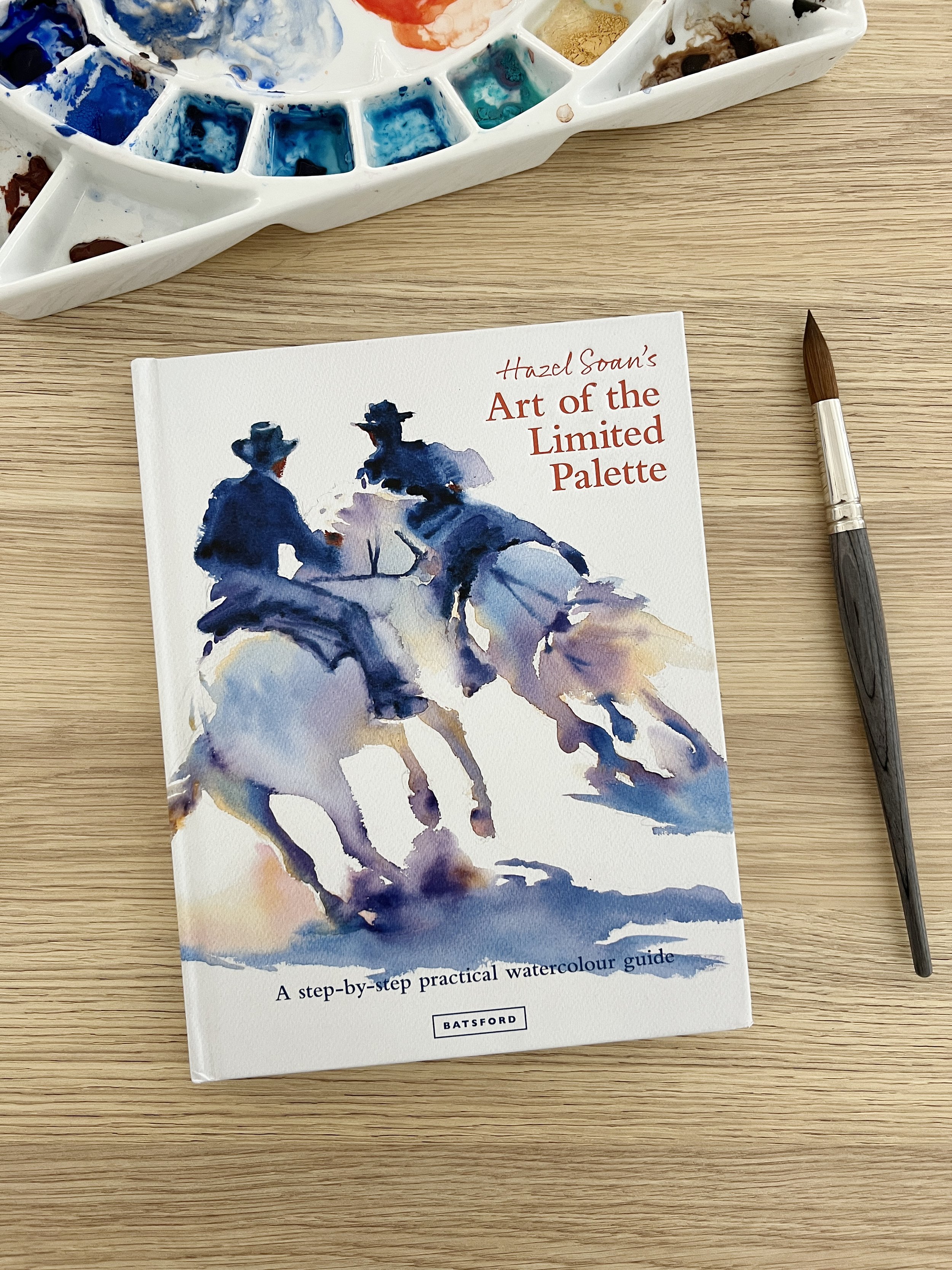
An art instruction book that changed the way I paint.
When I first started using watercolour I paid little attention to the array of colours I used in my paintings. I rarely mixed colours, other than grey, and I would often use as many as 8 or 9 different colours in any one painting. It was only after discovering the insights shared within the pages of Hazel Soan's awesome and informative book, 'Art of the Limited Palette' that I came to appreciate the transformative power of painting with a limited palette.
I'm excited to share with you the benefits I've uncovered after reading the book and how it has changed the way I approach my watercolour paintings.
What is a limited palette?
When you use a limited palette you minimise the number of colours you use in your painting. It's all about the idea that the primary colours, red, yellow and blue, can mix together to produce a full range of colours.
The goal of using a limited palette is to achieve colour harmony, simplify the decision-making process, and gain better control over the interaction of colours in a painting. You use a limited palette to create balanced, cohesive, and visually pleasing paintings.
It's important to note that a limited palette is not 'limiting'. Hazel Soan emphasises that working with a limited palette doesn't confine your creativity; instead, it sets you free. It empowers you to paint fearlessly, secure in the knowledge that your colours will harmonise effortlessly.

The benefits of using a limited palette
Limiting your color palette to a maximum of 5 colours has several benefits.
Colour Harmony: Using a limited palette of colours ensures that the colours in your painting harmonise well with each other. If you aren't using as many hues you are less likely to create muddy colours.
Simplicity and Focus: A limited palette simplifies the decision-making process during painting. When you aren't thinking about what colours you are going to use you can focus on the subject, the composition, and the way the colours work together, rather than getting overwhelmed by a vast array of colour choices.
Mixing Mastery: A limited palette encourages you to become more proficient in colour mixing. By learning how to mix colours effectively, you can achieve a broader range of colours, even with a limited number of pigments. You'll begin to understand the properties of the paints you are using quicker and the results will be more predictable.

What is Colour Harmony?
When we talk about colour harmony we are referring to a pleasing combination of colours in a way that is visually appealing, balanced, and aesthetically pleasing. It involves the use of colour in a way that creates a sense of unity, coherence, and order in a painting.
To achieve colour harmony in a painting, you need to rely on the principles of colour theory, which provide a structured and systematic approach to selecting and combining colours. You might choose colours for your paintings based on different colour schemes. For example, you might choose a complementary colour scheme for visual impact. Complementary colours sit opposite one another on the colour wheel and when they are used together on a painting they intensify each other.
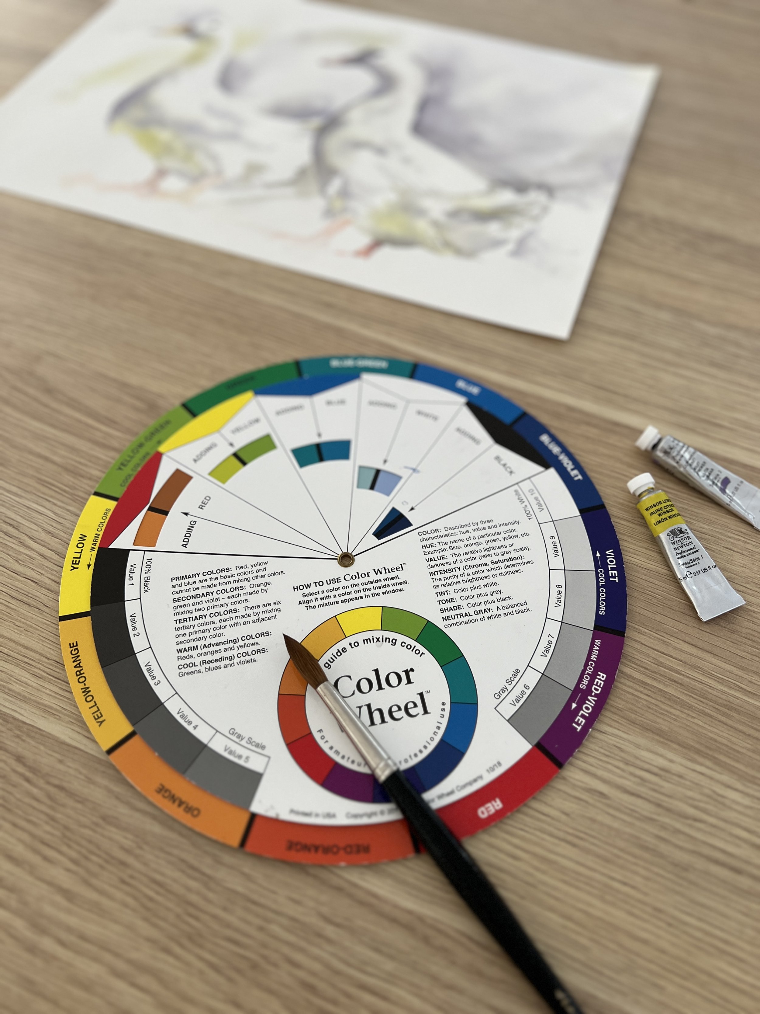
You also need to consider factors such as value and saturation to create contrast and balance. Colour temperature is another important element as well. You might use warm and cool colours to convey specific emotions.
Limiting the amount of colours used on a painting makes it much easier to achieve colour harmony.
The book 'Art of the Limited Palette'
Hazel Soan is a British artist known for her work in watercolour and her contributions to the field of art instruction.
The 'Art of the Limited Palette' is a fantastic resource for artists looking to dive into the world of colour and master the use of a limited palette. This book features a wealth of stunning watercolour paintings by Hazel, alongside clear and concise text that makes it easy to grasp the concepts. What truly stands out is Hazel's remarkable ability to not only demonstrate her painting expertise but also convey her insights in a straightforward and easily comprehensible manner.

The book is divided into two parts. In part 1, Hazel provides information about understanding the limited palette and in part 2 she describes how she has put the information into practice with examples of her beautiful paintings.
Before reading the book I paid little attention to the colours and the characteristics of the pigments that I was using. I also knew little about temperature bias and how important it is when you are mixing colours. I rarely mixed colours and instead used whatever premixed colour I had in my paint kit that was closest to the colour I needed.
As a result, some of my earlier paintings tend to show colours that look a bit artificial. The greens, in particular, on some of my botanical paintings look unnatural.
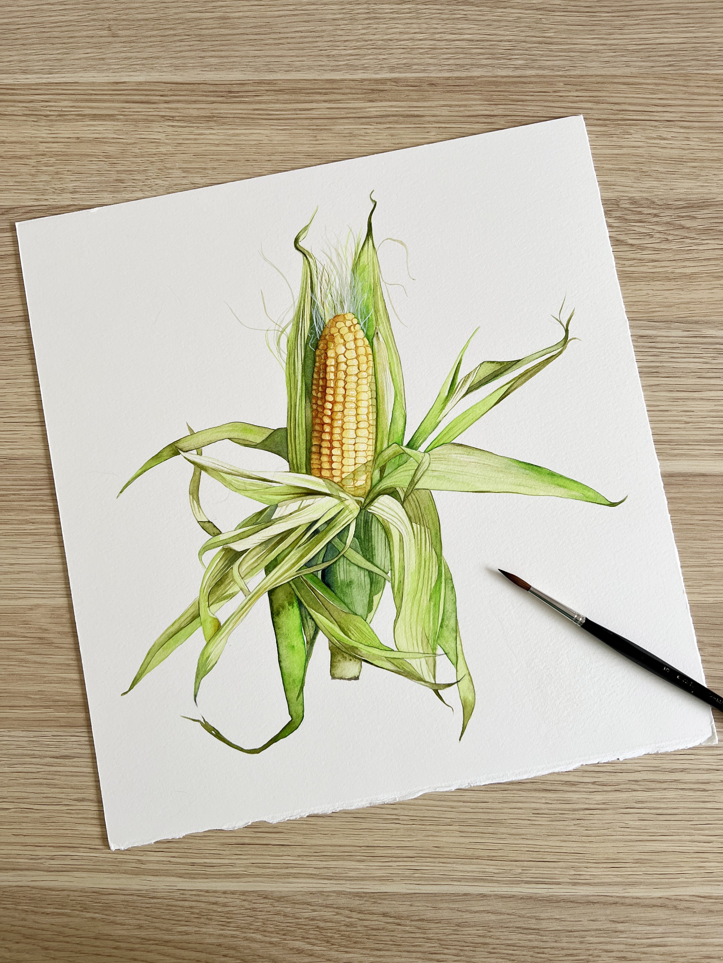
To paint the husk of the corn on this painting I used Daniel Smith's Phthalo Yellow Green and now I can see that the colour is too bright. After reading the book, I have a deeper understanding of colour mixing and I know how important it is to plan out my colour choices before I begin painting. If I was to paint the corn again, I would mix greens using the yellow that I used for the corn kernels.
How I choose my palette now

When I begin a painting now, I take time to plan out the colours I am going to use.
I try to choose the least number of colours possible that will allow me to achieve the range of colours and tones that I need. Many of the choices I make are based on the temperature of the colour because the temperature of a colour has an impact on the colours you mix. I have a video about the importance of understanding the temperature bias of colours.
When I choose colours for a painting, I usually start with the dominant colour and I work from there.
Example 1- Leucadendron
I recently painted this Leucadendron using only three colours. The colour I chose first was yellow because it was the dominant colour of the subject.

I decided to use a cool yellow, a warm blue and a cool red. My choice for the yellow was Winsor Lemon, a colour I was familiar with, but I knew it would be too intense on its own. So I needed other colours that I could mix with it to tone it down.
For the leaves, I needed a green hue, but not an overly vibrant one. Green is a cool colour. To achieve a vibrant green, mix a cool yellow and cool blue. Since Winsor Lemon (my chosen yellow) is a cool colour and I didn't want the green I would mix to be too bright, I chose a warm blue, French Ultramarine, to create the green I wanted. Because French Ultramarine is warm, when it is mixed with a yellow to create green, the mixed colour is less vibrant than a green mixed with a cool blue.

The bracts of the Leucadendron have delicate pink tips and edges so I needed a suitable red pigment. I selected Permanent Rose, a cool red, to capture those details. I chose Permanent Rose because it was a cool red. I anticipated the need for violet in certain areas along the bract edges, and I knew that mixing Permanent Rose with French Ultramarine would make a vivid and clear violet.
To tone down Winsor Lemon I mixed it with a small amount of French Ultramarine and Permanent Rose and that gave me the main colour I used on the bracts.

Where once I would have used at least two yellows and two greens to complete a painting like this, I mixed everything I needed from only three colours.

Example 2 - Magnolias
With the Magnolia painting I challenged myself to use a complementary color scheme of just two Winsor & Newton colours: Winsor Green (blue shade) and Permanent Rose.

Before I started painting, I combined the two colours in different ratios to see how many different hues I could mix.

I was amazed at the colour range that I could achieve using just two colours. Not only do Winsor Green and Permanent Rose mix together to create an array of beautiful colours, they also make a gorgeous grey. Greys are useful in a painting because they don't compete with the other colours and they give the eye areas to rest. When you mix grey you can vary the temperature of the colour by adding more or less of one colour. I used the grey that I mixed for much of the background and I also used it as the main colour on the branches.

Example 3 - Little Girl
With this painting of a little girl I used only three Winsor & Newton colours. I chose a red, a yellow and a blue: Permanent Rose, Burnt Sienna and French Ultramarine.
Permanent Rose was the red, Burnt Sienna was the yellow and French Ultramarine was the red.
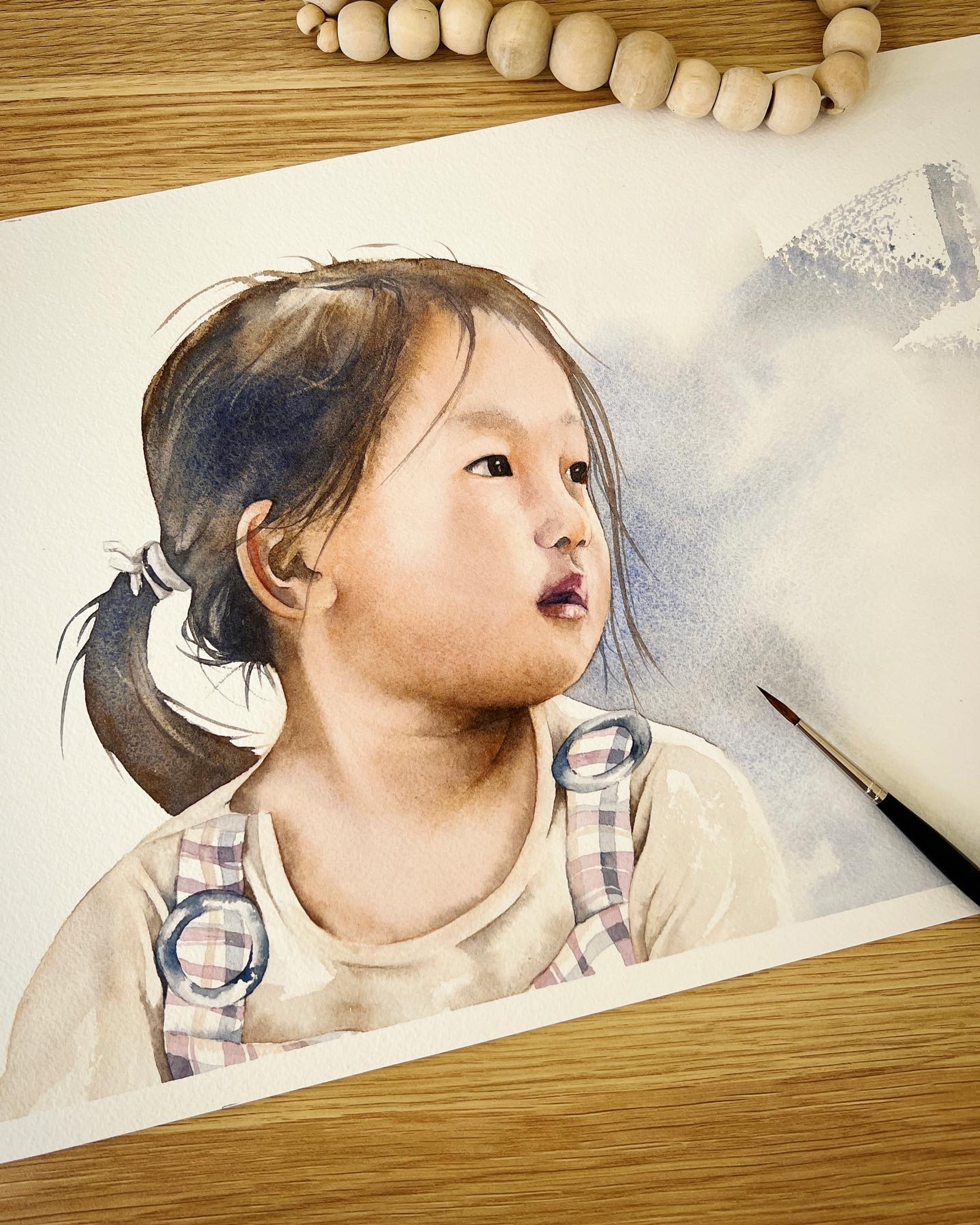
I mixed the skin tones with Burnt Sienna and Permanent Rose. French Ultramarine mixed with Burnt Sienna makes a beautiful grey and when I increased the amount of Burnt Sienna in the mixture I was able to achieve the dark tones for the hair and eyes.
Limiting my palette to just three colours allowed me to focus on the subject and my technique. When I'm not thinking about what colour I'm going to use I can paint more efficiently and quickly.
Sometimes the properties of a colour might be more important than the hue
Hazel mentions in the 'Art of the Limited Palette' that sometimes you may choose a colour for its properties rather than its hue. For example, if you were painting a subject with texture you might choose a granulating colour over a non-granulating colour. Or if you want a colour to stay in place when working on wet paper, you might choose an opaque colour because opaque colours are heavier and denser than transparent colours.

Advice about paint colours for beginners
When you first start out, I suggest you buy a warm and cool version of each of the primary colours. Buy a warm and cool red, blue and yellow. You'll be able to create many different colours with them and you will quickly learn about the characteristics of the colours you have chosen. If you are not sure what temperature a colour is I have a video with some tips that might help you.
To practice colour mixing, buy a watercolour journal and mix your colours together- two at a time and create colour swatches in your journal.
For example, blend your cool yellow with the cool blue to document the resulting green, and then experiment with the cool yellow and warm blue to observe the variation.
Repeat this process with the reds and blues to explore the violets and experiment with reds and yellows to discover the oranges you can achieve.

With a limited palette, you'll rapidly gain insights into the unique qualities of your chosen colours. This quick learning curve includes understanding which pigments are easier to blend, which ones are transparent, which are opaque, and which exhibit granulating effects.
As you progress you will begin to add more colours to your painting kit which will increase your mixing capabilities. Even though you will have more colours to choose from, it's still advisable to limit the amount of colours you use for each painting.
In my journey as a watercolour artist, I can't stress enough how transformative the experience has been since I delved into the world of a limited palette, thanks to the invaluable insights from Hazel Soan's incredible book, 'Art of the Limited Palette.'
This wonderful book has provided me with a deeper understanding of color theory, the color wheel, and improved colour mixing. It has been truly eye-opening, revealing that with fewer colors, I can create unlimited hues.

I can now approach my art with a newfound confidence, knowing that my colours will harmonise effortlessly, and I'll be able to focus more on my subjects and technique.
So, for all beginners out there, I highly recommend embracing the concept of a limited palette – it's a journey filled with wonderful discoveries and endless possibilities.

If you are interested in learning to paint in watercolour, I have over 170 online, voiced over watercolour tutorials for all skill levels.
Originals and prints are available to purchase in the shop.


