How to Create Depth in a Painting
How colour choice and tonal value can impact distance and perspective in watercolour painting

Cool colours tend to recede whereas warm colours advance towards the viewer.
Today, I'm going to dive into a topic that's as fascinating as it is essential in our journey with watercolour art – the concepts of colour perspective, air perspective and perspective in general. These concepts help us add depth, distance, and realism to our watercolour paintings. Depth and composition work hand in hand to guide the viewer's eye through a painting.
These are not just fancy terms; they are your secret ingredients to creating artworks that breathe with depth and emotion. So, if you find, that your painting lacks depth, grab your favourite cup of tea, and let's explore these captivating concepts together!
What is perspective?
The definition of Oxford Languages for perspective is “the art of representing three-dimensional objects on a two-dimensional surface to give the right impression of their height, width, depth, and position in relation to each other.”
In other words: perspective is needed in two-dimensional art, such as watercolour painting, to achieve a sense of three-dimensionality.

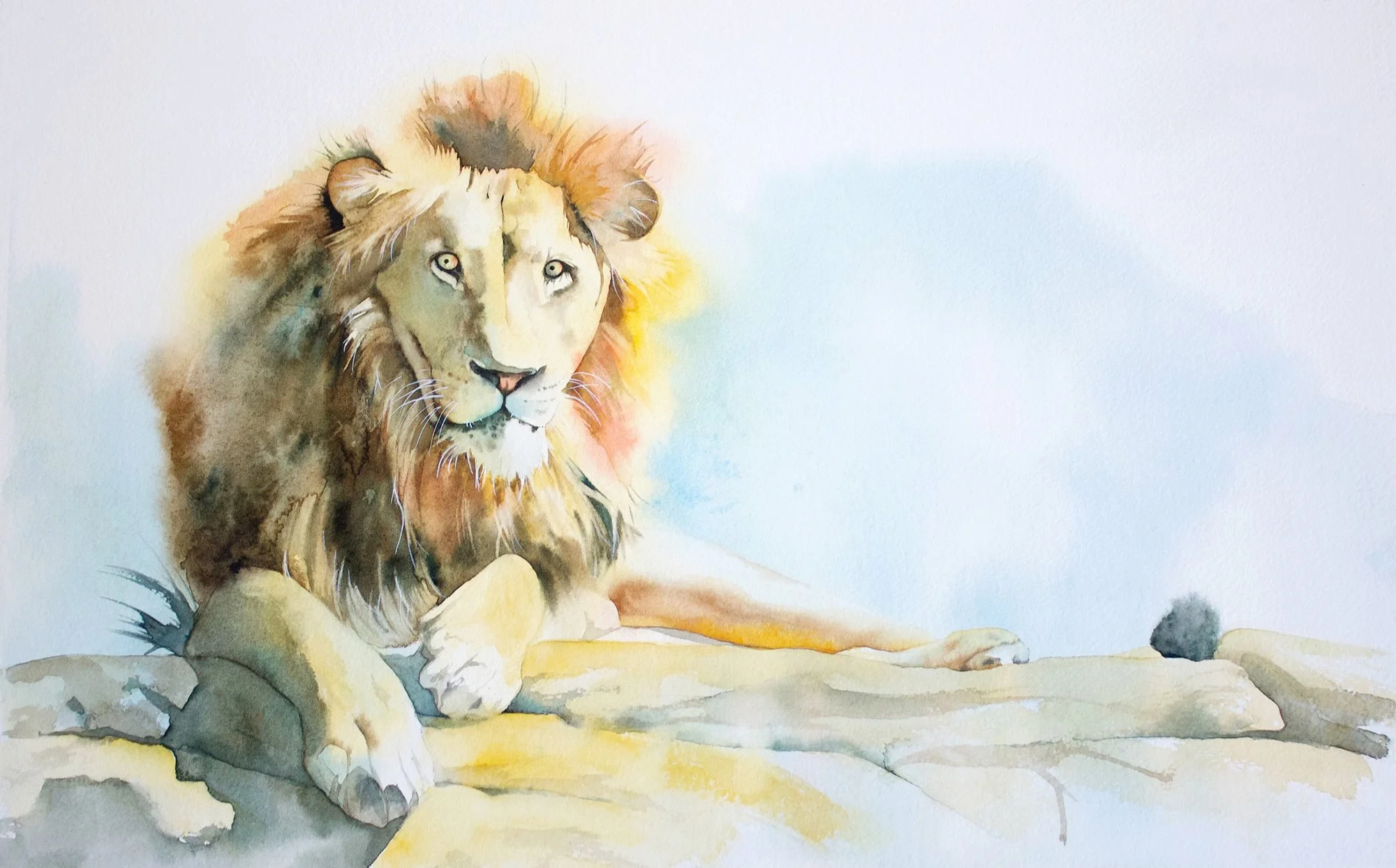
Painting landscapes is difficult when you first start. Here I have painted a vignette to ease my way into them.
In the enchanting world of watercolour painting, we artists often play a delightful game of spotlight with our subjects. Some objects in our paintings are the stars of the show, boldly stepping into the foreground, basking in the spotlight, and captivating the viewer's gaze with their vivid charm. They're the showstoppers, the ones that catch your eye and refuse to let go.
Meanwhile, other elements in our artwork prefer a more subtle role, gracefully receding into the background. They're like the whispers behind the main melody, softer, a tad fuzzy, and less vibrant. These background elements are content to support the scene from afar, adding depth and context without stealing the show. It's this beautiful balance between the bold and the demure that creates the mesmerising harmony in our landscape painting and watercolour art.

John Lovett creates the illusion of depth by adjusting tonal contrast through his paintings.
John Lovett, one of my favourite watercolour artists, is a master at creating depth in his paintings. He expertly draws attention to the focal point using tonal contrast.
Warm Colors versus Cool Colours
Picture this: you're standing in a field bathed in sunlight. The colours near you are like a vivid melody - intense yellows, fiery oranges, and passionate reds. These warm colours feel like they're reaching out to you, don't they? This is the essence of colour perspective. Understanding colour temperature is one of the simplest ways to make your colour choices feel more intentional.

Warm colors advance towards you. Use warm colours where you want to bring things closer to the viewer.
These hues have a psychological knack for appearing closer to us, in the foreground, almost like they're reaching out from the canvas. In the art of watercolour, we use these warm colours to create a sense of intimacy and immediacy.
Creating focus with warmth
These warm colours are not just colours; they are the storytellers in our paintings. They're used to highlight elements in the foreground that demand attention – the delicate petals of a flower, the rustic charm of a cottage, or the lively expressions of figures. In their vibrancy, these colours give life to the intricate textures and sharp details. The sharply defined rugged bark of a tree or the crisp edges of leaves come alive, making the foreground elements appear in more detail and feel almost within reach.
We can use this wonderful play of warm colours in the foreground to create a sense of closeness and intimacy. As you move further into the painting, cool colours like soothing blues and serene greens take over, creating a sense of distance. This contrast between warm and cool colours adds a dynamic and realistic depth to our objects. It's like orchestrating a symphony with colours, where each note plays its part in creating a harmonious depth.

'Meadow' by Alfred Sisley 1875 - Both colour and the use of vertical lines on the fence help to create focus and depth.
In 'Meadow,' Sisley used warm colours like soft yellows and light browns in the foreground to highlight the grasses and flowers. These warm tones bring attention to the immediate front of the painting, making the meadow appear closer and more inviting. You can almost feel the warmth of the sun on the grass.
As the painting extends towards the background, Sisley gradually transitions to cooler colours such as gentle blues and purples. These cool colours create a sense of distance and depth, making the meadow seem to stretch out into the horizon. The contrast between the warm foreground and the cool background adds a dynamic quality to the scene, enhancing the three-dimensional feel.
Sisley also employed linear perspective effectively in his painting, particularly with the inclusion of the fence, to enhance the sense of depth and three-dimensionality in the scene.
Sisley's use of warm and cool colours in 'Meadow' orchestrates a harmonious interplay of hues that not only adds depth but also captures the changing atmosphere and light across the landscape, creating a serene and immersive experience for the viewer.
How to Achieve Distance in Watercolour Painting: The Aerial Perspective
Now, let's add another layer to our painting - the aerial or atmospheric perspective. This is all about how atmospheric conditions like air pollution or humidity influence how we perceive colors and details at a distance. As objects recede into the background, they become lighter, less distinct, and take on a bluish tint. It's like looking at a mountain far away, shrouded in a misty blue veil.
When painting with watercolours, we use what atmospheric perspective taught us, to make distant objects in our paintings appear softer and less detailed, often in cooler, bluish tones. This subtle gradation from clear to hazy not only adds depth but also a touch of mystery to our paintings.

Photo from the book: 'Brushes with History. Masters of Watercolour by Linda and David van Nunen.
Josefia Lemon, in the paintings depicted here, has used warm colours in the foreground. To make the distant mountains recede, he has used cooler bluish tones.
Create the Illusion of Distance
Cool colours are our tools for depicting the elements that lay far in the background. Distant mountains, sprawling forests, and the vast sky are often swathed in these cooler tones, creating a sense of expansiveness. These colours are excellent at suggesting details, adding layers to the painting without overwhelming the main subjects. They invite the viewer to look deeper and discover the story behind the painting. These colours often belong to the cool spectrum of the colour wheel and appear more muted and diluted. Changing a colour's value aids that sense of reality and can create depth and greater distance.
Understanding Tonal Value in Watercolour: A Key to Creating Depth and Realism
When speaking of creating depth in our artworks, we also have to talk about the value of a colour. A bold, undiluted, vivid colour will stand out more, than a diluted, muted and subtle colour value. Understanding how colour intensity matters, will transform your composition with realism and create depth.
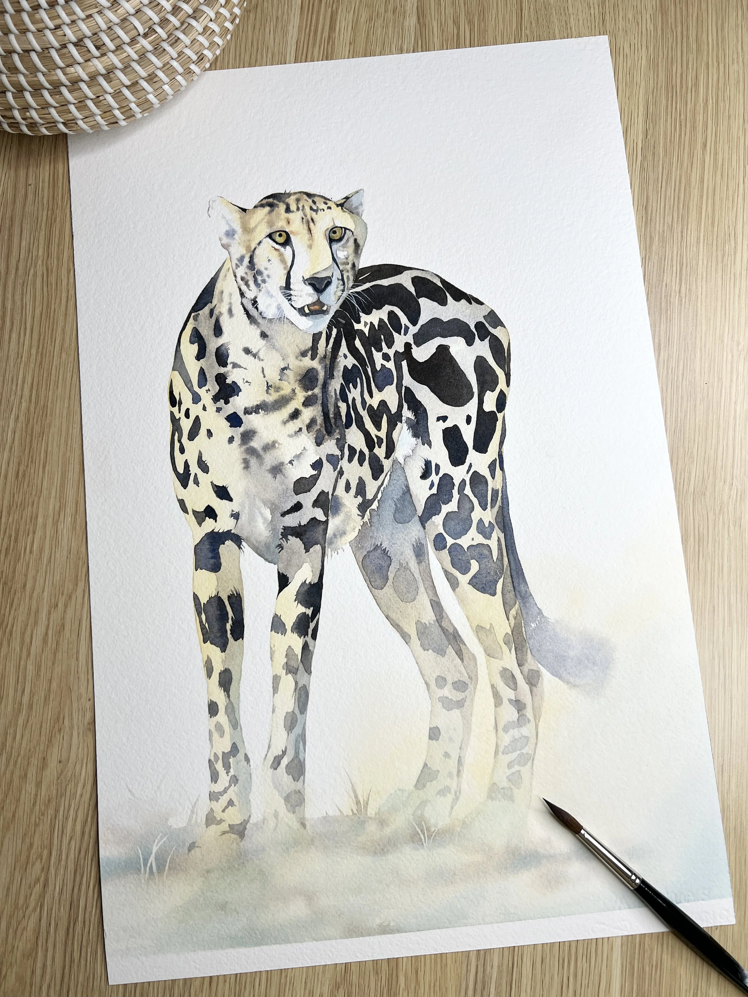
In this watercolour painting of a Cheetah I made use of tonal value to help create attention around the focal point. I used strong vivid colour on the body and head of the Cheetah but I diluted the colours I was using on the lower half of the legs and also on the back leg that is the furthest away from the viewer.
What is Color or Tonal Value?
Colours have both hue and tone (or sometimes referred to as value). Colour value refers to the lightness or darkness of a colour. In watercolour, this is particularly crucial because the transparency of the medium offers unique challenges and opportunities in value manipulation. Colour intensity is determined by the amount of water that is added. Learning to control the value of colours when you are painting is crucial to success. A simple value scale is one of the best ways to see how much range a single colour can give you.
Why Color Value Matters in Perspective
As mentioned above, in the world of watercolour, we mimic how light interacts with the atmosphere to create depth. Distant objects are lighter and less detailed, mimicking the effect of atmospheric haze. By using lighter values for distant elements, we create the illusion of depth.
Light and Shadow
The play of light and shadow is all about value. Light areas are depicted with higher values, while shadows are darker. This contrast is crucial for adding dimensionality to your paintings.
Value Contrasts
Through strategic value contrasts, we can guide the viewer's eye to the focal points of our paintings. Areas of high contrast draw attention, while more uniformly valued areas with less detail recede. This creates depth in a painting.

To create depth in this painting and to draw the viewer's eye to the boat I used high contrast and dark tonal values there. Where the water recedes into the background I used a lighter tonal value.
Layering Techniques
Watercolour’s beauty lies in its layering capability. By overlaying washes of varying values, we create intricate details and textures that add richness to our composition. Building colour gradually with transparent layers helps preserve the luminosity that makes watercolour so distinctive.

There are many layers of varying values on this old watercolour pick up truck.
Understanding Color Temperature and Value

Swatch your watercolour paints to see the range of values they can give you from dark to light.
Remember, warm colours tend to advance, and cool colours recede. This effect is amplified by value choices - darker, warmer colours can pop forward, while lighter, cooler colours can fall back.
Experiment with diluting your paints to achieve a range of values from a single colour. Practice creating a value scale with each colour to understand its range from light to dark. Use the glazing technique to layer colours and build up values gradually. Always consider the value of colours in relation to each other, not just in isolation, to make your artwork evolve from its two dimensional surface to a vivid painting with depth.
Learning from the Masters
Did you know that the great Leonardo da Vinci was a master of air perspective? Just look at his "Mona Lisa" notice how the background gradually fades into a dreamlike haze? And let's not forget Albrecht Dürer, who painted distant mountains in pale blue to enhance the depth in his landscapes. These masterpieces are not just works of art; they are lessons in composition, technique and the beautiful art of perspective.

The "Mona Lisa" by Leonardo da Vinci, featuring her enigmatic smile.
Bringing it All Together
In our watercolour journey, the combination of colour and aerial perspectives, is key to achieving a realistic and emotionally resonant composition, whether it is watercolour landscapes or other objects. While the colour perspective plays with warm and cool colours, the aerial perspective focuses on portraying distant objects as lighter, paler, and less detailed. Together, they create depth and a compelling illusion of space and distance that can transport the viewer into the painting itself.
Your canvas awaits.
Remember, every object you paint is a story waiting to be told. As you pick up your brushes and look at your palette, remember the power of these colours and tones. Watch as they transform your watercolour art from simple paintings to windows into another world.
If you are interested in learning to paint in watercolour, I have over 170 online, voiced over watercolour tutorials for all skill levels.
Original artworks, prints and merchandise are available to purchase in the shop.