Watercolour Transparency and Opacity
Watercolour is a beautiful light medium and one of the characteristics that makes a watercolour painting so appealing to look at, is its transparency.

A watercolour painting can glow with light.
Beginner watercolour artists often ask me if they should not use opaque paints and just use transparent paints. My answer to that is no because watercolour artists can embrace both transparency and opacity in their paintings. In this blog post, we'll explore the magic and art of watercolour translucency by comparing the unique qualities of transparent and opaque pigments.
What is the Difference Between Opaque and Transparent Watercolour?
The main difference between opaque and transparent paints lies in how they interact with light and how they appear on the paper.
Transparent watercolour pigments create luminous effects on the paper because they allow light to pass through the paint layers. They mix well with one another and they are used for layering and creating depth in a painting.
Opaque colours, on the other hand, are less transparent and more dense. Painting with them results in a more solid, less luminous appearance. They are less suitable for layering and are often used for specific areas that need more intense colour.

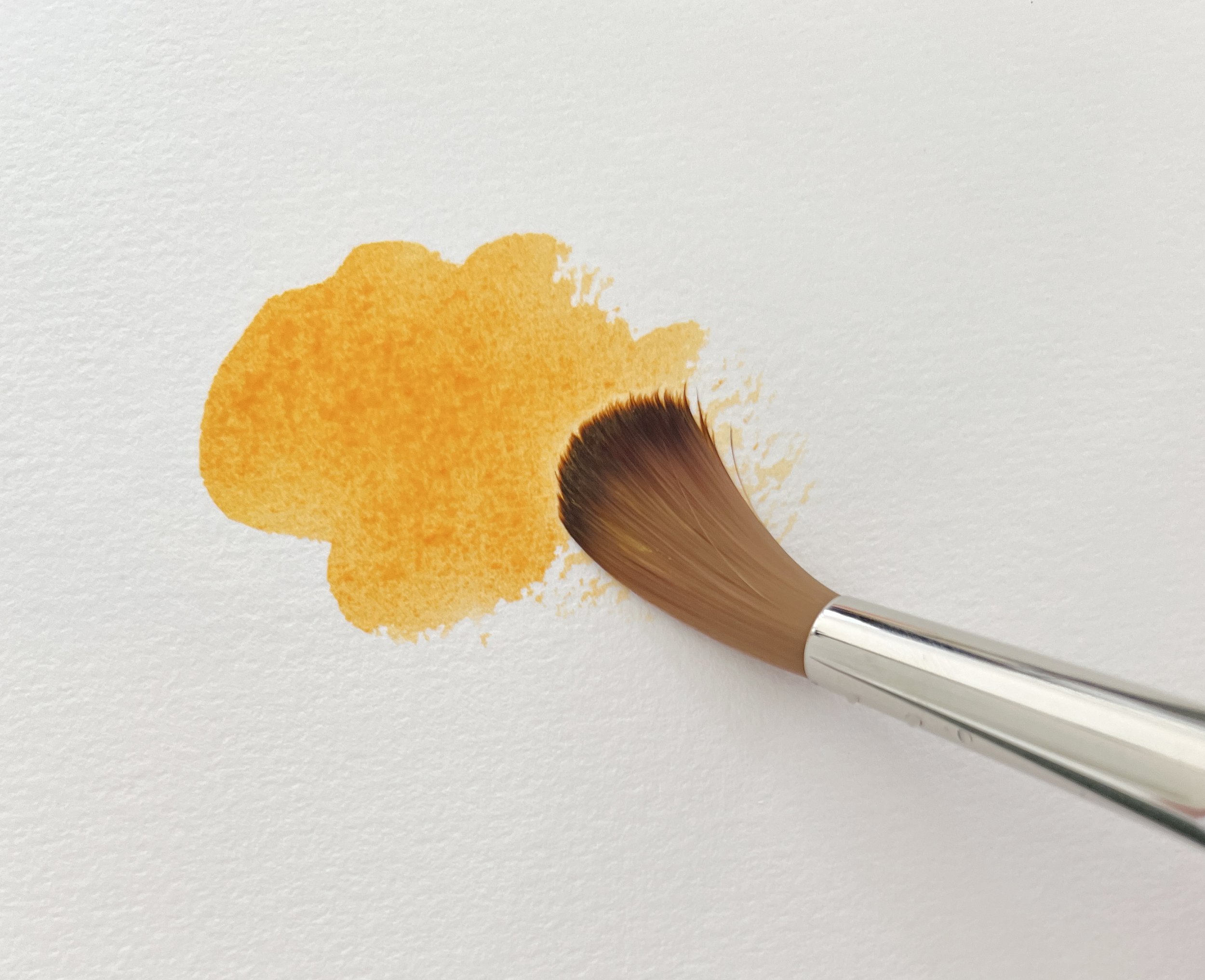
Transparent Yellow glows on the white paper.
Transparency and Opacity is Affected by Dilution
Something to remember is that transparent paints, can surprisingly take on an opaque appearance when applied with a heavier hand. On the other hand, opaque pigments, can appear almost translucent with the addition of extra water. This flexibility in altering the appearance of paints allows you to explore a broader spectrum of textures and depths within a single painting.

Quinacridone Red can take on an opaque appearance when applied heavily to the paper whilst Indian Red can look transparent when diluted with water.
Winsor & Newton's Quinacridone Red, although a transparent colour, can take on an opaque appearance when applied heavily to the paper. On the other hand, their Indian Red, known for its opacity, achieves a transparent look when diluted with water.
Mixing with Opaque and Transparent Pigments
One thing most watercolour artists try to avoid is making mud when they mix colours.

Mixing two opaque colors should be avoided if possible: Here I've used Cadmium Yellow Deep and Cadmium Red Deep
Muddy colours appear lifeless or lacking in vibrancy. To avoid making dull colours it's best to use transparent colours when you mix paint.
Opaque pigments, because they are heavier and denser, tend to become dull and lifeless when you mix with them, particularly when you mix two or more opaque pigments together.
If you need to mix with an opaque pigment - pair it with a transparent pigment to avoid a thick and heavy mixture.

Two opaque colours- Schmincke's Cadmium Yellow Deep mixed with Cadmium Red Deep make an earthy orange.
Schmincke's Transparent Pure Yellow mixed with semi transparent Saturn Red make a vibrant orange hue.
Transparent colours, particularly staining transparent colours, are useful when you want to mix dark, bright and vibrant colours.
Glazing with Watercolour Paint

I used transparent watercolor glazes to deepen the value on some of the petals of a geranium.
Glazing is a watercolour technique where you paint one colour or value over the top of another colour that has dried to alter the previous colour/value.
When you glaze it is best to use transparent colours because they allow the light to pass through and reflect off the underlying surface, creating depth, luminosity, and rich colour variations without obscuring details beneath.
Opaque colours on the other hand, are ideal for providing solid coverage. They can almost cover the underlying paint layer and provide a uniform, vivid appearance.
How Can You Tell if a Watercolour Paint is Transparent or Opaque?
If you are using tubes, you can check the label to see if a paint is transparent or opaque (and semi-transparent or semi-opaque).
Paint manufacturers label their paint tubes to show the characteristic of translucency.
Winsor & Newton and Schmincke use a square and Daniel Smith use a circle to indicate this characteristic.
A square or circle that is not filled in indicates transparency and a square or circle that is completely solid indicates an opaque pigment.
A square or circle with a dash through the middle indicates that the pigment is semi transparent and a square or circle that has been half filled in indicates that the pigment is semi opaque.

Check the labels of your paint tubes to determine watercolor transparency or opacity.
The labels of your paint tubes will also show the watercolour’s semi-transparency or semi-opacity.
Another way to check if a pigment you want to use is opaque or transparent is to rinse the paint colour out of your brush in some clean water. Opaque colours tend to make the water look cloudy.
In the photo below I rinsed Burnt Sienna out of my brush in the jar on the left and I rinsed Indian Red out of my brush in the jar on the right. Burnt Sienna is transparent and the water remains clear. Indian Red is opaque and you can see that the water has become cloudy.

You can check watercolour transparency with your water container. Opaque pigments make the water look cloudy.
You could also test the transparency of your paints by painting over the top of a black mark made with a sharpie pen.
Opaque colours will cover the black mark to some degree whereas transparent colours will not.

Transparent Yellow and Naples Yellow (opaque) painted over a black sharpie mark made on watercolour paper.
What do you use Opaque Colours for?
Opaque colours are useful because they are denser than transparent pigments. There might be an area on your painting where you want to work wet on wet but you want the colour to stay in place rather than spread over the wet paper. That's where an opaque colour can be useful.

Opaque colours like Cadmium Yellow Deep are thicker and denser than transparent colours. Here you can see that the Cadmium Yellow Deep hasn't spread as far as the Transparent Yellow on wet paper.
You can also use opaque pigments to add contrast to areas of high transparency. Place an area of opaque pigment adjacent to an area where you have used transparent watercolour paint to enhance the translucency.
Some transparent colours I sometimes use.

Winsor & Newton - Raw Sienna - PR101, PY42
Winsor & Newton - Burnt Sienna - PR101
Schmincke - Phthalo Blue - PB15:1
Schmincke - French Ultramarine - PB29
Schmincke - Ruby Red - PV19
Schmincke - Transparent Yellow - PY150
Winsor & Newton - Quinacridone Gold - Pr206, PV19, PY150
Some opaque and semi opaque colours I sometimes use.

Schmincke - Naples Yellow - PW6, PY53, PBr24
Schmincke - Prussian Blue (semi opaque) - PB27
Winsor & Newton - Indian Red - PR101
Winsor & Newton - Sepia - PBk6 - PR101
Winsor & Newton - Paynes Grey (semi opaque) - PB15, PBk6, Pv19
What is the Difference Between Opaque Watercolour and Gouache?
Opaque watercolour paint and gouache are often confused because they share many characteristics, but they have distinct differences mainly based on their composition and finish. Gouache has a higher pigment concentration and the addition of white filler, usually chalk, making it uniformly opaque and matte. Gouache dries to a matte finish which makes it a popular medium with illustrators because the lack of sheen eliminates reflections, making the work easier to photograph or scan.
Final Thoughts
Embracing both the ethereal beauty of transparent watercolours and the bold, vibrant presence of opaque pigments allows you to explore a vast spectrum of artistic expressions. By understanding the unique properties and applications of each type of pigment, you can craft paintings with depth, contrast, and luminosity that captivate and engage viewers. Whether creating delicate layers with transparent glazing or defining bold shapes with opaque pigments, the choice between transparency and opacity is a powerful tool in your palette. Let the dance between light and pigment inspire your next masterpiece.
If you are interested in learning to paint in watercolour, I have over 170 online, voiced over watercolour tutorials for all skill levels.
Original art, prints and merchandise are available to purchase in the shop.


