How Do You Choose Colours for a Watercolour Painting?
If you’re just starting out with watercolour, one of the trickiest questions is: How do I choose what colours to use in a painting?
It seems like such a simple thing, but once you sit down with your paints and watercolour palette, you suddenly realise you’ve got no idea where to start.
You're not alone - this is one of the questions I get asked the most, and the answer is… it depends. There’s no one-size-fits-all rule, but there are a few easy steps that can help you make confident colour choices, even if you're new to painting.
Let’s break it down.
Start with the Subject
One of the easiest ways to narrow down your colour choices is to look at what you’re painting. The subject itself will usually point you in the right direction.
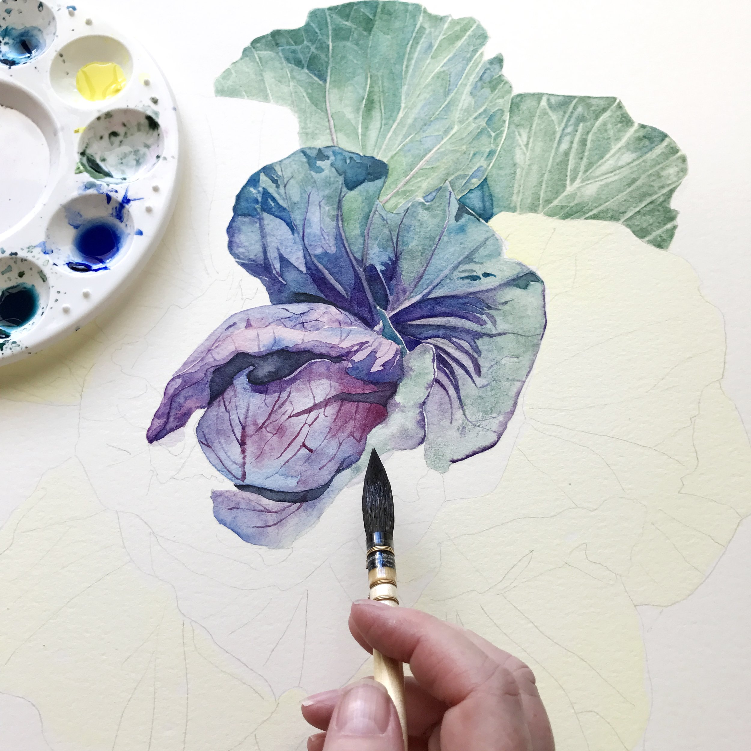
Let’s say you’re painting a magnolia. Straight away, you’re thinking soft pinks and vibrant magentas - maybe a brown for the stems.

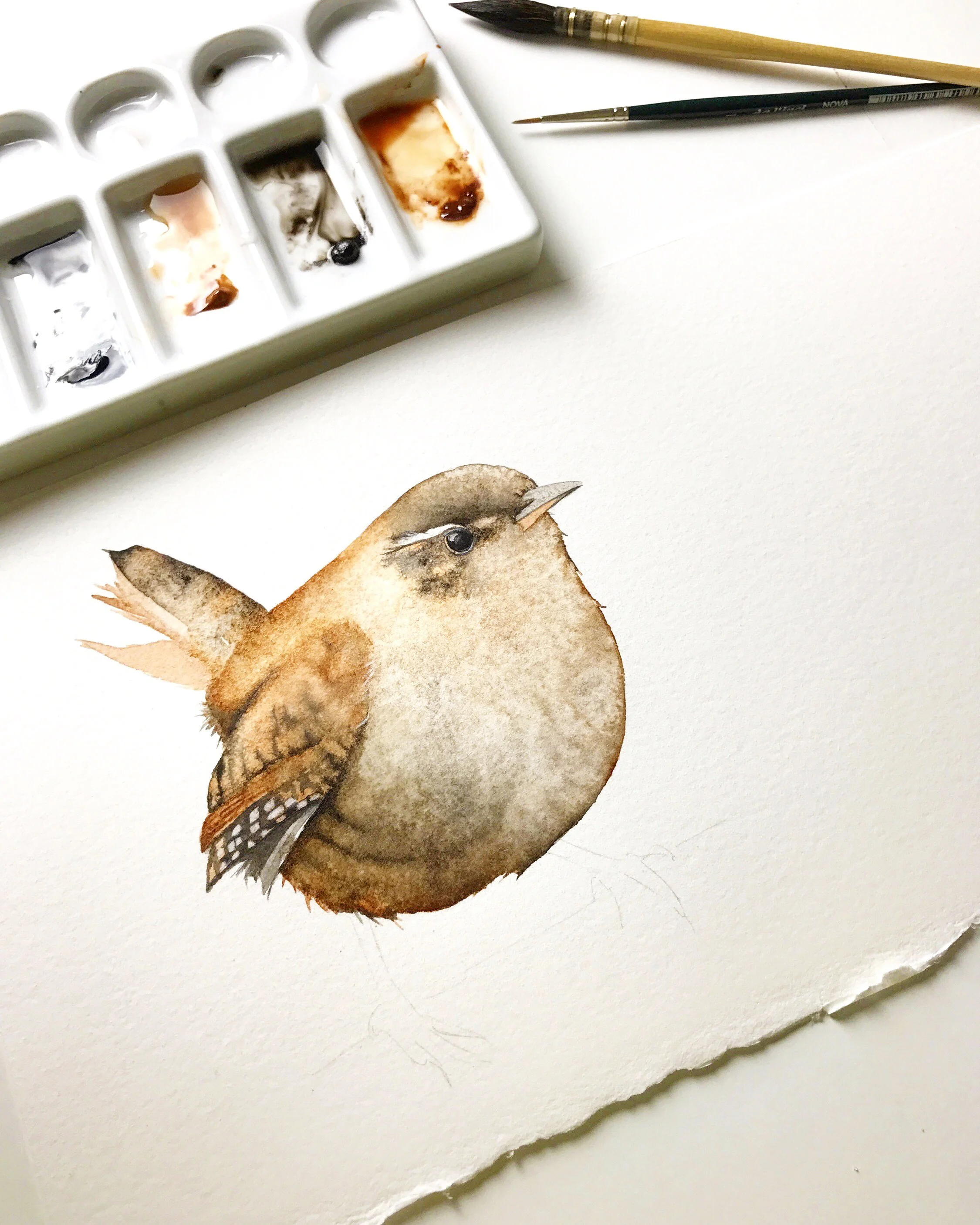
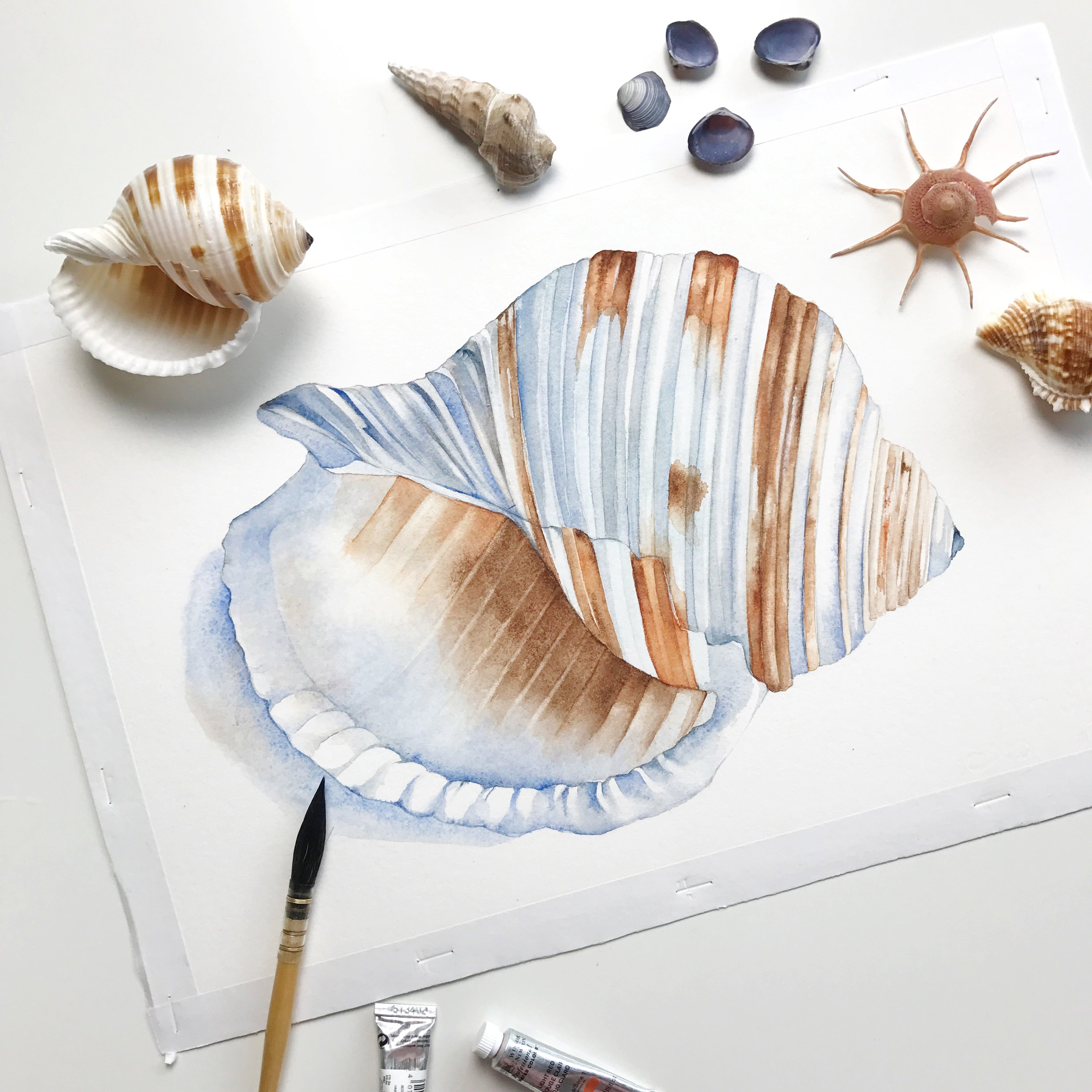
Now compare that to painting a seashell- you’re in a totally different colour world: earth tones like a dark brown, some greys, maybe some soft blues.

The subject gives you clues:
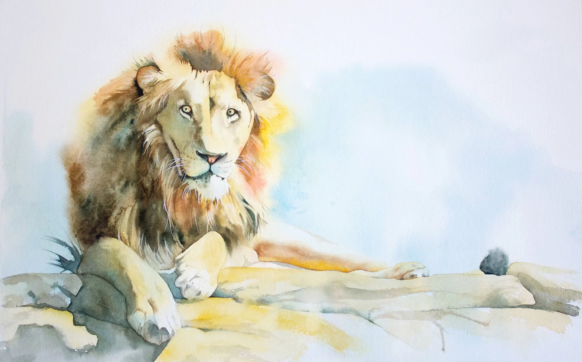
Animals: Think about their natural colours, but also the surrounding environment. A white goat might need warm or cool shadows depending on the mood you are going for. A kingfisher has bright, punchy blues.
Florals: What colours are in the petals, the leaves, the shadows? Do you want to push the colours and go more expressive?
Landscapes: What time of day is it? Early morning might call for soft, cool tones. A sunset scene leans towards warm golds and oranges.
And if your subject doesn’t have an obvious colour, that’s when you get to have a bit more fun and make stylistic choices.
Even then, think about what kind of feeling you want to evoke - and let that guide your palette.
You don’t have to reinvent the wheel every time. Start with the subject, and let that inform your choices. It’ll narrow down your options and give you a good starting point - which is often the hardest part. Once you've chosen your subject, thinking about the overall composition will help you decide where those colours should have the greatest impact.
What mood are you trying to convey?
Think About the Mood You Want
The mood of a painting plays a big role in your colour choices. It’s not just what you paint, but how it feels when someone looks at it.
Before picking up your brush, ask yourself:
What kind of mood do I want to create?
Here are a few examples:
Peaceful and calm – Go for cool colours like soft blues, greens, and neutrals. Think gentle transitions, subtle shadows, and low contrast.
Warm and inviting – Use earthy reds, golds, and browns.
Bright and cheerful – Bring in high-chroma colours like lemon yellow, pink, or turquoise. This works well for playful subjects like florals, birds, or anything lighthearted.
Dramatic or moody – Use deep darks, strong contrast, and bold colour pairings like blue/orange or purple/yellow. These can give your painting a bit of punch and emotional depth.
You can paint the same flower using different palettes and get a totally different feeling. That’s the power of mood - and it’s all in the colours you choose.
So once you’ve chosen your subject, pause for a second and ask yourself:
How do I want this to feel?
Let that be your compass for colour.

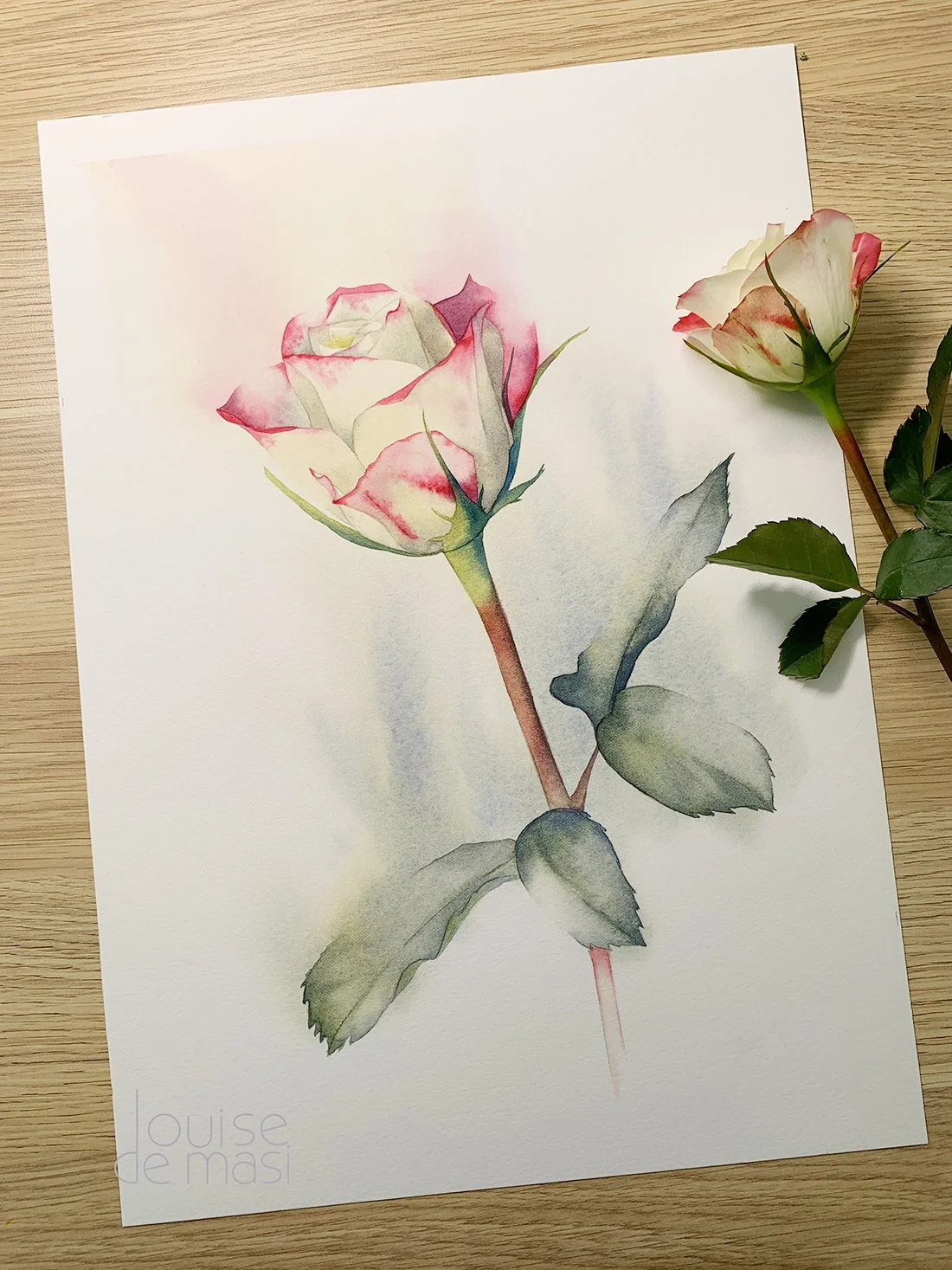
I changed the background colour of this rose painting because I wanted a softer more subdued mood.
In the reference photo for this rose painting, the background was full of vibrant greens - very true to life, but it felt a bit too energetic and distracting for the mood I wanted. So I changed it.
I went with a softer, more subdued blue-grey instead. It helps calm the painting down and makes the rose feel more gentle and dreamy. It also creates a subtle contrast that lets the soft pinks and whites in the petals stand out without being overpowered.
That’s the power of colour. You’re not just copying what you see - you’re setting the mood. And sometimes, changing a colour from the reference photo is exactly what makes the painting work better.
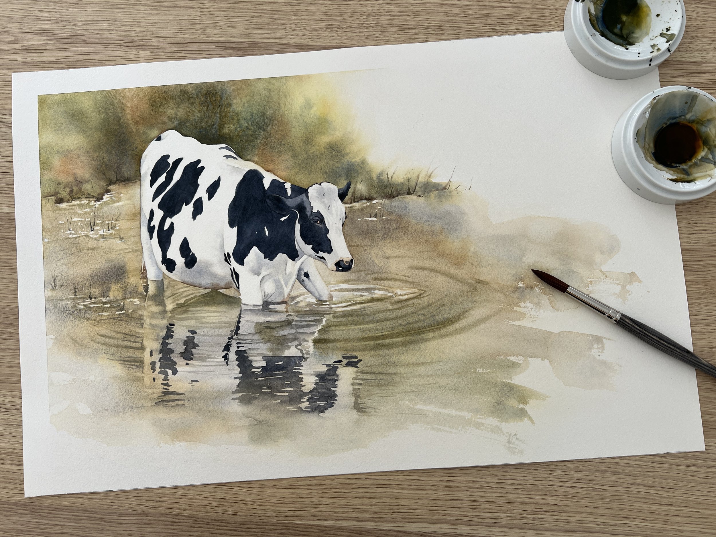
For this cow painting, I wanted to capture a rustic, countryside feel - something calm, natural, and a bit nostalgic. The colours played a big role in that.
I stuck with a muted, earthy palette: soft browns, olive greens, and golden tones in the background and water. These colours help create a warm, peaceful mood and give it that rural, farm-life feeling. Nothing too bright or modern - just quiet and grounded.
The black-and-white of the cow adds contrast without breaking the harmony. It stands out, but still feels like it belongs in the scene because the surroundings are so soft and tonal.
When you’re going for a specific vibe - like “country and calm” - choosing slightly desaturated, natural colours can really help reinforce that mood without needing to say anything at all.
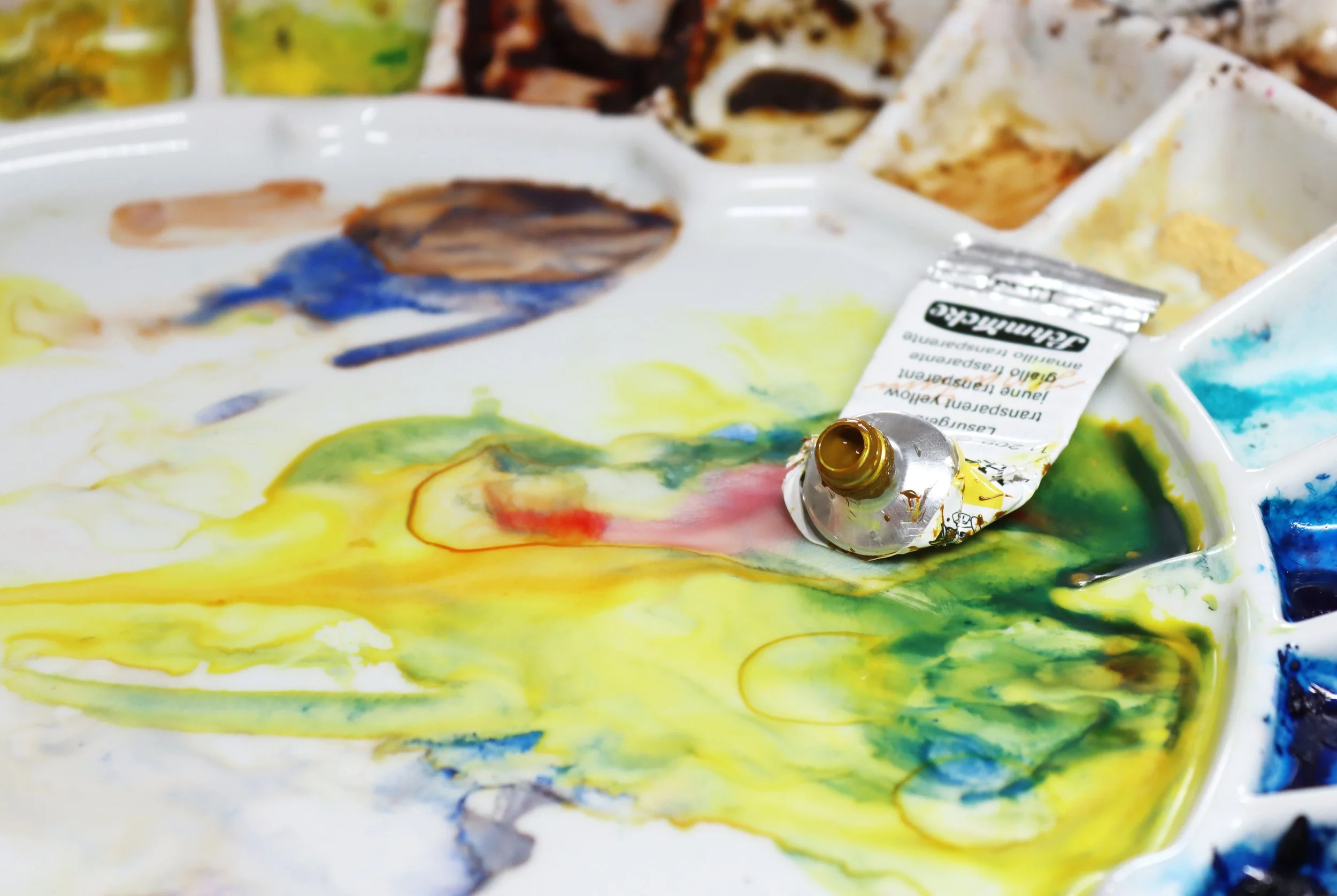
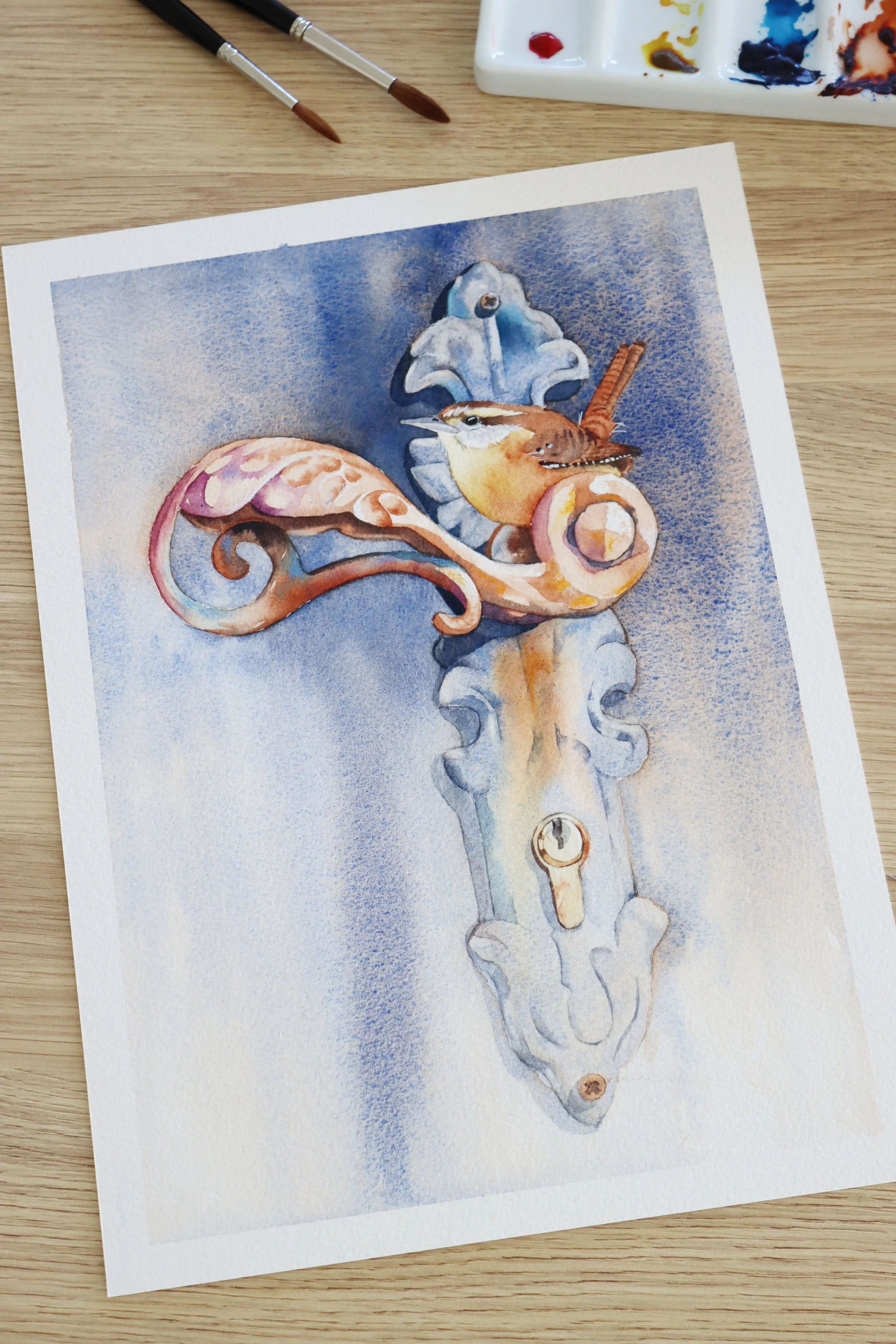
Limit Your Palette

This is a big one. When I first started painting, I used way too many colours. I thought using more would make the painting more interesting - but all it did was create muddy mixes and make everything feel a bit all over the place.
It took me a while to realise that less is more.
These days, I try to stick to just three to five colours for most pieces. It makes a huge difference.
Why?
Your colours will automatically harmonise
It’s easier to control your mixes
You really get to know your paints
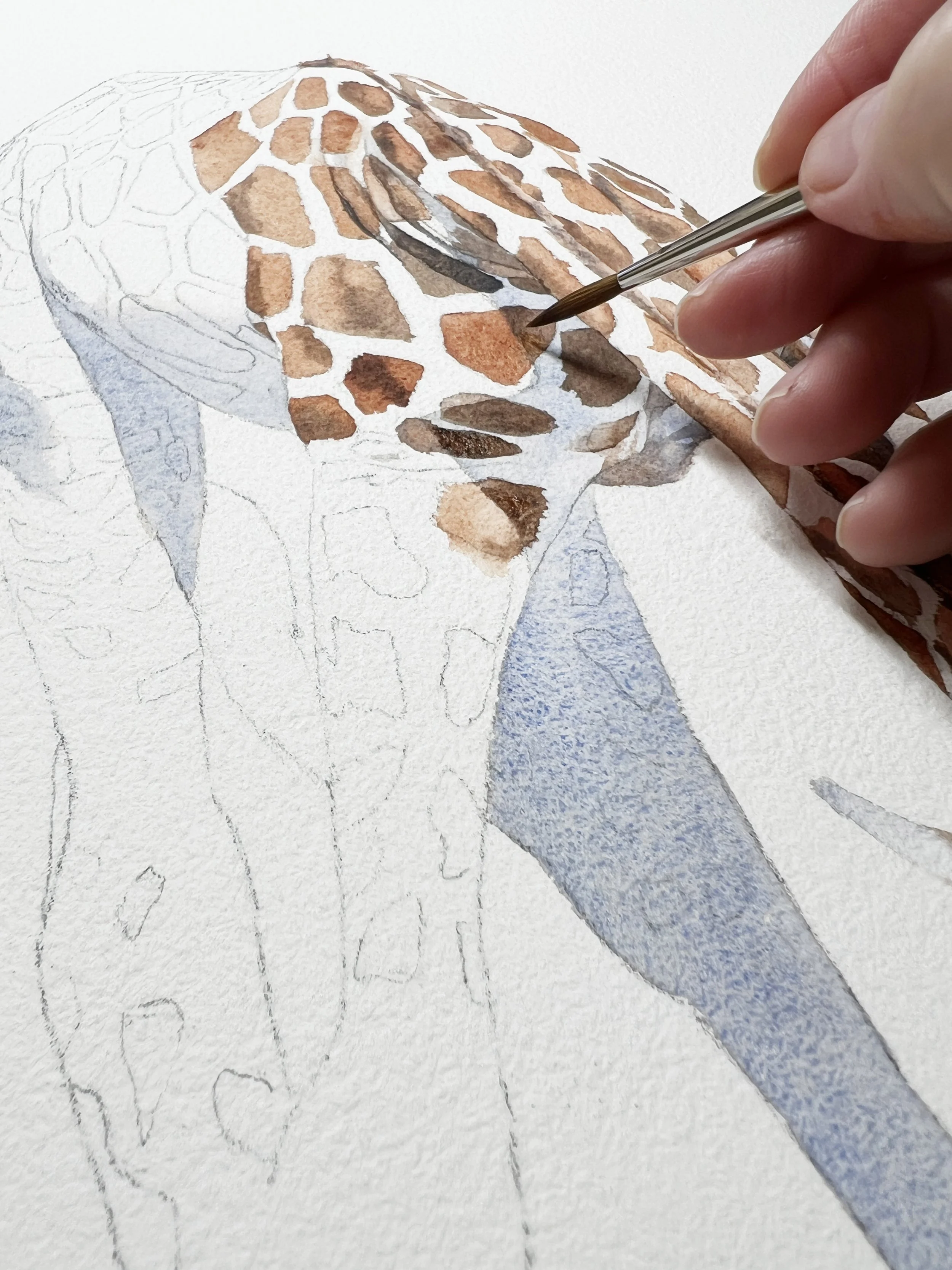
A limited palette doesn’t mean your painting will look flat or dull - quite the opposite. You can mix an incredible range of hues from just a few transparent pigments. Creating a simple colour mixing chart is a great way to discover just how many colours you can make from a small palette. And the bonus is, your whole painting feels more cohesive.
Once I made the switch to using fewer colours, things just started to click. You can read more about using a limited palette here.
Isolate Tricky Colours
Sometimes when you're looking at a reference photo, it can be hard to figure out exactly what colour you're seeing. Is that shadow a grey? A purple? A cool green?
When I’m unsure, I open the image in Photoshop and use the eyedropper tool to grab the colour I’m trying to identify. Then I paste it onto a blank canvas so I can see it on its own, without being influenced by the surrounding colours. It really helps to isolate the colour and understand what’s actually there.
This is especially handy if you’re trying to figure out subtle tones in a shadow, fur, or petal - areas where the colours can be more complex than they first appear.
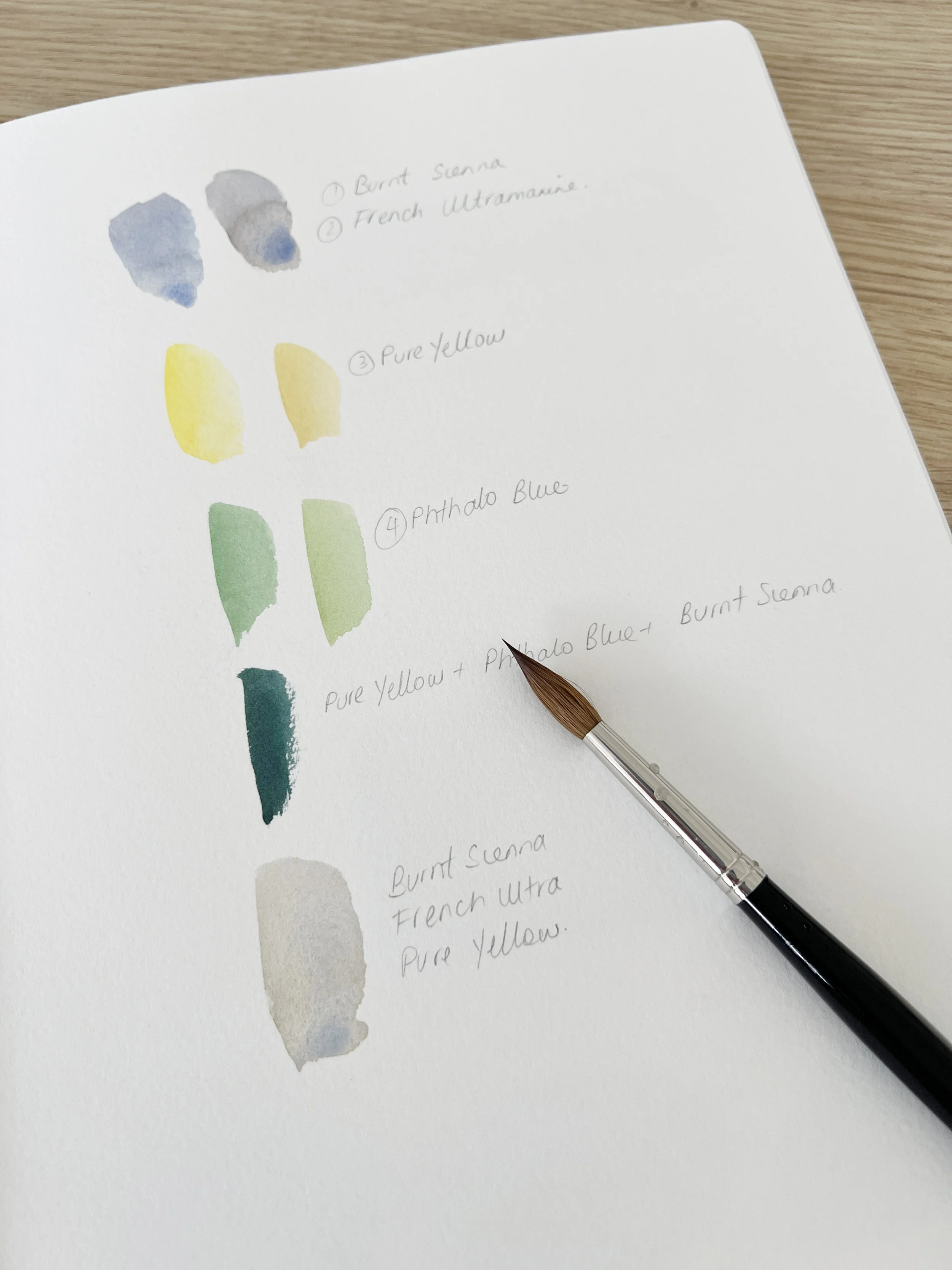
Here’s an example I pulled from a reference photo of a rose. I used the eyedropper tool in Photoshop to sample the different colours and placed them alongside the photo so I could see them clearly:
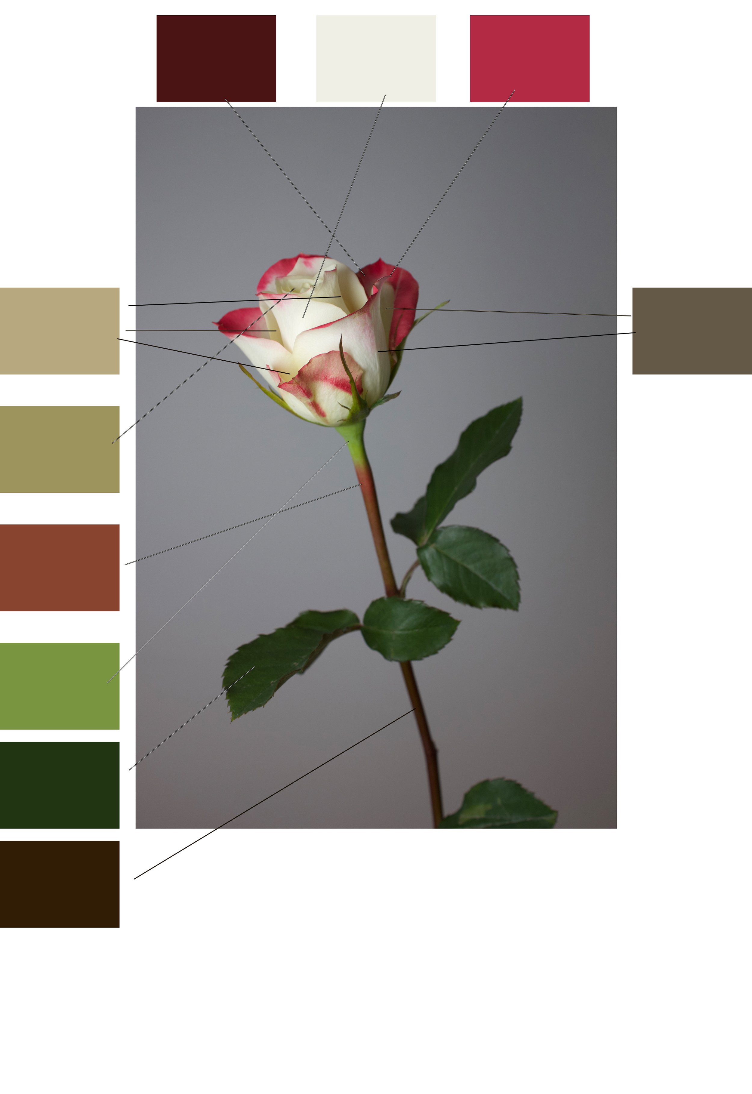
You can see just how many different colours are actually in the photo - reds, creams, greens, browns, even olive and maroon tones. It’s a lot.
When it came time to paint, I didn’t try to match every colour in the reference exactly. I kept it simple and chose four core colours that captured the overall mood. From those, I mixed everything else. It gave the painting a sense of harmony and kept it from looking too busy or disjointed.
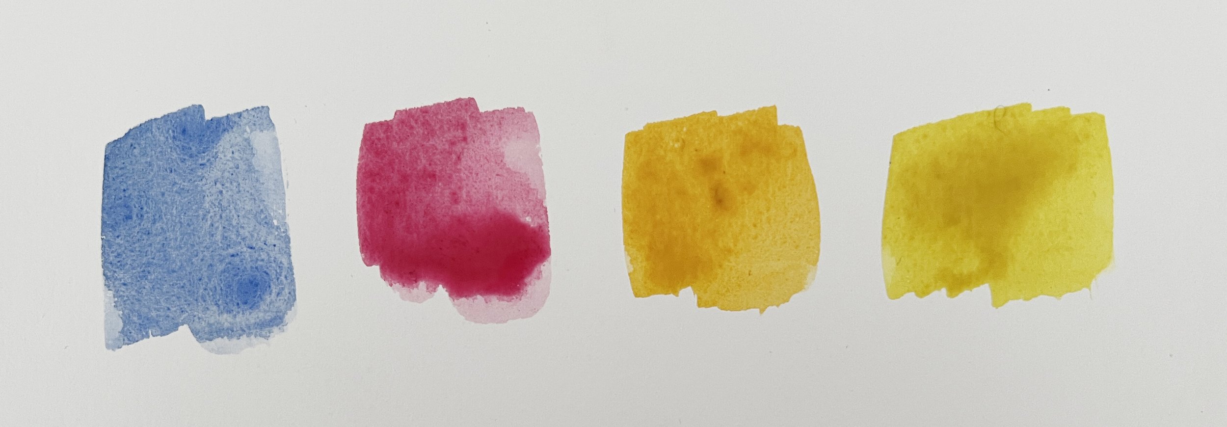
I used Schmincke’s French Ultramarine (PB29), Ruby Red (PV19), Indian Yellow (PO62/PY139), and Transparent Yellow (PY150). Those four were all I needed to mix the rest of the colours in the painting.
The colours I used for the rose painting.
So while this kind of colour-picking is super helpful, don’t let it tempt you into using too many pigments. It’s a tool to understand colour not a to-do list for your palette.
If you don’t have Photoshop, don’t worry because there are free tools that do the same thing:
Just upload your photo and click on any part of the image to see the colour up close.
This is especially handy if you’re trying to figure out subtle tones in a shadow, fur, or petal - areas where the colours can be more complex than they first appear.
4. Swatch and Test First
Before diving into the painting, take a few minutes to test your colours.
Try some little mixes on scrap paper. Lay the background colour next to your subject colour and see how they interact.
Does it feel right? Do the colours look fresh or dull?
This quick step saves a lot of heartache later - especially if you're trying out new combinations.
Use Single Pigment Colours for Cleaner Mixes
One of the easiest ways to get cleaner, more vibrant colour mixes is to use single pigment paints.
Every watercolour tube has a pigment code on it such as PB29 for French Ultramarine or PY150 for Transparent Yellow. If the tube only lists one pigment code, it’s a single pigment paint. If there are two or three, it’s a mix.
Why does this matter?
When you mix two single pigment colours, you’re only dealing with two variables. But if you mix colours made from multiple pigments, things can get messy fast. You might accidentally end up combining five or six pigments and that’s how you get muddy, lifeless mixes.
Using mostly single pigment colours gives you:
Cleaner mixes
More predictable results
Less frustration when something turns brown or grey unexpectedly
It also becomes much easier to understand how each pigment behaves.
You don’t need to use only single pigment colours because some multi-pigment paints are beautiful and well-behaved but if you're just learning to mix, start with singles where you can. It makes understanding colour much easier.
Choose Transparent Colours for Luminous Mixes
When you're mixing colours in watercolour, transparency matters. Transparent paints let light pass through the layers and bounce off the paper which is what gives watercolour its trademark glow.
Opaque colours, on the other hand, tend to sit on the surface and can make mixes look dull or chalky, especially when layered. They have their place, but if you want fresh, luminous colour go for transparent pigments.
You’ll notice:
Your mixes stay cleaner and more vibrant
Glazes look richer and more glowing
You avoid that flat, muddy look that beginners often struggle with
Most brands will mark paints as transparent, semi-transparent, or opaque or you can test them by painting a swatch over a black line. If you can clearly see the line through the paint, it’s transparent.
A few useful transparent and semi transparent colours are:
Transparent Yellow
Hansa Yellow medium (Daniel Smith)
Indian Yellow
Ultramarine Blue
Phthalo Blue
Raw Sienna
Permanent Alizarin Crimson
For more information about transparent and opaque colours read this blog post.

So many different paint tubes - so many colours!
You Don’t Need to Match the Colours Exactly
One of the biggest traps beginners fall into is trying to match the colours in their reference photo exactly. Every petal, feather, or shadow - they want it to be the same as what they see.
But here’s the thing: you’re not a printer. You don’t need to replicate colours perfectly for your painting to work.
Watercolour is expressive. It’s more about capturing the feeling of the subject - not ticking boxes for accuracy. Often, tweaking the colours slightly makes the painting better.
For example, you might:
Cool down a background to push it back
Warm up a flower to bring it forward
Use a more vibrant or more muted version of a colour to suit the mood
Your job isn’t to copy the colours - it’s to interpret them in a way that supports your composition, your focal point, and the mood you want to create.
Once you let go of the need to match everything exactly, painting becomes a lot more fun and your results will often be stronger for it.
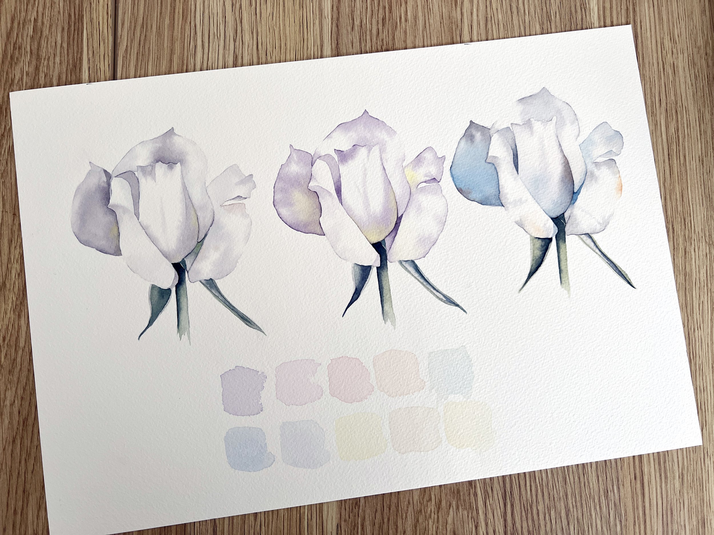
The same rose painted with different colour combinations - experiment with your colours.
Start with a Warm and Cool Version of Each Primary
Basic colours for watercolour palette
When you're first starting out, it’s tempting to buy all the colours - but you really don’t need a huge set to get started. In fact, too many paints can just make things more confusing.
A great way to begin is by choosing a warm and cool version of each primary colour - red, yellow, and blue. This gives you flexibility in your mixing and helps you understand colour temperature, which plays a big role in how your mixes behave.
Colour temperature just means whether a colour leans warm (towards red/yellow) or cool (towards blue/green). For example:
Warm yellow: Indian Yellow PY110, PY154 or New Gamboge PR209, PY150
Cool yellow: Lemon Yellow PY150 or Transparent Yellow PY150
Warm red: Scarlet Lake PR254 or Scarlet Red PR254
Cool red: Permanent Rose PV19 or Ruby Red PV19
Warm blue: French Ultramarine Blue PB29
Cool blue: Phthalo Blue PB15:1 or Prussian Blue PB27
With just these six colours, you can mix a huge range of secondary and neutral colours, and you’ll start to see how temperature affects vibrancy, harmony, and mood. It’s also a fantastic way to train your eye and gain control over your mixes.
Keep it simple at first and learn what your paints can do.
I talk about the importance of colour temperature in this blog post.

My Custom Schmincke Watercolour Set
Last year I worked with Jackson’s Art Supplies to create my own custom set of Schmincke paints. I chose each colour carefully to reflect the way I actually paint - keeping the palette versatile, transparent, and beginner-friendly, without including anything I don’t personally use.

My custom set of Schmincke watercolour paints gives you a huge mixing range.
The set includes a warm and cool version of each primary colour, which is perfect for anyone just getting started. For example, there’s French Ultramarine (a warm blue) and Phthalo Blue (a cool blue), Scarlet Red (warm) and Ruby Red (cool), and Indian Yellow (warm) alongside Transparent Yellow (cool). That means you can mix a huge range of vibrant or subtle colours, depending on the temperature you choose - and it’s a great way to understand how colour mixing works.
I've also included useful mixers like Transparent Sienna, Burnt Umber, and Phthalo Green, all of which I use regularly in my own work. If you’re looking for a set that takes the guesswork out of building a palette, this one’s a great place to start.
If you take my classes, you’ll learn how to mix with these exact colours - I use them throughout my tutorials. So whether you're just starting out or looking to simplify your palette, this set is a great foundation to build your skills on. You can purchase the set here.
Final Thoughts
Choosing colours for a watercolour painting doesn’t have to be overwhelming. Start with your subject, think about the mood, keep your palette simple, and don’t be afraid to adjust what you see in a reference photo. Over time, you’ll build confidence in your colour choices and you’ll start to develop a palette that feels like you. Keep experimenting, stay curious, and most of all, enjoy the process.
If you are interested in learning to paint in watercolour, I have hundreds of online, voiced over watercolour tutorials for all skill levels.