Using Procreate to Help You on Your Watercolour Journey
How I Use Procreate to Plan and Improve My Watercolour Paintings
Hi, I’m Kimberly – one of Louise’s students and a passionate watercolour hobbyist. Like many artists, I used to dive straight into painting without much planning, but I often felt frustrated when things didn’t turn out how I imagined. That all changed when I discovered how useful Procreate can be as a tool alongside traditional watercolour.
In this blog post, I want to share how I use Procreate on my iPad to plan compositions, test colour palettes, and create line drawings – all before I even pick up a brush. It’s helped me paint with more confidence and intention, and I hope it can help you too.
Procreate is a powerful and affordable digital illustration app for iPad. While you can use it with just your finger, it’s really designed to work best with the Apple Pencil. Together, they give you a precise, intuitive way to sketch, adjust, and refine your ideas before bringing them to life in watercolour.
Sketching and line work
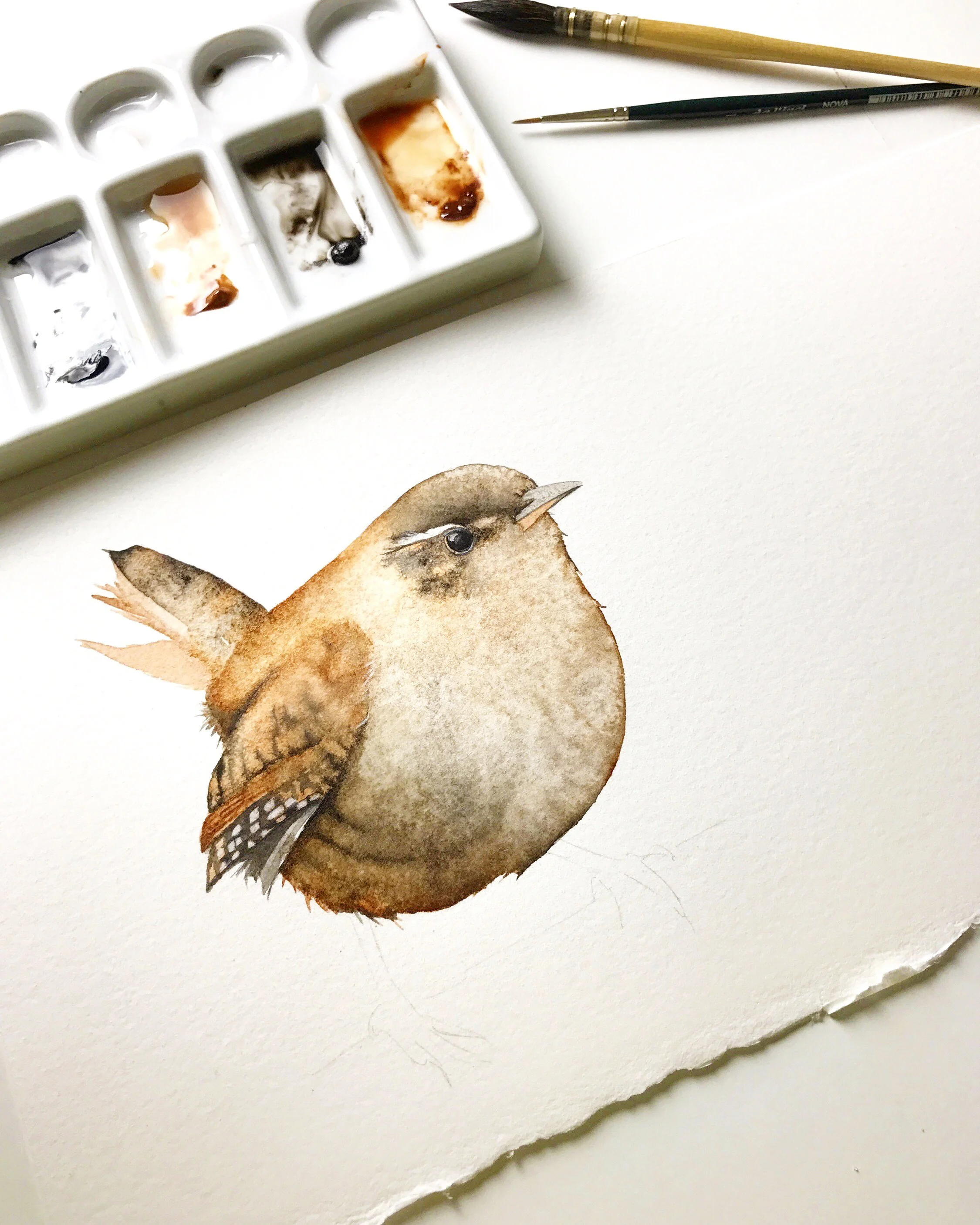
Before I can start painting, I need to sketch or trace the subject I want to paint, and I can do all of this in Procreate. If I have a sketch in my sketchbook that I like, I take a photo of it, then enlarge and refine the drawing in the app. This gives me a clean line drawing that I can trace onto watercolour paper. It saves time and prevents excessive erasing on the watercolour paper, which could damage its fibres.
To create a line drawing, simply import a photo or scan, reduce the opacity, and trace over it on a new layer. Once you’re done, hide the original image and save your clean line art.
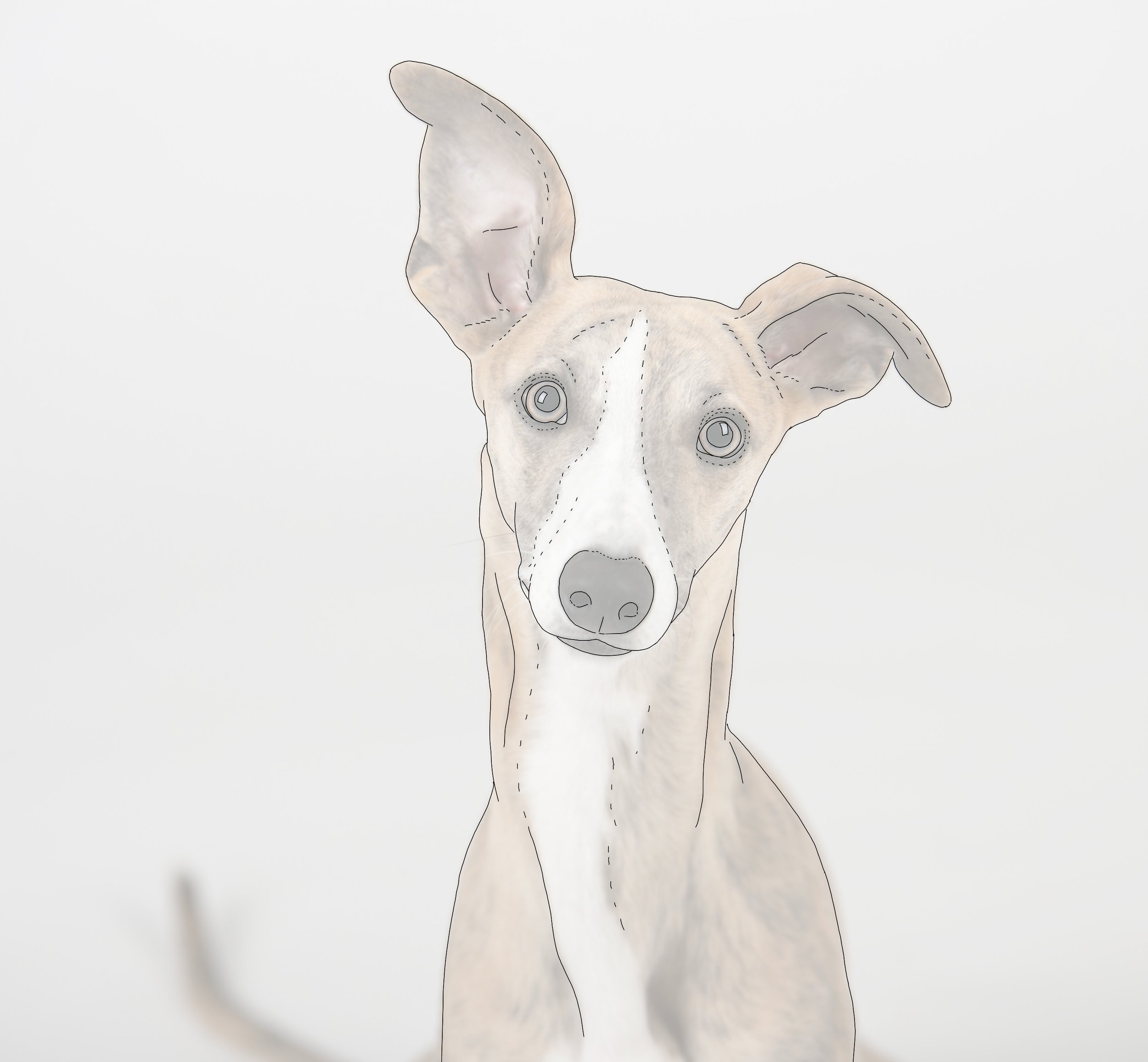
After importing the image, I lower the opacity and create a line drawing from it.
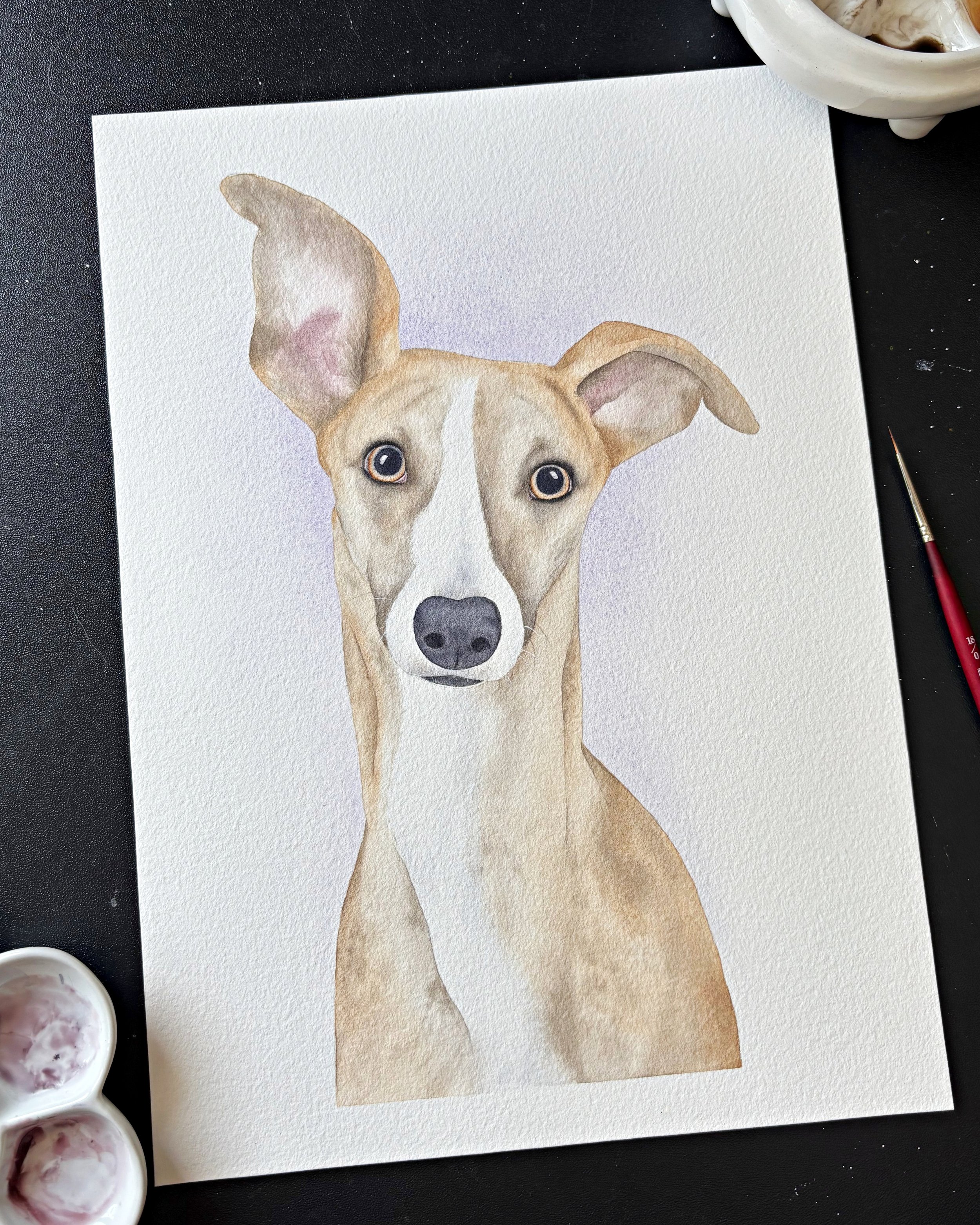
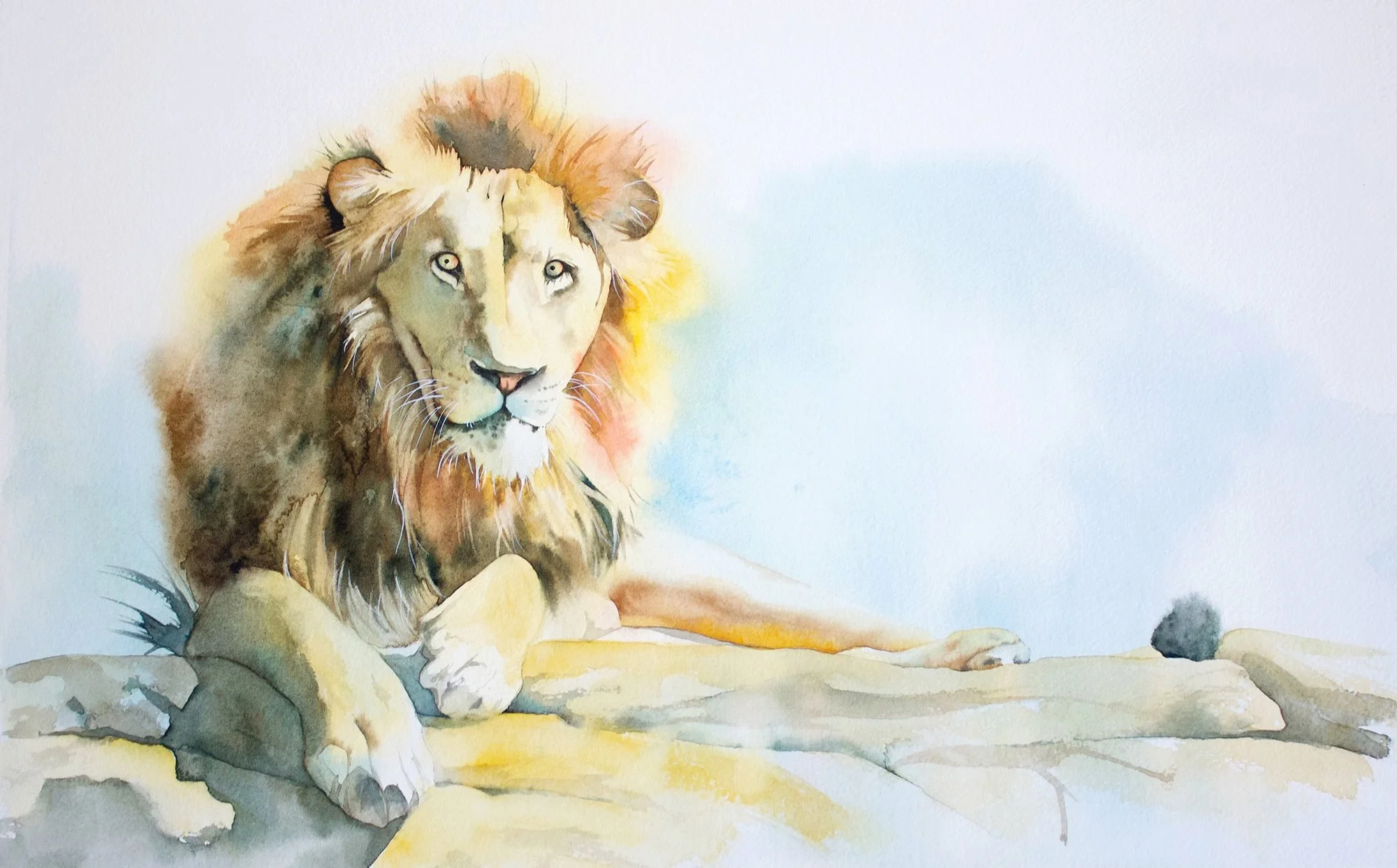
This is the finished painting from my line drawing and reference photo.
Value studies and planning light
Using the app for value studies can be helpful for mapping out shadow areas, placing highlights and details, and establishing a focal point.
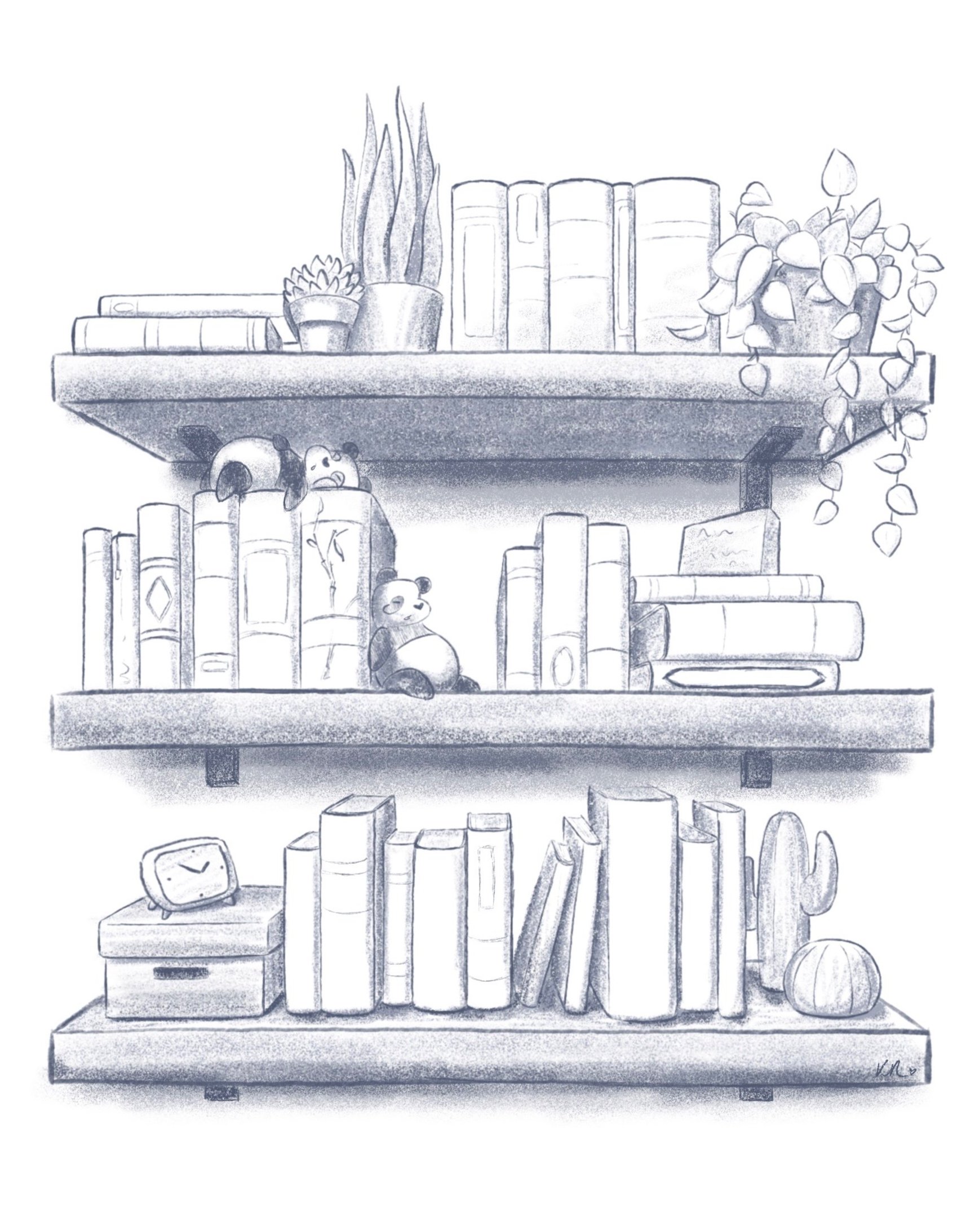
A value study of a bookshelf.
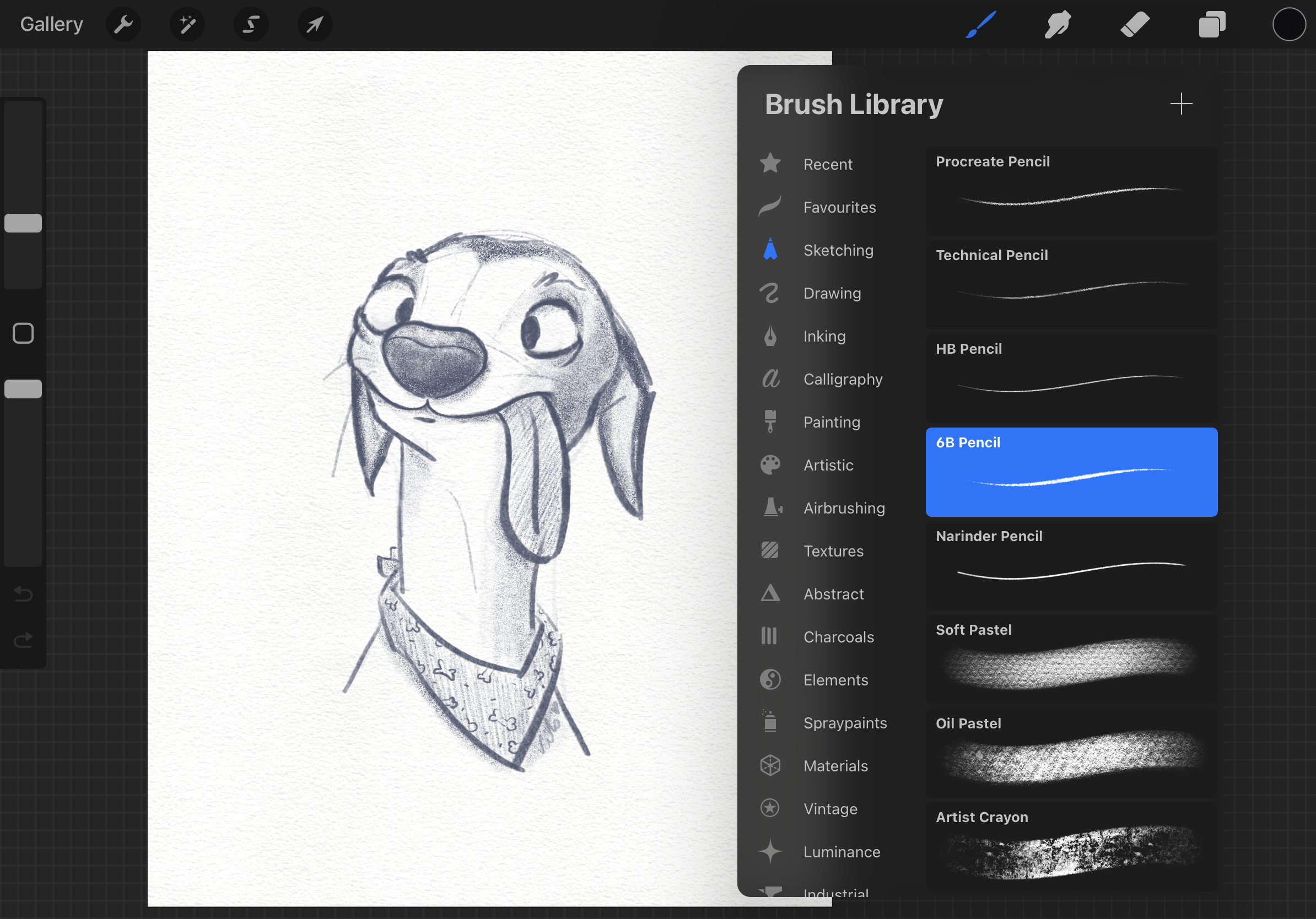
My “Silly Dog” value sketch created in Procreate along with the brush selection I used.

“Silly Dog” sketch completed.
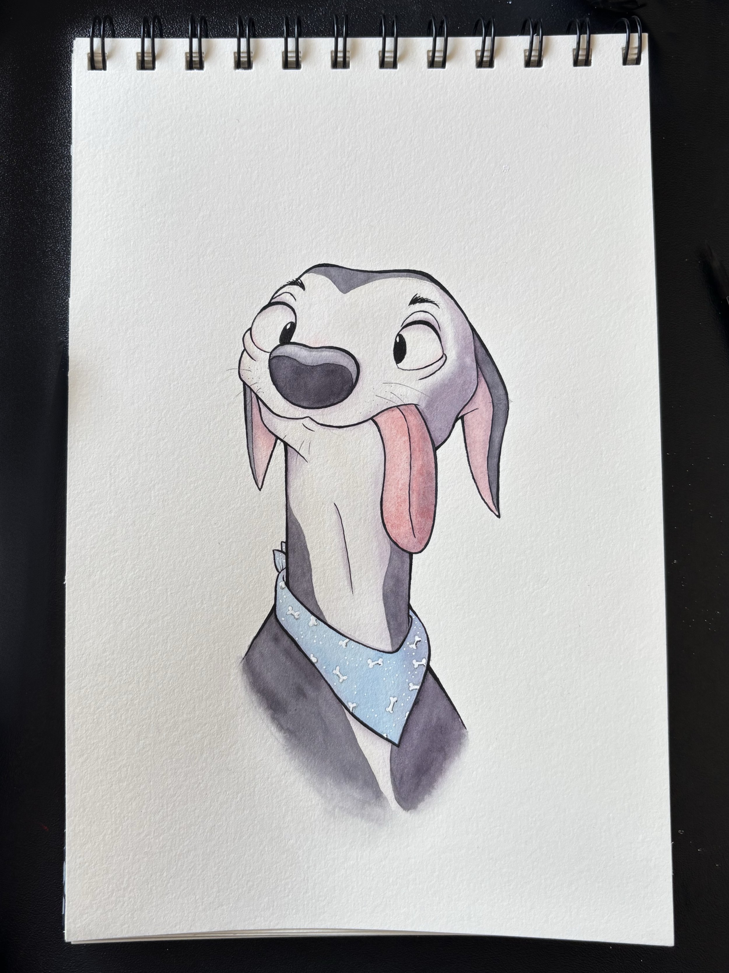
This is the completed watercolour painting of my “Silly Dog”.
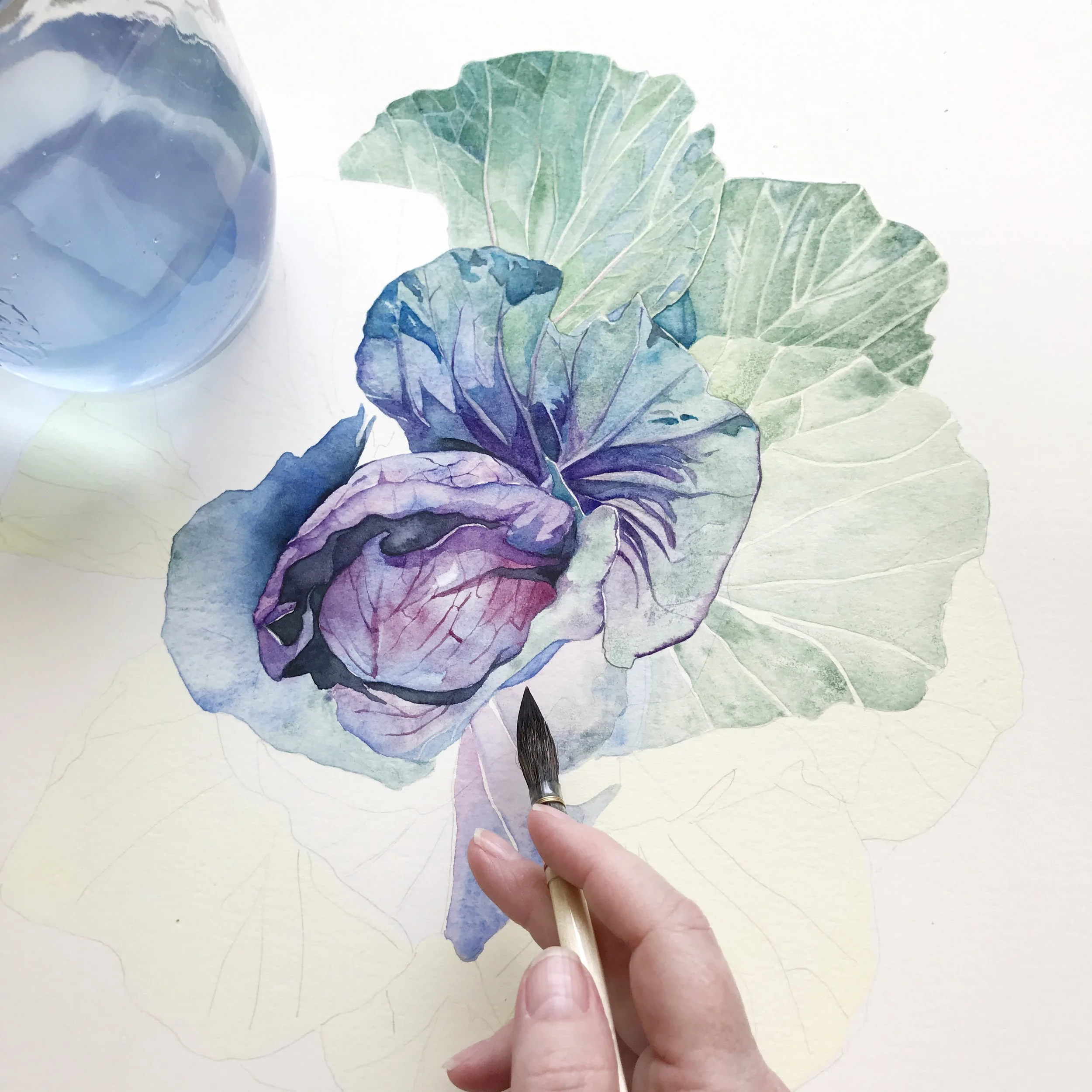
Refining and recolouring
If I’m unsure whether a painting I’m working on needs a background, I take a photo of the painting, import it, and test out different background colours digitally. This removes the pressure of committing too soon and lets me explore multiple options without fear of ‘ruining’ the artwork.
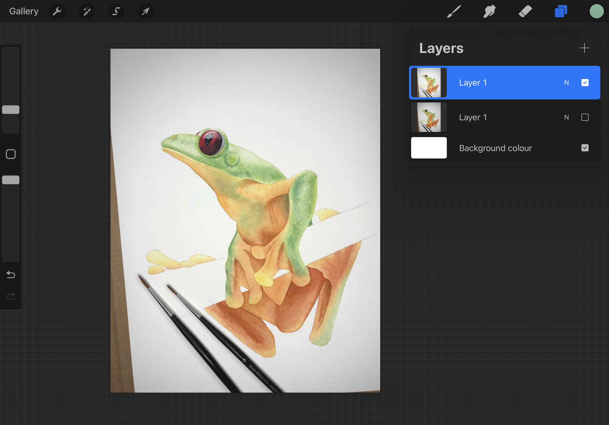
I imported this incomplete frog painting into Procreate to test some colours.
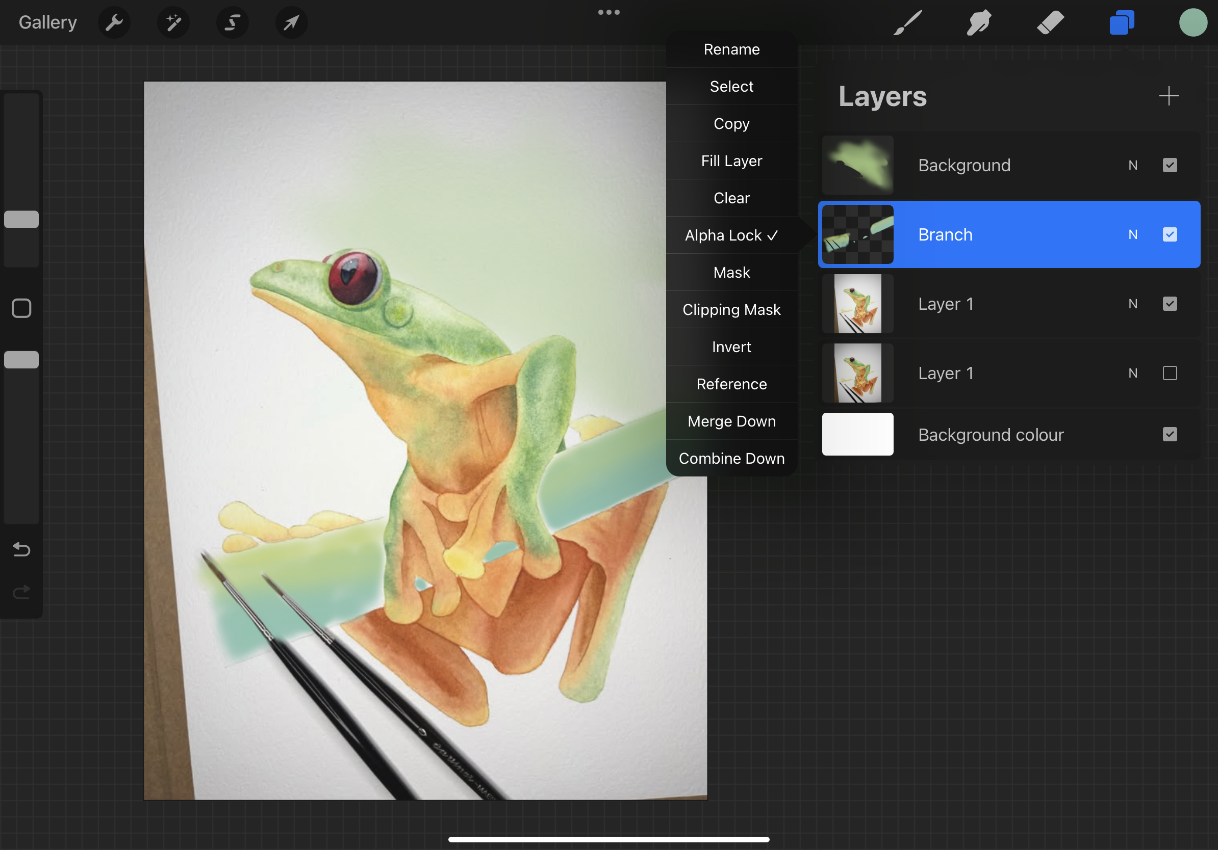
Testing the branch and background colour of this tree frog.

I made the decision to leave out the background but to make the branch green.
When I was going to paint the branch I didn’t know which colour I wanted to make it, so I did some test runs. Ultimately I ended up with a blueish version, when initially the reference image showed an orange one. I tried to test out a background, but eventually decided it didn’t need one, it would be too distracting.
Procreate can also allow you to refine edges, soften hard lines, or erase areas to create lost edges, helping you shape the overall composition. If a colour doesn’t feel right, the Alpha Lock feature lets you recolour specific layers without having to repaint the entire section.
Creating custom colour palettes in Procreate app
One of the app’s other features is the ability to create custom colour palettes.
If you have swatches or mixing charts of your own, consider scanning them for the most accurate results. A photo can distort colours depending on the lighting in your room. Once imported, you can build personalised palettes by colour-picking directly from your reference materials.
I took screenshots from Louise’s website to sample the Schmincke colours she uses in her palette. I also made separate palettes based on her blog post about colour mixes, dividing them into categories like greens, oranges, purples, greys and skin tones.
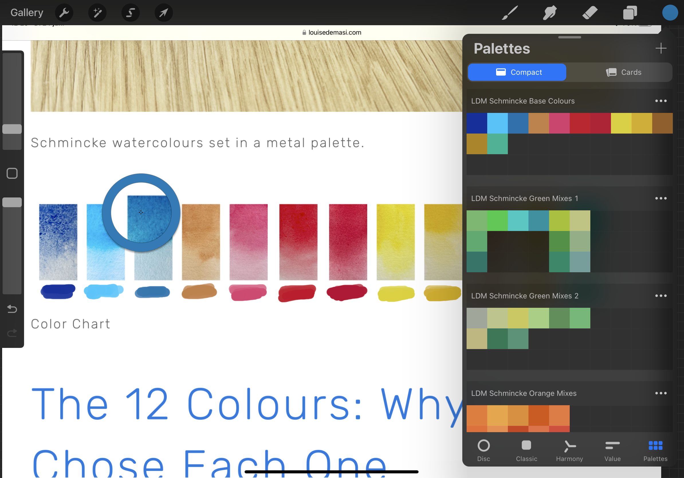
Taking a colour sample from the screenshot of Louise De Masi’s paint set.

Having these palettes ready makes it much easier to test out specific combinations I have in mind. I can apply them digitally to my sketch, adjusting opacity to simulate the effect of water dilution, just like with real watercolours.
You can layer different colours to predict how they will appear when glazed over one another.
Saving materials and testing ideas
One of the biggest advantages of using Procreate for planning is that it saves paper and materials. You can test countless colour combinations and compositions without committing them to paper until you’re sure.
For example, I created a digital illustration of a happy little girl, which I plan to recreate on a larger scale using watercolours. The app can help me decide on colours and compositions before I even touch my paper.

A digital illustration of a “Happy Little Girl”.
For this particular illustration, I wanted orange hair, a green overall, and brown shoes. Using the mix palettes, I experimented until I found the perfect shades.
Once I was happy with the colours, I took notes in the app about the mixes I used, making it easy to reference later when painting traditionally.

Working with limited palettes
There are times when I enjoy using a wide range of colours, like with the “Happy Little Girl”. Other times, I prefer a more unified look with a limited palette. You can create a palette using just two colours and all the hues they can produce when mixed. Scan it, import it into Procreate, and experiment freely.

My imported colour palette of just 2 colours.
Although the colours you see on screen won’t be an exact match to traditional paint (mixing ratios and paper textures will always vary), you still get a fairly accurate impression of how your colour palette will work as a whole. The only thing Procreate can’t simulate is the behaviour of granulating pigments on real paper, but that unpredictability is part of what makes watercolour so special.
From Digital to Traditional
I actually started with Procreate before I picked up a paintbrush – mostly because I didn’t have space for traditional art supplies. But once I realised watercolour doesn’t take up much room either, I gave it a go. There’s something so satisfying about painting on paper, and now I can’t imagine not doing it.
Using Procreate might sound a bit technical at first, but it’s helped me experiment more freely and plan my paintings without the fear of wasting materials. It’s now a key part of my process – a bridge between ideas and finished artwork.
Thanks for reading! I hope this gives you a few ideas to try in your own painting practice – and maybe even opens up a new way to approach your watercolour journey.
Kimberly Rombaut
If you are interested in learning to paint in watercolour, Louise has hundreds of online, voiced over watercolour tutorials for all skill levels.