How to Mix Watercolour Paints: My Top 13 Tips
How can I get better at mixing colours?
Colour mixing is a complex subject that beginners often struggle with, so in this blog post I've got lots of juicy tips to share with you that I've learned over the years.
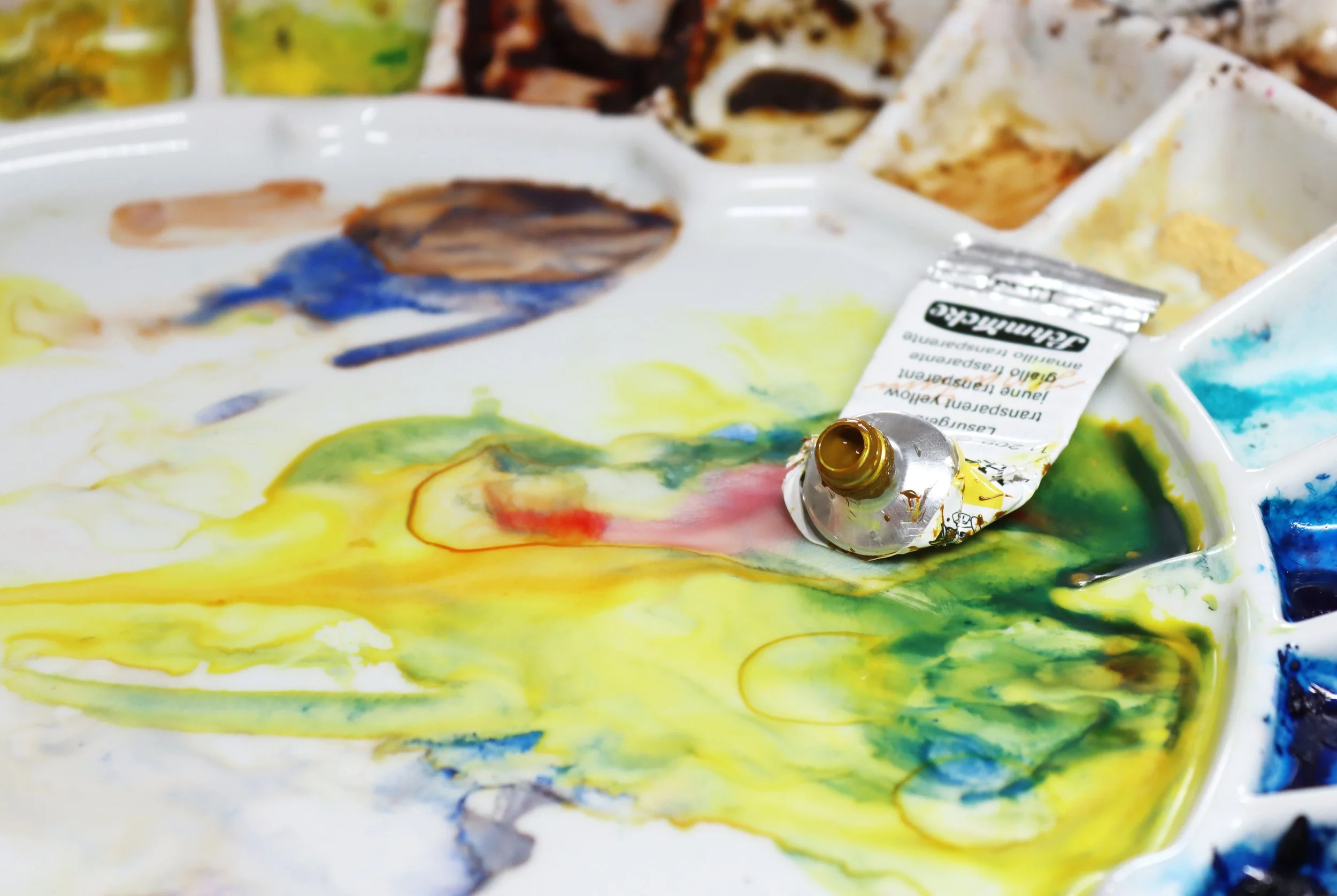
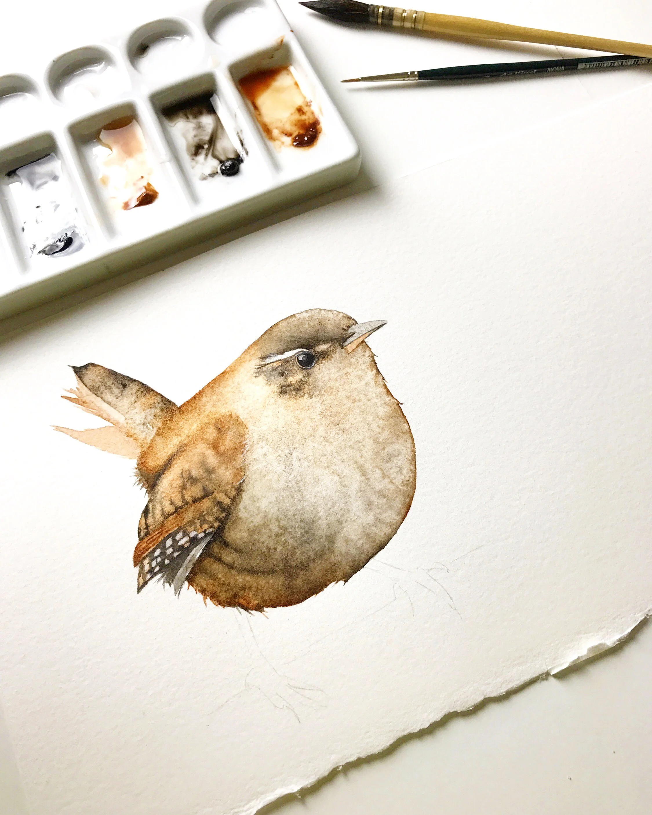
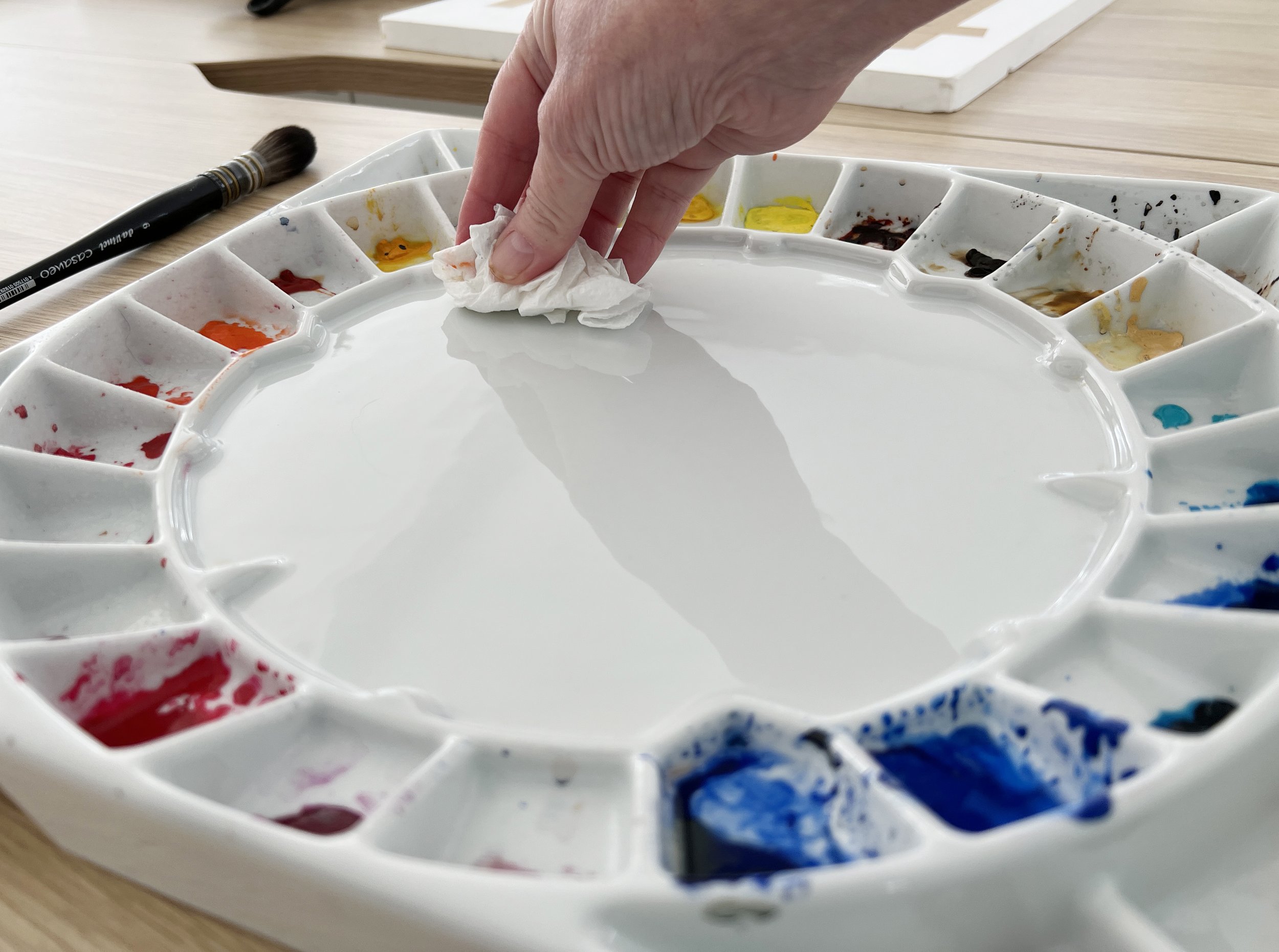
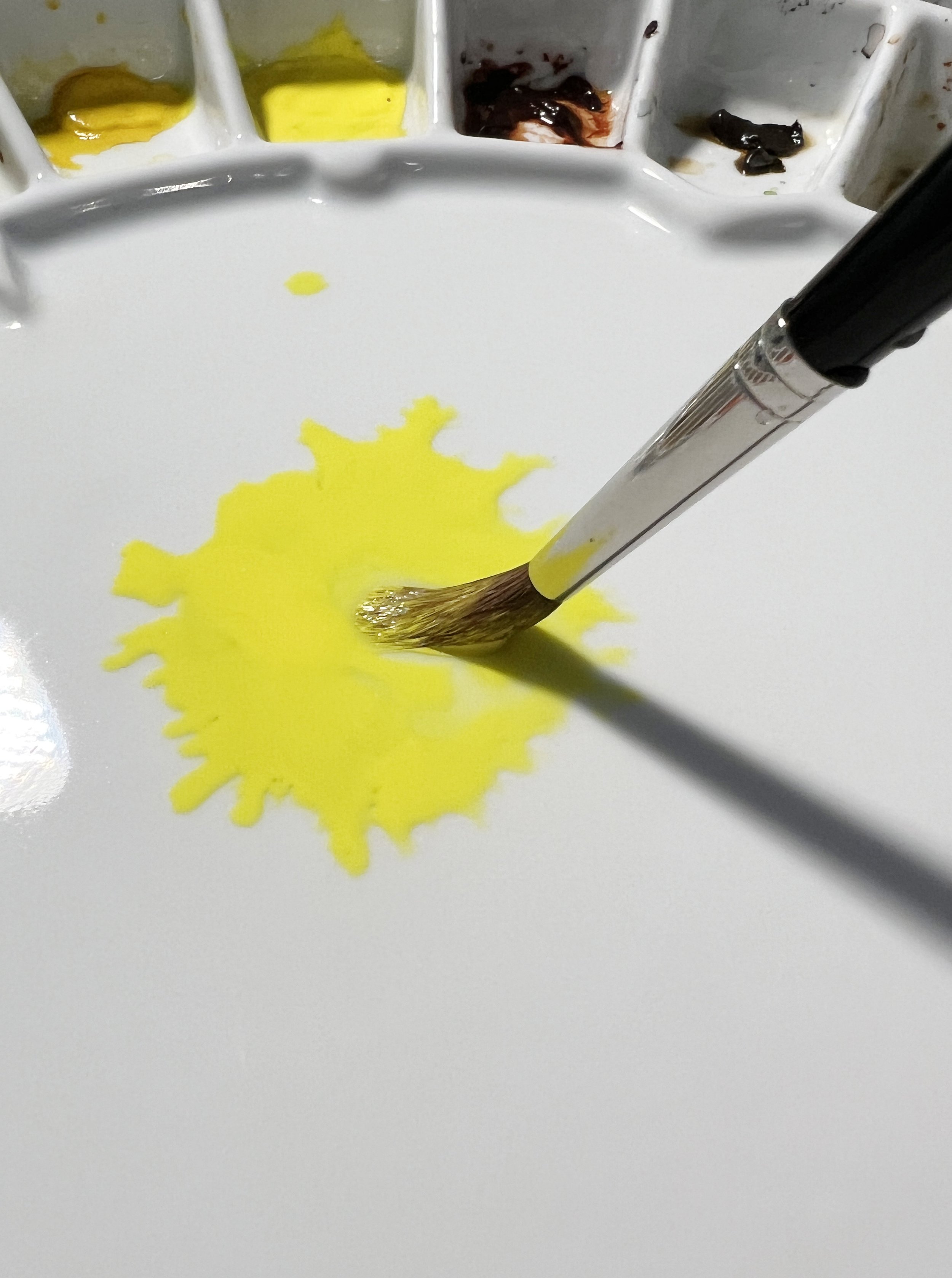
Start your painting with a clean palette.
I always start a new painting with a clean palette. I clean the mixing area of the palette for three reasons. Firstly, it helps me get into the right head space before I start painting. Secondly, I can see the colours I'm trying to mix more clearly and lastly, it reduces the risk of contaminating a new paint mixture with an older paint mixture.
Use two water containers when you paint
I often use two water containers when I’m mixing colours. The first I use to clean my brush between colours when I’m physically mixing the paint and the second to rinse out my brush when I’m painting.
The first container will become quite dirty because there is residue pigment on the brush when I change between colours.
The second container will stay cleaner for longer if I am not continually rinsing off excess pigment.
The hard part is remembering which container I am using for what.
Another thing to remember is to make sure that your brush isn't too wet after you have rinsed the colour out of it. If your brush is really wet when you go back into your paint puddle you will dilute your paint mixture. So give it a quick dab on your cloth before going back into your paint whenever you are mixing colours.

Create a mixing journal or watercolour mixing chart
A mixing journal or a colour mixing chart serves as a valuable tool for documenting your colour mixing experiments and as a reference for recalling specific colour combinations used in the past. You can record essential information such as the names and pigment codes of the colours you used, along with approximate quantities or ratios of each colour mixed. You can also record the properties of each colour such as whether they are granulating, transparent, opaque or staining. Understanding these paint characteristics makes it much easier to predict how colours will behave when mixed together. A journal or chart becomes a dedicated space for experimentation and recording your results. Creating a mixing chart like this is one of the fastest ways to build confidence with colour because it removes a lot of the guesswork from future paintings.
Recently, I bought some new Schmincke paints that I haven't used before. Knowing the importance of mixing greens rather than relying on pre-mixed greens, I decided to explore some of the green hues I could create using the yellow and blue paints I purchased.
Below is a photo of a small section I recorded in my journal. I can use this as a resource when I'm doing future paintings.

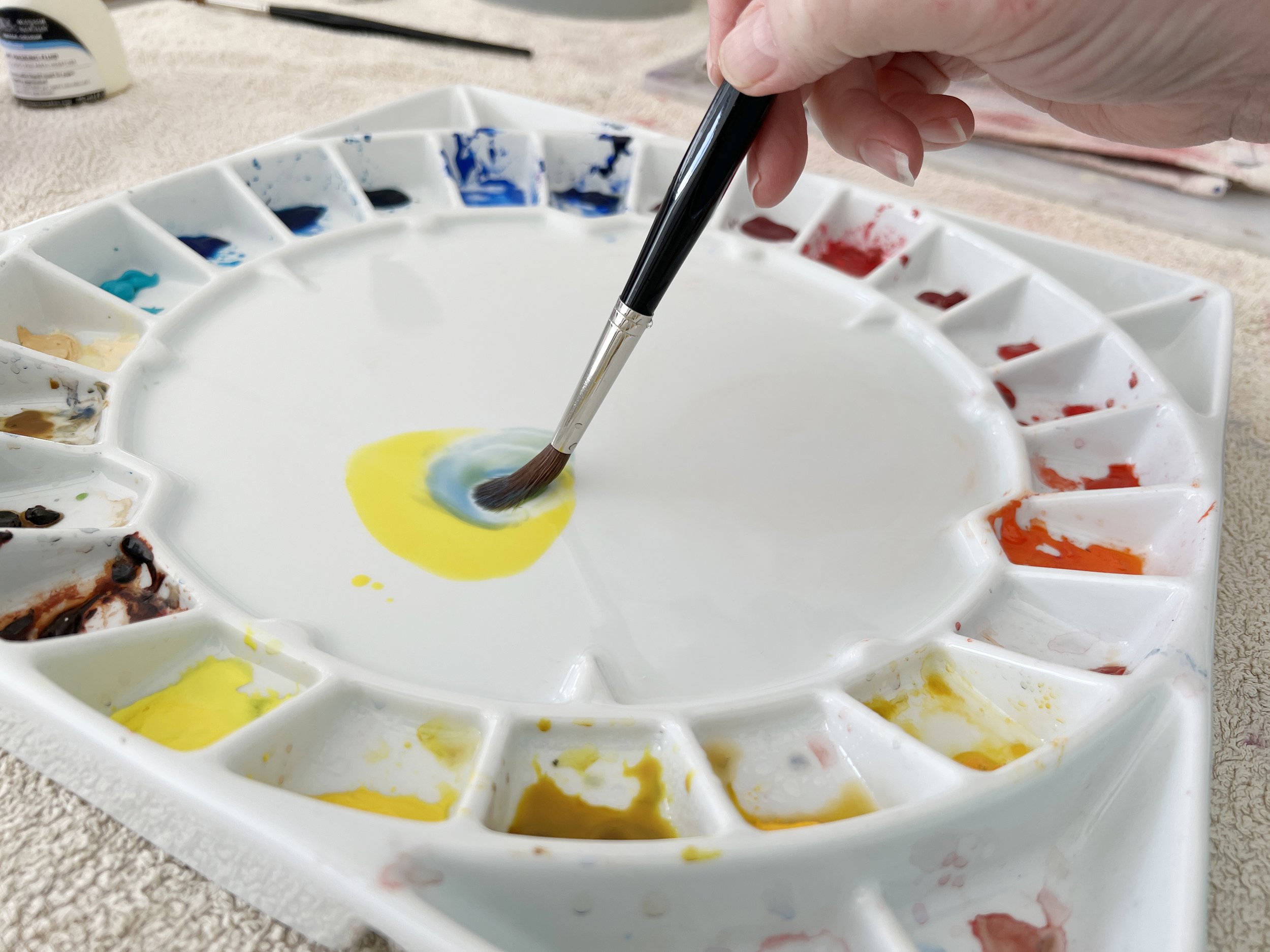
When you mix paints, start with the lighter colour
When you mix colours it’s a good idea to start with the lighter colour or the colour that has the lighter value.
For example, if you want to mix green, it’s best to start with yellow and mix blue into it gradually until you reach your desired colour, rather than the other way around where you start with blue and mix yellow into it. Blue has a darker value than yellow- it is more dominant than yellow.
Doing it this way will reduce paint wastage.
You should be able to use smaller quantities of blue to achieve your colour. If you start with the darker colour (unless you want a really dark green) you might have to put quite a lot of the lighter colour into the mix before you arrive at the colour that you want.
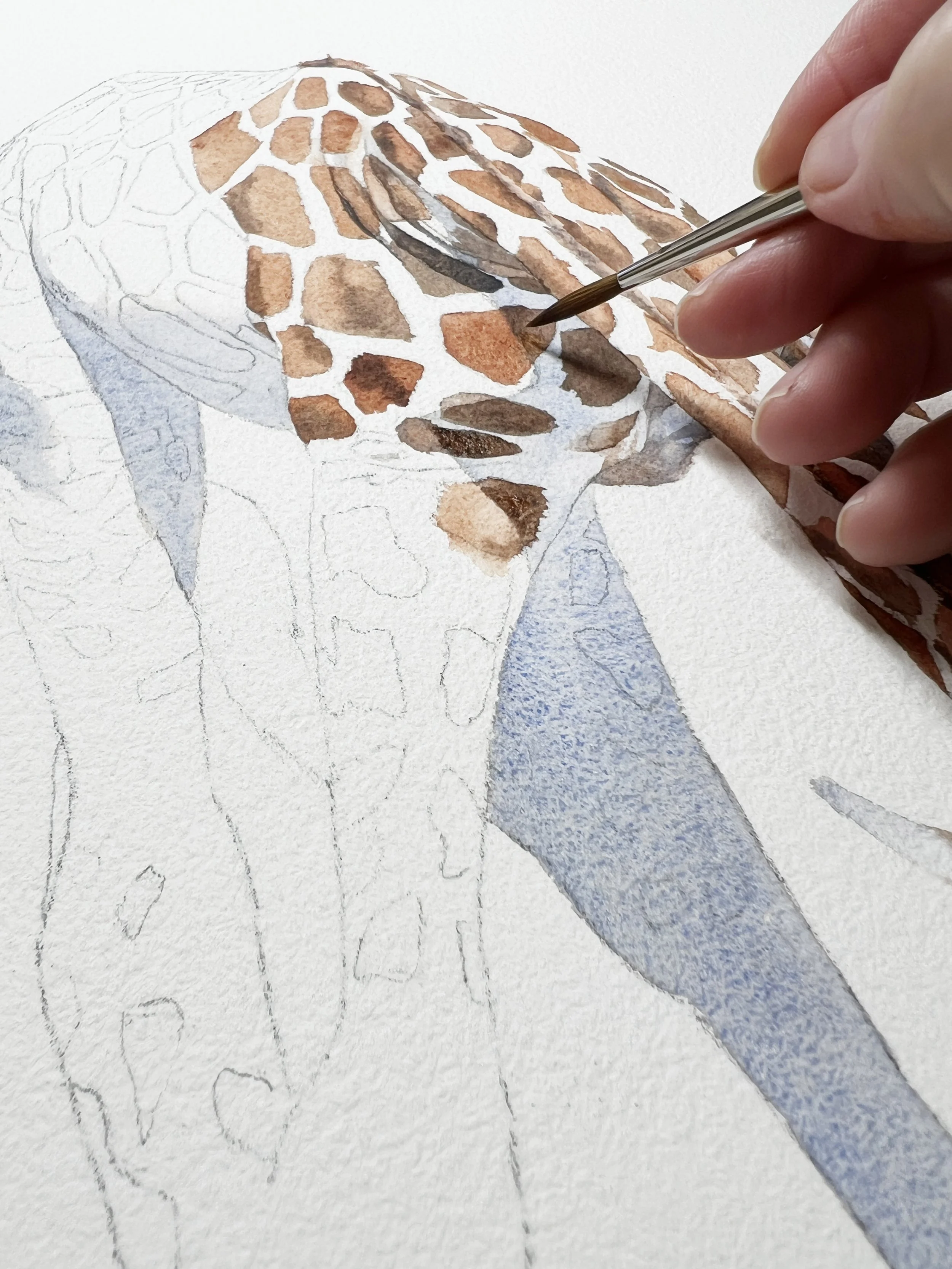
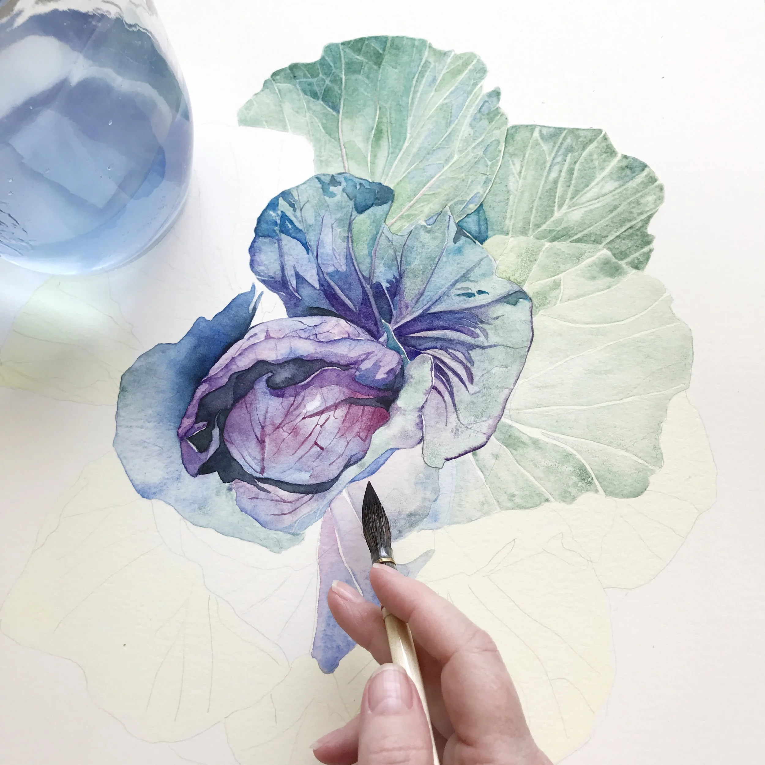
Try mixing colours on your painting rather than on the palette
Allowing colours to mix or mingle directly on watercolour paper can create more vibrant, natural blending than mixing everything on the palette. When the pigments interact on the paper, they form soft transitions and unique colour variations that can enhance your painting.
Watercolour is known for its fluid and spontaneous nature. When you embrace that unpredictability, you can use it to your advantage and create visually engaging areas in your painting. Allowing colours to mingle and dance on the paper by themselves can create some spectacular effects, but learning when to let them move and when to control them is closely tied to understanding how much water is sitting on the surface.


Test your colours on a piece of scrap paper
Some artists test their colour mixes on a piece of scrap watercolour paper that they place beside their paintings as they work on them. That way they can quickly judge if the value of the hue that they have mixed is too light or too dark before they touch their painting.
I don't do this but I think it’s a good idea because sometimes I place the paint on the paper a bit dark and then I have to quickly dip my brush in the water and dilute it 😕.
I was listening to Joseph Zbukvic on a DVD I have and he doesn’t test colours on a scrap piece of paper because he says he needs to see them on the painting surrounded by the other colours before he makes a judgement.
So I’ll leave this one up to you.
Use a limited palette
Using a limited palette involves utilising the fewest possible colours in your artwork. Rather than incorporating a wide range of 10 or 12 colours, you intentionally restrict yourself to just 3 or 4.
Adopting this approach has had a significant impact on my paintings over the past year or two. By selecting a limited palette, I am compelled to pause and plan my artwork before diving in. This practice contributes to a greater sense of harmony in my paintings, as well as making the painting process itself more manageable due to the reduced number of colour choices. As well as that, the likelihood of creating muddy colours diminishes since I am not mixing numerous pigments together.
A limited palette simplifies the colour mixing process. By employing fewer colours in your painting, you become intimately familiar with the unique characteristics of each pigment. You can easily gain knowledge of their temperature and whether they are transparent, staining, or granulating.
I have found that focusing on values becomes more straightforward as well. Value refers to the lightness or darkness of a colour. With a limited palette, you can concentrate more effectively on values since you have fewer colours at your disposal to create contrast.
I have experimented with painting numerous works where I restricted myself to just two or three colours on each piece.

Pigments
Also get to know how many pigments are in the paints that you use. Some paints are made with one pigment while others are made with two or more. It's best to avoid mixing more than three pigments in one colour mixture. When multiple pigments are mixed together, they can create a muddy or dull colour. I have a blog post about pigment codes that you can read.
Begin to learn basic colour theory
Basic colour theory is a set of principles and concepts that explore how colours interact with one another and how they can be combined effectively to create harmonious and pleasing compositions.
Get yourself a colour wheel and use it as a guide. I'll admit I don't use mine often but it might be helpful to you if you know nothing about mixing colours.
Colour theory is a broad subject, but I'll begin with the fundamentals. First, it's important to understand primary and secondary colours, as well as tertiary colours. When it comes to colour mixing, you need a basic grasp of using primary colours to create secondary colours and combining primary colours with secondary colours to produce tertiary colours.
The primary colours are red, yellow and blue. They are the fundamental colours that cannot be created by mixing other colours together. These colours are considered the building blocks for all other colours in the colour spectrum. By combining different proportions of the primary colours, you can create a wide range of secondary and tertiary colours.
Secondary colours are colours you mix from the primary colours: orange, violet (purple) and green.
Mixing colours:
Red and yellow mix to create orange.
Red and blue mix to create violet (purple).
Blue and yellow mix to create green.
Tertiary colours are the six colours that result from mixing primary colours with secondary colours. To make them you mix equal parts of the primary and secondary colours that sit adjacent to one another on the colour wheel.
Red-Orange: Mix red (primary colour) and orange (secondary colour).
Yellow-Orange: Mix yellow (primary colour) and orange (secondary colour).
Yellow-Green: Mix yellow (primary colour) and green (secondary colour).
Blue-Green: Mix blue (primary colour) and green (secondary colour).
Blue-violet: Mix blue (primary colour) and violet (secondary colour).
Red-violet: Mix red (primary colour) and violet (secondary colour).

Understand colour temperatures
We often refer to colours as being either warm or cool. Red and yellow are warm colours while blue, green and violet are cool. If you look at a colour wheel the warm colours are grouped on one side and the cool colours are grouped on the other side. Cool colours tend to recede in a painting while warm colours advance. That's why you'll often see distant mountains and trees painted in violets and blues.
Although yellow is a warm colour, there are warm yellows and cool yellows. There are warm reds and cool reds and there are warm blues and cool blues. It's important to understand what temperature a colour is because the temperature has an impact on the colours you mix. For example, green is a cool colour. The brightest greens result from mixing a cool yellow and a cool blue. If you want a more muted, earthy green you need to add a warm colour to the mix. A warm yellow and a cool blue will mix a more muted green.
I have a video about the importance of understanding the temperature of the colours you mix and I also have a video about how to tell what temperature a colour is.
Use complementary colours to mix gorgeous neutrals

Complementary colours sit opposite one another on the colour wheel: green is the complementary colour of red, violet is the complementary colour of yellow, orange is the complementary colour of blue. They are important because using them together can enhance your paintings.
Complementary colours mixed together create beautiful neutrals. Learning to use complementary colours intentionally can also help create stronger focal points and a more harmonious painting overall. Neutral colours are important because they serve as areas for the eye to rest between the dominant colours of your painting.
I often mix Burnt Sienna and French Ultramarine together to make a beautiful grey. If I want a cool grey I increase the intensity of the French Ultramarine and if I want a warm grey I use more Burnt Sienna in my colour mix. The colours will often seperate on wet paper creating beautiful effects.
When you use two complementary colours on your painting try to let one of the colours dominate to help balance your painting.

Why I use tube paints
When I mix colours I sometimes use freshly squeezed paint, particularly when I want a dark colour. If you use tube paints, when you put watercolour paint on your palette it quickly hardens as it dries. Unlike acrylic and oil paint you can still use watercolour paint after it has dried, you just have to refresh it with water. I usually give my paints a squirt of water about 15 minutes before I start painting to soften them slightly.

Then I can pick them up with the brush and start to mix colours.
If I want to mix a dark colour such as black or a dark brown I’ll squirt out some fresh pigment.
I do that because I can mix it without having a lot of water in my brush - which means I’m not diluting it very much.
When I arrive at the colour I want, I can add a small amount of water to the mixture - just enough so that it flows off my brush but not so much that it weakens the intensity of the colour.
Mix enough paint
When painting something where colour consistency is crucial, it's important to ensure that you have an ample amount of mixed paint before you start. Whether it's a sky, skin colour, or the overall colour of an animal, make sure to mix enough paint so that you don't run out. If you run out and need to mix more, it can be challenging to achieve the exact colour again.
If I need a large quantity of a particular colour, I prefer using small dish palettes instead of the mixing area on my palette.

However, it's worth noting that tonal value is more important than precise colour matching. So don't become too overwhelmed if you need to mix more of a particular colour. If the mixed colour varies slightly from your first mixture, that's ok, as long as it maintains the desired tonal value and contributes to the overall visual interest of the artwork.
Don't over mix colours
When you mix colours together - there’s no need to mix them really well. Just a quick swoosh with the brush is often all that is needed. You’re not mixing cake batter where everything has to be evenly combined. If you don’t over mix and instead let the colours mingle on the paper, your paintings will be much more visually interesting. Watercolour is meant to be spontaneous, fresh and fluid so let it - let it do its thing and don’t try to control it all the time.
How to mix colours: The process in steps
1. Give the paints on your palette a squirt of water about 15 minutes before you want to start painting so that they will soften. Alternatively, squirt out some fresh paint.

2. If you are mixing a light pigment with a darker pigment, for example, yellow and blue, it might be best to start with the yellow.
4. Rinse your brush and wipe it on a towel and then load it in some blue. Place the blue on the palette next to the yellow.

3. Load a wet brush in yellow pigment and place it on your palette. Unless you want a really dark colour, it is best to start with the light colour because you probably won't need a lot of the dark colour to arrive at your desired colour. You can add small amounts of the dark colour into the light colour.

5. To mix colours, gently pull the blue into the yellow and give it a quick swirl with the brush. Remember you're not mixing a cake. Then add a small amount of water until you reach the desired value.
Value
The value of a colour is simply its pigment concentration or how dark or light it is.
When you paint with watercolour if you want to make a colour lighter in value you don't mix white into it. Instead, you mix some more water into the paint. If you want a colour that is darker in value you use more pigment and less water.
When you add water to a paint mixture do it sparingly because you can always add more water but if you put too much into your mixture you will dilute the colour too much and you'll have to start over.
So a good rule of thumb is to mix the hue first (that's the colour) and then adjust the value (the darkness) with water.
I hope this was helpful to you. Remember to experiment as much as you can with mixing colours. With experience, colour mixing will become intuitive.
If you are interested in learning to paint in watercolour, I have over 170 online, voiced over watercolour tutorials for all skill levels.
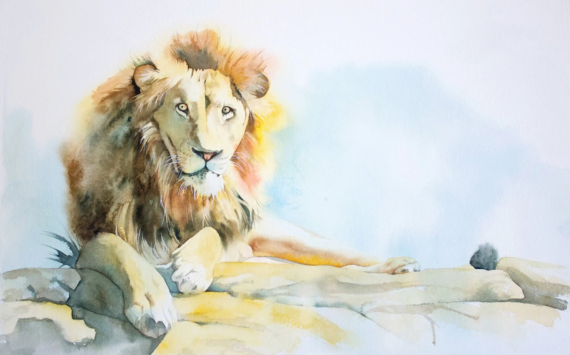
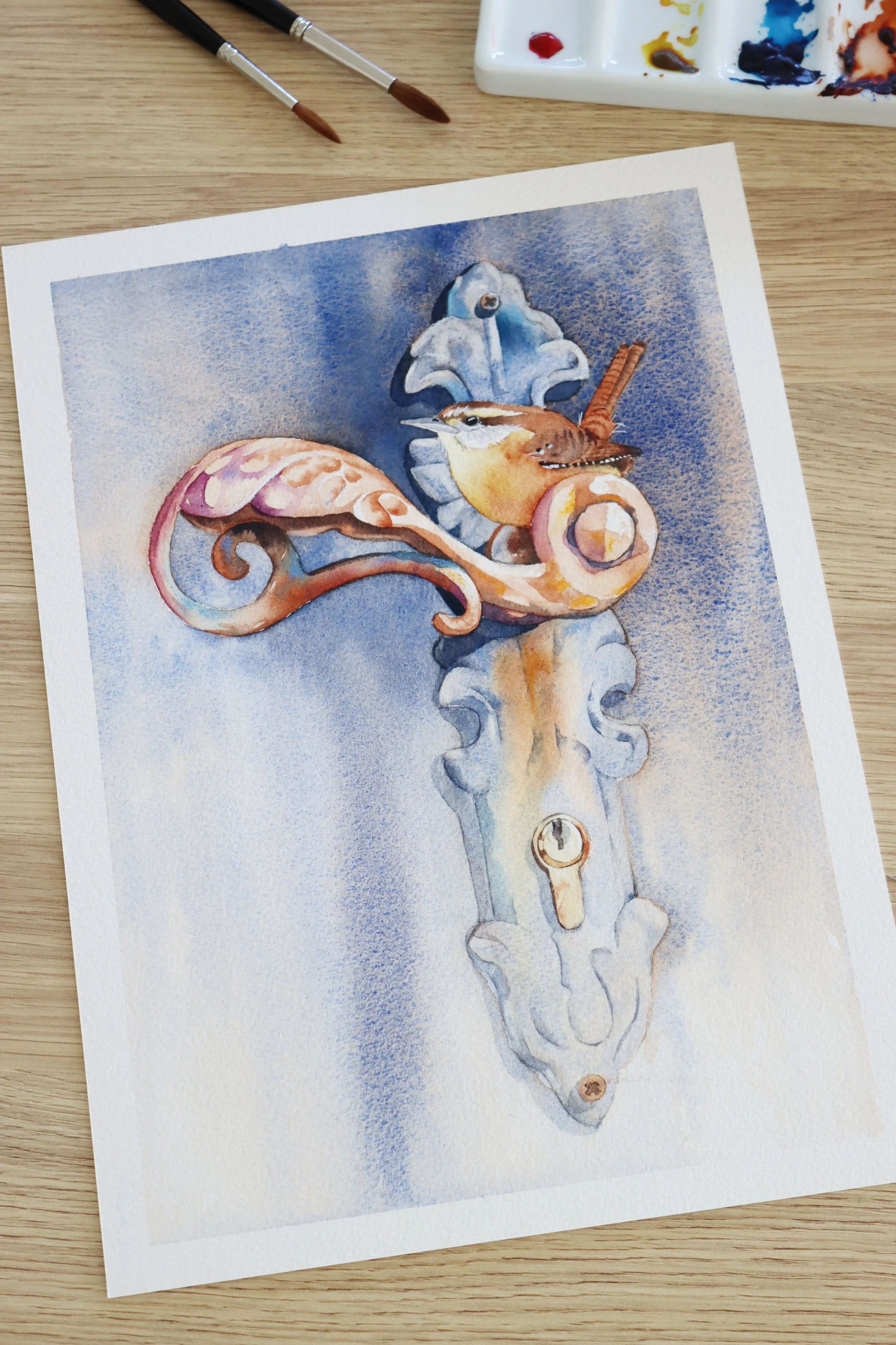
Originals and prints are available to purchase as a print in the shop.
Further reading: 9 Watercolour Texture Techniques
Disclosure: This post contains affiliate links, which means I may earn a commission if you make a purchase through my links at no extra cost to you.