Posts tagged Techniques
How Do You Choose Colours for a Watercolour Painting?

Sometimes when you're looking at a reference photo, it can be hard to figure out exactly what colour you're seeing. Is that shadow a grey? A purple? A cool green?

When I’m unsure, I open the image in Photoshop and use the eyedropper tool to grab the colour I’m trying to identify. Then I paste it onto a blank canvas so I can see it on its own, without being influenced by the surrounding colours. It really helps to isolate the colour and understand what’s actually there.

This is especially handy if you’re trying to figure out subtle tones in a shadow, fur, or petal - areas where the colours can be more complex than they first appear.

Read More
What Makes a Good Reference Photo for Watercolour Painting?

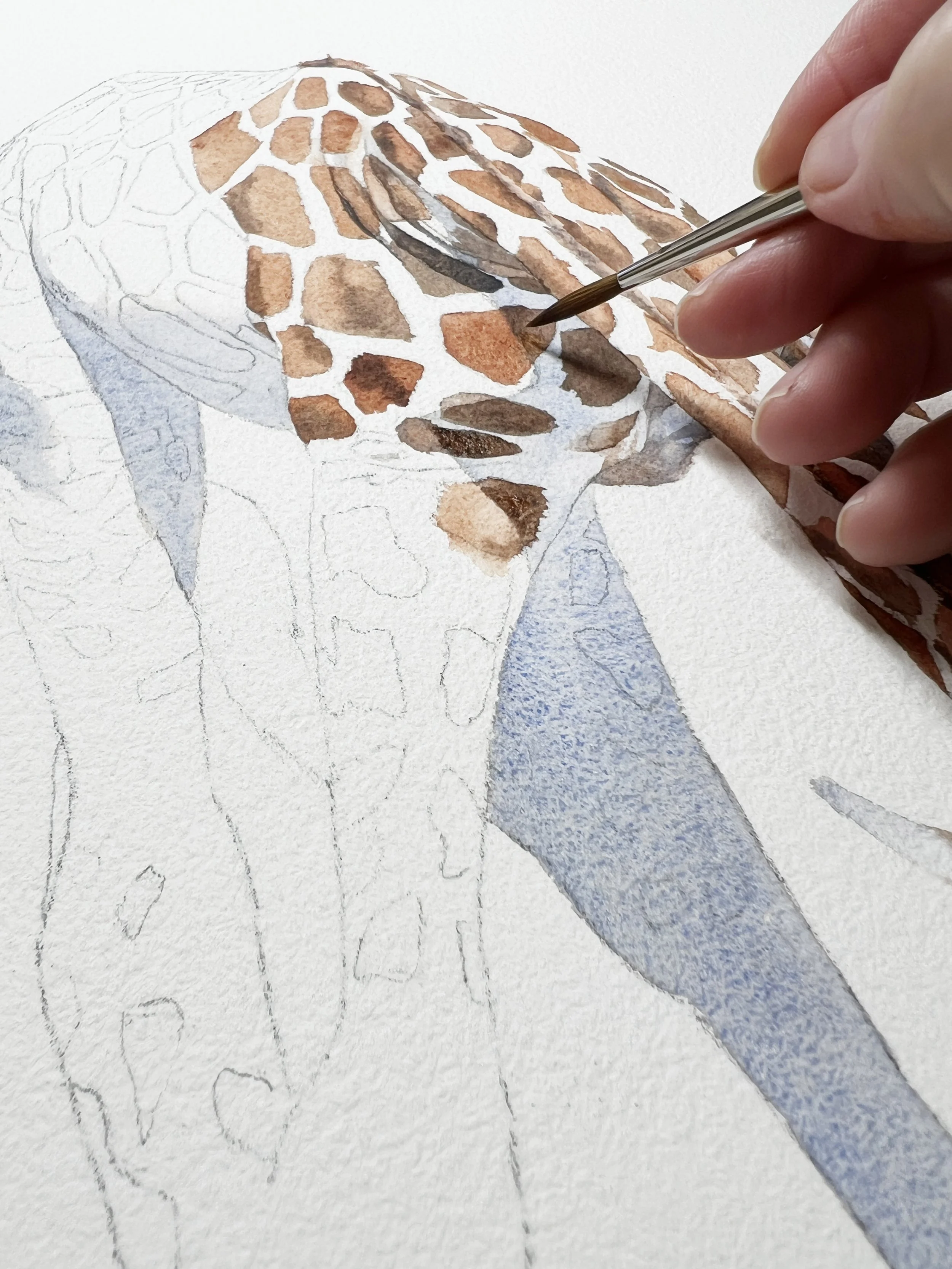
A strong painting needs a focal point - something that draws the viewer’s eye and gives the composition a sense of purpose. So when you’re choosing a photo, ask yourself: What is the star of the show?

It might be the eye of an animal, the curve of a petal, or the way the light hits a glass bottle, that fills you with inspiration. But there has to be something that grabs you. If a photo is too evenly detailed across the whole image, it can be difficult to know what to focus on in your painting.

Personally, I often find myself drawn to reference photos that have a bit of drama - a close-up angle, an expressive pose, or a little sparkle of light that adds interest. Once I’ve identified that focal point, I build the rest of the surrounding composition, supporting it rather than competing with it.

Read More
Watercolour Edges: Taming the Wobbly and Avoiding the Ugly

A big part of how your edges behave comes down to one simple but powerful thing: your water-to-paint ratio. If your brush is loaded with too much water, the pigment will pool and drift unpredictably. If it’s too dry, you’ll get scratchy, uneven marks.

The sweet spot lies in understanding the relationship between water and pigment - how they dance together on the page.

Read More
How to Paint Florals in Watercolour

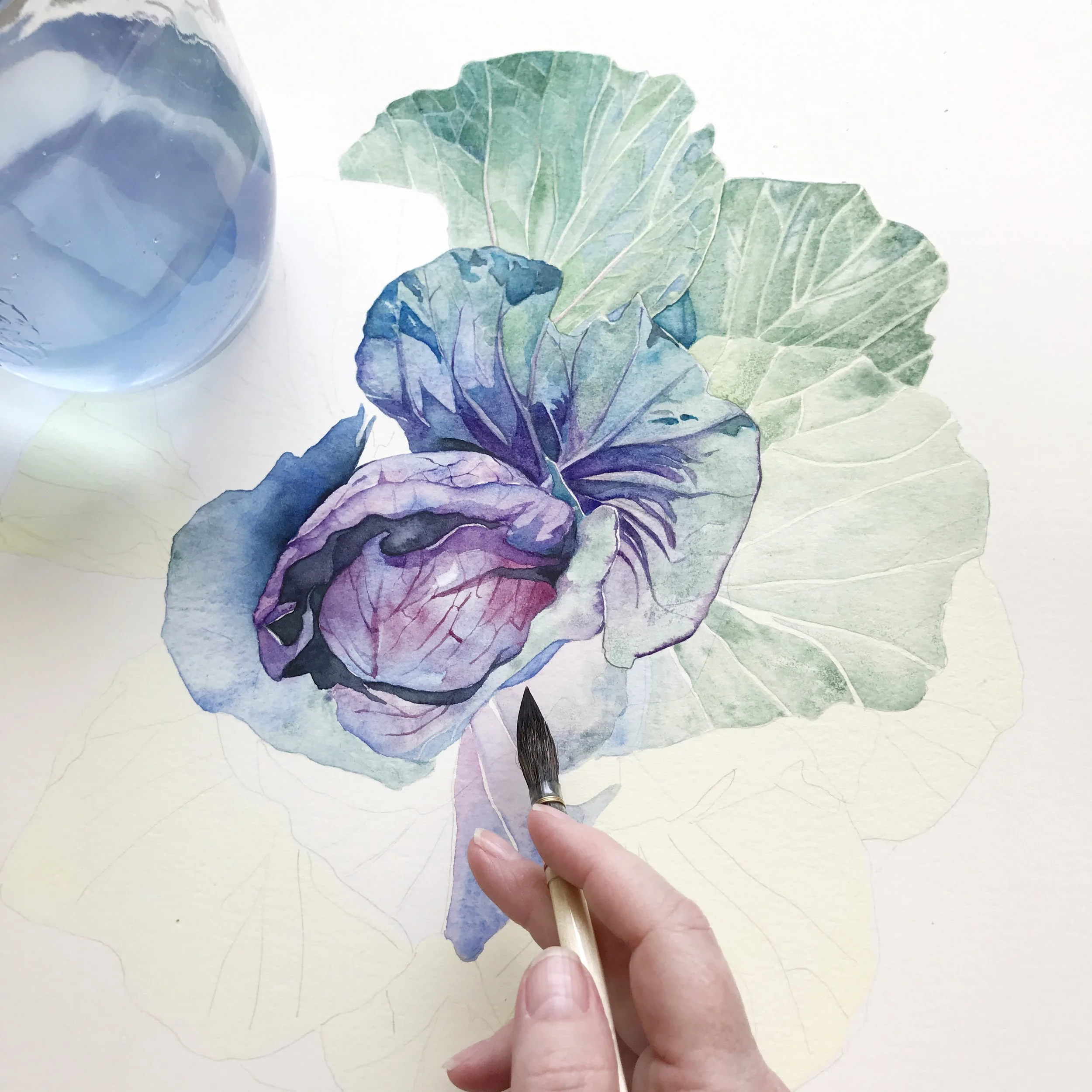
I always begin my floral paintings with a wet-on-wet technique for the initial wash, embracing the unpredictability and softness it brings. This stage is about capturing the ephemeral qualities of petals- their delicacy and the gentle interplay of light and shadow. I wet the paper first, allowing the paint to flow freely, blending seamlessly into the damp surface. Sometimes, I paint each petal individually, while other times I apply a wash over the entire flower at once. It depends on the flower and the level of colour or value variation within each petal.

Read More
Fixative for Watercolour

Sealing a watercolour painting can be an excellent way to protect it from environmental factors, especially if you plan to display it without glass. When a painting isn’t framed behind glass, it is more vulnerable to moisture, smudging, and dirt.

Applying a protective sealer or workable fixative creates a barrier over the surface, adding extra durability to your artwork. For those who like to give their pieces a modern, glass-free look, sealing is essential.

Read More
Mastering Green: Mixing Greens in Watercolour

Now that we’ve covered the basics, let’s roll up our sleeves and dive into the fun part - actually mixing those greens!

This is where the magic happens, and I promise, it’s not as daunting as it might seem. Whether you're aiming for a fresh spring green or a deep forest shade, the right colour combinations can make all the difference.

So, grab your paint palette, and let’s experiment with some tried-and-true mixes that will give you just the right colour green for any painting.

Read More
Mastering Watercolour Greens: Mixing vs. PreMixed Pigments for Stunning Results

Understanding temperature bias is crucial when mixing greens. Colours can have either a warm or cool bias, which affects the overall temperature of the green you create. Generally, because green is considered a cool colour, mixing a cool blue with a cool yellow will produce a bright and vibrant green. In contrast, mixing a warm blue with a warm yellow will result in a more subdued and dull green.

If you're unsure about the temperature of your colours, check out my blog post that explains how to determine their temperature.

Read More
25 Unique Watercolour Painting Techniques

The wet-on-wet technique is all about letting go and embracing the unpredictability of watercolour. Start by thoroughly wetting your paper with clean water. Next, load your brush with pigment and apply it to the wet surface. Watch as the colours blend and flow into each other on the wet paper, creating soft, organic transitions.

This technique is perfect for painting dreamy skies, misty landscapes, and soft backgrounds where you want the colors to meld seamlessly. It's like watching magic unfold on your paper, as the water guides the paint in beautiful, unexpected ways.

Read More
Watercolour Painting Steps

Many beginners fall into the trap of overthinking their paintings. Instead of letting go of the outcome and allowing themselves to be creative and have fun, they become tense and try to analyse every detail. This overuse of the left analytical brain can stifle creativity, overshadowing the intuitive and spontaneous process that is essential in watercolour painting. Finding a balance between analytical thinking and creative expression is key to enjoying the artistic journey and achieving satisfying results.

Read More
Exploring Daniel Smith Watercolour: Rose of Ultramarine: A Watercolour Gem

In the world of watercolour painting, the choice of pigments can significantly impact the final artwork. Daniel Smith paints, known for their Extra Fine Watercolours and Watercolour & Gouache products, offer a wide range of high-quality pigments. One of my old favourites is Daniel Smith’s Rose of Ultramarine, a unique blend that has brought my rose painting to life. In this post, I’ll share insights about this exquisite colour, its composition, and why it can be advantageous for artists to use premixed colours like this one.

Read More
Exploring Watercolour on Aqua Board

Aquabord is a unique painting surface created by Ampersand Art Supply, designed specifically for watercolour and other water-based media. Aquabord is available in various options, including flat panels and cradle profiles. The texture of Aquabord is similar to cold-pressed watercolour paper, allowing colours to retain their purity and vibrancy. Unlike traditional watercolour paper, Aquabord is made from a rigid, absorbent clay surface that is applied to a hardboard panel.

Read More
How to Create or Avoid Watercolour Blooms

When your paint no longer offers the sheen of freshness, it's time to step back and let the canvas breathe. Embrace this moment of stillness, allowing the paint to dry completely before introducing more pigment. This necessitates a swifter approach to your strokes - often a leap for watercolour beginners, who tend to meticulously shape their washes, giving time for the edges to start setting.

Read More
How to Improve Your Art Skills

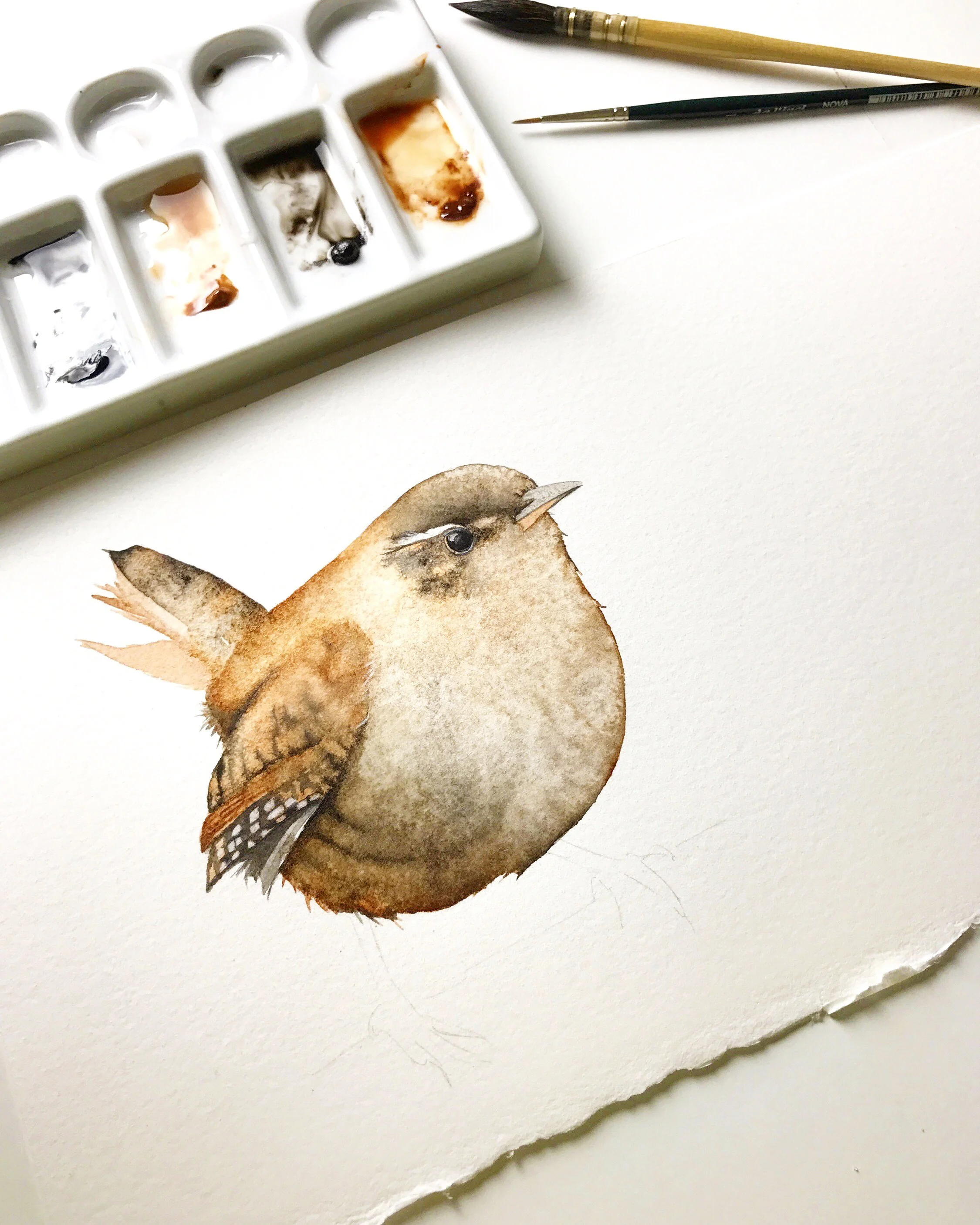
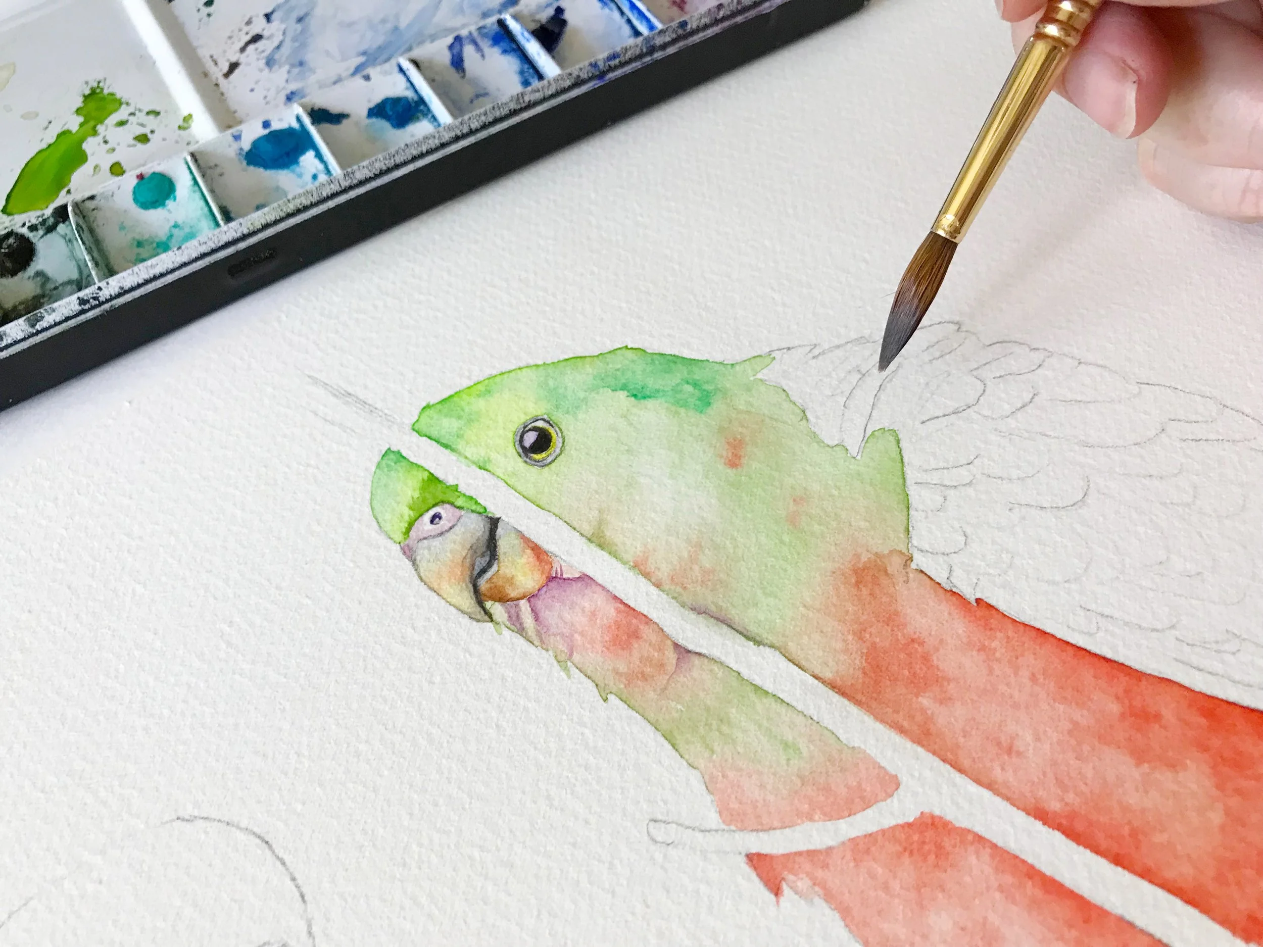
I love painting birds, and it's a lot of fun for me, but it wasn't working at the beginning. Even though I worked off reference photos, I needed a better understanding of what I wanted to achieve. The first painting did not turn out as planned, prompting me to start over, not once but multiple times. I had to develop new ideas and spend time practicing creating a beautiful artwork.

Read More
How to Paint Hard and Soft Edges in Watercolour

There are two effective methods to achieve soft edges in watercolour painting. The first is the wet-on-wet technique, where you are applying paint to wet paper. This method allows the paint to spread across the moist surface, naturally creating a soft edge as it disperses. You can apply this technique to paper that's visibly wet and shiny or to paper that's merely damp, after the initial sheen has faded.

Read More
Watercolour Transparency and Opacity

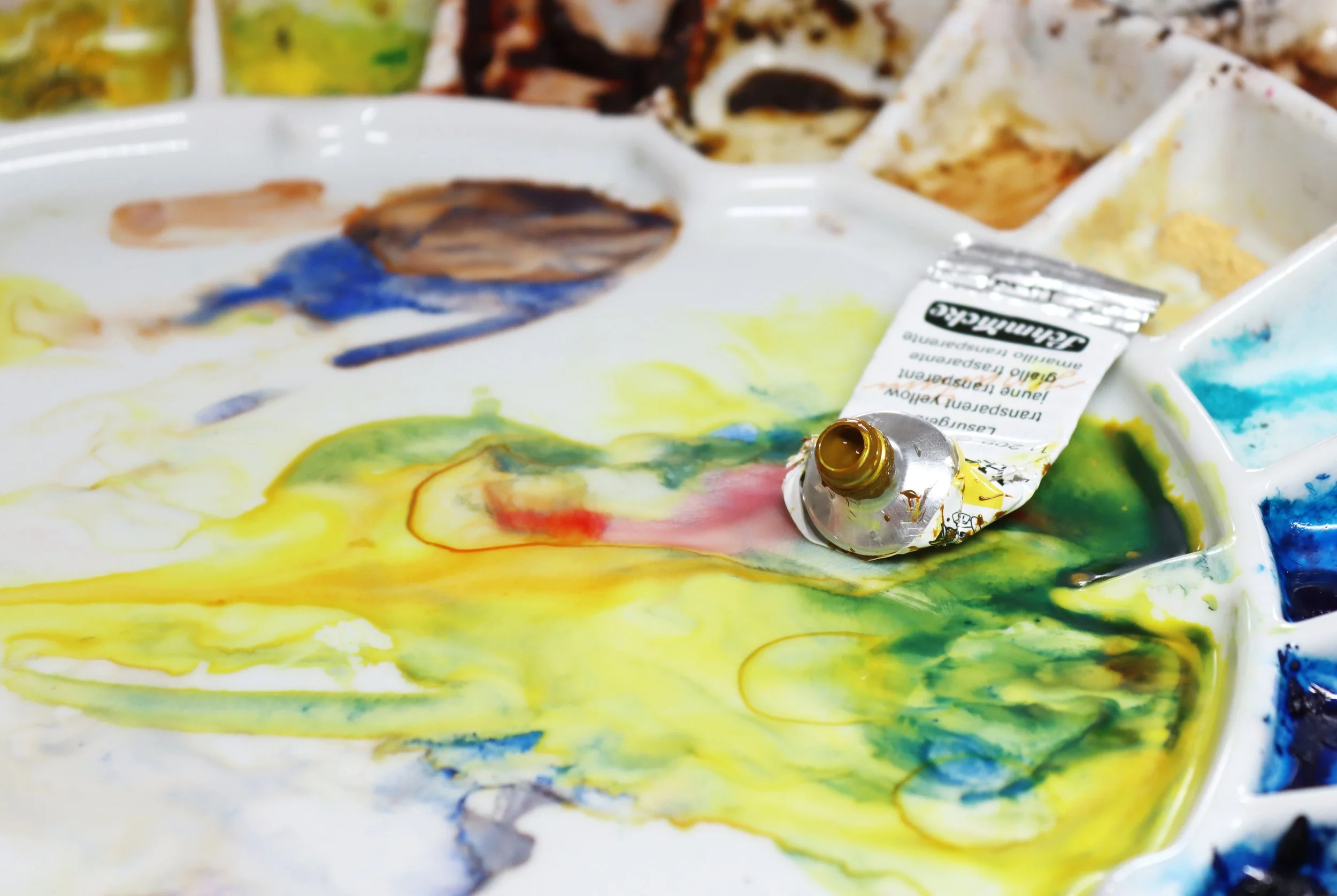
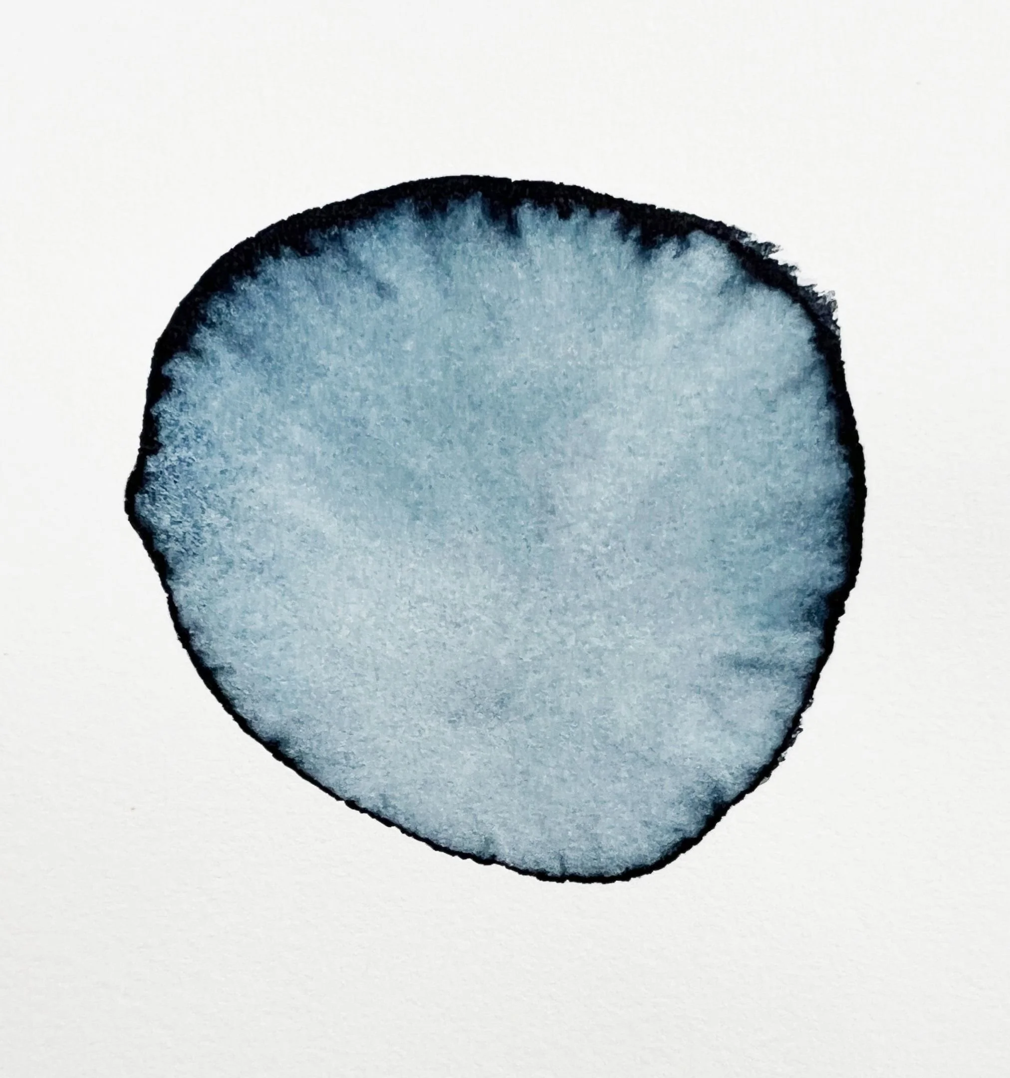
One thing most watercolour artists try to avoid is making mud when they mix colours.

Muddy colours appear lifeless or lacking in vibrancy. To avoid making dull colours it's best to use transparent colours when you mix paint.

Opaque pigments, because they are heavier and denser, tend to become dull and lifeless when you mix with them, particularly when you mix two or more opaque pigments together. If you need to mix with an opaque pigment - pair it with a transparent pigment to avoid a thick and heavy mixture.

Read More