How to Create a Watercolour Mixing Chart
There’s something wonderfully meditative about making a colour mixing chart. The slow rhythm of dipping the brush, adding a touch more pigment, watching two colours swirl together on the palette, it’s like taking a quiet walk through your paints. Every square you fill becomes a tiny discovery, a map of possibilities waiting to happen in your paintings.

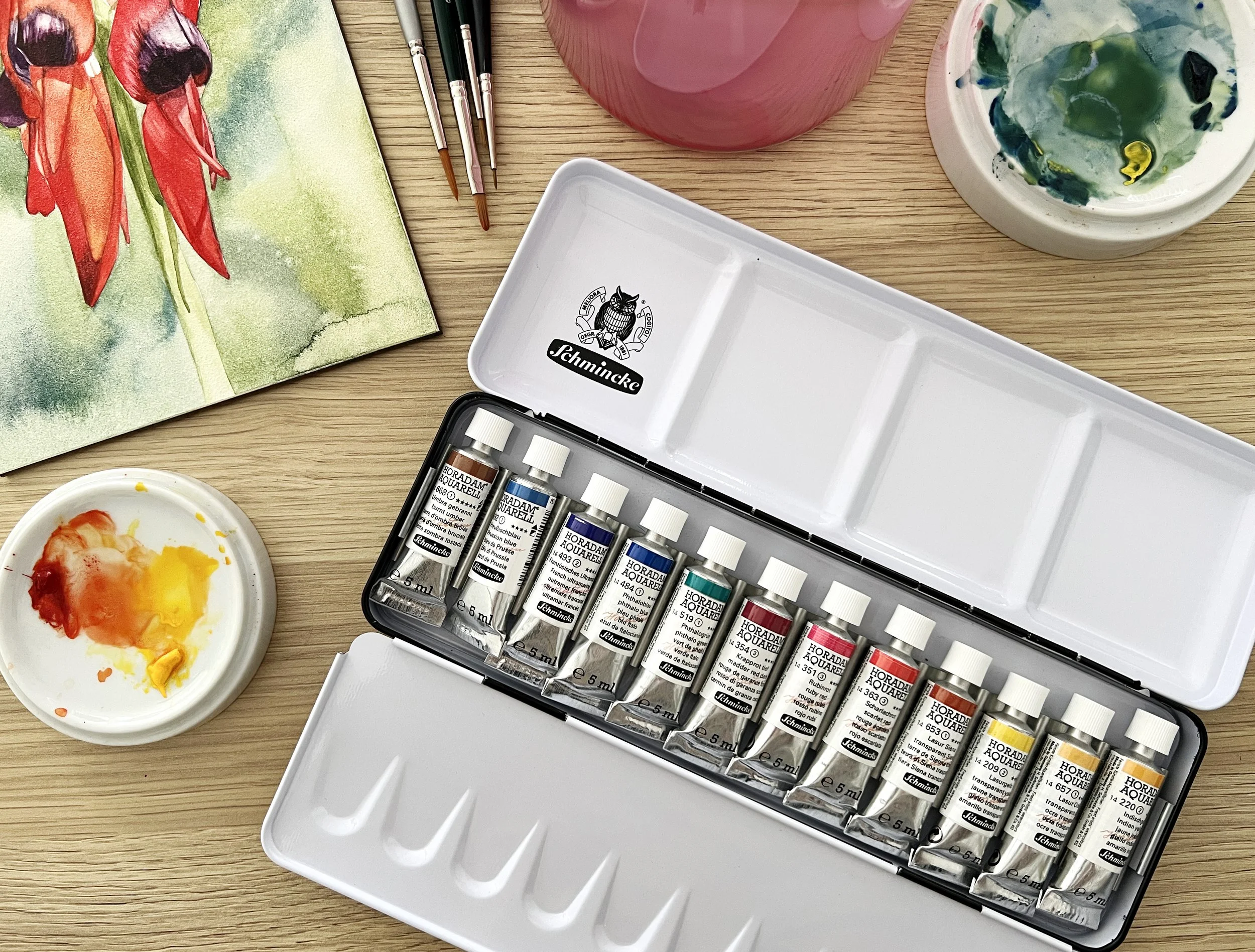
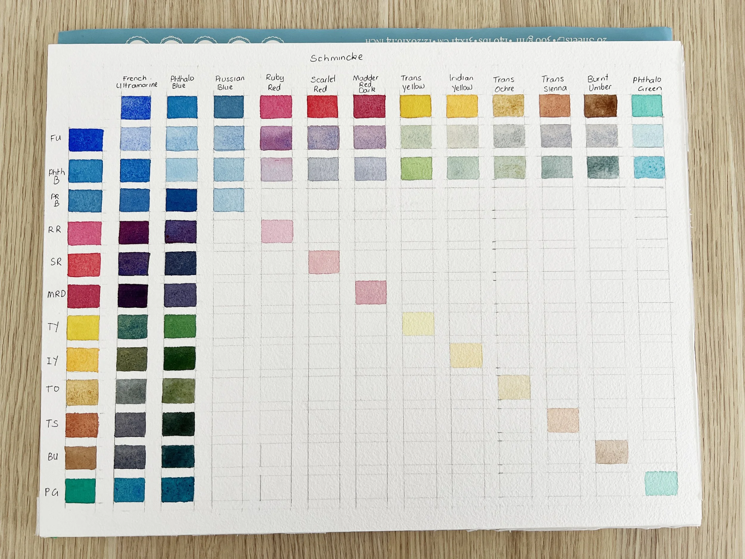
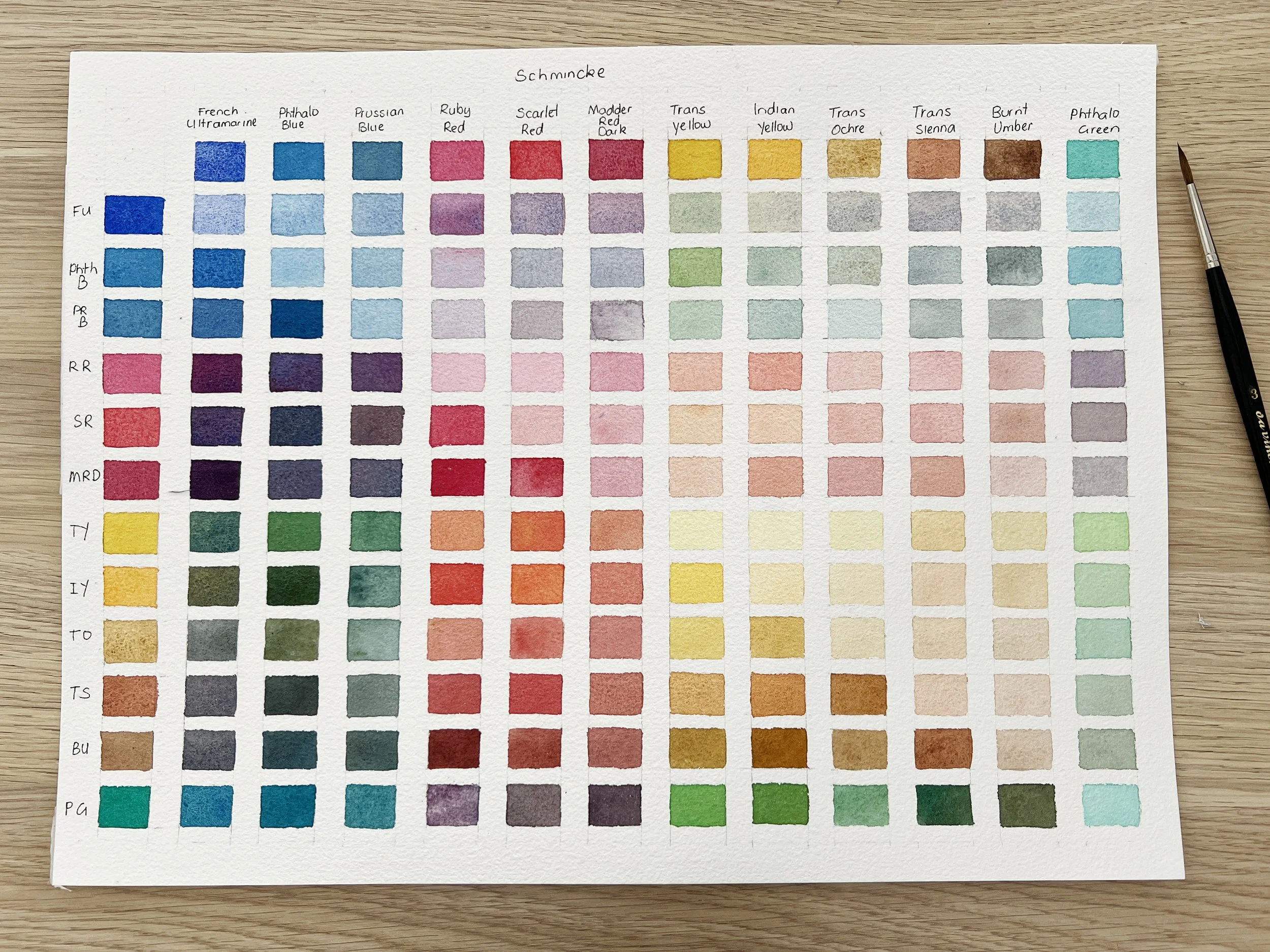
My custom palette from Schmincke.
When I first began watercolour painting, I used to think that simply owning a good set of paints was enough. I’d squeeze out a little of this and a little of that, mix them on instinct, and hope they’d cooperate. But more often than not, my lovely bright washes would turn dull. I’d try to mix a soft green for a leaf and end up with something that looked like dishwater. It wasn’t the paints, it was my lack of understanding of how they interacted.
Making a mixing chart changed everything for me. It became my most valuable reference, my quiet companion beside the palette, reminding me exactly which pigments create those luminous greens, vibrant violets, and subtle neutrals I love. It’s also one of the best exercises you can do to begin to understand your paints.
Today, I’m going to walk you through how to create your own watercolour mixing chart using the twelve colours from my custom Schmincke Horadam palette. This is the same set I use in most of my paintings, and I’ll show you how to record the beautiful interactions between these pigments so that your chart becomes a tool you’ll refer to again and again.
Why Make a Mixed Colours Chart?
There’s an almost magical shift that happens when you see how two pigments combine. A transparent yellow suddenly turns into olive when it meets a touch of French Ultramarine; a pretty violet emerges from a whisper of Ruby Red and French Ultramarine. When you understand those relationships, you no longer guess - you choose your colours with confidence.
My mixed colours chart.
A colour mixing chart helps you:
Learn your paints - every pigment behaves differently (granulating, staining, transparent, opaque).
Predict results - so you can mix precisely the hue you want before touching your painting.
Save time - you won’t waste precious pigment trying to “fix” a colour that’s gone muddy.
Find harmony - when you mix from a limited palette, your paintings feel unified and balanced.
I often compare it to learning the notes on a piano. Once you know which notes blend beautifully, you can make music effortlessly.
💡Tip: Keep your chart nearby while painting. You’ll find yourself glancing at it constantly once you realise how reliable it is.
My Twelve Schmincke Colours
My custom palette contains twelve carefully chosen colours, all selected for their transparency, versatility, and ability to mix cleanly. Each one has its own character, and together they form a beautifully balanced range of warm and cool tones.
French Ultramarine (PB29) – a rich, warm, granulating blue perfect for texture and depth. I love pairing it with Transparent Sienna for soft greys and moody neutrals.
Phthalo Blue (PB15:1) – a vibrant, cool blue with enormous tinting strength; ideal for fresh greens and clear skies.
Prussian Blue (PB27) – a deep, slightly greenish blue, semi-opaque and easy to control for shadows and water.
Scarlet Red (PR254) – a warm, glowing red that brings sunshine to florals and oranges.
Madder Red Dark (PV19, PR179) – cool, deep, and transparent; perfect for layering and rich purples.
Ruby Red (PV19) – a luminous, transparent cool red that sings in florals and portrait work.
Transparent Yellow (PY150) – clear and fresh; excellent for glazing and clean mixing.
Indian Yellow (PY110, PY154) – a warm golden yellow that radiates light in any mix.
Burnt Umber (PBr7) – earthy, semi-opaque, a grounding neutral for deep shadows.
Transparent Sienna (PR101) – a warm, glowing reddish brown; my go-to for mixing soft greys.
Transparent Ochre (PY42) – a gentle earthy yellow; transparent and ideal for natural tones.
Phthalo Green (PG7) – a cool, strong green; wonderful for both vivid foliage and deep shadows when tamed with reds or earths.
My custom Schmincke watercolour palette.
Each of these colours has a distinct personality, and the chart we’re about to make will show exactly how they interact.
You can find substitute colours to my palette from other manufacturers as well. Because paint behaviour differs across brands (even when pigment codes match), I emphasis that these are close substitutes, not perfect matches. Some paints list dual pigment codes (e.g., PR101 & PO48) for the substitute, meaning you’ll want to check the exact tube label. Mixing colours from other suppliers may give you a different result from mine.
| Colour | Pigment Code | Substitute(s) – Winsor & Newton & Daniel Smith | Substitute Pigment Code(s) |
|---|---|---|---|
| French Ultramarine | PB29 | French Ultramarine Winsor & Newton / French Ultramarine Daniel Smith | PB29 |
| Phthalo Blue | PB15:1 | Winsor Blue (Green Shade) W&N / Phthalo Blue Green Shade Daniel Smith | PB15 / PB15:3 |
| Prussian Blue | PB27 | Prussian Blue / Antwerp Blue W&N / Prussian Blue Daniel Smith | PB27 |
| Scarlet Red | PR254 | Winsor Red W&N / Pyrrol Red Daniel Smith | PR254 |
| Madder Red Dark | PV19, PR179 | Permanent Alizarin Crimson W&N / Permanent Alizarin Crimson Daniel Smith | W&N: PR206 / DS: PR177 |
| Ruby Red | PV19 | Permanent Rose W&N / Quinacridone Rose Daniel Smith | PV19 |
| Transparent Yellow | PY150 | Transparent Yellow W&N / Nickel Azo Yellow Daniel Smith | PY150 |
| Indian Yellow | PY110, PY154 | Indian Yellow W&N / Indian Yellow Daniel Smith | W&N: PO62, PY139 / DS: PY97, PY150 |
| Burnt Umber | PBr7 | Burnt Umber W&N / Burnt Umber Daniel Smith | PBr7 |
| Transparent Sienna | PR101 | Burnt Sienna W&N / Burnt Sienna Light / Quinacridone Burnt Orange DS | PR101 / PO48 |
| Transparent Ochre | PY42 | Gold Ochre W&N / Transparent Yellow Oxide Daniel Smith | PY42 |
| Phthalo Green | PG7 | Winsor Green (Blue Shade) W&N / Phthalo Green (Blue Shade) DS | PG7 |
Preparing Your Materials
Here’s what you’ll need:
Watercolour paper (I recommend 100% cotton, cold press, around A4 or A3 size, the surface is smooth enough for clean swatches but still with tooth to hold pigment).
Ruler and pencil for drawing your grid.
Your 12 paints, a palette, and clean water.
A fine round brush (size 4–6 works well) for precise squares.
Paper towel for blotting excess water.
💡 Tip: Choose good paper because your chart is a long-term reference, not a scrap test. You’ll want the paints to behave just as they do in a finished painting.
Setting Up the Grid
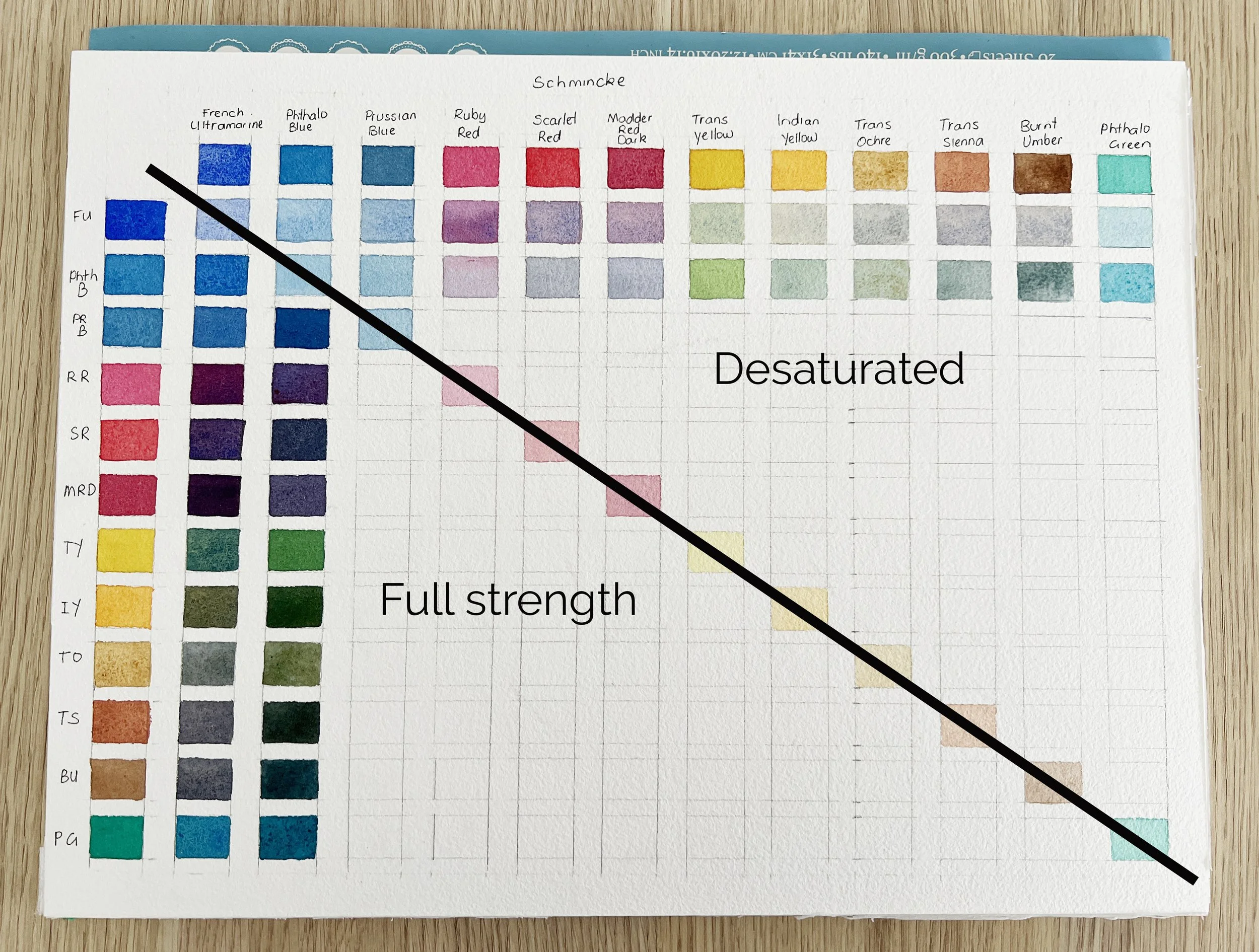
For a 12-colour palette, you’ll need a 13 × 13 grid. Leave the top left space in the grid empty.
Draw the grid in pencil.
Label the rows and columns with the colour names in the same order.
Leave a little margin around each for notes.
Start with neat swatches with full saturation on the top row and left column.
These pure pigments serve as your “base notes.”
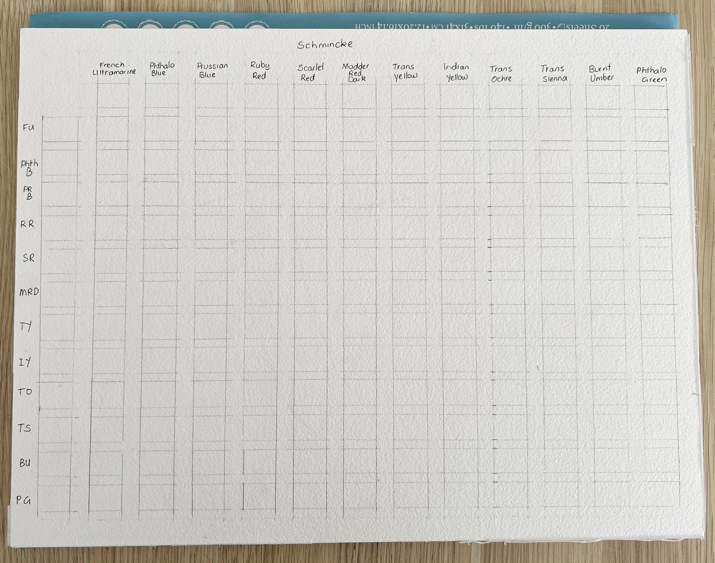
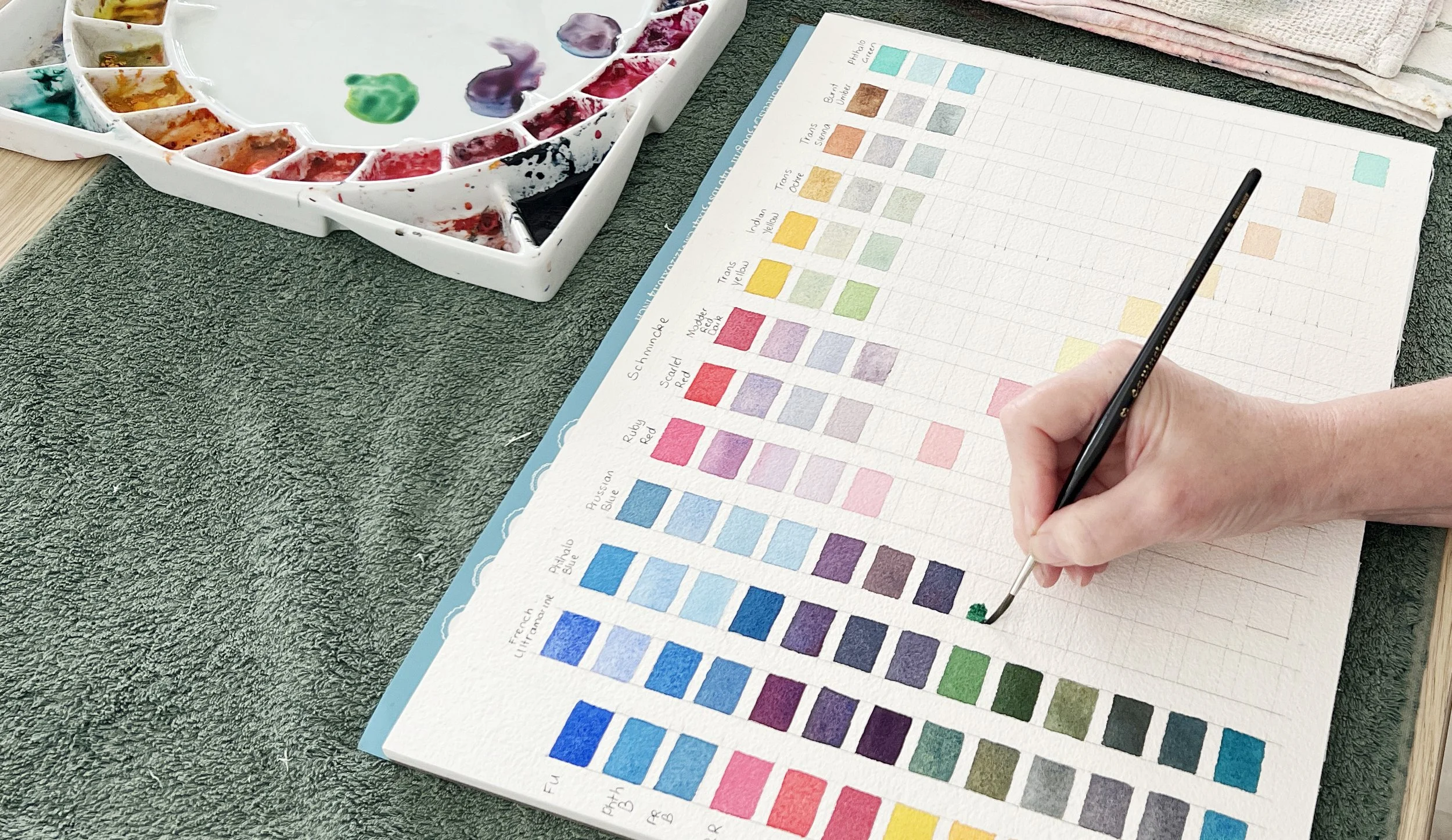
Setting out my grid pattern.
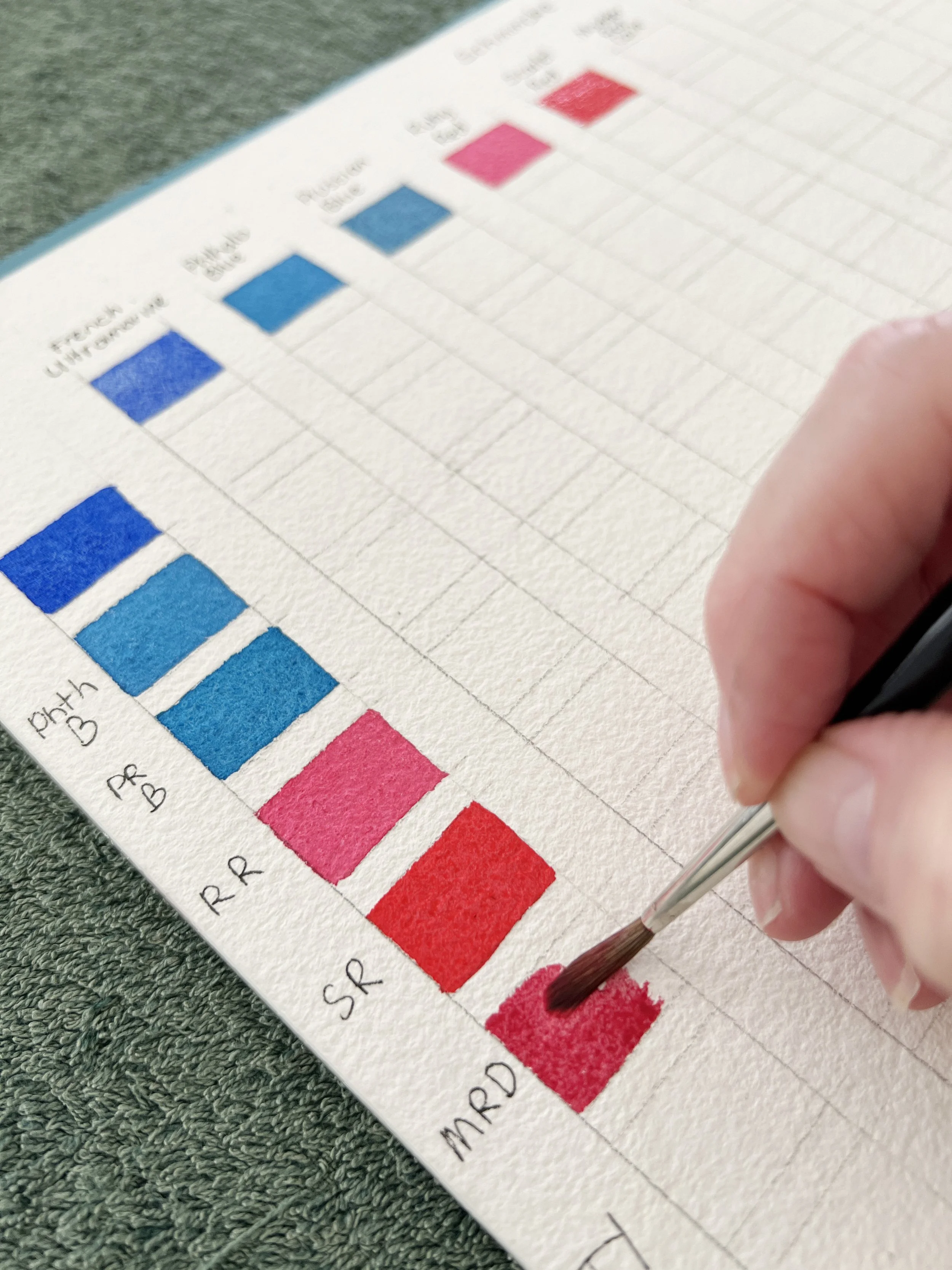
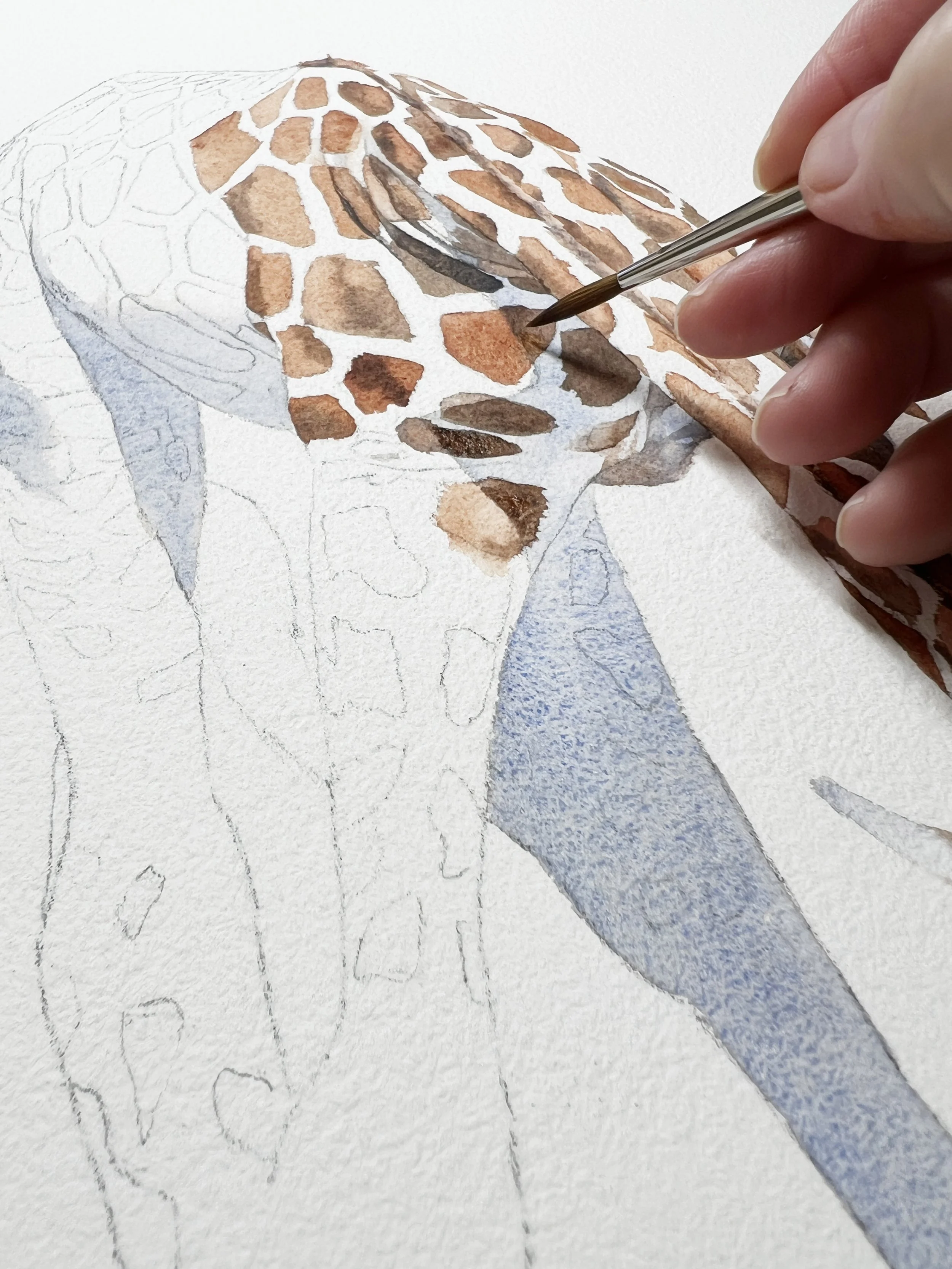
Filling the squares with paint.
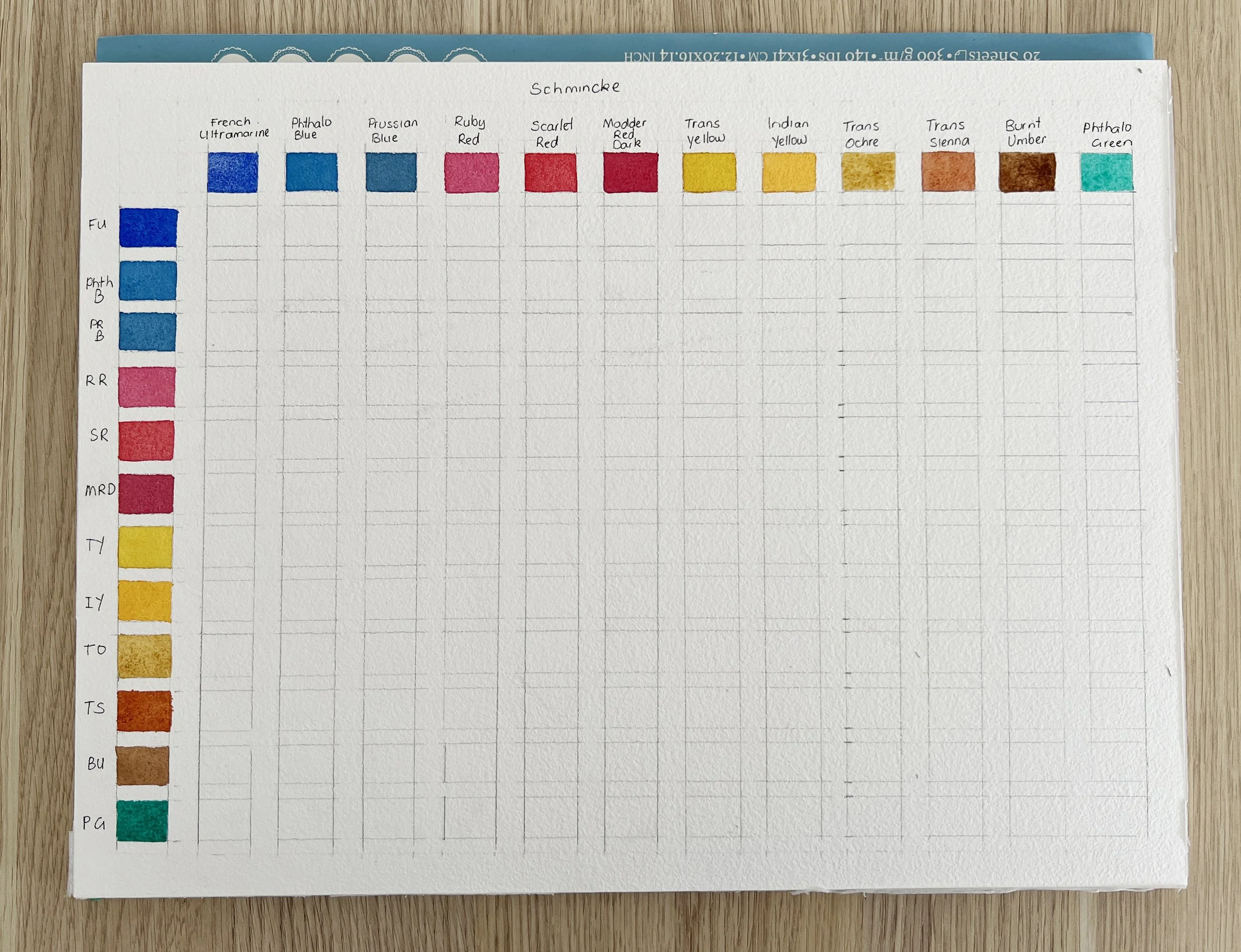
I have painted in the top row and the left column with the colours at their full intensity. Each colour is listed twice.
Colour Mixing - Filling the Chart
Where the same colours meet on the chart, I painted that single colour again, but this time in a lighter value. Instead of using it at full strength like the top row and side column, I added water to dilute the paint. This shows the lighter version of each colour and helps me see how transparent or subtle it can look when thinned down.
Start mixing colours
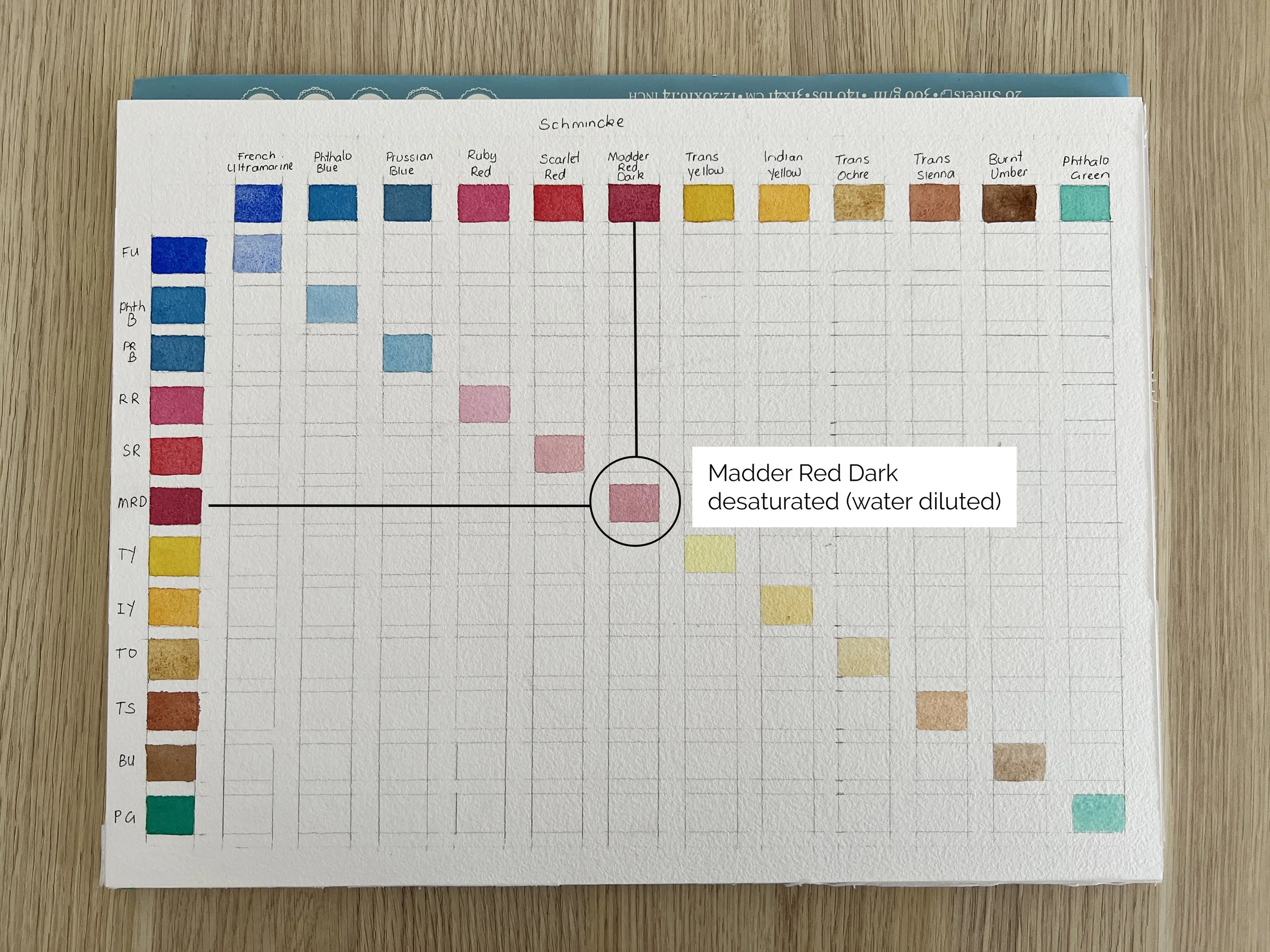
For each square, I mixed the colour from the top row with the colour from the left column. So I started by mixing Phthalo Blue with French Ultramarine, then Phthalo Blue with Prussian Blue, Phthalo Blue with Ruby Red, Phthalo Blue with Scarlet Red etc.
I tried to keep each mixture about a 50/50 ratio of the two colours so I could see a true mix rather than one dominating the other.
Because the same mixtures appear twice on the chart - the mixtures on the left side (under the diagonal line) are painted at full strength, while the mixtures on the right (on top of the diagonal line) are thinned with some water. This lets me compare how each combination looks when it’s rich and saturated versus when it’s lighter and more transparent.
Here are a few tips when mixing colours.
Begin with the lightest pigment first.
Pick up a little of the lighter colour (for instance, Transparent Yellow) and drop in a small amount of the darker (a dark blue like Phthalo Blue). Mix on your palette, not on the paper. This keeps your chart tidy, accurate and true.Adjust the water ratio.
Aim for a juicy, even wash. If your brush leaves streaks, you’ve used too little water; if it bleeds beyond the square, you’ve used too much.Paint a smooth square.
Fill it completely, then move on. Try to keep consistency so you can compare mixes easily later.Always clean your brush completely between each mix. Even a trace of the previous pigment can throw off the next colour. Keep two jars of water - one for the first rinse, one for clean water and refresh them often.
As you move down and across the grid, you’ll start to recognise relationships: how some pigments love to mingle, while others seem to resist each other. French Ultramarine, for instance, granulates beautifully with Transparent Sienna, creating a textural grey that’s ideal for bark or stone. Phthalo Green and Phthalo Blue, on the other hand, will dominate nearly anything they touch.
Observing and Noting Your Mixes
Take your time with this stage. Don’t rush to fill every box in one sitting; it’s perfectly fine to do a few rows each day. The beauty of this process lies in the quiet observation.
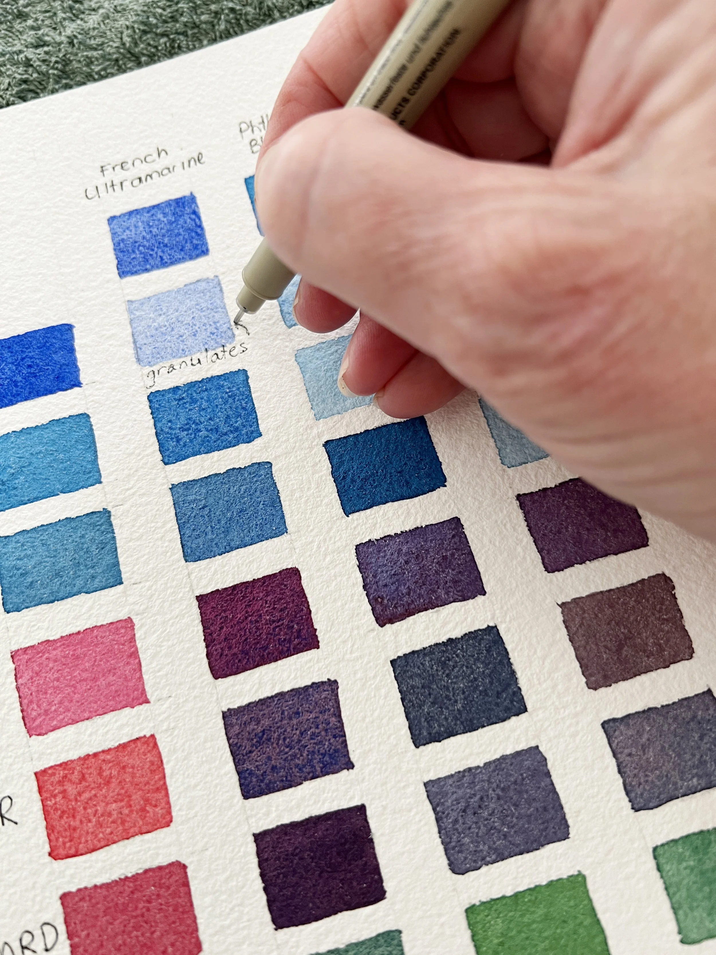
As you paint each mix, write small, helpful notes beside or beneath the square. Record what you see:
Granulating? (like Ultramarine, Burnt Umber)
Transparent/Opacity? (like Transparent Yellow or Ruby Red)
Does it lift easily? (Madder Red Dark lifts well; Prussian Blue doesn’t.)
Useful for? (sky, leaf shadows, portrait skin tones, etc.)
These notes of the characteristics of colours are worth their weight in gold later on when you’re mid-painting and trying to recall, “Which mixtures gave me that soft lavender for petals?”
💡Tip: Use a waterproof pen for your labels. You’ll thank yourself later if your brush happens to touch the edge.
If you’re new to mixing, keep a scrap of paper nearby and test each combination before committing it to the chart. Once you’re happy, recreate it neatly in its square. Over time, you’ll notice patterns emerging, families of greens, violets, and browns that share a harmony because they’re all born from the same limited palette.
Understanding the Colour Mixes
Let’s look at a few of my favourite combinations from this palette:
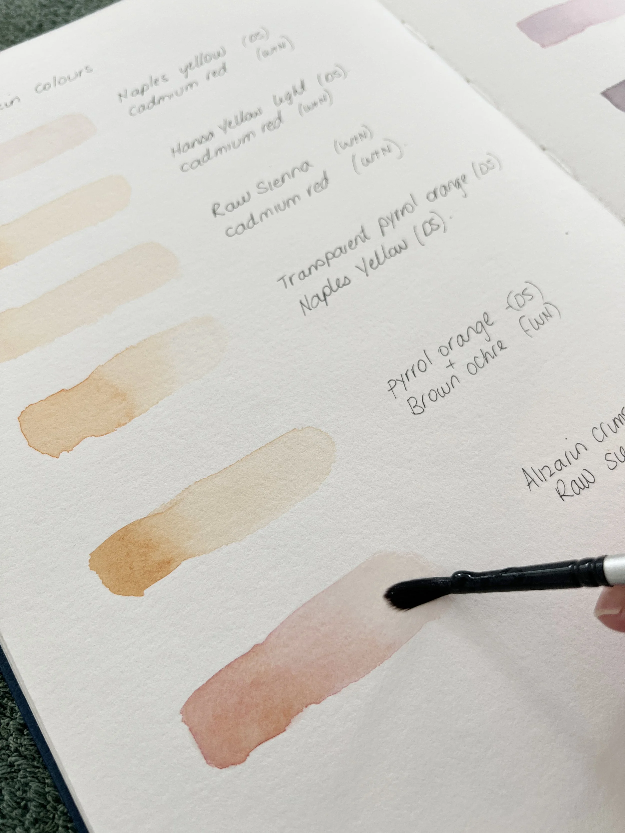
1. French Ultramarine + Transparent Sienna
This is my go-to mix for greys and neutrals. Add more Ultramarine for a cool, moody tone, or more Sienna for warmth. It’s perfect for stone, fur, and subtle shadows.
2. Prussian Blue + Indian Yellow
A vivid, glowing green - ideal for spring leaves. With more Prussian Blue, it deepens into a natural forest green.
3. Phthalo Blue + Transparent Yellow
A bright, brilliant, clean turquoise-green that sings. Use sparingly in nature scenes, as it can become too intense if overused.
4. Ruby Red + French Ultramarine
A beautiful violet that layers well for floral petals. If you shift toward Ruby Red, it becomes warmer and more magenta; add more Ultramarine for a cooler lilac.
5. Scarlet Red + Phthalo Green
At first this mix looks ordinary - a dull brown-grey - but it’s perfect for natural shadows or a darker version of either colour. That’s the magic of complements: when opposites meet, they neutralise each other, creating believable depth.
This is where a touch of colour theory helps. Every hue has a complementary colour which is its opposite on the colour wheel. When you mix complements, you mute intensity; when you mix near neighbours, you enhance harmony. Recognising these relationships gives you enormous control over the mood of your work.
My finished color mixing chart
Using the Chart in Practice
Once your chart is dry, you’ll find it becomes one of the most valuable tools in your studio. Here’s how I use mine every day:
Planning colour palettes.
Before starting a new painting, I look over the chart and identify a few favourite mixes that suit the subject. For a warm floral, I might focus on Ruby Red, Scarlet Red, and Indian Yellow combinations. For a misty grey, I’ll choose French Ultramarine, Transparent Sienna, and any third colour.Avoiding guesswork.
Instead of wondering what two pigments will create a certain hue, I already know. That confidence allows me to focus on brushwork and expression rather than chemistry.Building harmony.
Because all the colours in your chart come from a single palette, any combination you choose will automatically work together. This gives your paintings a cohesive, professional feel.
Refining and Extending Your Chart
Once your main chart is complete and fully dry, you can take it a step further. The more you explore, the more nuanced your understanding of colour becomes.
1. Glazing Tests
Some pigments behave differently when layered rather than mixed. Take a scrap of the same paper and try painting one transparent colour over another once the first is dry, for example, Transparent Yellow over Phthalo Blue. Notice how the colour glows more than if you had mixed them wet-in-wet. That’s the beauty of glazing: the light travels through each layer, bouncing back with luminosity.
💡 Tip: Transparent colours glaze beautifully; opaque ones tend to dull when layered.
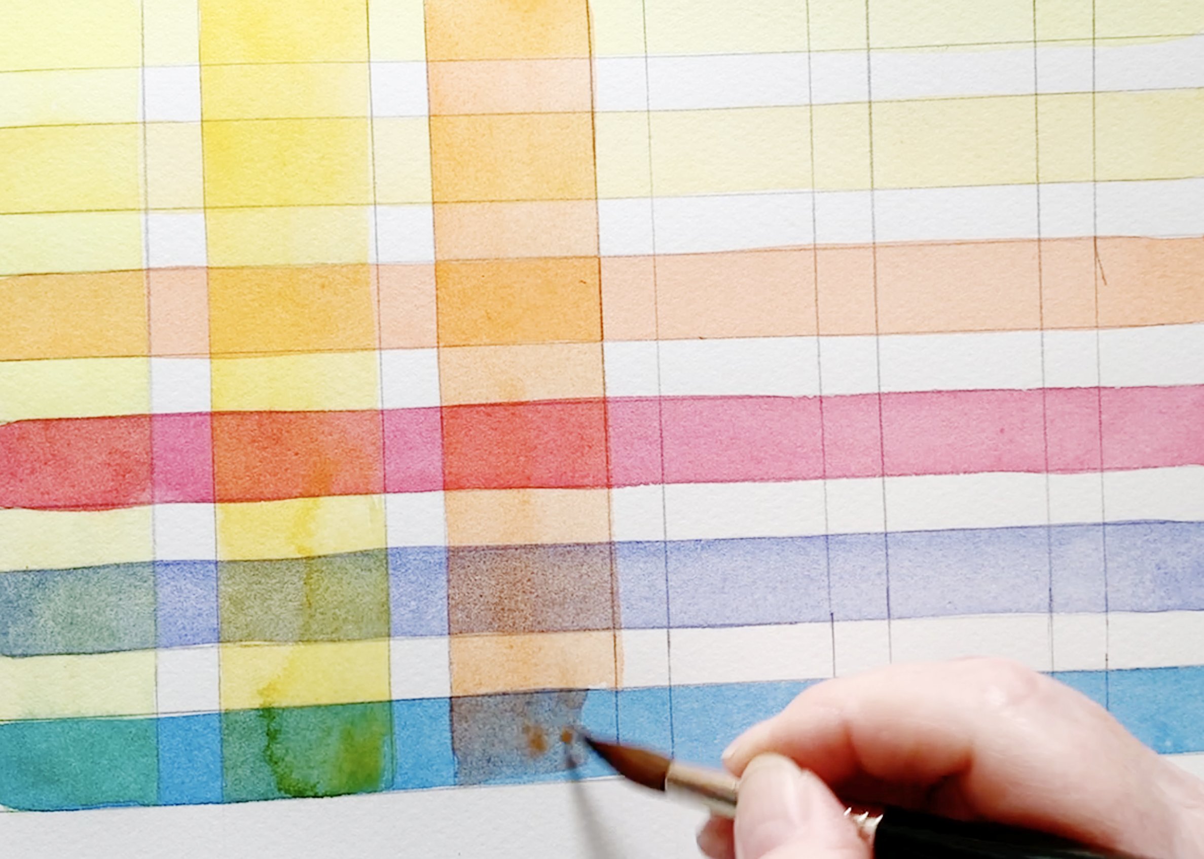
Try making a glazing chart with your colours so you can see the colours that form when you paint one colour over another.
2. Exploring Value
Beside your chart, create a small value strip for each colour, from full strength to the palest wash. It’s astonishing how much range even a single pigment has. Prussian Blue, for example, can move from nearly black to the softest misty blue-grey. These strips help you judge how much water to use for highlights versus deep shadows.
A Prussian Blue value strip shows the colour at its full intensity and how it looks when diluted with water.
3. Neutrals and Greys
If you love subtlety, mix pairs of complements: Ruby Red with Phthalo Green, or Transparent Sienna with French Ultramarine and experiment with different ratios. You’ll uncover a range of gentle greys and browns that can replace pre-mixed neutrals entirely. I rarely reach for a tube of grey anymore; I prefer to mix my own from colours already present in my painting. It keeps everything harmonised.
Caring for Your Chart
Store it flat, somewhere visible. I like to keep mine near my painting area so I can glance at it whenever I’m unsure about a mix. If you create multiple charts, label them with the palette and date because paints shift over the years, and so does our understanding of them.
You might even laminate a copy or photograph it for quick reference. I’ve seen artists shrink their charts down to postcard size and tape them inside the palette lid - a clever idea for plein-air work.
A Few Troubleshooting Notes
Uneven washes? Try slightly thicker paint and keep the brush moving in even strokes.
Bleeding edges? Your paper may be too wet. Let it dry a few seconds before adding more pigment.
Streaky squares? Use a softer brush and ensure enough water for smooth coverage.
Muddy colours? You may be over-mixing or combining too many pigments. Keep it to two at a time.
💡 Tip: Mud isn’t failure, it’s a teacher. Every dull mix shows you where balance was lost. Notice why it happened and try again more gently next time.
Beyond the Chart
Once you’ve built this foundation, your painting process changes completely. You’ll start seeing relationships everywhere, the subtle green in a shadow that’s really a whisper of blue and ochre, the soft pink in a petal that’s nothing more than diluted Ruby Red with a hint of Transparent Yellow.
The chart becomes your language of colour. Each square tells a story, a quiet conversation between pigments. And when you paint, you’re simply retelling those conversations on paper, in petals, feathers, fur, or skies.
If you ever feel stuck creatively, making a new chart is a wonderful reset. It’s meditative and grounding. You slow down, notice your paints again, and remember why you fell in love with watercolour in the first place.
If you don't feel like ruling up a chart, dedicate a journal to recording different paint combinations. Just paint some swatches and record the colours you used beside them.
Creating a colour mixing chart isn’t just a technical exercise; it’s a practice in patience and awareness. It teaches you to see, to wait, to observe. Every square you paint is a small study in restraint and curiosity.
So, take your time. Enjoy each mix. Let this be a quiet conversation between you and paint colours. The more you explore, the more fluent you’ll become in the language of colour.
And when you hold that finished chart, twelve colours blossoming into dozens of beautiful new ones, you’ll know you’ve built something far more valuable than a reference sheet. You’ve built understanding.
Don’t be afraid to make mistakes. Every muddy mix, every uneven edge, every unexpected hue is simply your paint teaching you something new. Keep colour mixing, stay curious, and above all, keep enjoying the process.
If you create your own mixed colours chart using this Schmincke palette, I’d love to see it. Share it with me; tag me on Instagram or send a photo through my website. Watching how differently each artist interprets these same pigments is endlessly inspiring.
Happy painting,
Louise
If you are interested in learning to paint in watercolour, I have hundreds of online, voiced over watercolour tutorials for all skill levels.