A New Watercolour Sketchbook
Painting the Things I Love
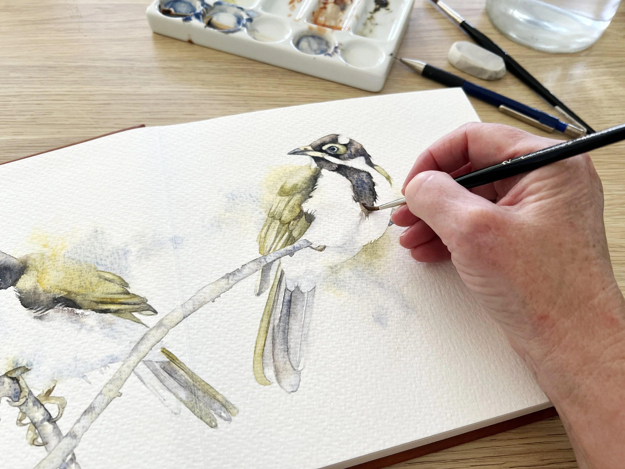
Recently, I was sent two watercolour sketchbooks by Luchetti to try. What caught my attention was their gutter-free design, which allows you to paint across two pages without the usual crease down the middle.
I’ve already started painting in the larger sketchbook, and I’m saving the smaller, travel-sized one for our European river cruise next year (….can’t wait)!
Initially, I thought I might fill the larger sketchbook with birds, flowers or paintings that followed a particular theme. But then I decided I didn’t want to restrict myself. Instead, I’d paint things that caught my eye, particularly subjects that are part of my everyday life.
I like the thought that one day, when I’m no longer around, my children and grandchildren might enjoy looking through it and getting a little glimpse into my world and the things I loved. I’m also going to add a few handwritten notes alongside each painting, recording where the inspiration came from and when I painted it.
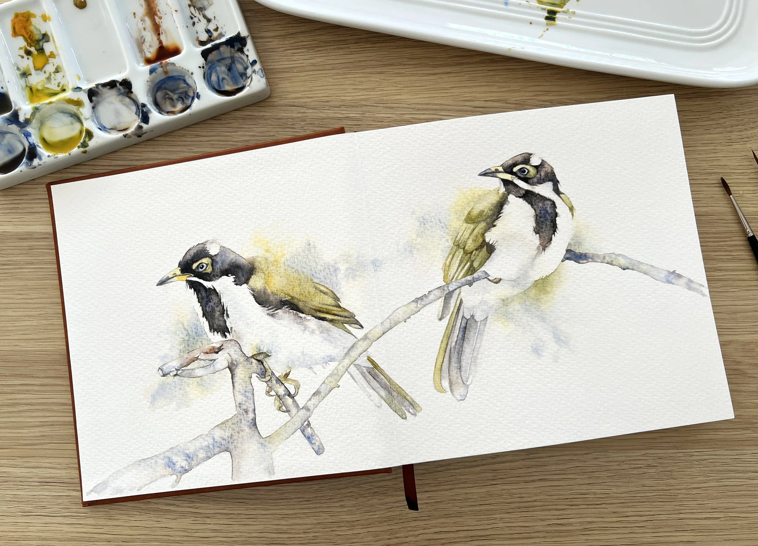
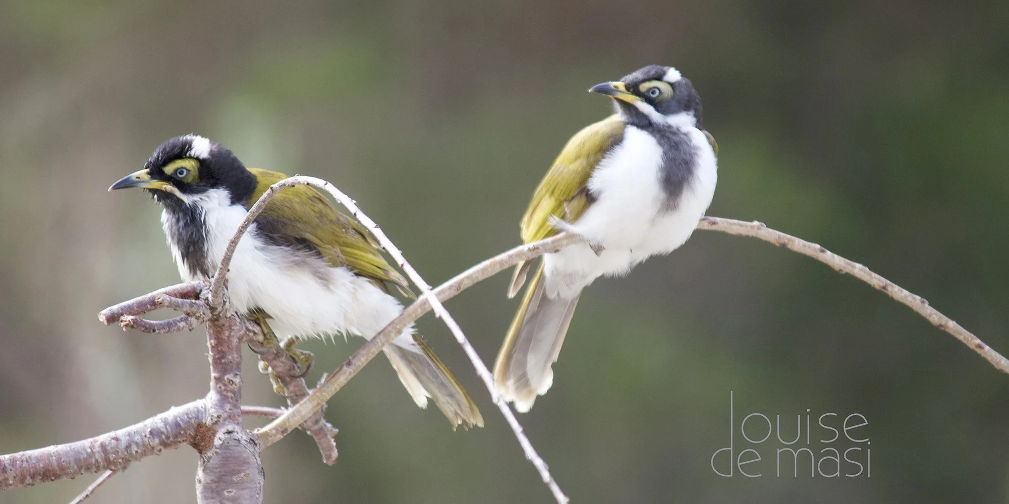
My first painting in the sketchbook is of two blue-faced honeyeaters. We have a flock of these beautiful birds living in our garden, and the two I’ve painted are juveniles who had just enjoyed a bath in the birdbath before flying up into the weeping cherry tree outside my studio.
I heard them calling, so I grabbed my camera and managed to get a few photos before they flew away. I thought they’d make a nice subject for the opening double-page spread of my sketchbook.
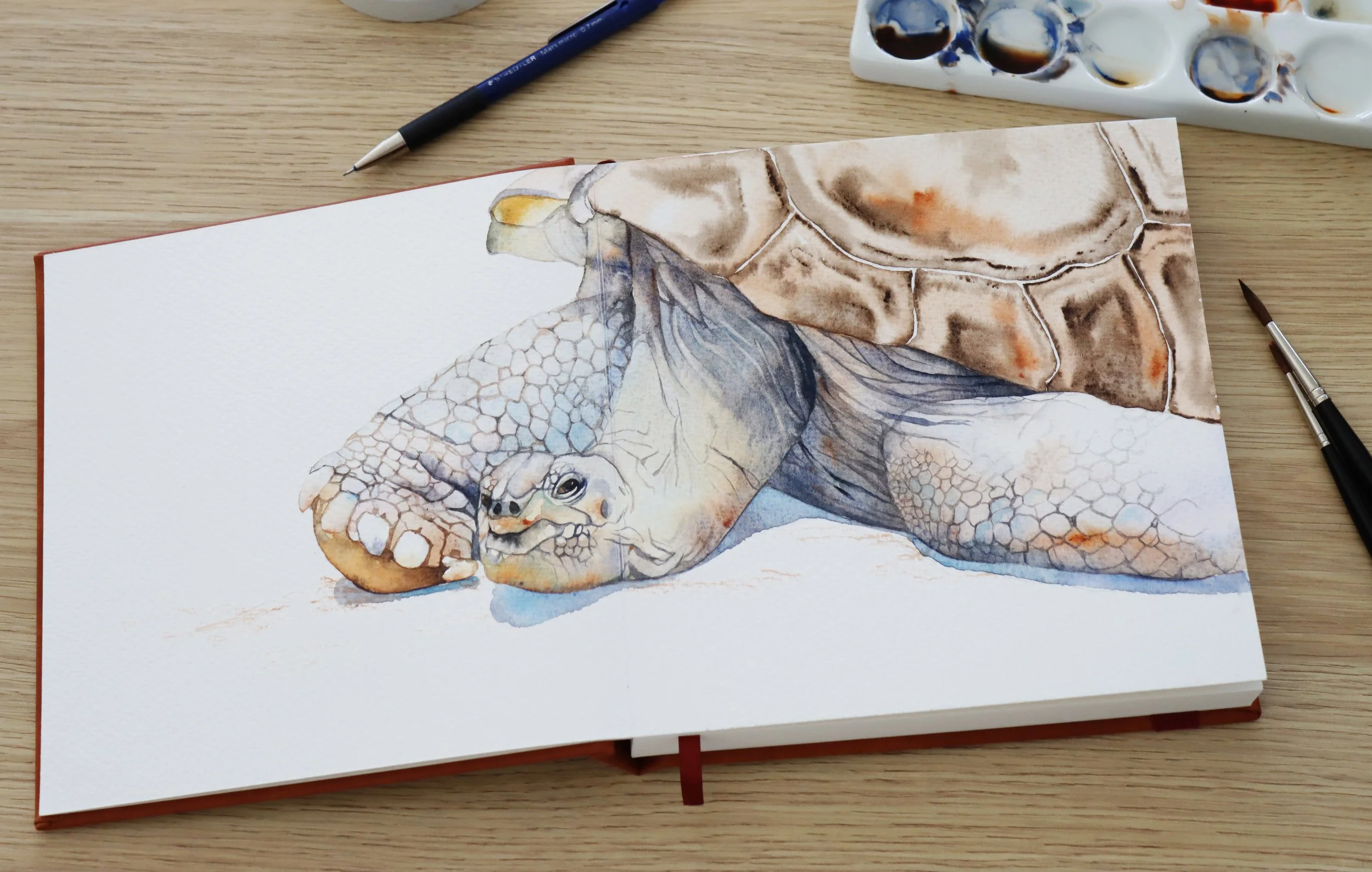
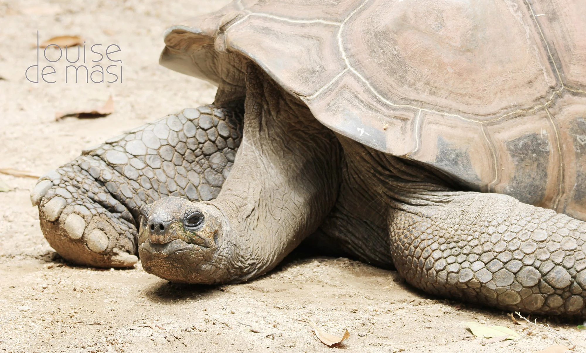
For my second painting, I chose a tortoise from a photograph I took at Taronga Zoo in Sydney. I was drawn to the texture of its skin and the interesting patterns on its shell, but I wasn’t quite sure how I was going to capture them in paint.
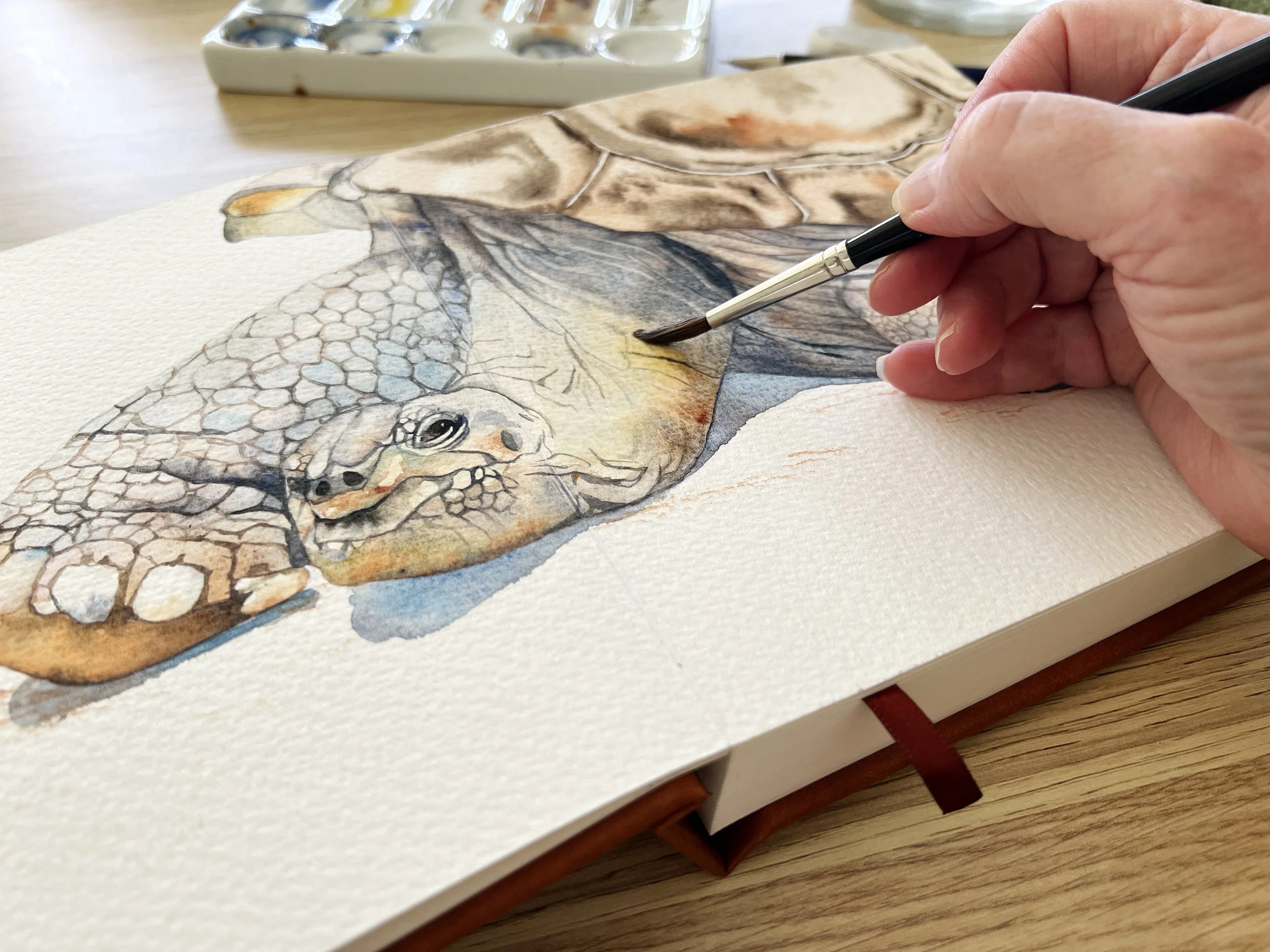
That’s one of the great things about keeping a sketchbook. It gives me the freedom to play around and experiment with different techniques. For this painting, I ended up using a combination of graphite and watercolour, which worked really well for creating those textures.
My First Impressions of the Luchetti Sketchbook
The books themselves are beautifully constructed. They feel special to touch as though they are worthy of being filled with beautiful paintings.
The gutter free binding is fabulous for painting across two pages at once. You have the option of painting on each page individually or you can spread your painting over two quite easily.
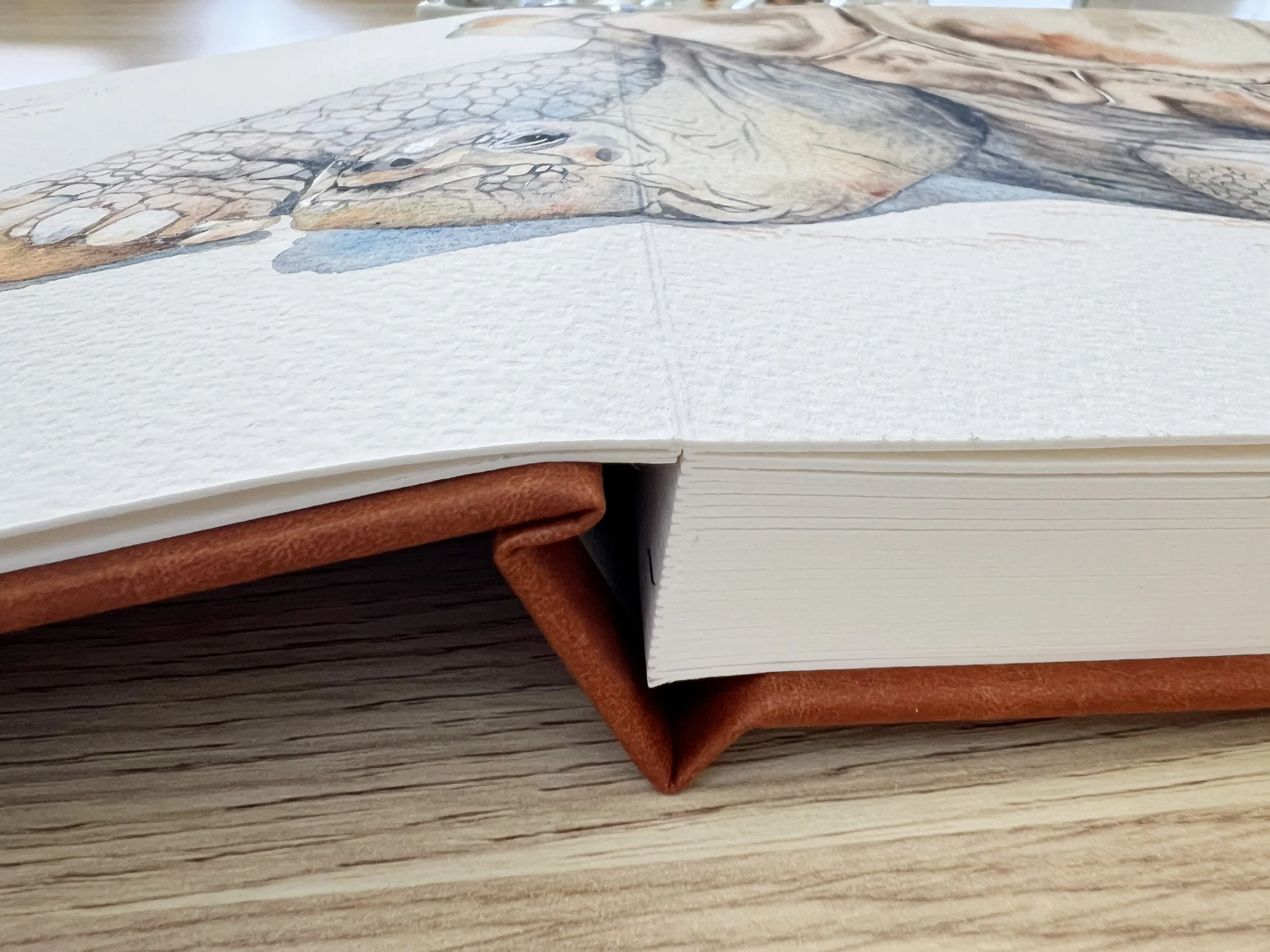
The paper is 100% cotton, acid-free and a lovely thick 600 gsm, which are all great qualities for a sketchbook. The one I’m painting in is 8 × 8 inches and contains cold-pressed paper. I found the surface quite heavily textured, more like rough watercolour paper than the cold-pressed paper I’m used to.
I use quite a lot of water when I paint, and I’ve found that the paper handles the moisture fairly well. When I work particularly wet, the page develops a slight curve or bow, but drying both sides with a hairdryer helps it flatten out again so I can continue painting.
If you’re used to painting on good quality watercolour paper like Arches or Fabriano, you’ll probably notice that the paper in this sketchbook behaves a little differently.
I’ve found that the paper behaves a little differently from the Arches paper I normally use, particularly when painting wet on wet. The paint doesn’t flow and spread across the wet surface in quite the same way I’m accustomed to, so I’m still getting a feel for how the paper responds.
Wet on dry techniques worked well, including glazing. I was able to build up several layers of colour without disturbing the paint underneath, and the colours remained lovely and vibrant.
Lifting dried paint worked well too, as did softening hard edges on dry paper.
These are just my first impressions after completing two paintings in the sketchbook. I’m still getting used to the way the paper behaves, and I’m looking forward to experimenting with different subjects and techniques as I fill the pages. It’ll be interesting to see whether my impressions change as I become more familiar with it.
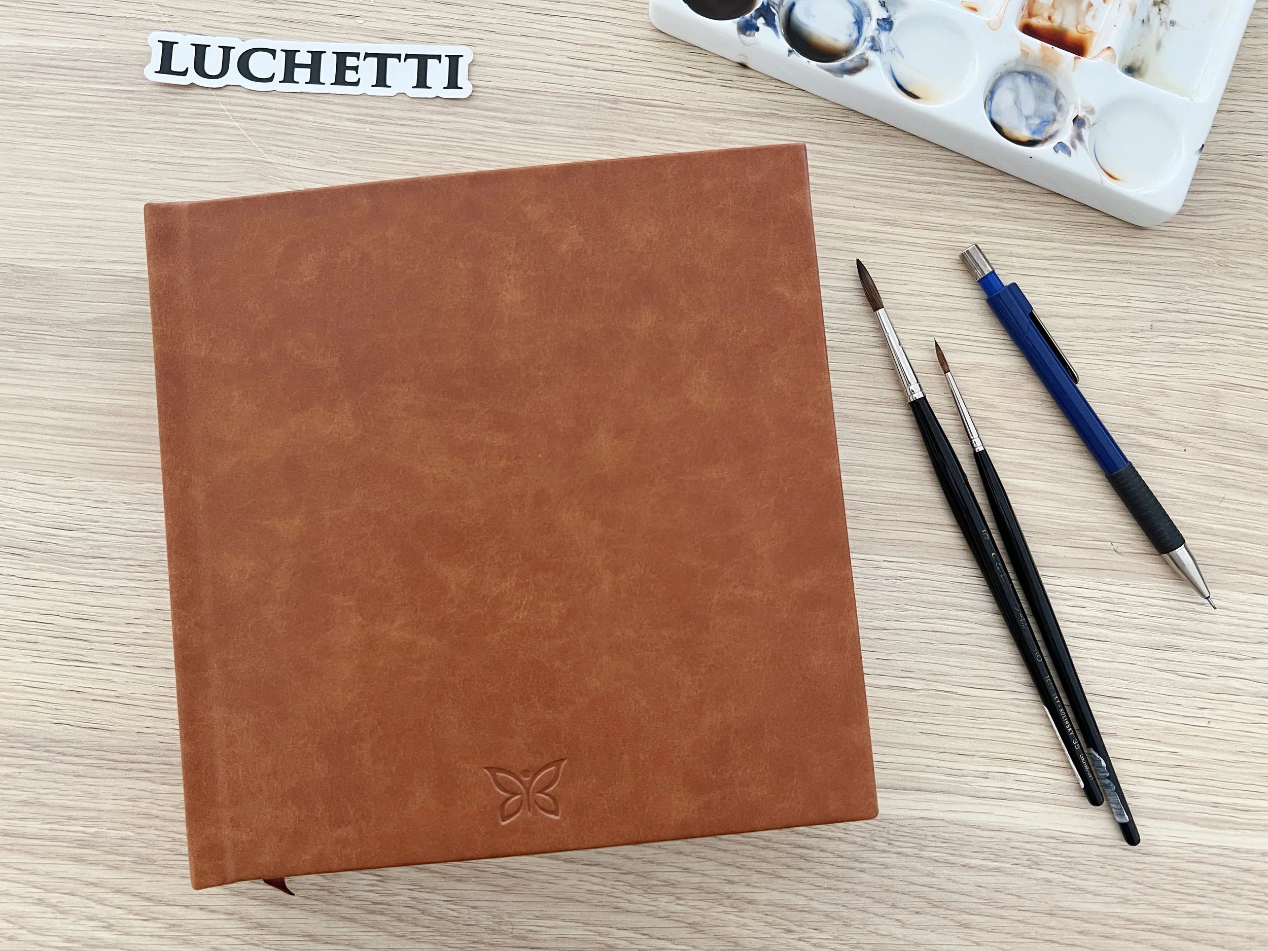
Interested in the Luchetti Sketchbooks?
If you’d like to have a closer look at the Luchetti sketchbooks, you can find them on their website using the link below.
Luchetti kindly gifted me these sketchbooks to try, and they’ve also provided me with an affiliate link. If you make a purchase through my link, I’ll receive a small commission at no extra cost to you.
I’m looking forward to seeing how this sketchbook develops. I have no idea what I’ll paint next, and I quite like that. I’ll just keep adding paintings of things that catch my eye, along with a few hand written notes about why I chose them.
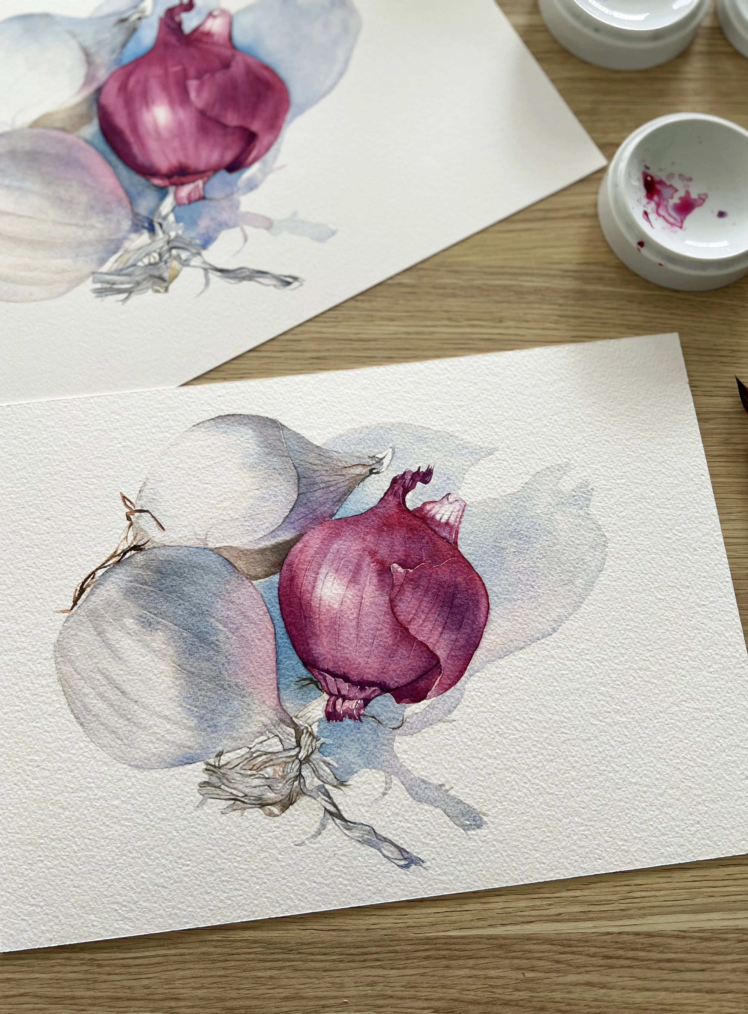
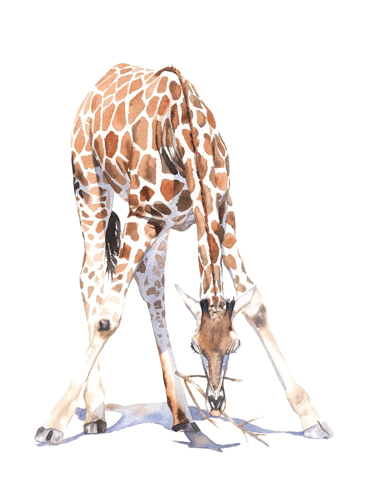
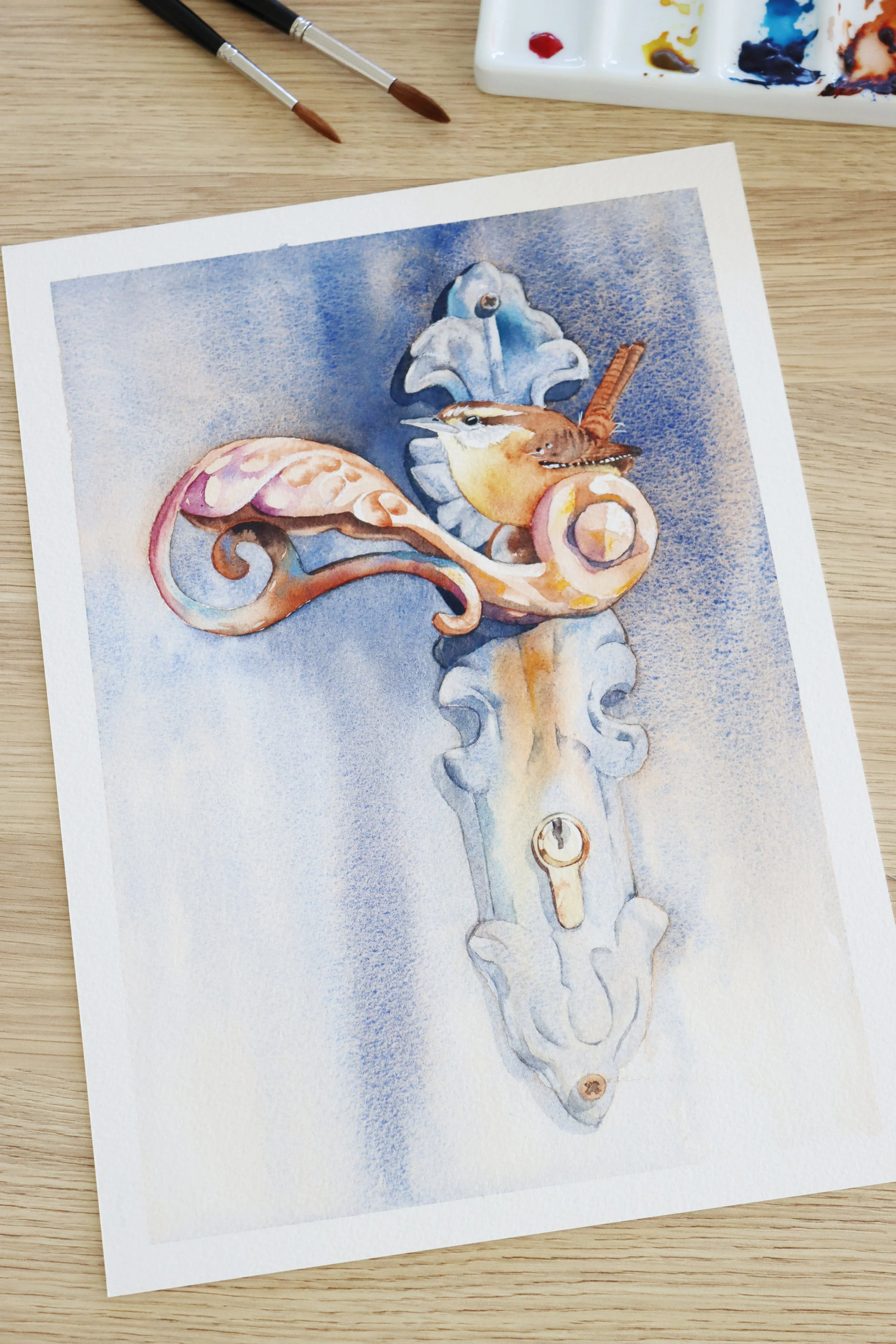
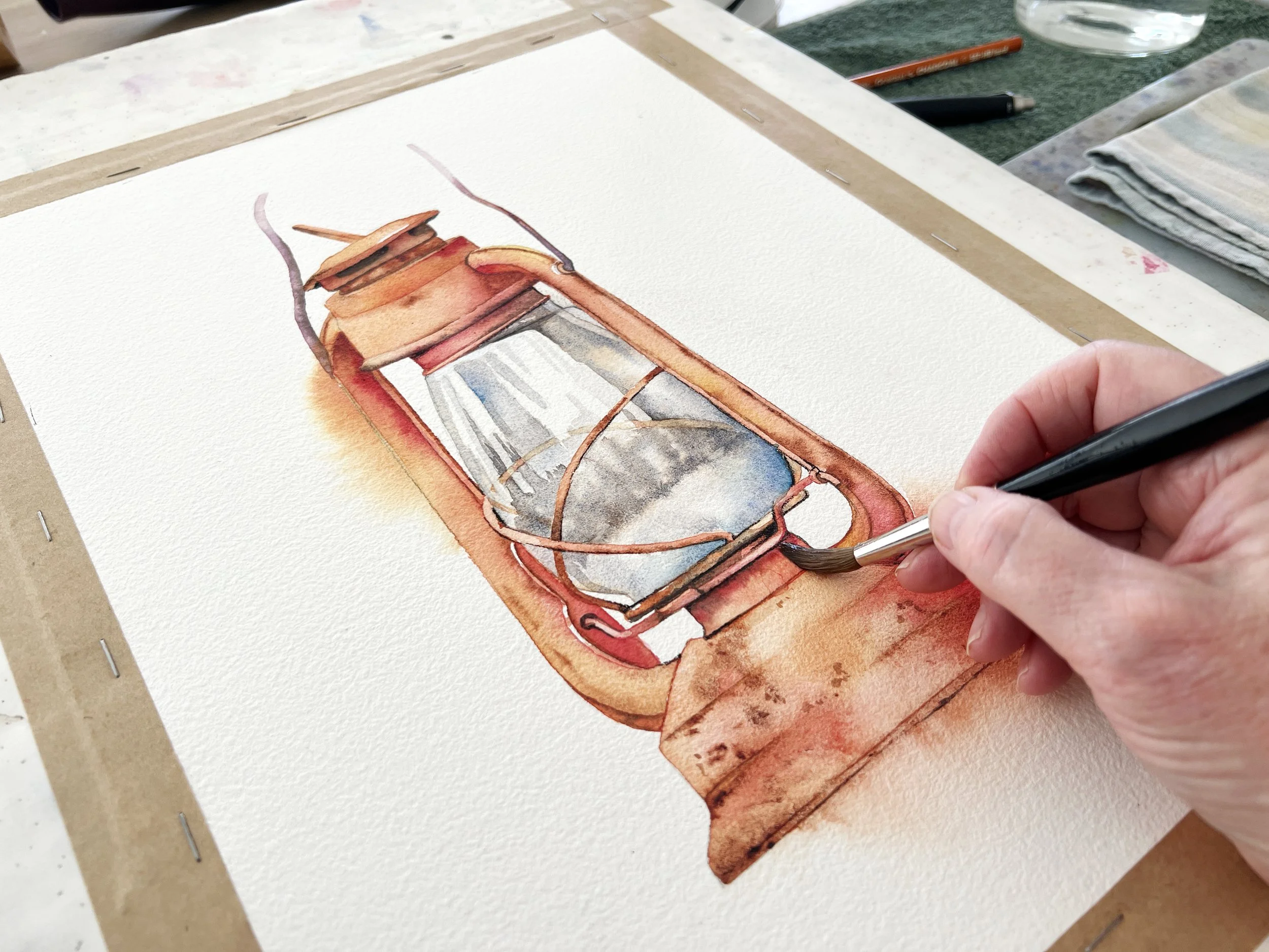
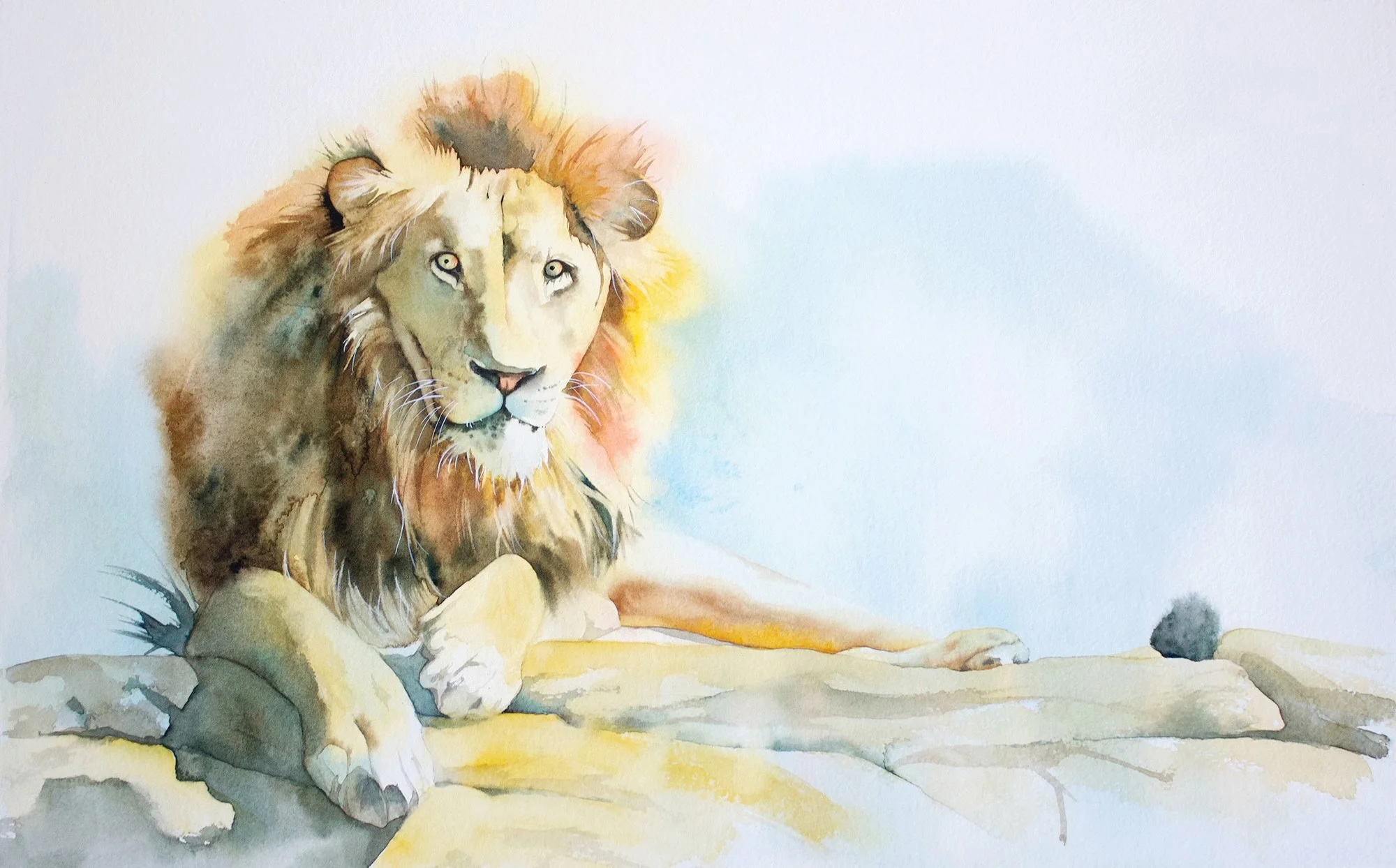
There’s a saying among watercolour painters: “If it looks right when it’s wet, it’s wrong.”
It’s a little dramatic, but it makes a good point. Watercolour often looks darker and more intense while wet. As it dries, the colour loses some of that intensity.
As a general guide, the change can be around 20–30%, although it varies between pigments and depends on how much water and pigment you use.
One way I deal with this is to make sure those areas are strong enough in the first wash, rather than assuming I’ll be able to correct everything later.