
How Dark Should You Go in Watercolour?
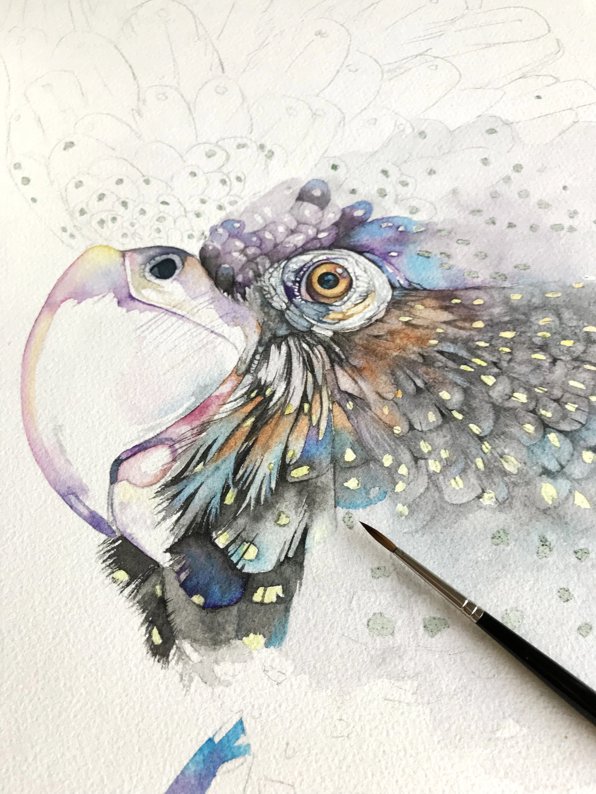
Create depth by building up your values.
One thing I hear quite often from watercolour painters, especially beginners, is that they’re afraid of going too dark.
I understand it. Watercolour is transparent, and once you put a strong dark wash onto the paper, it can feel like a big commitment. There is always that little voice saying, What if I’ve gone too far?
The result is that we sometimes play it safe. We build up the lighter washes, add a few more mid-tones, perhaps a little detail, but never quite put in the darkest values.
And the painting can feel a little… timid.
So how dark should you actually go?
The short answer is: as dark as the painting needs, but don’t rush to get there.
I like to sneak up on my darks
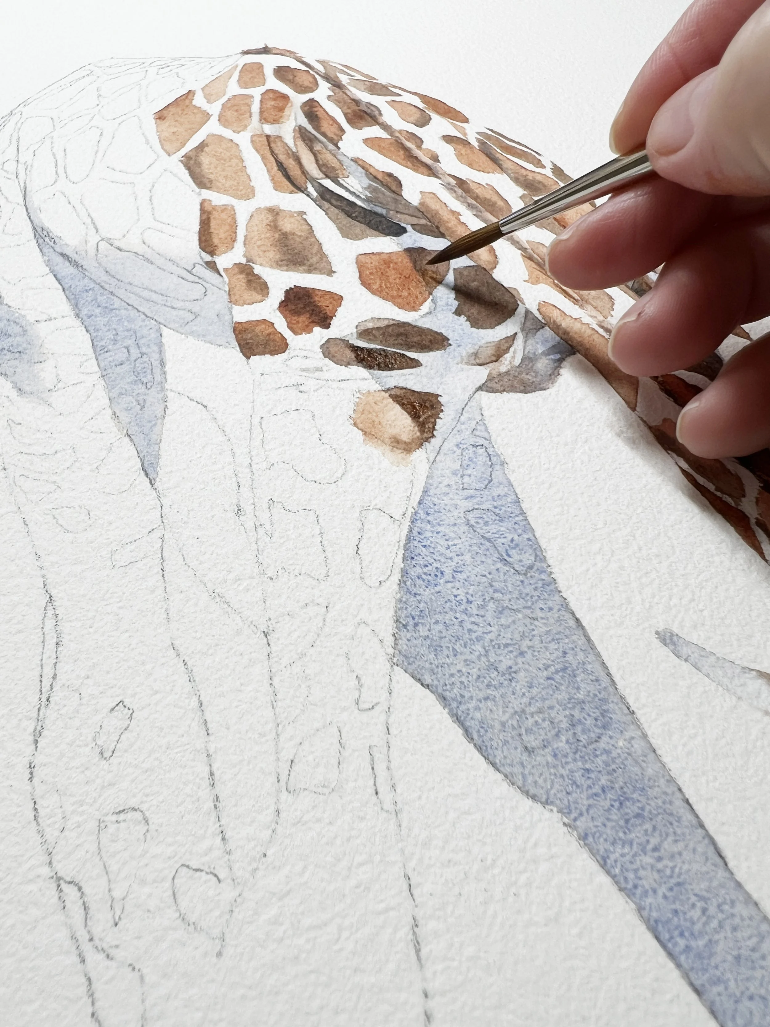
One of the things I find important when painting in watercolour is working from light to dark.
The lightest value is the white paper. At the other end of the scale is your darkest value, usually the pigment with very little water added. But I never put that darkest value in at the beginning.
Instead, I like to sneak up on my darks.
I start with a pale wash, then gradually introduce the mid-tones. Once those are established, I can start looking more carefully at where the darkest areas really need to be. I can then build them up with additional layers rather than committing to a very dark wash straight away.
There is a practical reason for this.
If you go too dark too soon, you have nowhere to go.
You can always make a pale area darker. It is much harder to make a very dark area lighter. As I paint, I want to leave myself somewhere to go.
There’s another reason I prefer to save my darkest values until later in the painting.
Dark washes contain a lot of pigment, and if you wet that area again while you’re still working, some of that pigment can lift and smudge. If you’re painting wet on wet nearby, or glazing over the top, that dark colour can suddenly start travelling into areas where you don’t want it.
Before you know it, you can have a muddy mess on your hands.
Lighter washes contain less pigment, so there’s simply less colour sitting on the paper waiting to be disturbed. By building my values gradually and leaving the really dark passages until I need them, I’m less likely to disturb those heavy concentrations of pigment as I continue painting.
So....... sneak up on those darks rather than rush towards them.
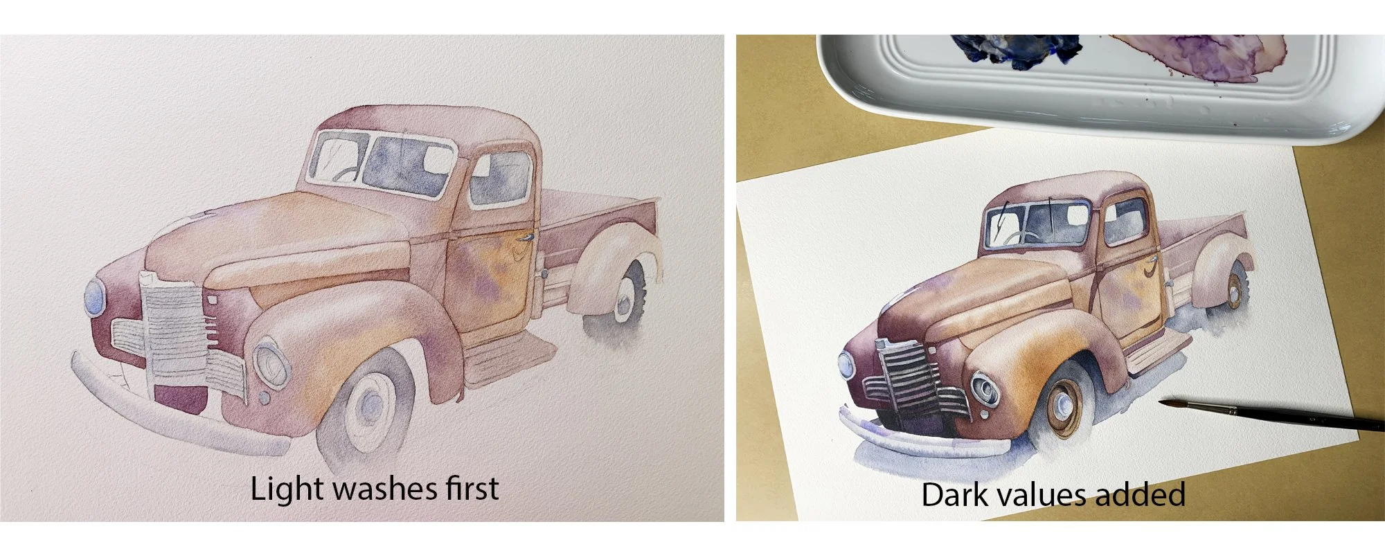
Dark is relative
There is another reason I don't like deciding at the beginning exactly how dark everything should be.
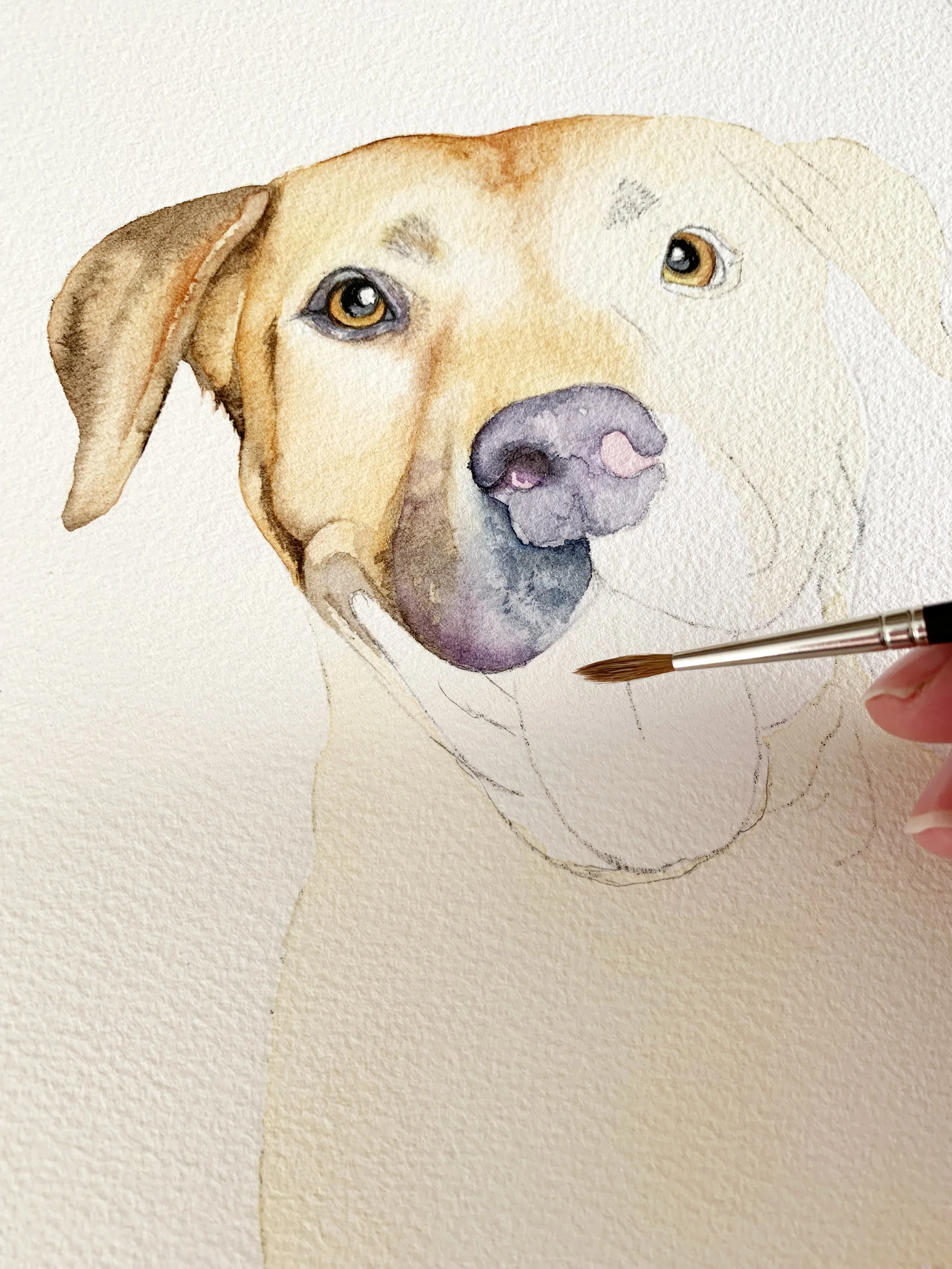
As you paint, keep comparing the darkness of one area with another. Values are easier to judge in relation to the areas around them.
Tonal values only really makes sense in relation to the values around it.
When I'm painting, I'm constantly comparing one shape with the shapes next to it. Is this area lighter? Darker? About the same? Does it need another layer? Does it have the same value?
This is particularly important because two very different colours can have a similar value. A deep violet and a dark green, for example, can look very different in colour while being surprisingly similar in darkness.
So rather than asking, "Is this colour dark enough?", it can be more useful to ask:
"Is this area dark enough compared with the areas around it?"
That small change in thinking can make value much easier to judge.
Understanding value scale: Some pigments go darker than others
It's also worth remembering that not all colours have the same tonal range.
Some pigments can take you from a very pale wash to a surprisingly deep, dark mixture. Others remain relatively light, even when you use quite a lot of pigment.
This is something I find useful to explore with simple value scales.
Take one pigment and paint it from its strongest, least diluted mixture through to a very pale wash. Then do the same with another colour. You'll quickly see that their ranges can be quite different. Creating these little scales also helps you become much more familiar with your water-to-paint ratio.
It is a simple exercise, but it can take some of the guesswork out of painting.
You begin to know, This is about as dark as this particular pigment will go.
And that can make you much more confident when you need a darker value in a painting.
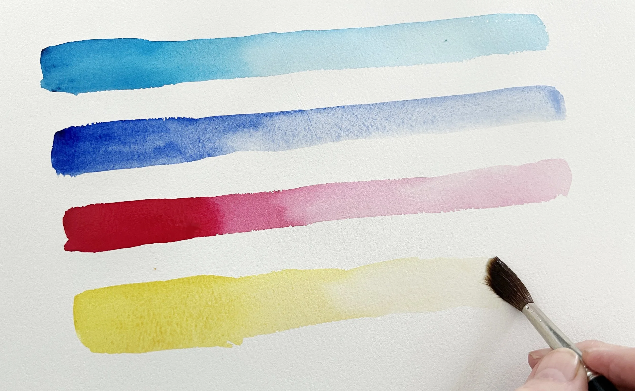
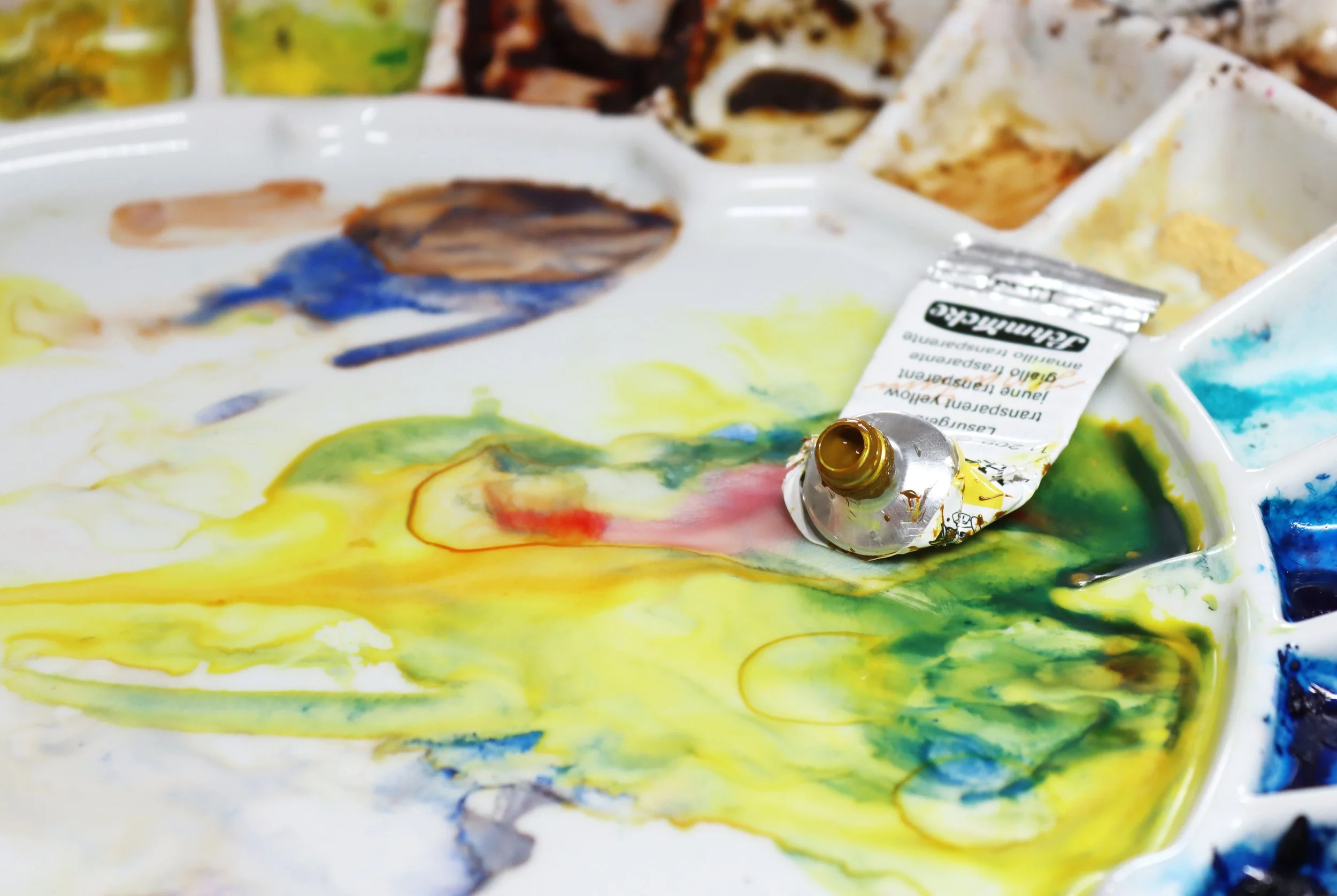
Some pigments, such as Transparent Yellow, have a limited value range. Even when used at a high concentration, they can only become so dark.
More pigment, less water
So, how do you actually make a watercolour darker?
Usually, the answer is not to reach immediately for a different colour. Start by changing the ratio of pigment to water.
More pigment and less water will give you a darker, stronger mixture. Add more water and you dilute the pigment, creating a lighter value.
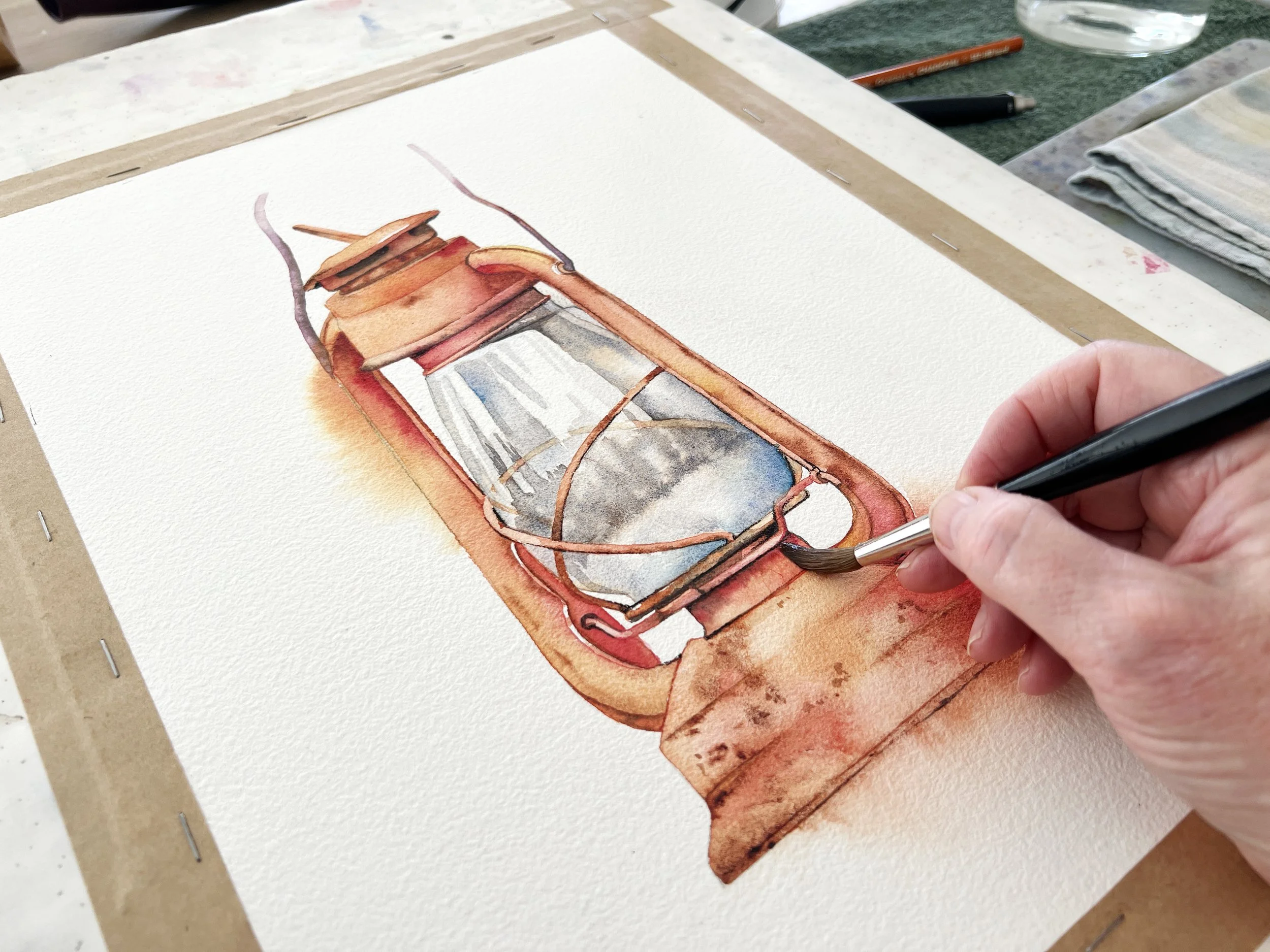
This is one of the reasons I like to use tube paints. If I’m mixing a dark colour, I can squeeze out some fresh paint and pick up a little with a slightly damp brush, then transfer it to the mixing area of my palette. I do the same with the second colour and mix the two together. At this stage I have a very concentrated mixture with very little water in it.
I then add just enough water to give the mixture the consistency I need and help it flow from my brush. I’m still working with a high concentration of pigment, but the paint is fluid enough to use comfortably.
If the paint has dried and hardened on my palette, I need to introduce water just to soften it and get it onto my brush. That can make it a little harder to achieve those really strong, concentrated mixtures.
If I’m using a single colour rather than mixing two colours together, I’ll sometimes pick up fresh paint directly from where I’ve squeezed it onto my palette. I’ll transfer a small amount to the mixing area and add just enough water to make it workable.
The important thing is that I’m controlling how much water goes into the mixture rather than automatically adding lots of water to my paint.
And if I need to go darker still, I can always add another layer once the first one is completely dry.
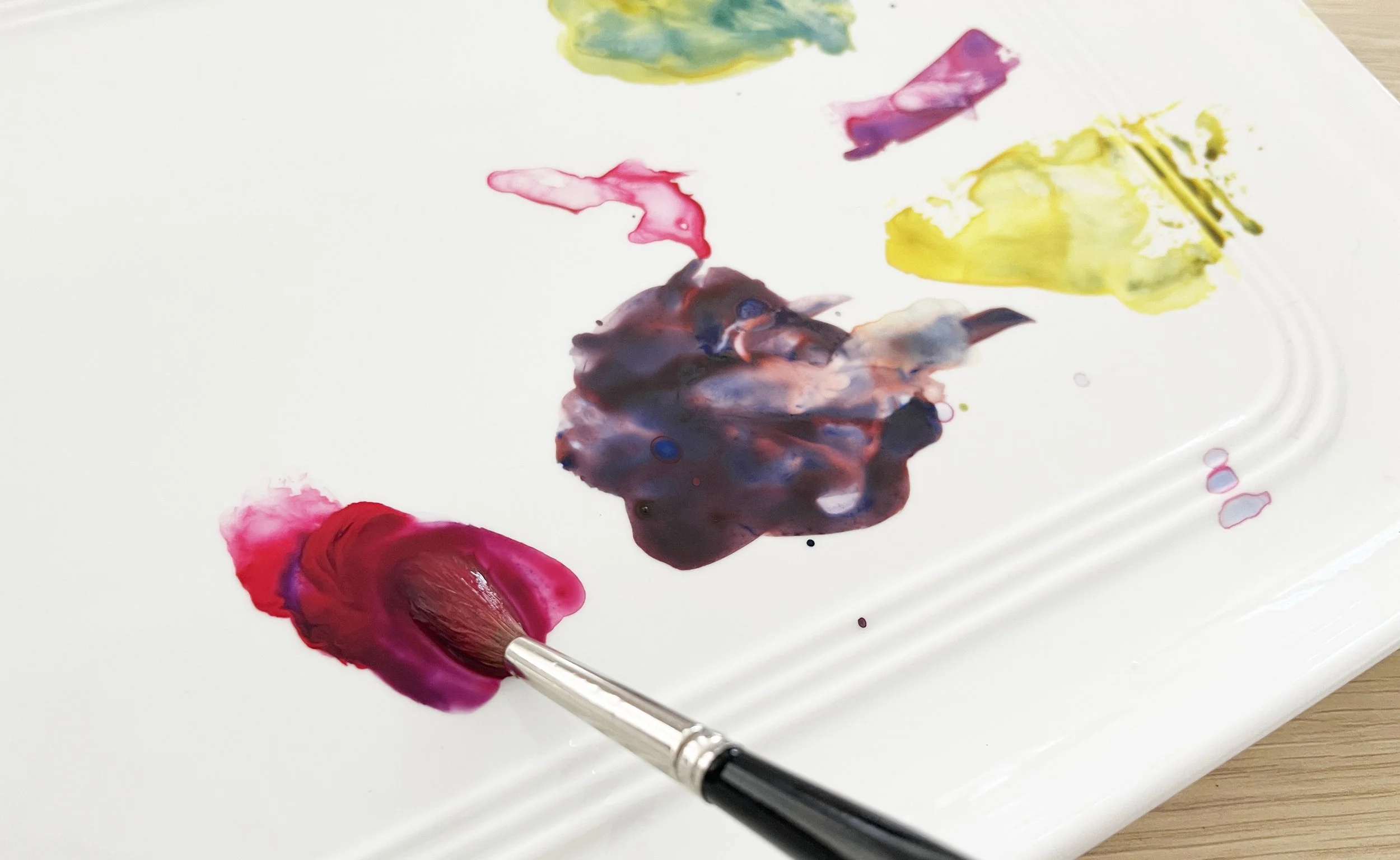
Using fresh pigment helps with colour mixing
Don't be afraid of the darkest darks
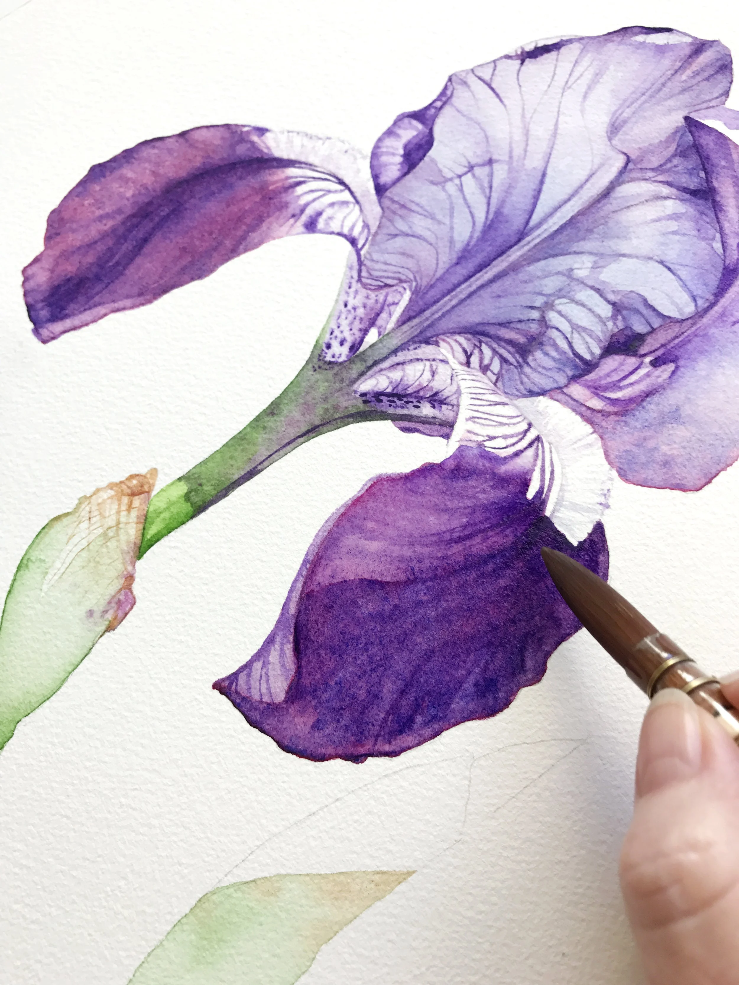
There is a difference between using dark values and making everything dark.
You don't need strong contrast everywhere.
One of the elements that gives a painting more visual impact is having a range of values. Some areas can remain light and understated while a few carefully chosen areas become much darker.
Those darkest values can then help the lighter areas appear even lighter.
They can also help direct the viewer's eye. Dark values can suggest solidity, shadow and depth, and controlling them can strengthen the focal point of a painting.
So if your painting feels a little flat or timid, it may not need more detail or more colour.
It may simply need a greater range of values.
What if you're frightened of going too dark?
Try building the dark gradually.
Put in a first layer and let it dry. Look at it again. Does it need to be darker?
If it does, add another layer.
Then stop and compare it with the surrounding areas.
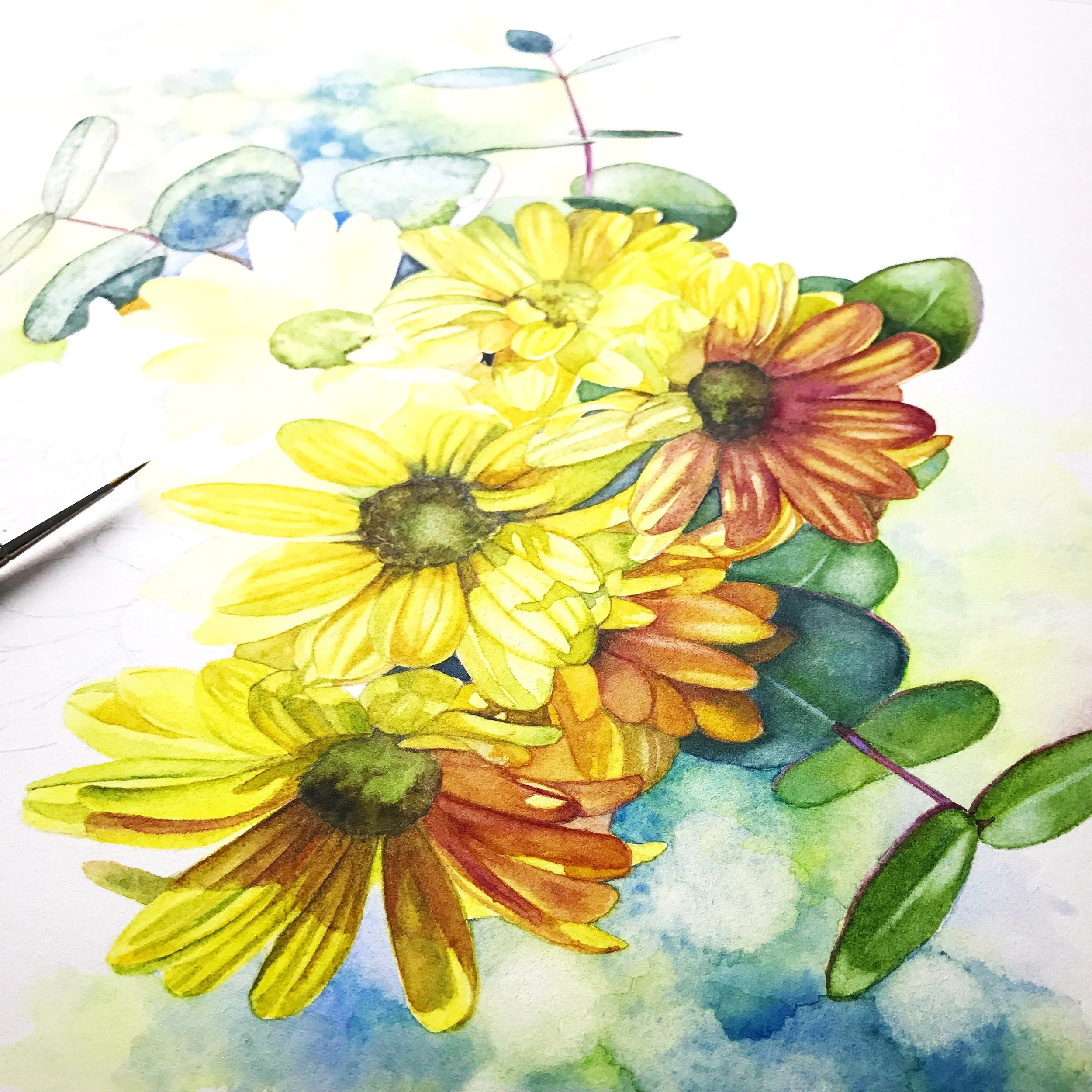
This is something I did when painting a rose that was past its best. I began with a very pale Raw Sienna wash, which established my lightest value. From there I gradually built up the mid-tones. Only once those were in place did I begin concentrating on the darkest parts of the rose.
When I eventually started adding the darkest values, I could judge them against everything else that was already on the paper.
That makes a big difference.
You are no longer asking, "How dark should a rose be?"
You're asking, "How dark does this particular shape need to be compared with the shapes around it?"
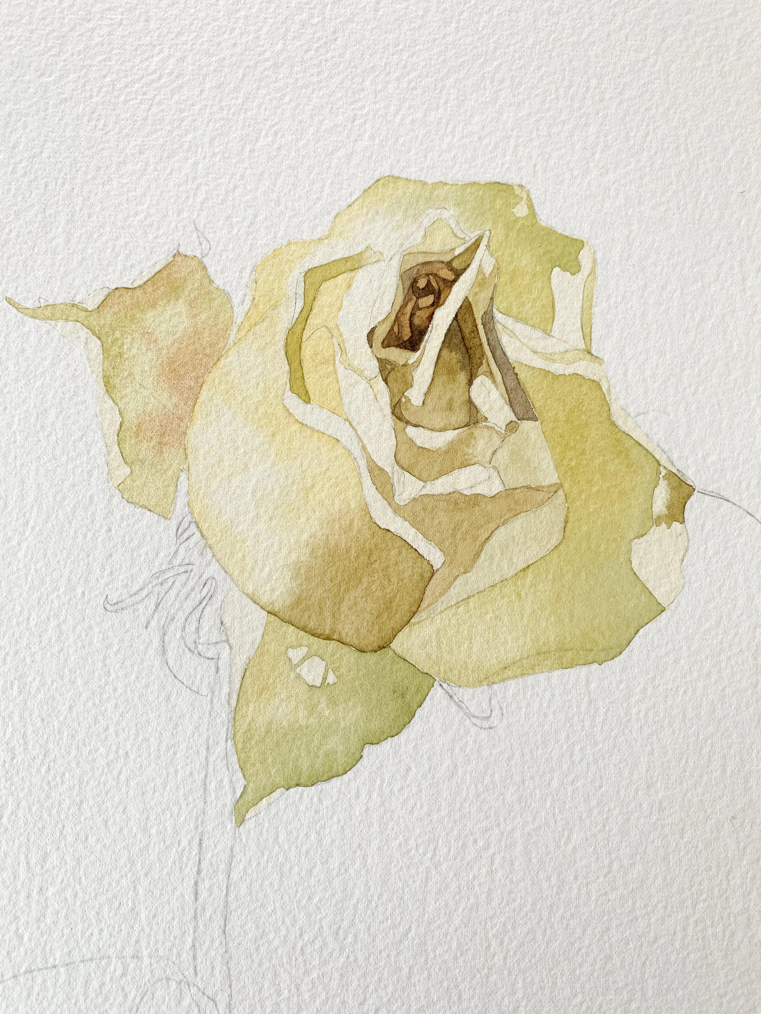
I started with pale washes, preserving the lightest areas while gradually establishing the mid-tones. There was no need to commit to the darkest values yet.
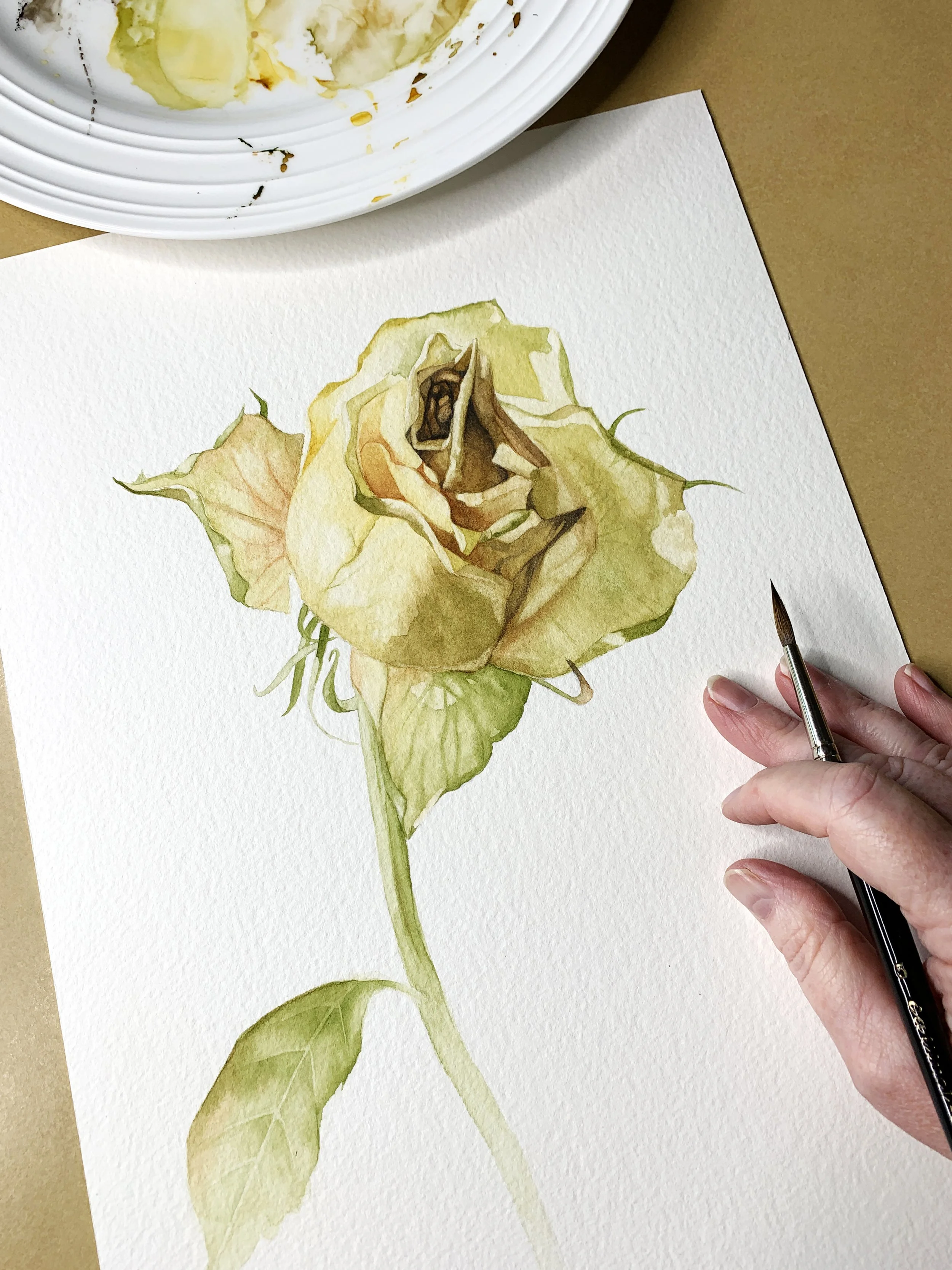
As the painting developed, I gradually strengthened the values and introduced the darkest areas. With the lighter and mid-values already established, it was much easier to judge how dark I needed to go.
Use a black and white image as reference
If you're struggling to identify the darkest parts of a reference photo, try removing the colour altogether.
Looking at your reference in black and white makes the tonal structure much easier to see. Without all the colours competing for your attention, you can concentrate on the actual light and dark shapes.
You can do the same with your painting.
Take a photo of it and look at it in grayscale. Suddenly you may notice that the area you thought was quite dark is actually only a mid-tone, or that two areas you thought were very different colours are almost identical in value.
It can be surprisingly revealing.
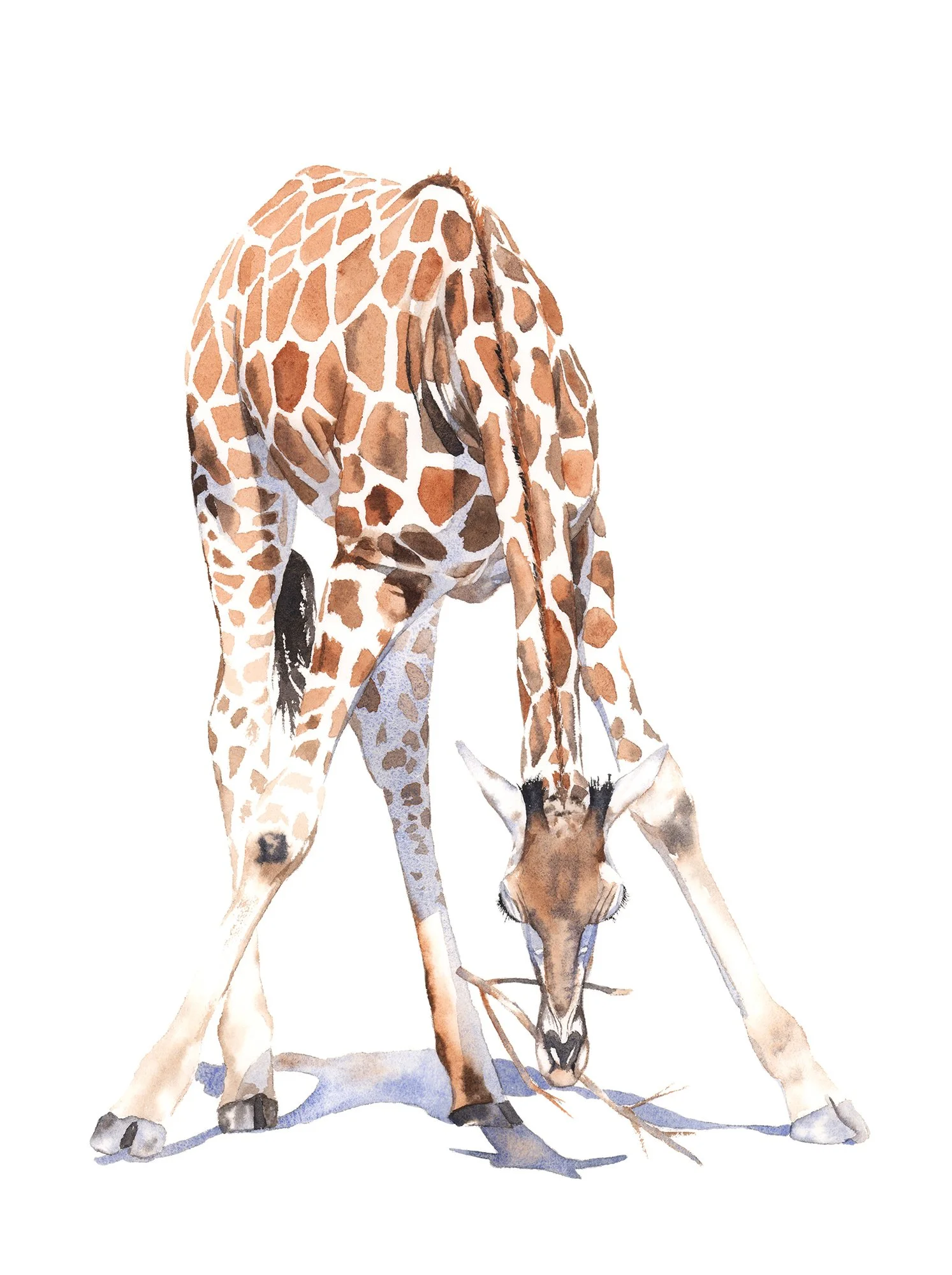
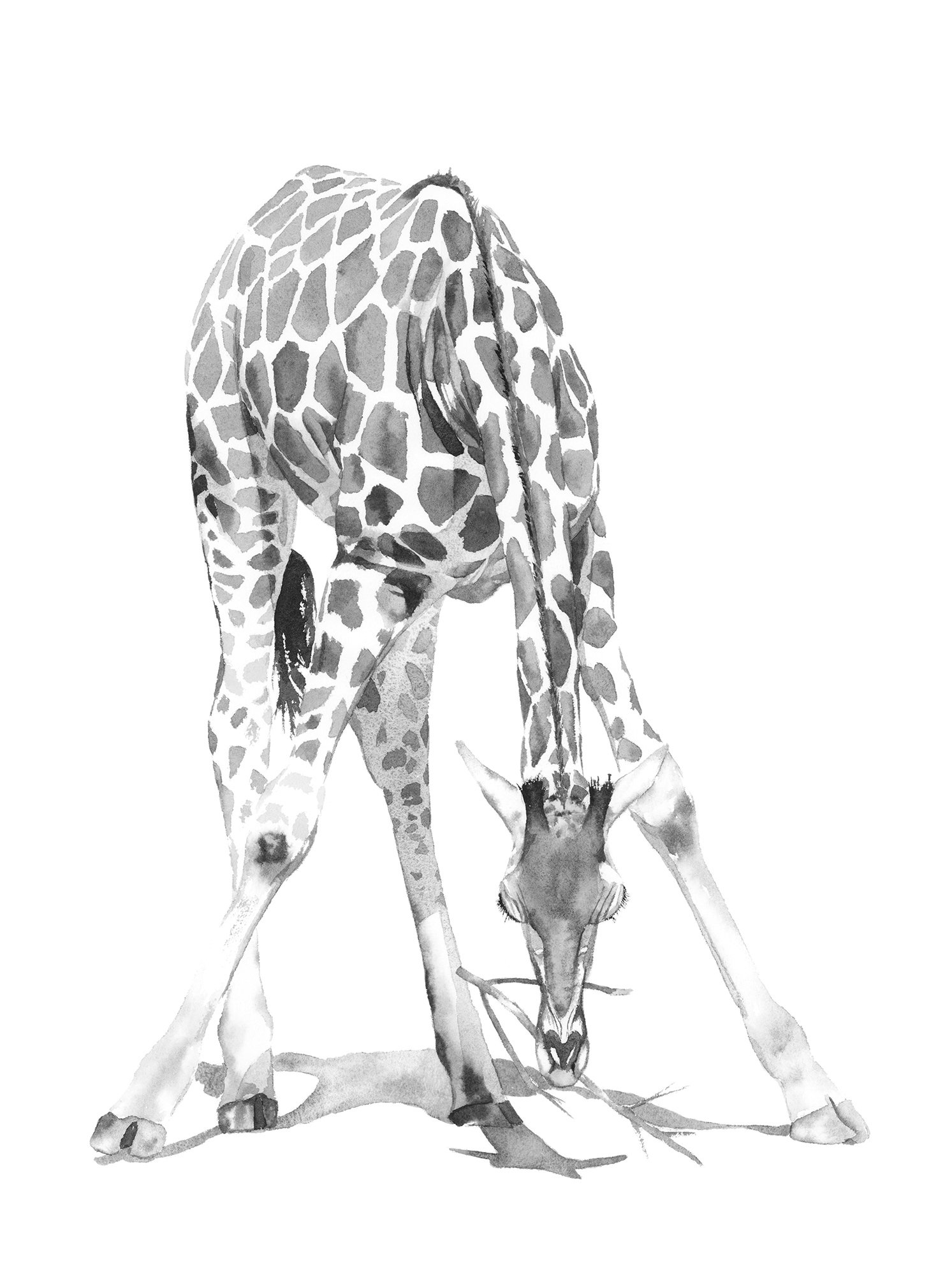
Viewing your painting in a black and white version removes the distraction of colour and makes it much easier to compare the light, mid and dark values.
Don't confuse colour with value
This is probably one of the most useful things to remember when you're learning to judge darks.
Value is not the same as colour.
A bright, intense colour isn't necessarily a dark colour. And a colour that looks quite dull isn't necessarily light.
Value simply describes how light or dark something is.
Hue tells us what colour it is. Value tells us how light or dark it is.
Once you start looking at paintings in terms of value rather than colour, it becomes much easier to see where your painting might need strengthening.
So, how dark should you go?
I don't think there is one universal answer.
The darkest value in your painting should be determined by the reference, the light you're trying to describe and the range of values you've already established.
But if you notice that you are consistently avoiding the darkest areas because you're worried about ruining the painting, try this instead:
Don't put the darkest dark in straight away. Build towards it.
Start with your lightest values. Establish the mid-tones. Let the painting develop. Then begin to deepen the areas that genuinely need more contrast.
And remember that you can always add another layer.
You don't have to get the darkest dark right on the first attempt.
Sometimes the confidence comes not from knowing exactly how dark to go, but from knowing that you can get there gradually.
So don't be afraid of your darks.
Just sneak up on them.
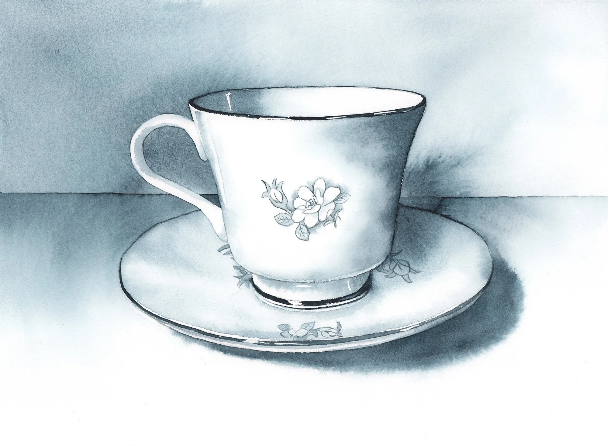
Want to get more confident with your darks?
In my Teacup Value Study class, you’ll practise judging values and gradually building stronger darks without losing control of the painting.
New to watercolour? Try Louise’s free class.
It's also worth remembering that not all colours have the same tonal range.
Some pigments can take you from a very pale wash to a surprisingly deep, dark mixture. Others remain relatively light, even when you use quite a lot of pigment.
This is something I find useful to explore with simple value scales.