
How to Paint Cast Shadows in Watercolour
Colour, Values and Edges
Shadows can be surprisingly difficult to paint.
You look at your reference and see a shadow. It might look grey, so you mix up some grey paint and put it on the paper. But somehow the result looks flat, heavy or a little bit lifeless.
I think this is because we often think of a shadow as simply being the darker version of whatever is in the light.
But shadows are much more interesting than that.
They have their own colour, their own tonal value and their own edges. They can contain reflected colours from the objects around them, and they change depending on the quality of the light.
Once you start looking at shadows this way, they become much easier and much more interesting to paint.
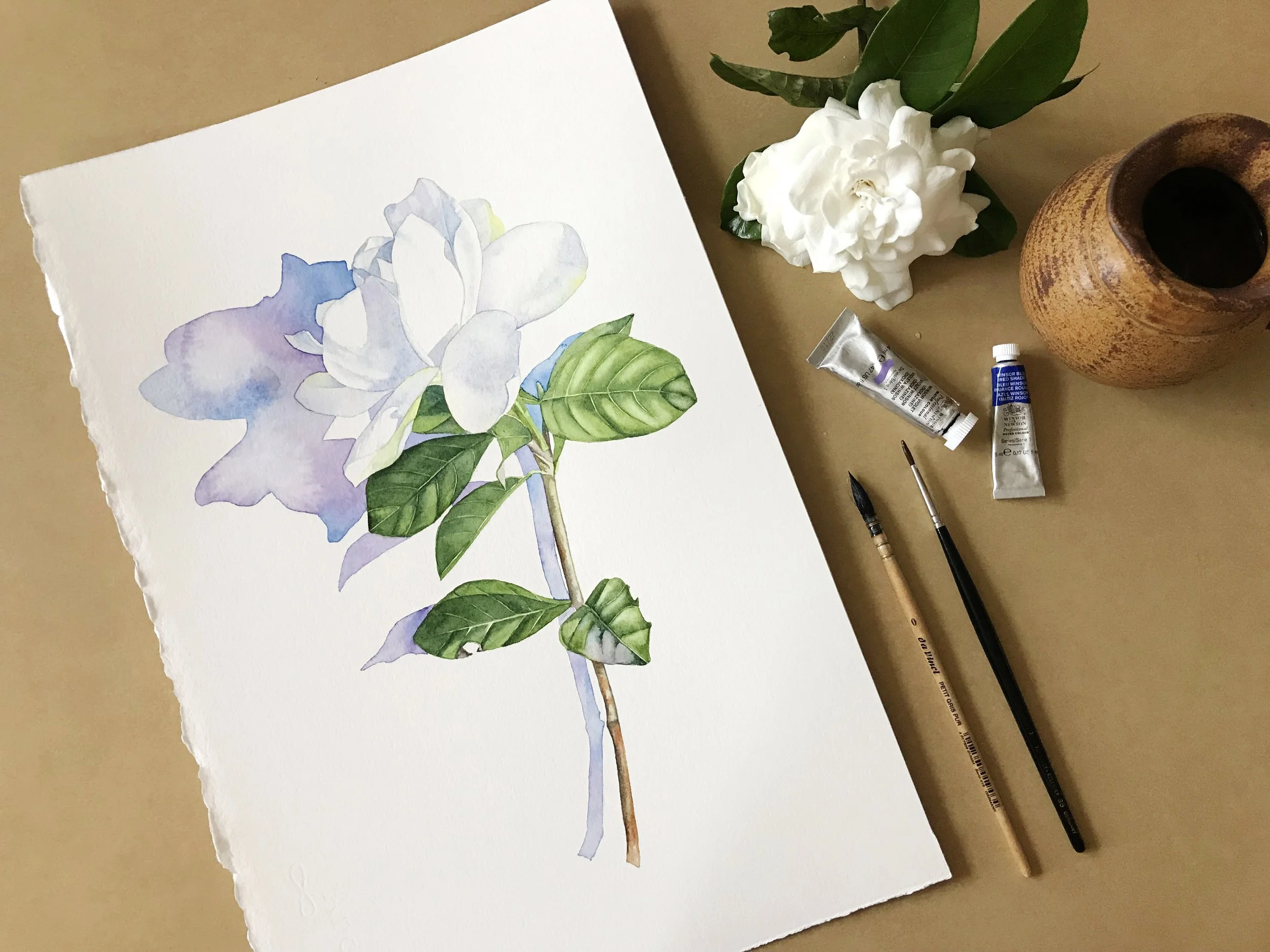
The pale blue-violet shadows help define the white petals without losing their brightness, while the stronger cast shadow adds depth and separates the flower from the background.
Cast shadows and form shadows
First, it helps to distinguish between two different types of shadow.
A cast shadow is made by an object blocking the light. A flower might cast a shadow onto a leaf, a vase might cast a shadow onto a table, or a plant might cast a shadow onto the wall behind it.
A form shadow is the part of the object itself that isn't receiving the light. It helps us understand the shape and three-dimensional form of the object.
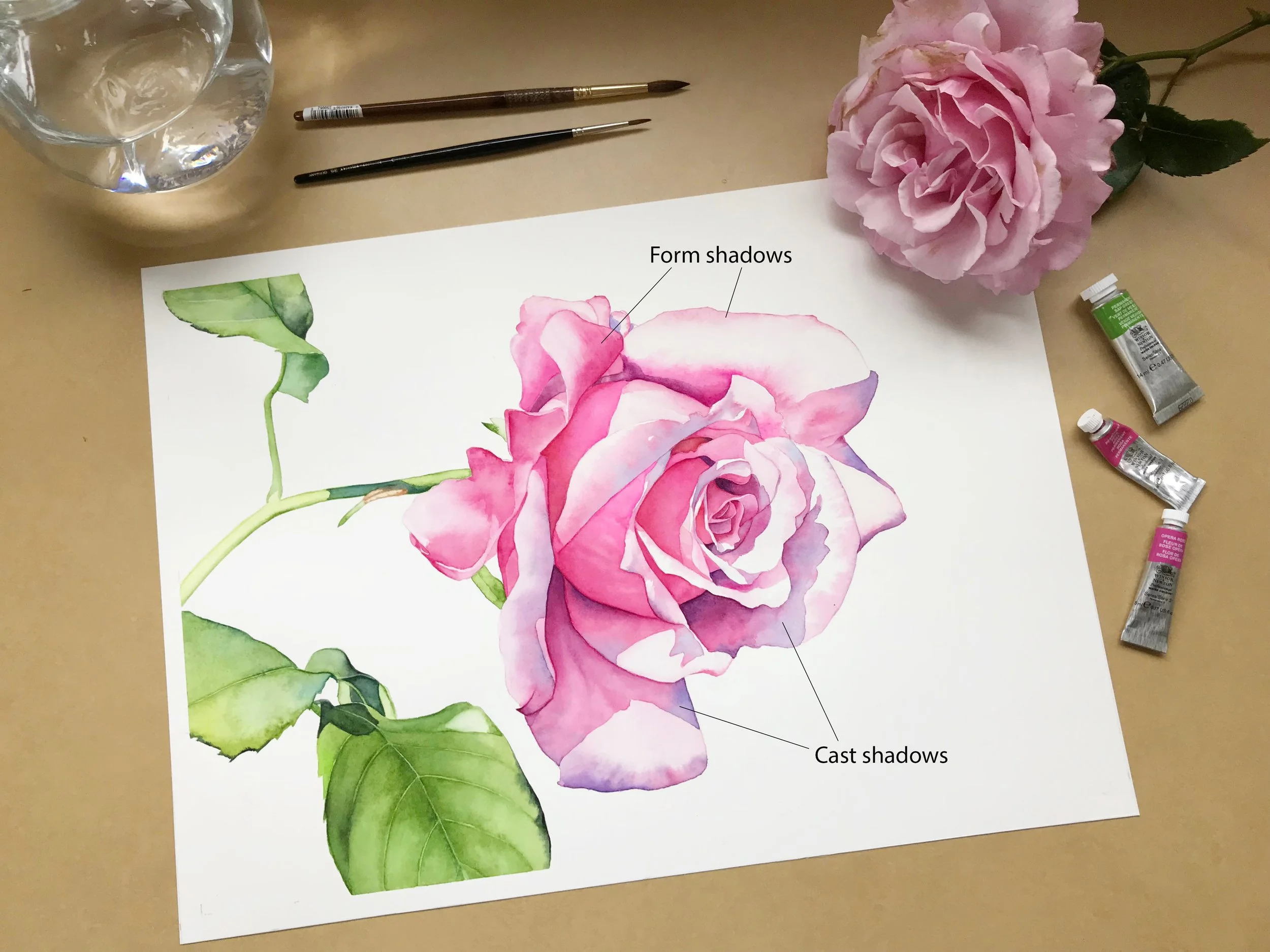
Form shadows describe the curved surfaces of the rose petals, while cast shadows show where one petal blocks light from reaching another.
For this article, I'm concentrating on cast shadows, because they can be such an important part of a painting's composition.
In fact, I often choose a reference photo because of the cast shadows in it. A beautiful shadow can make an otherwise ordinary subject much more interesting to paint.
A shadow isn't necessarily grey
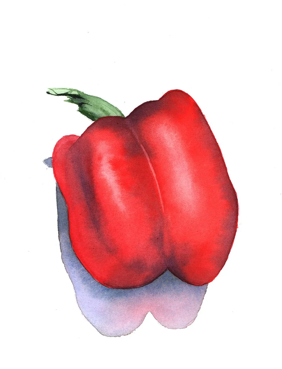
The darker tonal values give the capsicum its rounded form, while the blue-violet cast shadow helps anchor it to the surface.
This is probably the first thing to change if your shadows are looking a little dull.
Shadows aren't simply grey areas that you put underneath an object.
They can contain all sorts of reflected colours from the things around them.
When I painted a capsicum with a strong cast shadow, I mixed French Ultramarine and Burnt Sienna to make a grey for the main colour of the shadow. I tend to favour cool shadows, so I added a little extra blue.
But I didn't leave it there.
I dropped some Winsor Violet and Cadmium Red into the wet grey. The red was a reflected colour from the capsicum itself. The violet echoed the colour I had used on the capsicum. The result was much more interesting than a flat grey shadow.
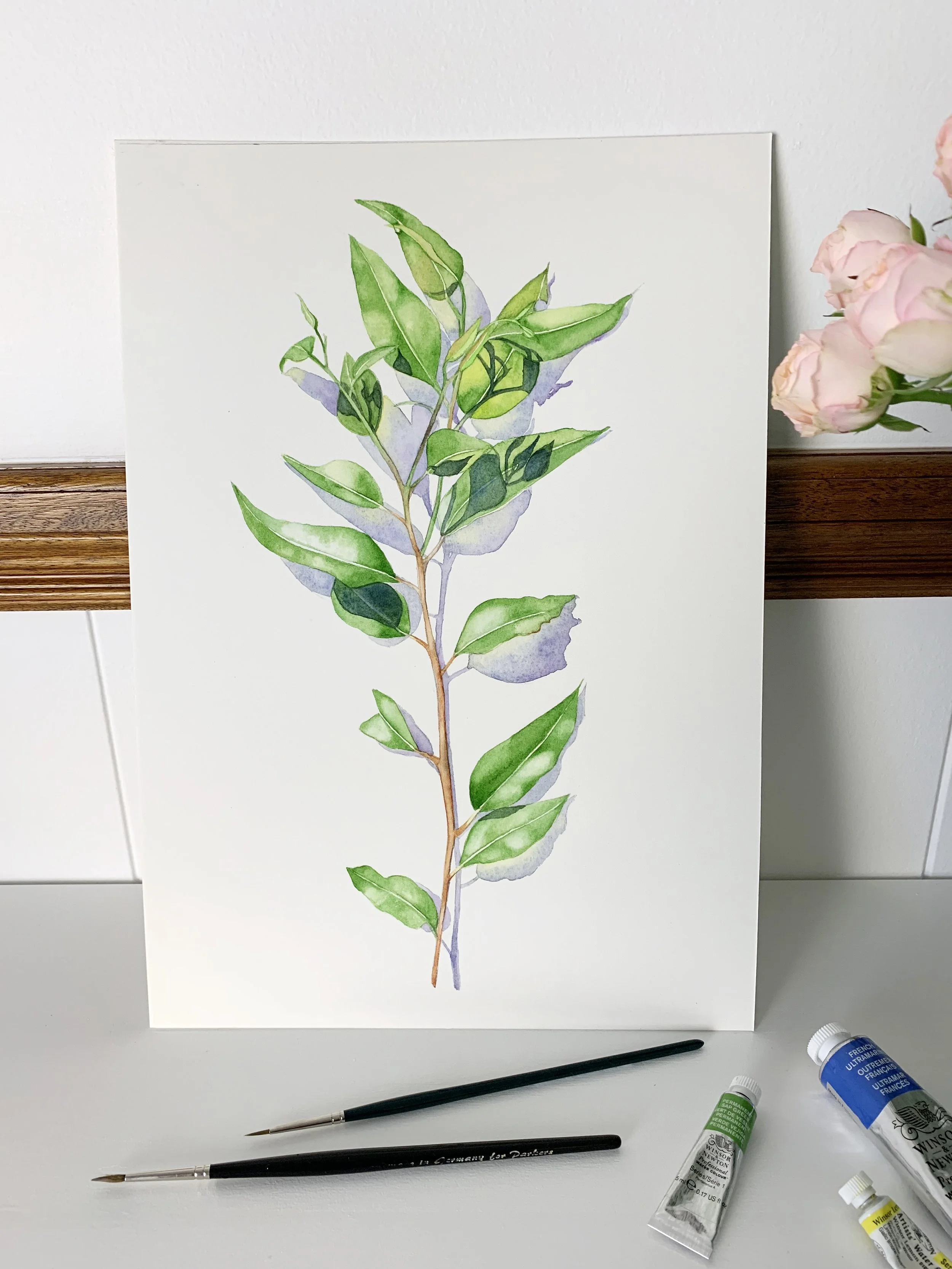
The cast shadows add depth to this simple botanical painting, helping separate the leaves and create a sense of dimension.
I've used the same idea in other paintings. In one painting of eucalyptus leaves, for example, I used pale grey in the background shadows, but added violet and yellow where I could see those colours reflected. On the leaves themselves I used darker greens and blue. With daffodils, I used greens and even some orange reflected from the flowers.
So when you're looking at a shadow, don't just ask:
"What colour is the shadow?"
Also ask:
"What colours can I see in the shadow?"
That little shift in observation can make a big difference.
Look at the light before you paint the shadow
The quality of the light affects both the value and the edges of a cast shadow.
In strong, bright light, cast shadows tend to be darker and have more defined edges.
In weaker light, shadows are usually paler, with softer, fuzzier edges.
This is useful information when you're working from a photograph.
If your reference was taken outside on a sunny day, you may see a strong, clearly defined shadow. If the same subject was photographed inside on a dull day, the shadow might be much softer and more subtle.
So don't automatically give every shadow a hard edge.
Look at what the light is doing.
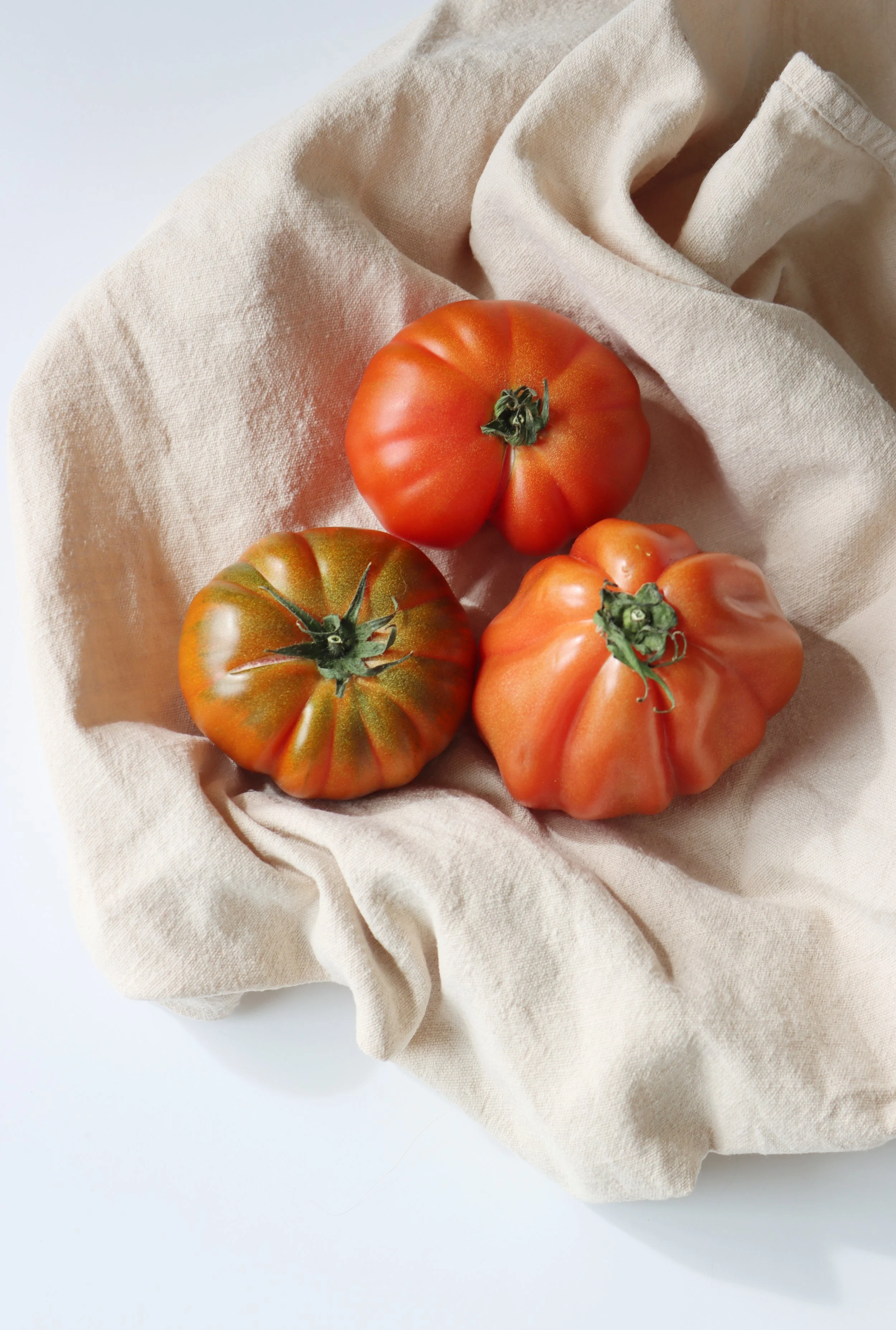
Softer, more diffused light produces gentler transitions between light and shadow. Notice how the cast shadows are lighter and less defined, creating a softer, more subtle sense of depth.
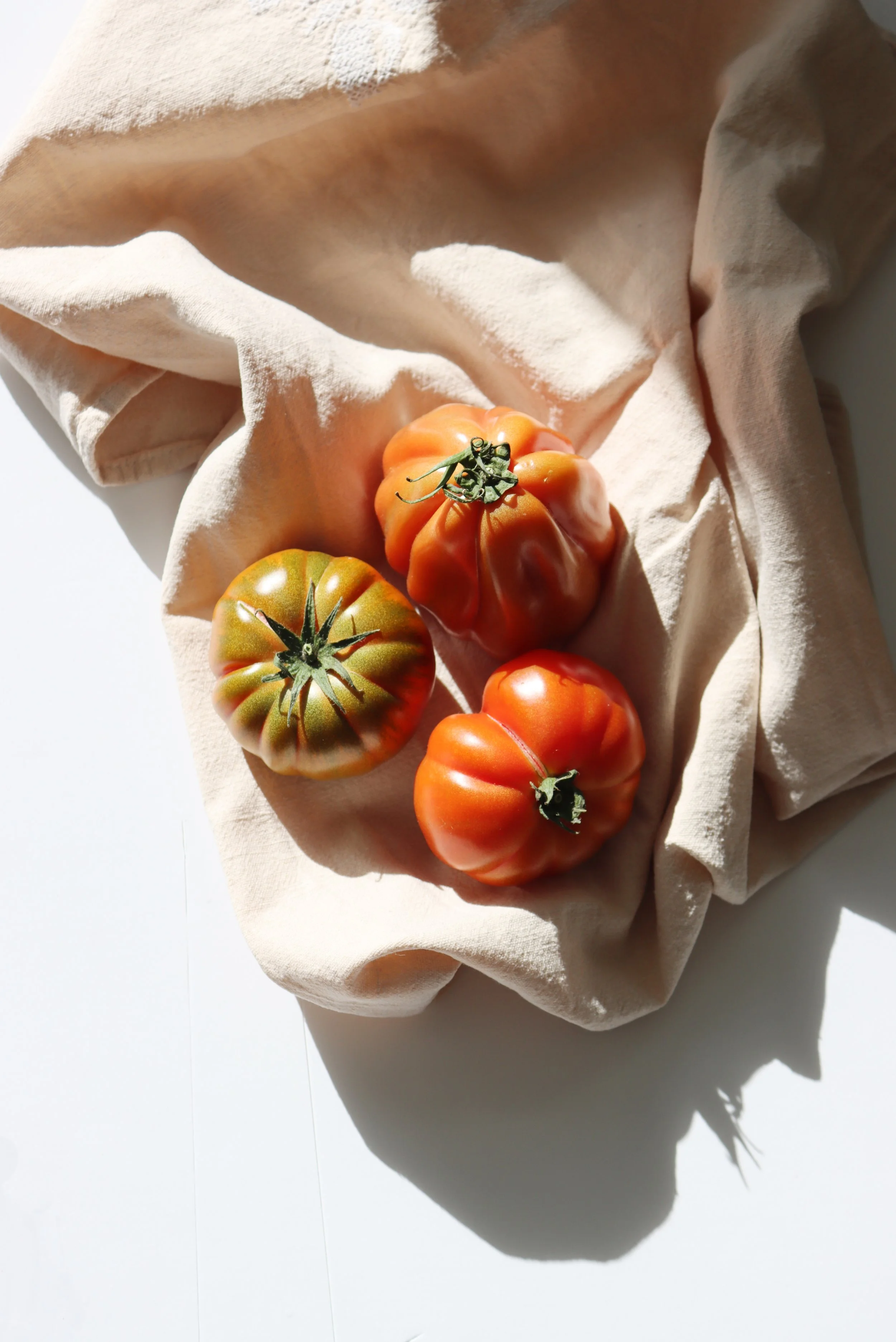
Strong, direct sunlight creates dark cast shadows with clearly defined edges. Notice the dramatic contrast between the brightly lit tomatoes and fabric and the deep shadows surrounding them.
The darkest part of a cast shadow
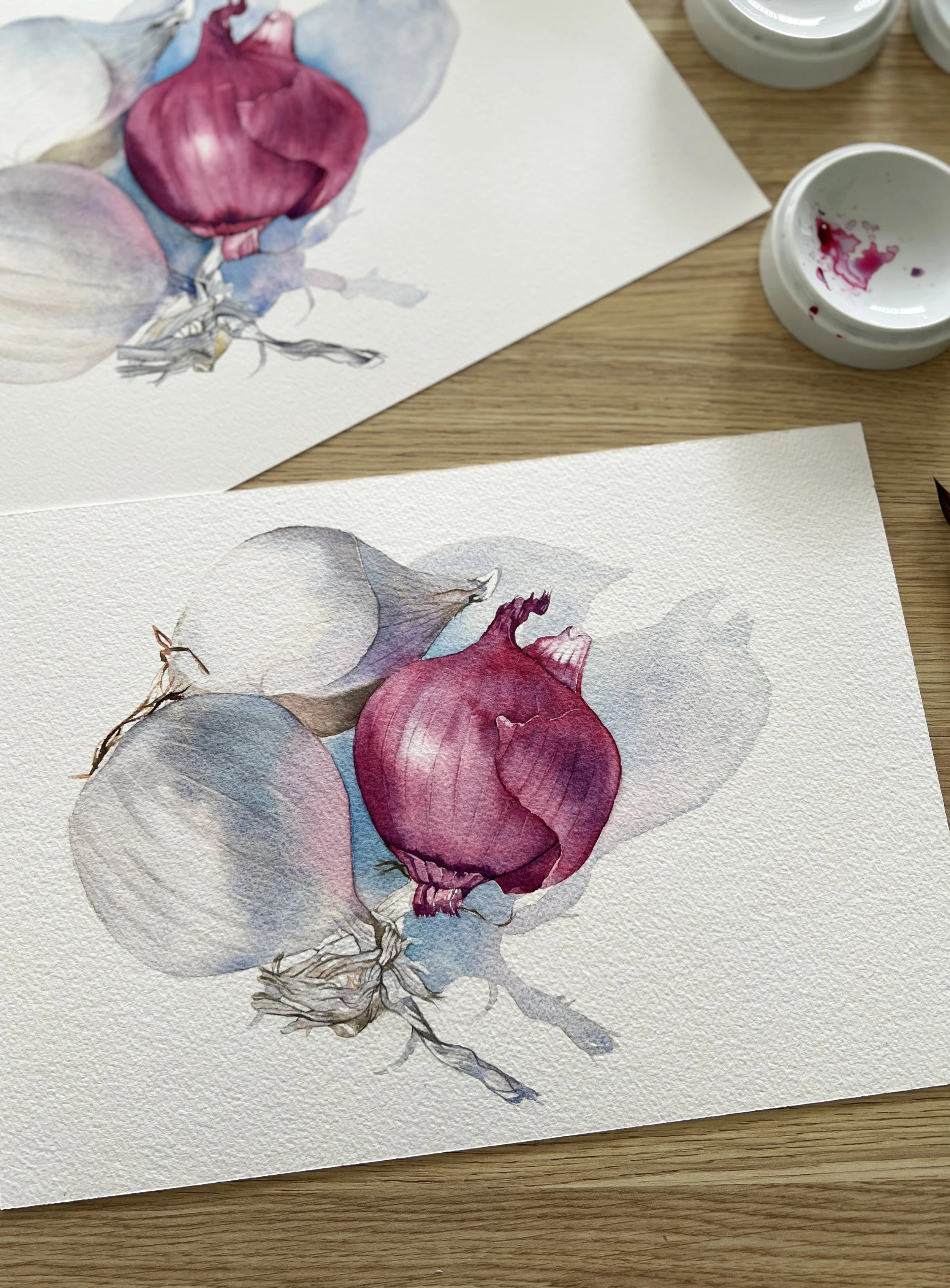
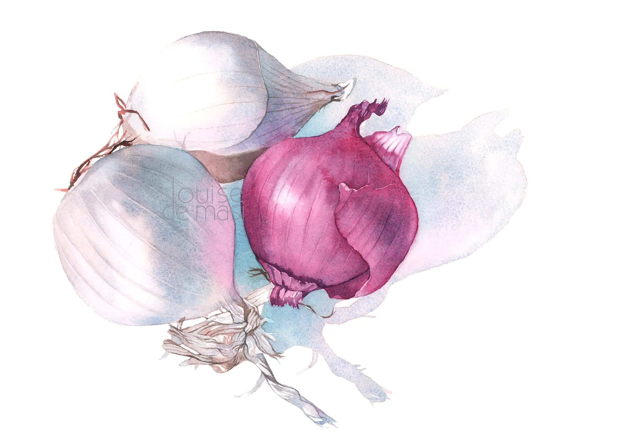
fully observed form and cast shadows help establish the rounded shapes of the onions and give the painting a greater sense of depth.
There is another simple principle that helps when you're painting cast shadows.
The shadow is usually darkest closest to the object casting it.
As it moves away from the object, it becomes lighter.
When I painted the cast shadows around the onions, I started with the darkest mixture right against the onions. As I moved away from them, I dipped my brush into water and gradually reduced the amount of pigment on it. When everything was dry, I rewet the shadow areas with clean water and dropped in some Phthalo Blue close to the onions to deepen the colour where the shadows were darkest.
The difference is quite subtle. It doesn't have to look like a stripe going from dark to light. But that gradual change helps the shadow feel much more natural.
And remember that the shadow should actually touch the object that is casting it. It isn't an unrelated shape floating beside it.
Warm or cool?
I tend to favour cool shadows, so I often introduce a little extra blue into my shadow mixtures.
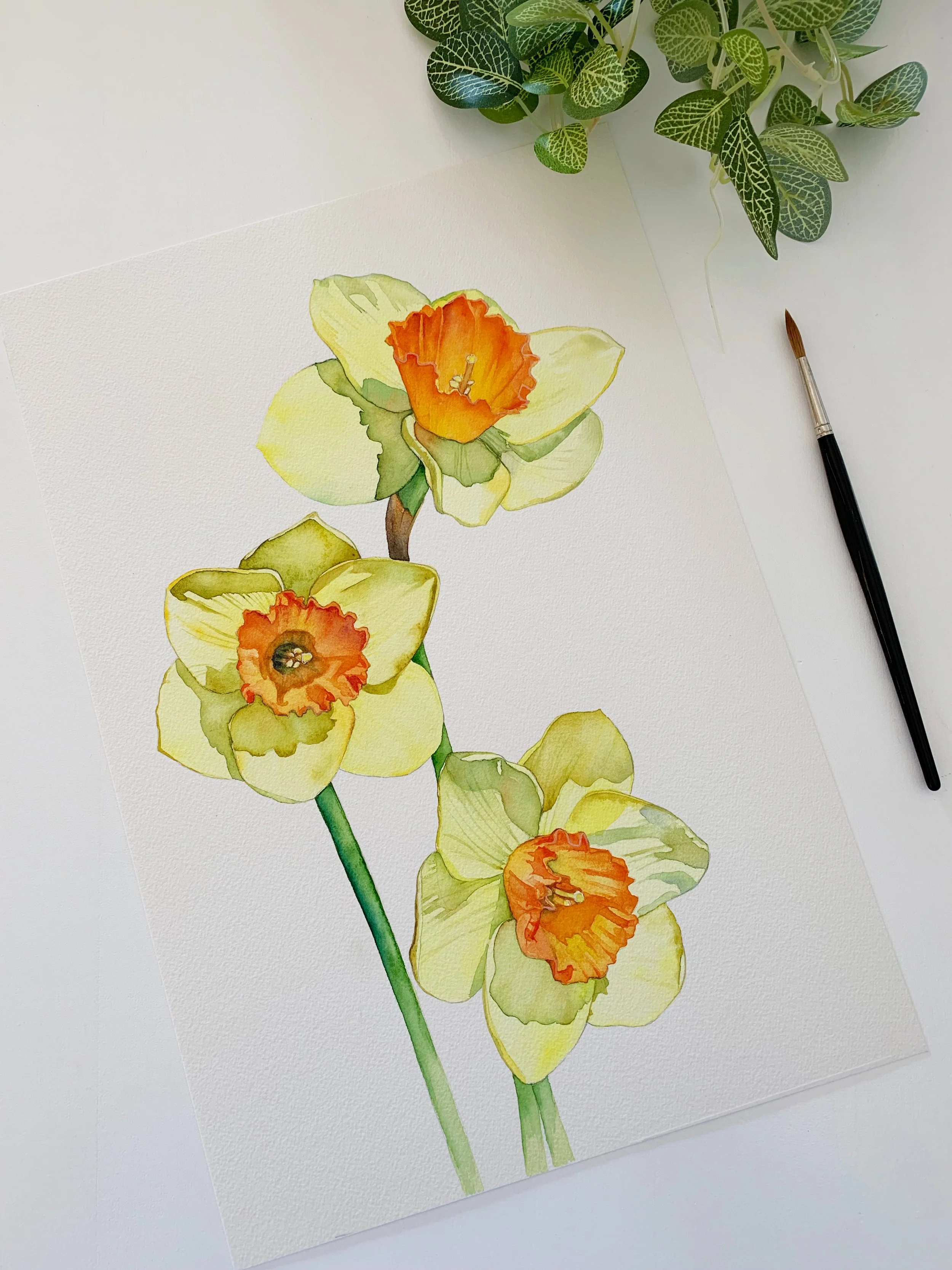
Subtle changes in tonal value help describe the delicate petals, while stronger colours and darker values draw attention to the flower centres.
But I don't think every shadow needs to be cool.
Look at the colours around you.
The colour of the light, the colour of the object and the colours of nearby surfaces can all influence what you see in the shadow.
Sometimes a complementary colour is a useful starting point. If you're painting something yellow, for example, violet can be a beautiful way to create a shadow. I sometimes mix a little violet into yellow to neutralise it and create a softer, more natural shadow.
With yellow flowers such as daffodils, I might also use transparent greens or a muted earth colour such as Raw Umber, depending on what I'm seeing.
The important thing is not to follow a formula.
Look at the shadow in front of you.
Let your colours mingle
One of my favourite ways of painting a colourful shadow is to put down a pale base colour and then drop other colours into it while it is still damp.
This is sometimes called charging the colour.
The colours mingle on the paper rather than being mixed completely on the palette. In the capsicum painting, for example, I allowed the grey shadow to remain wet while adding violet and red.
This gives you a shadow that contains variation without having to paint lots of little patches of colour.
It's subtle, but when the painting is dry you can see those different colours sitting inside the shadow.
Don't make your shadows too dark
This is probably the most common shadow problem I see with beginners.
They are often too dark and too much of a single, drab colour.
When a shadow is darker than it needs to be, the eye can go straight to it. Instead of supporting the painting, the shadow becomes the thing you notice first, and the whole painting can feel out of balance.
I much prefer to start with a lighter shadow.
You can always add another layer.
You can't so easily take away a dark wash once it has dried.
This is one reason I like building my watercolour paintings gradually. I can put down a pale shadow, let it dry, look at it again and decide whether it needs to be darker. I can also adjust the colour as I go.
It gives me much more control.
Hard edges or soft edges?
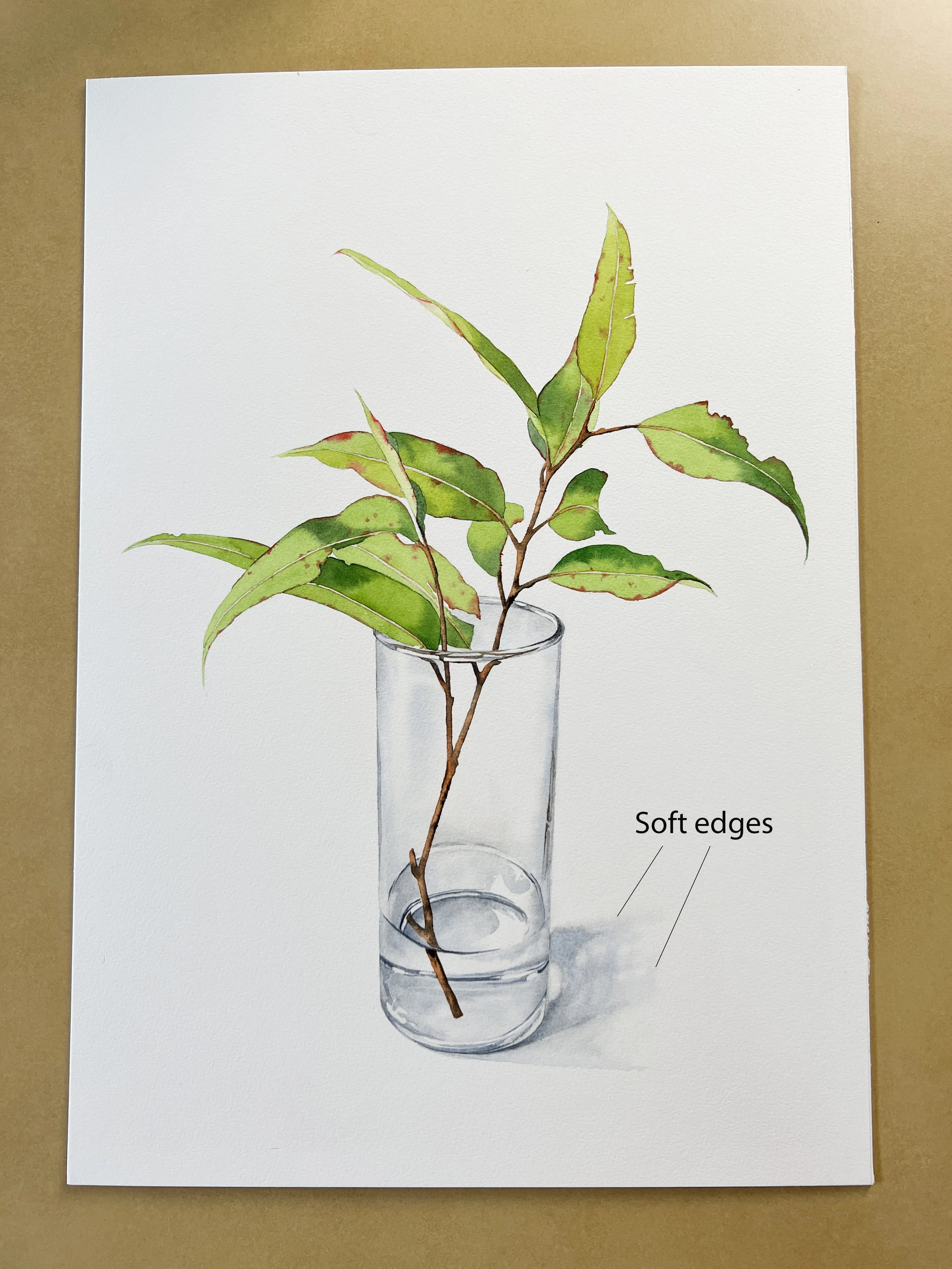
The soft edges of the cast shadow suggest diffused light and help the glass vase sit naturally on the surface.
The edge of a shadow tells us something about the light.
A strong, direct light can create a fairly hard-edged shadow. A softer light source can produce a much more diffuse one.
In this painting of eucalyptus leaves in a glass, the cast shadow is very soft. There isn’t a clearly defined edge where the shadow suddenly stops. Instead, it gradually fades into the white paper.
To create this effect, I painted the shadow quite pale and softened the outer edges with water, allowing them to disappear gradually into the paper.
Compare this with a shadow created by strong sunlight, where you would expect to see a much more defined edge and often a stronger contrast between the light and shadow.
Again, the reference will tell you what to do.
Think about the shadow as part of the painting
I think shadows are sometimes treated as something we have to add at the end because an object needs to look as though it is sitting on a surface.
But a good cast shadow does much more than that.
It can anchor an object. It can describe the direction and strength of the light. It can add colour and variation. And it can even be the thing that makes you want to paint a particular reference in the first place.
So next time you're looking at a reference, spend a little time studying the shadows before you start painting them.
Ask yourself:
Where is the light coming from?
Where is the shadow darkest?
Does it become lighter as it moves away from the object?
Are the edges hard or soft?
What colours can I see in the shadow?
Is the shadow warm or cool?
Are there colours being reflected from the object or its surroundings?
You might discover that what first looked like a simple grey shape is actually one of the most interesting parts of the painting.
And that is the thing I love about watercolour.
Sometimes the most beautiful colour isn't in the object itself.
It's hiding in the shadow.
Put what you've learnt into practice
Want to try painting cast shadows yourself? In my Onion Watercolour Tutorial, I'll show you how I use colour, tonal values and soft edges to create natural-looking shadows that give the onions form and depth.
You'll learn how to gradually build darker values, introduce colour into your shadows and create subtle transitions that help bring your painting to life.
New to watercolour? Start with the free class.
I've used the same idea in other paintings. In one painting of eucalyptus leaves, for example, I used pale grey in the background shadows, but added violet and yellow where I could see those colours reflected. On the leaves themselves I used darker greens and blue. With daffodils, I used greens and even some orange reflected from the flowers.
So when you're looking at a shadow, don't just ask:
"What colour is the shadow?"
Also ask:
"What colours can I see in the shadow?"
That little shift in observation can make a big difference.