
Why Your Watercolour Painting Looks Flat
… and How to Fix It
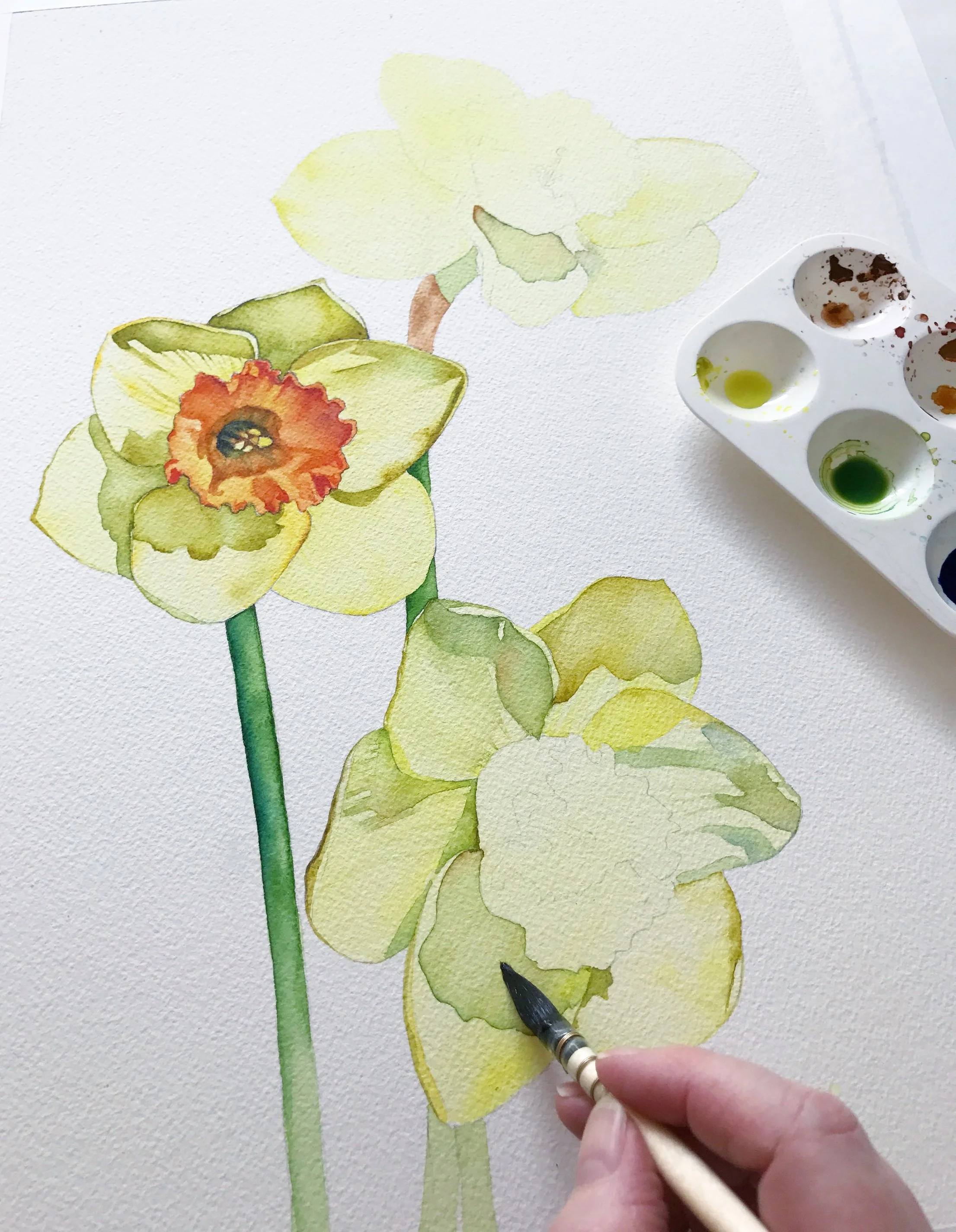
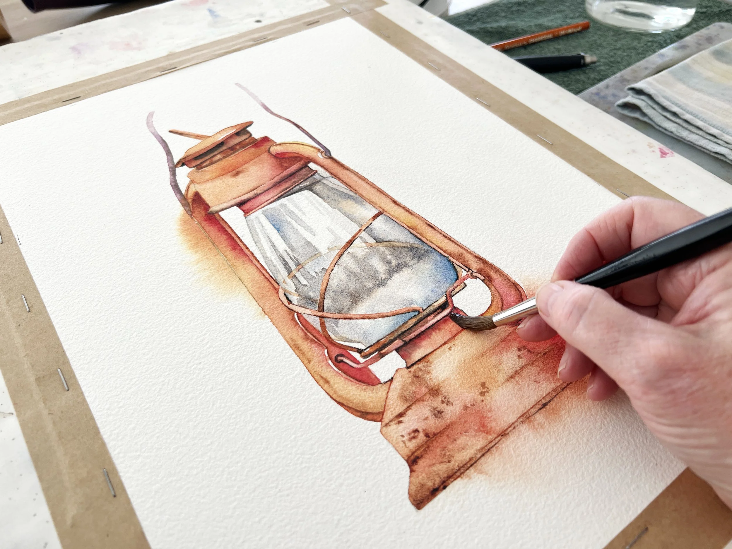
The early washes are deliberately light, leaving room to gradually build darker values and create form.
You’ve painted the subject carefully. The colours are beautiful, the details are there, and yet when you step back and look at the finished painting, something is missing. It looks a little flat.
This is something I see quite often, particularly with beginner watercolour painters. The temptation is usually to add more: more detail, more colour, perhaps a few darker brushstrokes. But adding more isn’t necessarily going to give your painting more depth.
Often, the answer lies in a few quieter decisions: tonal values, contrast, edges, shadows and where you want the viewer’s eye to go.
These things work together. And once you start paying attention to them, you may find that your paintings need less detail, not more.
Start by looking at tonal values
One of the most important things to get right in a watercolour painting is the tonal value, in other words, how light or dark something is.
This is actually more important than getting the colour exactly right.
A painting can have lovely colours, but if all the areas are similar in value, it can be difficult to see the form and depth. Everything starts to sit on the same visual level.
I find it helpful to think about a painting in terms of light, mid-tones and darks rather than thinking about colour first. When I'm working from a reference photo, I will sometimes turn it into black and white. This makes it much easier to see where the darkest and lightest areas are.
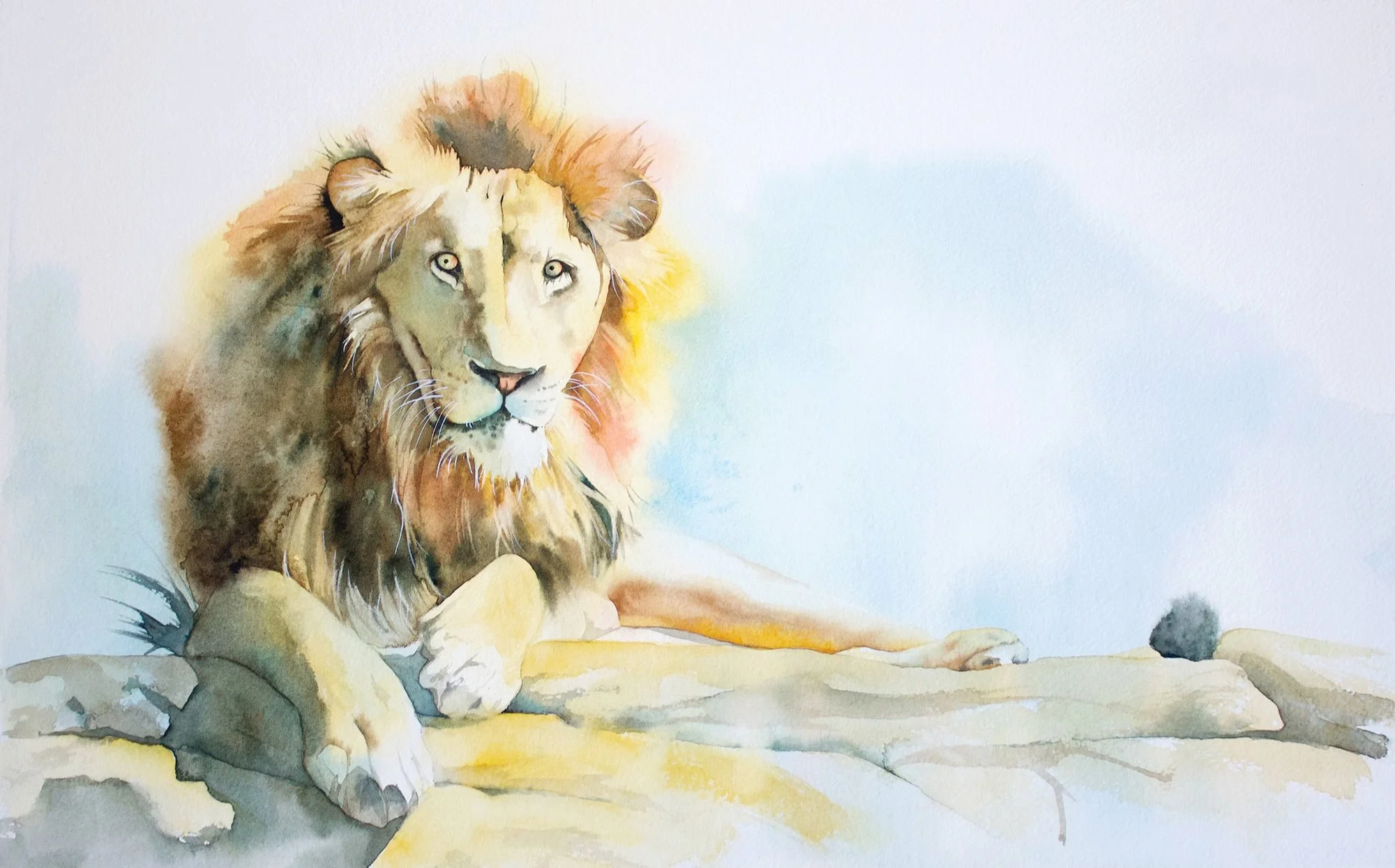
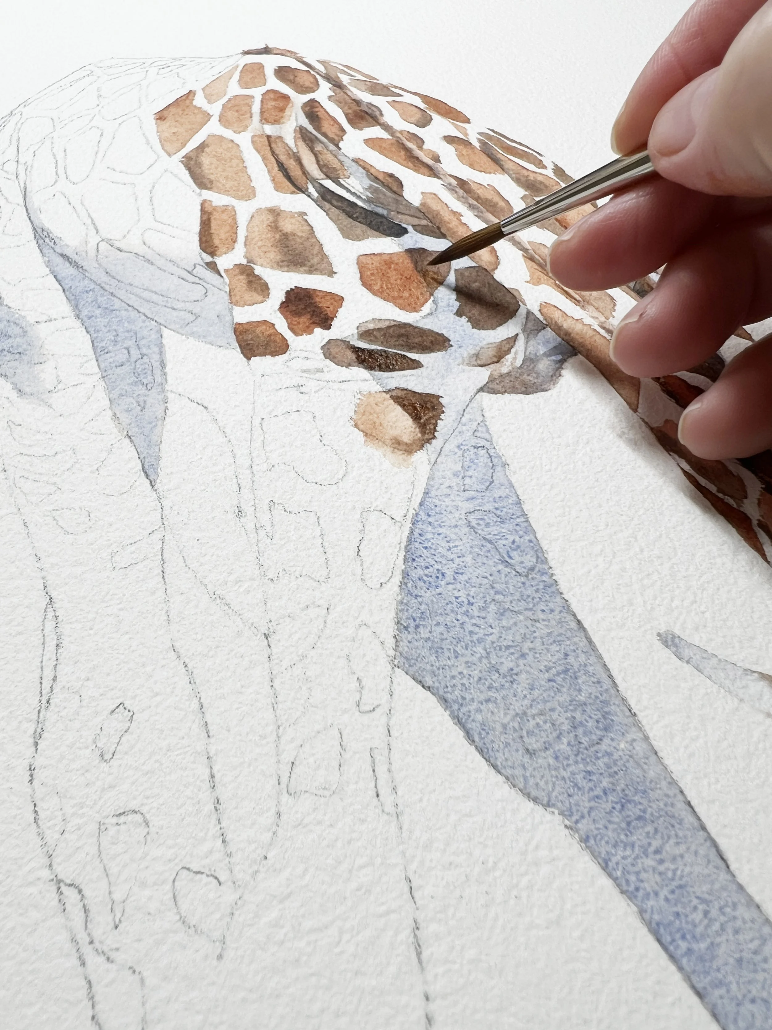
I also work from light to dark. I usually start with a pale wash and then gradually build up the darker values. I like to sneak up on my darks rather than committing to them too early.
This is particularly important in watercolour because the white of the paper is your lightest value. Once you've gone too dark in an area, there isn't much room left to go.
So rather than asking yourself, “What colour is this?”, try asking:
“Is this area lighter or darker than the one next to it?”
That simple question can make a surprising difference.
You don't need contrast everywhere
Once you've established your values, think about contrast.
Contrast is one of the things that tells the viewer where to look. If every part of your painting has the same degree of light and dark, the same amount of detail and the same strength of colour, the eye doesn't really know where to settle.
I learnt this quite clearly while painting a python.
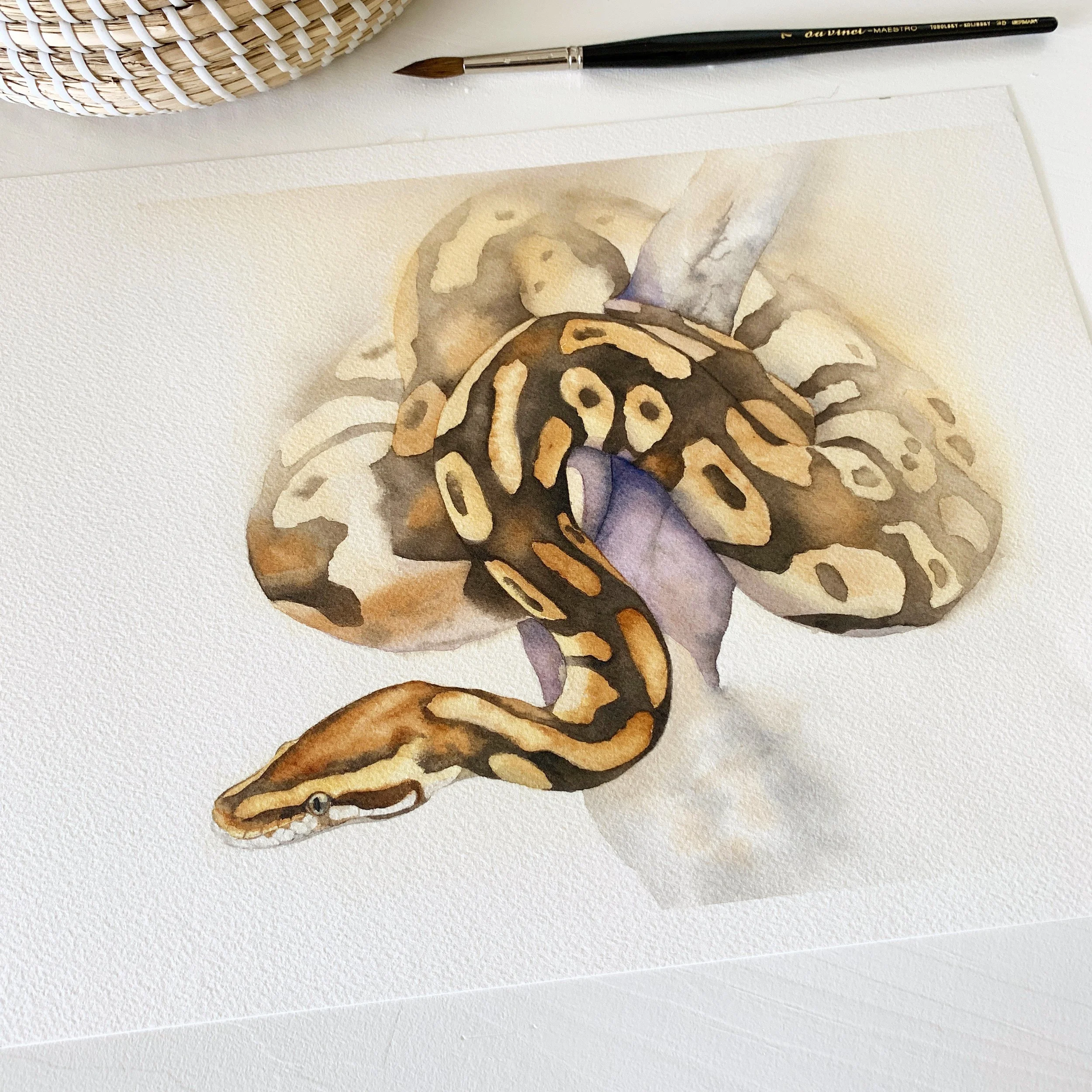
The finished snake uses a wide range of values, from untouched light areas to deep browns, to create dimension.
The pattern on the snake was beautiful, but if I had painted every little marking exactly as I saw it in the reference photo, the painting would have become incredibly busy. Instead, I decided that I wanted the head and front section of the python to be the focal point.
So I increased the tonal contrast there and allowed the contrast to become weaker towards the back.
The result was much more interesting than simply copying every detail. The viewer's eye is drawn towards the head, then can wander towards the back before returning to the focal point.
This is something I try to remember when painting:
Contrast doesn't need to be evenly distributed.
In fact, it is often more effective when it isn't.
If you want one particular area to stand out, give it stronger contrast and allow the surrounding areas to be quieter.
Pay attention to your edges
Edges are another wonderfully useful way of creating depth.
A hard, clearly defined edge tends to bring something forward. A soft or lost edge allows it to recede.
This is something I deliberately used in my python painting. I concentrated the harder edges around the front of the snake, where I wanted the focal point to be. Towards the back, I softened the edges and allowed parts of the snake to fade into the background.
You can do this by working on wet paper.
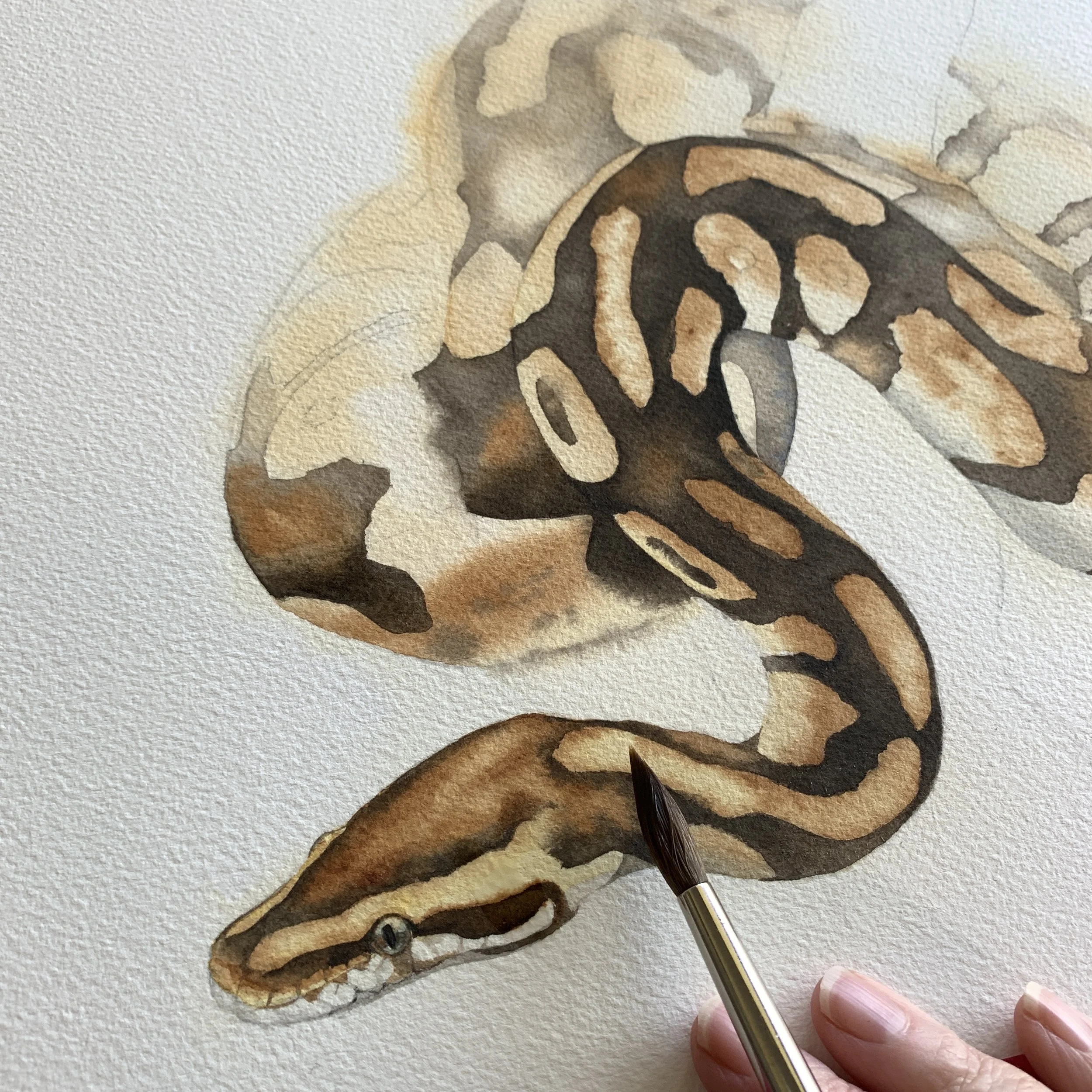
Building stronger dark values beside lighter markings creates contrast and helps the snake feel rounded rather than flat.
When I first painted the snake, I wet the paper beyond its edges. This meant that when I applied the paint, some of it could gently bleed beyond the shape of the snake, creating those soft edges.
Later, I also used a clean, damp brush to soften some of the paint edges and fade the back of the snake.
You don't need to make every edge equally crisp.
In fact, if you carefully soften some edges while leaving others sharp, you can create a much stronger sense of depth without adding any extra detail.
This is also one reason I don't like outlining everything. Sometimes an edge that disappears is much more useful than one that is carefully painted.
Don't forget about shadows
Shadows can make an enormous difference to a painting.
I often choose reference photographs partly because of the shadows. A beautiful cast shadow can be what makes me want to paint a particular subject in the first place.
It's worth remembering that there are two different types of shadows. Form shadows are the areas of an object that aren't in the light and help describe its shape. Cast shadows are created when an object blocks the light and casts a shadow onto something else.
Both can help give your painting depth.
One of the most common problems I see with cast shadows, though, is that beginners make them too dark.
If a shadow is much darker than everything around it, your eye can be pulled straight towards it, even when it isn't supposed to be the focal point.
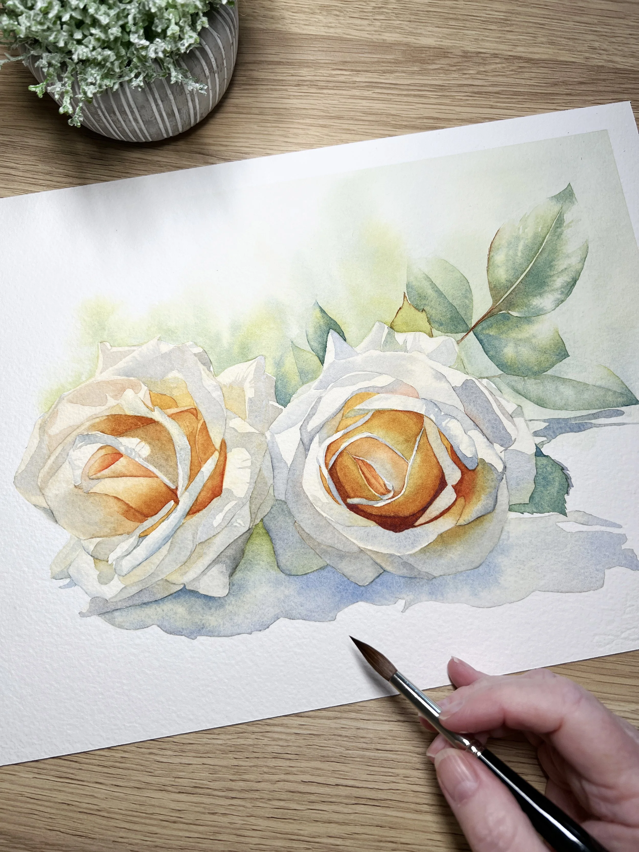
Even white flowers need a range of values. The shadows between the petals help give these roses their three-dimensional form.
I usually start with a relatively pale shadow because I can always make it darker later.
There are a few other things to remember. The darkest part of a cast shadow is generally closest to the object creating it. As the shadow moves further away, it becomes lighter.
And shadows aren't necessarily grey.
I often mix French Ultramarine and Burnt Sienna to make a grey, but then I might drop other colours into the wet paint. If the object is red, for example, I might add some red to the shadow. This reflected colour makes the shadow much more interesting.
The light itself also affects the character of a shadow. Strong sunlight tends to produce darker shadows with harder edges, while softer light produces paler shadows with softer, fuzzier edges.
So rather than thinking of a shadow as simply “the dark bit”, look at what the light is actually doing.
Give your focal point the most attention
This brings us back to the focal point.
If you look at your painting and your eye doesn't know where to settle, it can be tempting to add more detail everywhere. But detail isn't necessarily what is missing.
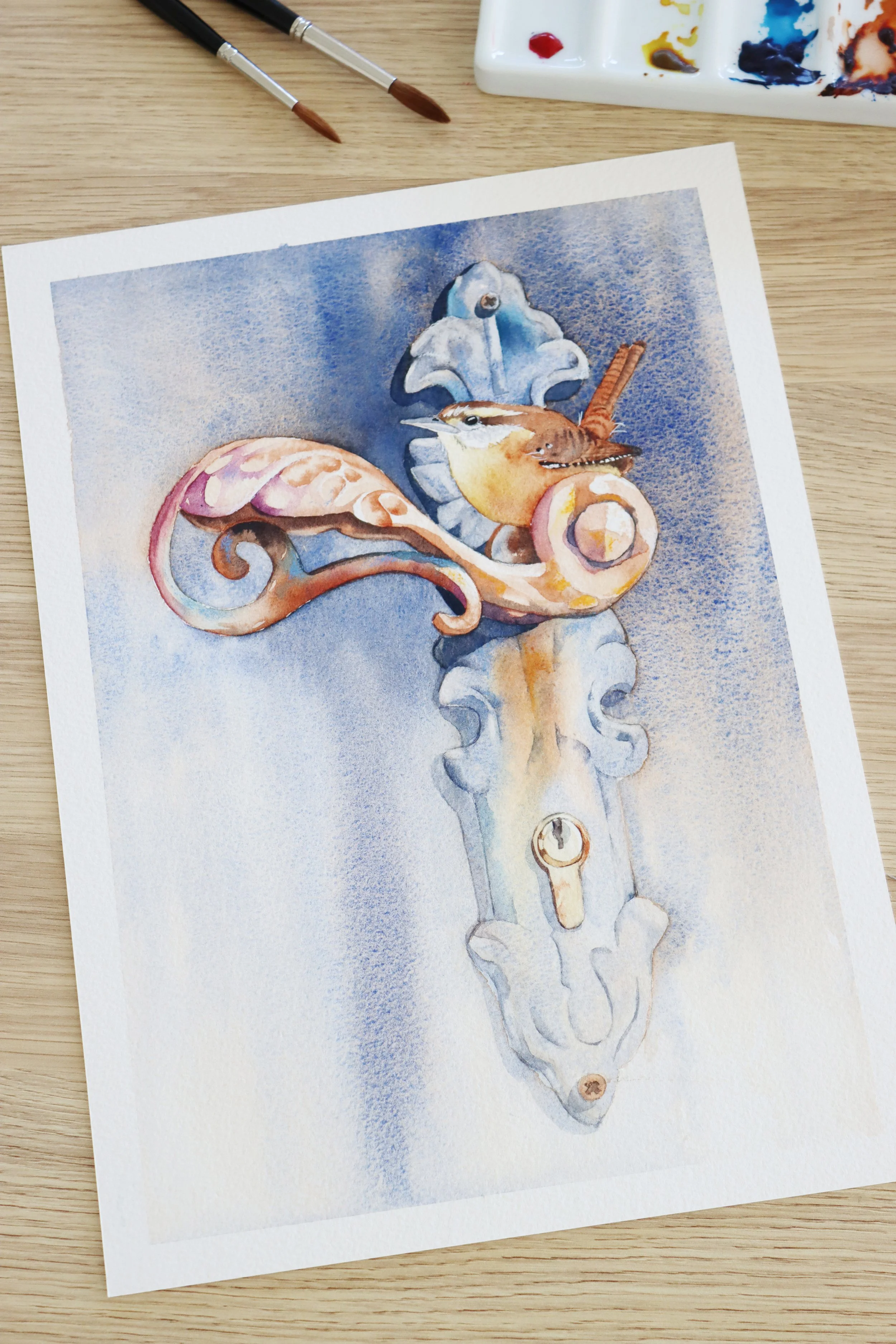
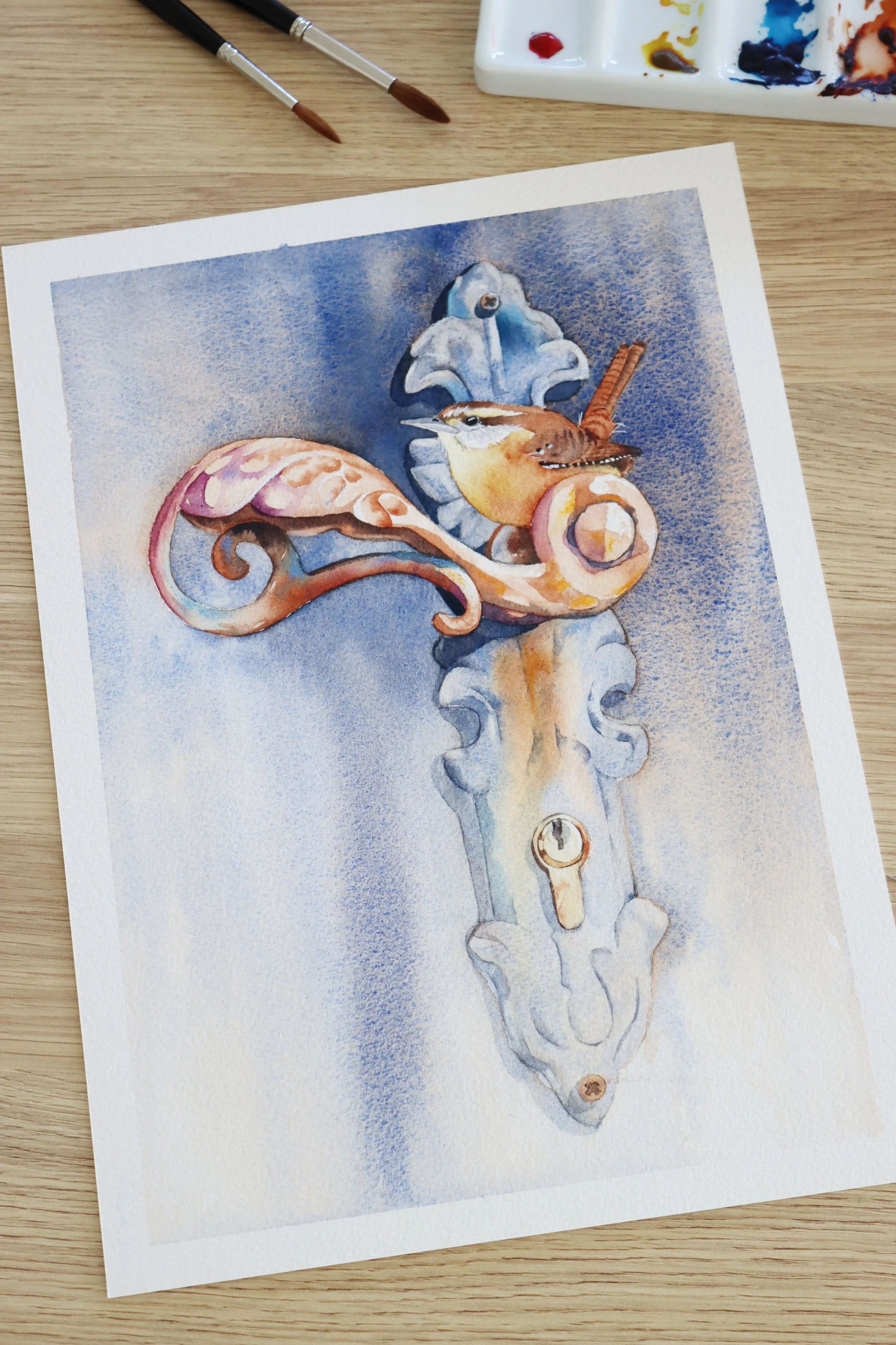
I have used stronger colours and sharper detail on the wren and the area surrounding it to draw attention there.
Want to try this class?
or
Try deciding first what you want your painting to be about.
Perhaps it's the face of an animal, the centre of a flower, a particularly beautiful area of light, or a small object within a larger scene.
Once you've decided, you can start making choices that support that area.
You might give your focal point:
stronger tonal contrast
darker values
sharper or harder edges
more detail
stronger colour
And then do almost the opposite elsewhere.
Soften an edge. Reduce the contrast. Let a colour become paler. Simplify a pattern. Leave something unfinished.
This doesn't mean that the rest of the painting is unimportant. It means that everything doesn't need to compete for attention.
Sometimes the answer is to paint less
This is perhaps the hardest thing to learn.
When a painting looks flat, our first instinct is often to do more. But sometimes the painting doesn't need another brushstroke. It needs a clearer hierarchy.
I think about this a lot when I'm working on a painting. Where do I want the eye to go first? Where can I allow the viewer's eye to wander? Which areas need to be sharp and which can be soft?
The answer might be to deepen one small area rather than darkening the whole painting. It might mean softening an edge rather than adding another detail. Or it might mean leaving an area almost completely alone.
If everything is detailed, nothing feels particularly important.
If everything has strong contrast, nothing really stands out.
And if every edge is hard, you lose the opportunity to use softness to create depth.
So the next time your watercolour looks a little flat, try not to reach immediately for another colour.
Step back.
Look at your values. Look at your contrast. Look at your edges. Look at your shadows.
And then ask yourself one final question:
Where do I want the viewer to look and have I given that area a reason to stand out?
Very often, that is where the depth begins.
Want to practise creating more depth in your paintings?
In Louise’s Apple Stripes class, you’ll see how she uses value changes, layering and stronger darks to give the apples and fabric more form and dimension.

New to watercolour? Try Louise’s free class.

One of the most important things to get right in a watercolour painting is the tonal value, in other words, how light or dark something is.
This is actually more important than getting the colour exactly right.
A painting can have lovely colours, but if all the areas are similar in value, it can be difficult to see the form and depth. Everything starts to sit on the same visual level.