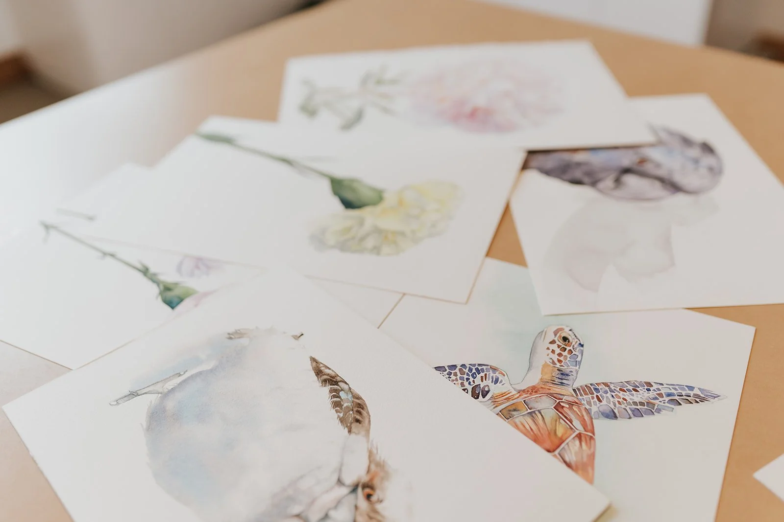
11 Watercolour Colour Mixes That Will Transform Your Painting
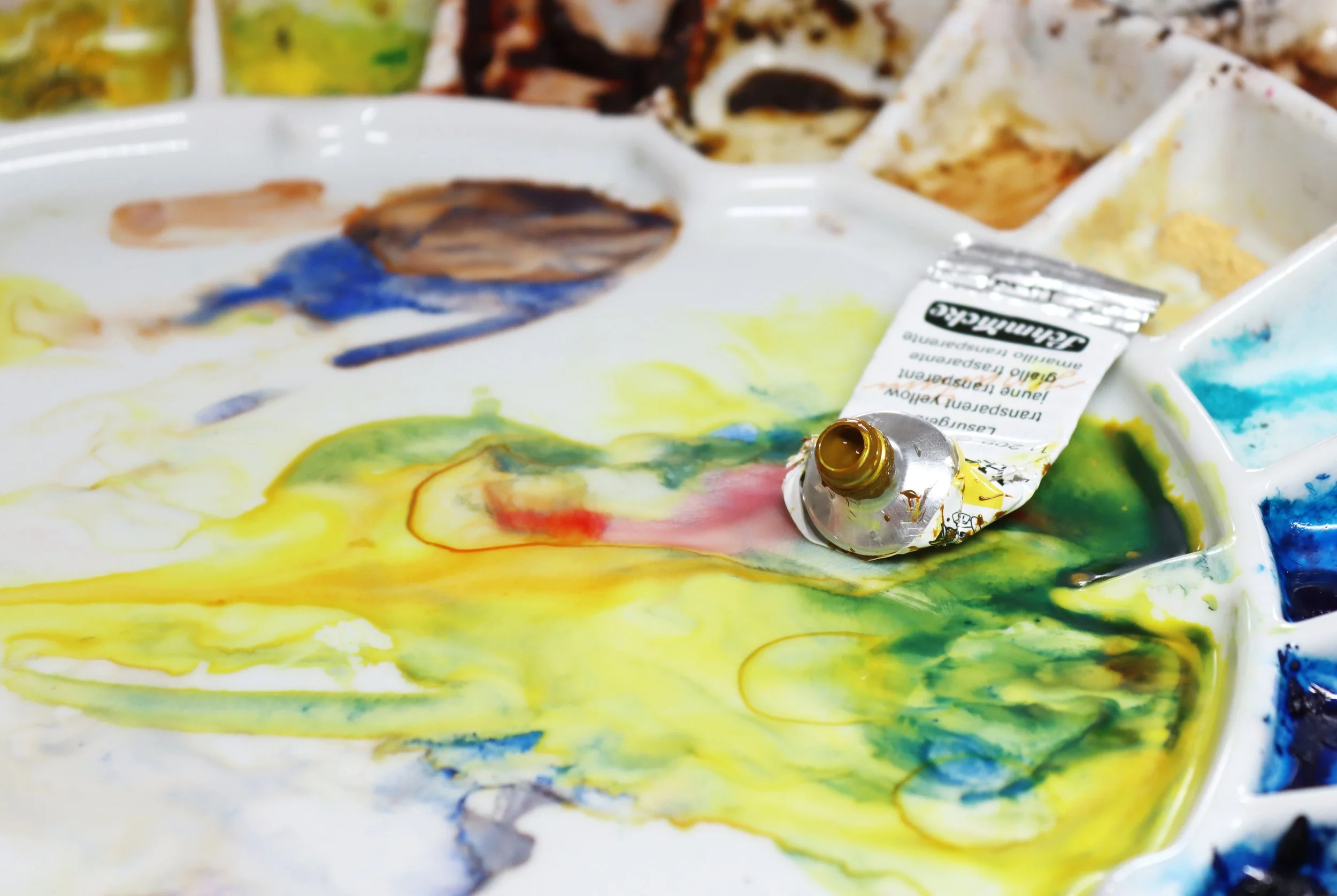
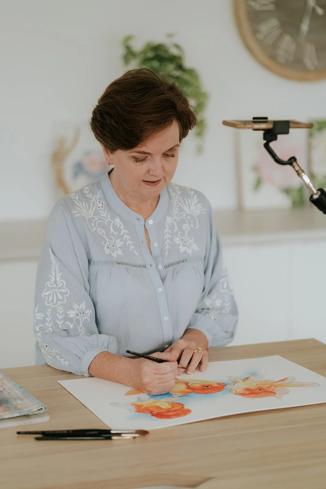
There is a quiet kind of magic that happens on the palette, that moment when two colours meet and settle into something entirely new. Mixing colour is one of my favourite parts of painting. It is where you begin to understand how pigments behave, how they shift with more water, and how they change each other in the most surprising ways.
Over the years, I have found myself returning to a handful of mixes again and again. Some began as small experiments, others solved very specific painting problems, but all of them earned a permanent place on my palette.
Today I am sharing some of those mixes with you, simple combinations that create beautiful natural colours. They are not my everyday choices anymore (apart from my beloved grey mixed from French Ultramarine and Burnt Sienna), but they were once central to what I considered my ultimate mixing palette, and they are still worth knowing.
The following mixes have all been created with Winsor and Newton colours. However, you can recreate them with colours of any paint manufacturer or find your own mixes with other colours. You can find a list of colour substitutes for Schmincke and Daniel Smith paints here.
1. Scarlet Lake (PR188) + French Ultramarine (PB29)
A warm violet perfect for tulip stems
This unexpected pairing of warm red and warm blue creates a violet with a lovely warm undertone, soft and botanical and never dull. It behaves beautifully in wet in wet passages, granulating just enough to keep the colour breathing.
When you are aiming for a vibrant violet you would usually reach for a cool red and a warm blue. Because this mix uses a warm red with a warm blue, it naturally settles into a more muted, earthy violet. That softer quality is exactly why it works so well here.
Scarlet Lake mixed with French Ultramarine
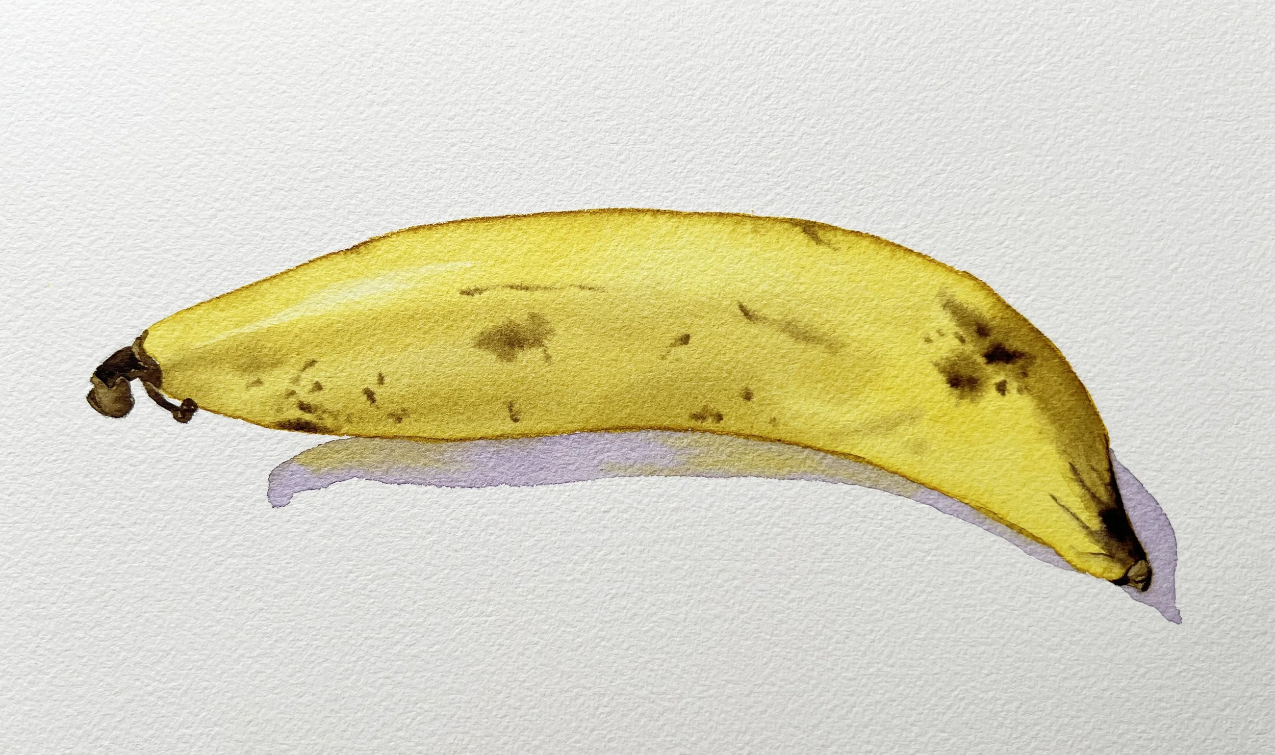
2. Transparent Yellow (PY150) + Winsor Violet (PV23)
From dirty yellow to rich brown
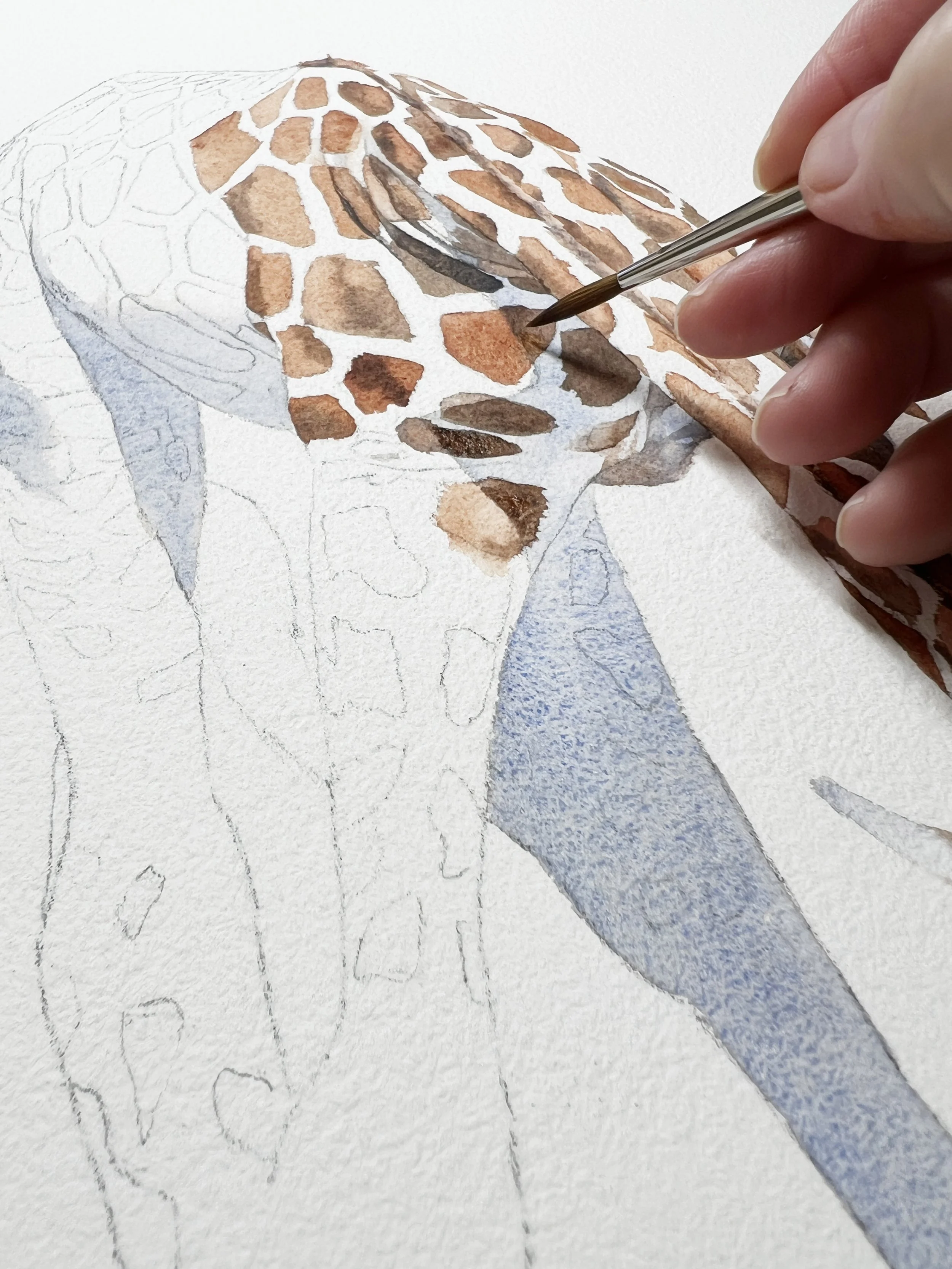
When you combine these two, you move through an entire earthy spectrum: muted yellow, olive-tinged shadows, and warm browns. It’s a flexible mix that is ideal for variegated petals, dried leaves, or any place where you need a natural transition from light to shade. Here's a banana I painted with the same colours.
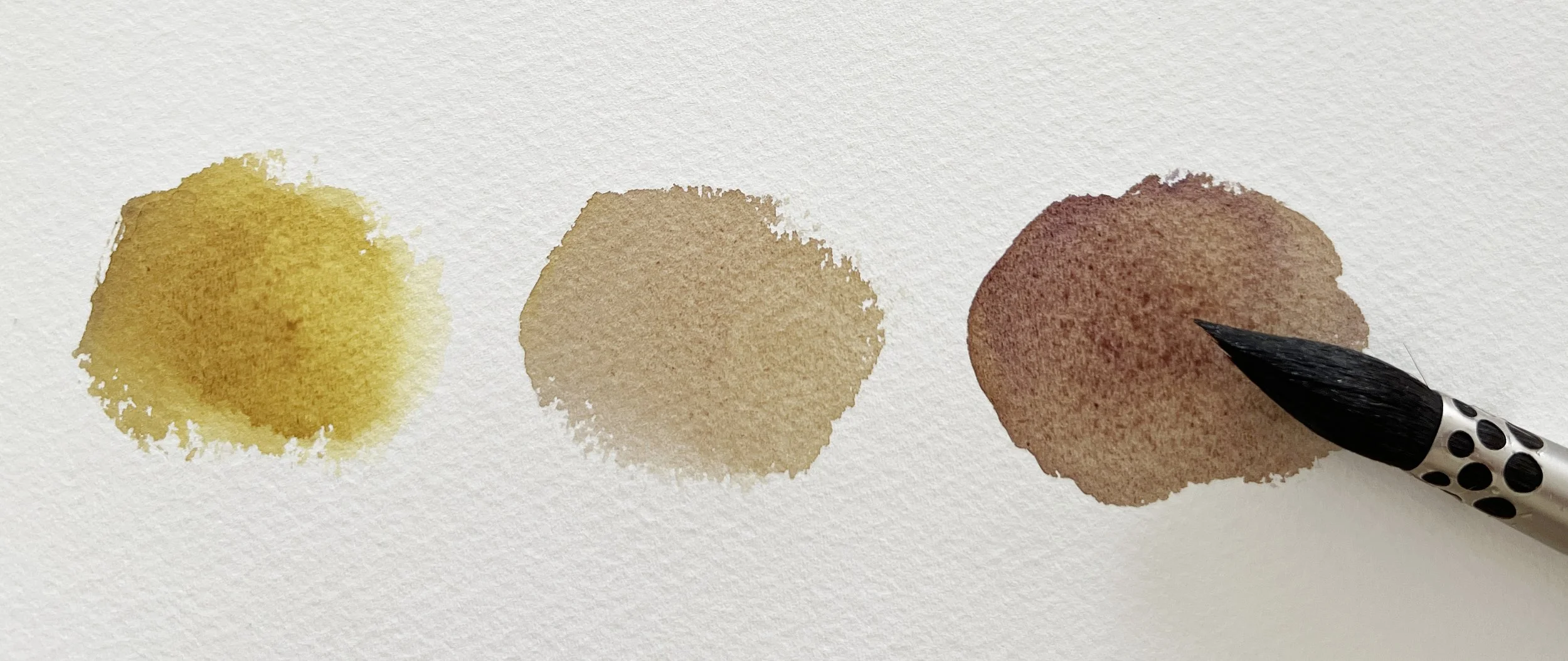
Transparent Yellow mixed with Winsor Violet. You could substitute Daniel Smith's Nikel Azo Yellow here.
3. Orange
Winsor Yellow (PY154) + Scarlet Lake (PR188) + Winsor Blue (Red Shade) (PB15)
A luminous orange-shadow brown
An orange mixed from scratch already has life in it, and adding Winsor Blue red shade deepens it instantly into a burnished, transparent brown. It is a wonderful shadow colour for anything warm toned, such as persimmons, apricots, terracotta surfaces or even skin tones.
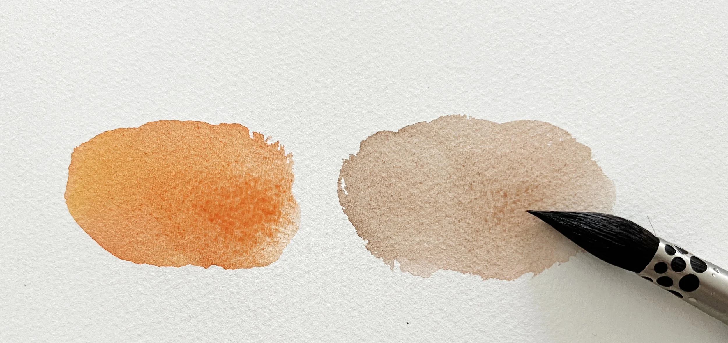
Orange mixed from Winsor Yellow and Scarlet Lake on the left. I've added a small amount of Winsor Blue red shade on the right.
4. Antwerp Blue (PB27)+ Burnt Sienna (PR101)
A teal-blue surprise
This is one of those delightful accidents that became indispensable. Instead of the traditional blue-grey one might expect, you get a soft, moody teal when mixing a cool blue and Burnt Sienna. It makes atmospheric backgrounds feel effortless and adds a touch of drama without heaviness. Its perfect for Eucalyptus.
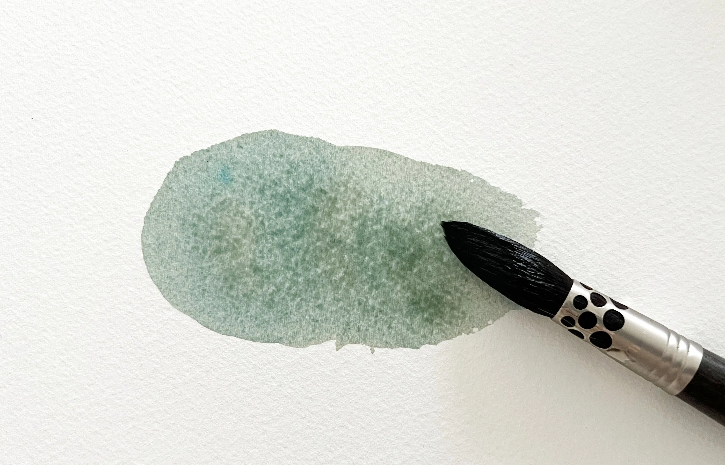
Antwerp Blue is the same pigment as Prussian Blue but is milder, lighter and less intense because it is formulated with a lower pigment strength.
I used Antwerp Blue mixed with Burnt Sienna for the shadows of these eucalyptus leaves.
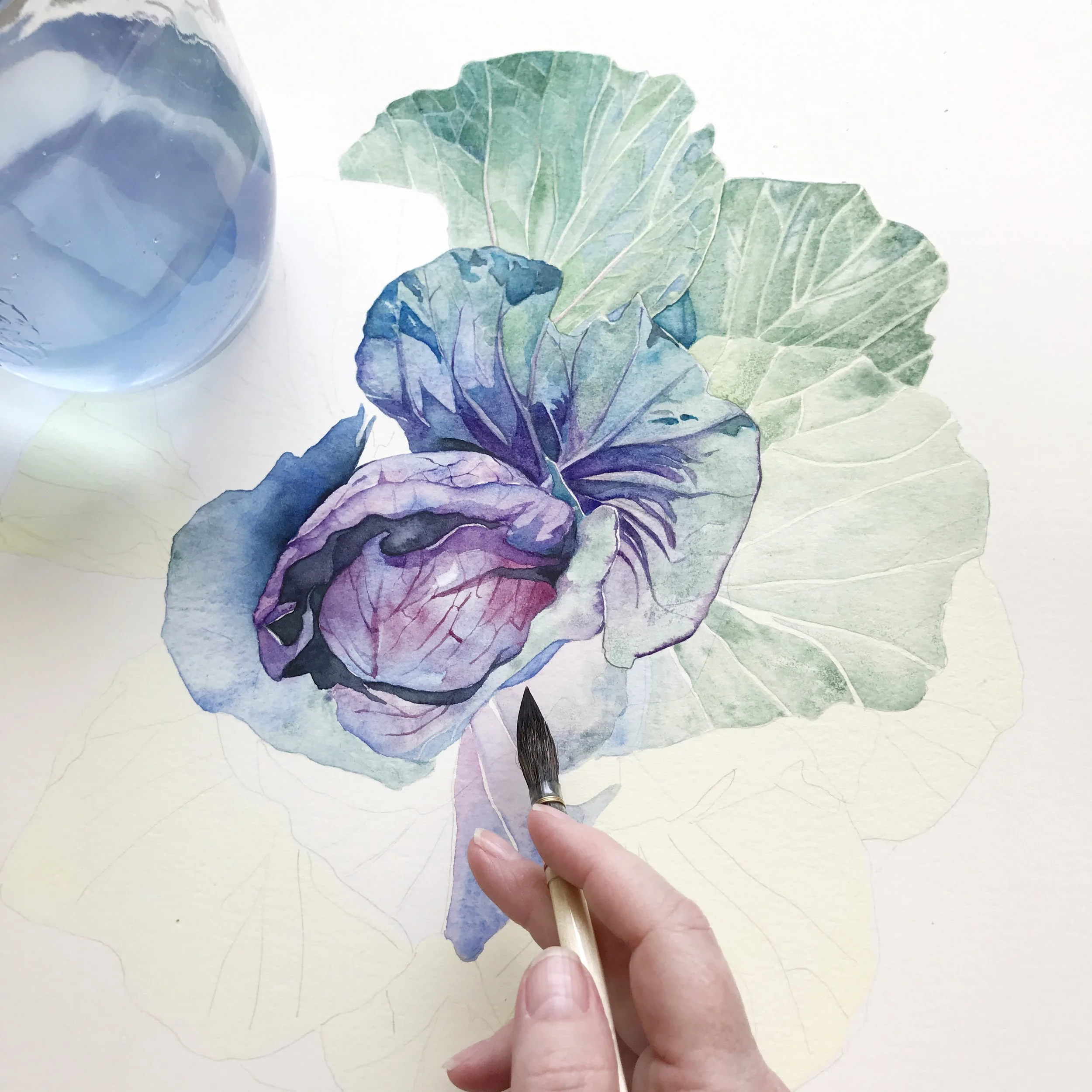
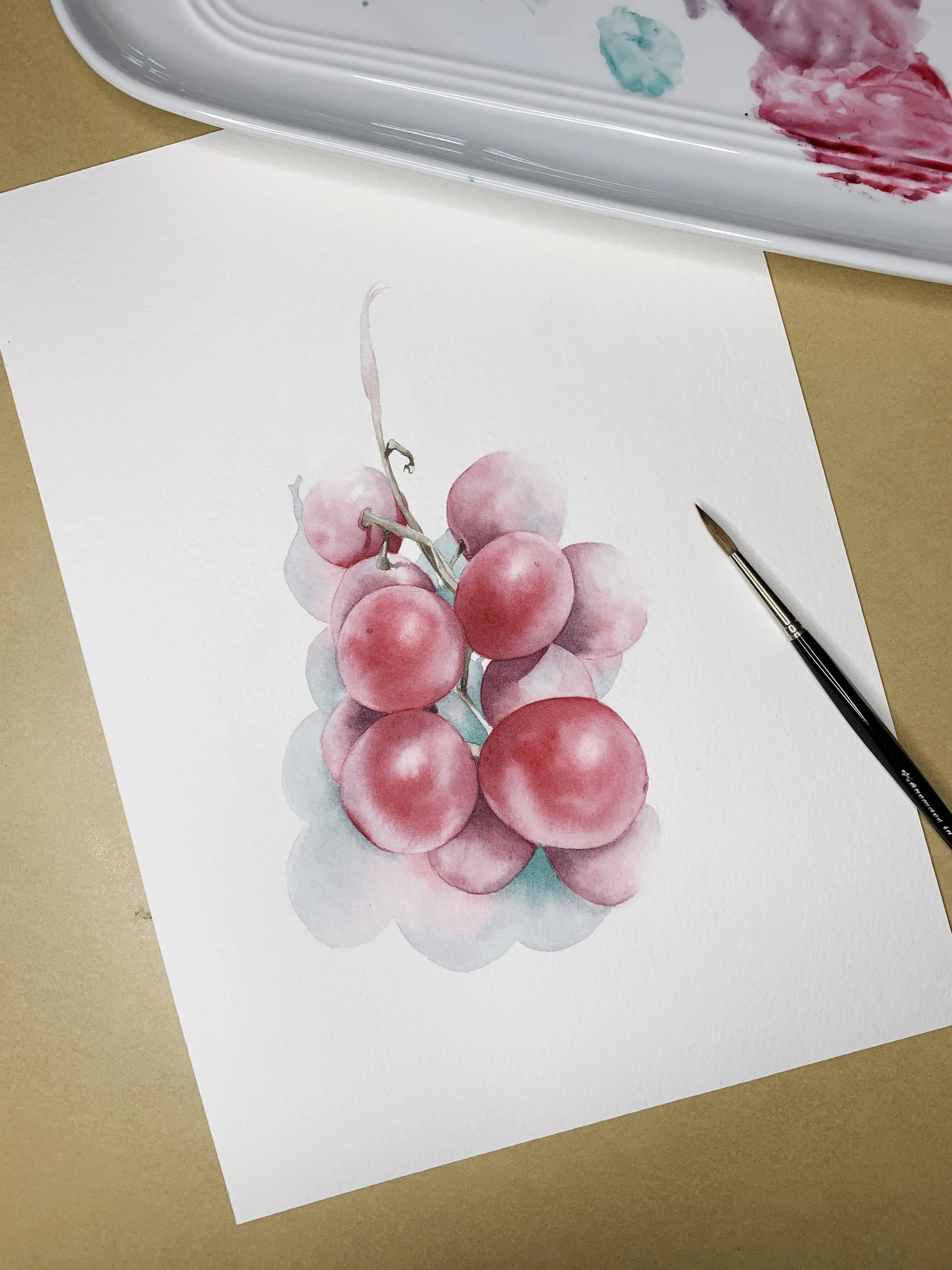
5. Viridian (PG18)+ Permanent Alizarin Crimson (PR206)
A dark plum violet for grapes
This combination yields a jewel-deep violet that’s perfect for fruit textures. It has a slightly cool undertone, which keeps it lively even in the darkest passages. Lovely for grapes, plums, dark cherries, or deep shadow accents.
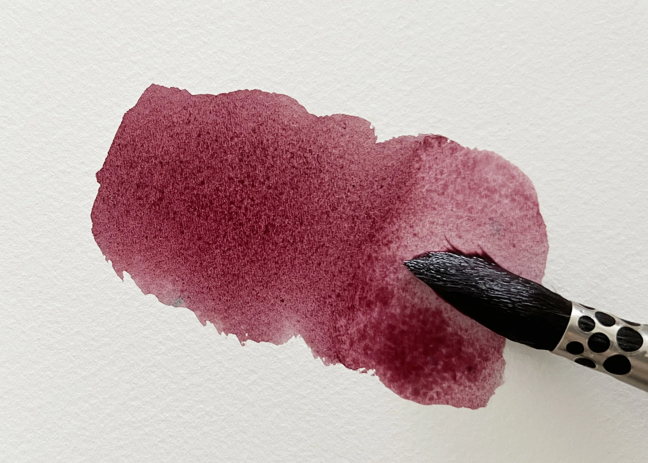
Viridian mixed with Permanent Alizarin Crimson.
6. Sepia (PBk6, PR101)+ Viridian (PG18)
A greenish, grounded brown
Perfect for bark, old wood, or the shadows between leaves, this mix gives a natural, earthy weight to a composition. It’s especially useful when you want a brown that feels alive rather than flat. I used it for stems in my grape painting.
7. French Ultramarine (PB29)+ Naples Yellow (PBr24, PW6)
Minty, muted greens.
With more Naples Yellow in the mixture, the colour shifts into a soft, almost vintage green, gentle enough for botanicals and soothing enough for background foliage. It is a beautiful alternative to tube greens, and even though Naples Yellow is an opaque colour, it still blends softly in this mix and gives the green a lovely muted quality. It made a beautiful flannel flower.
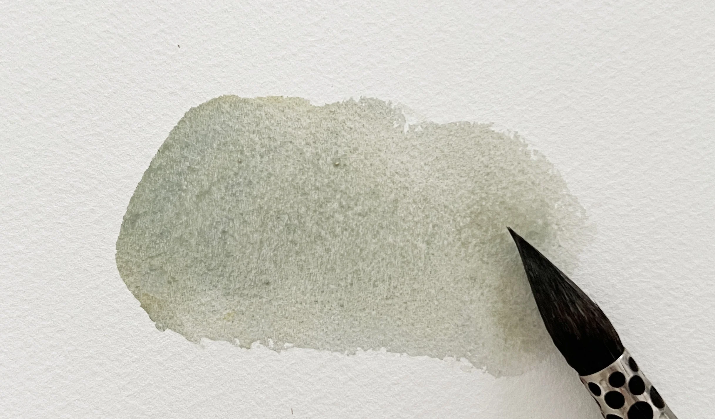
French Ultramarine mixed with Naples Yellow.
French Ultramarine mixed with Naples Yellow gave me the beautiful minty breen I needed for the centres and stems of these flannel flowers.
8. Permanent Alizarin Crimson (PR206) + Winsor Green (Blue Shade) (PG7)
A lifelike, vivid black
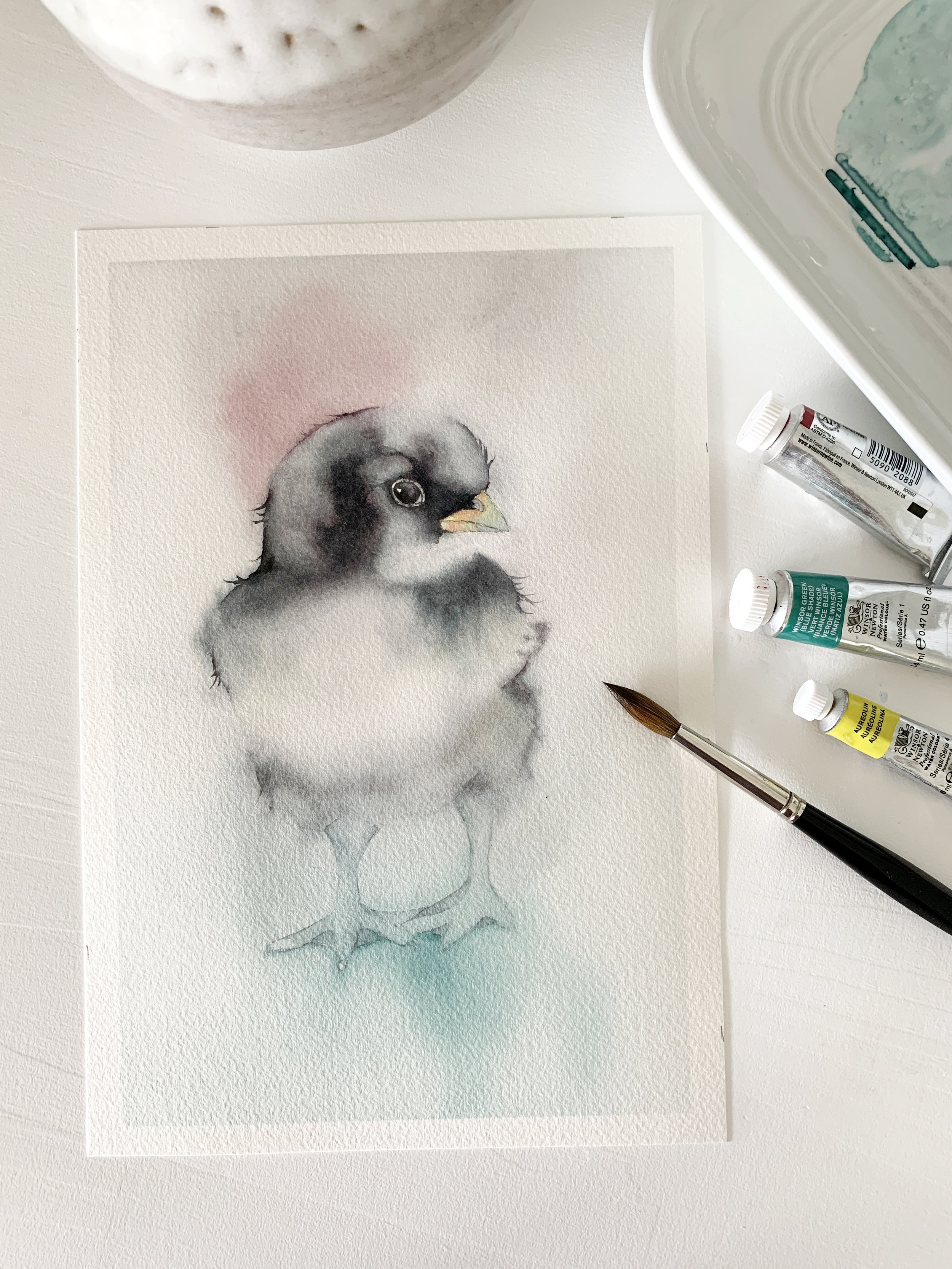
This is one of my most reliable blacks, rich, deep and never chalky. Because it is mixed from transparent colours, it layers well, far better than most premixed blacks. Add a little water till you reach the right consistency and you will find a full family of greys hiding inside. It gave life to a little chicken.
Permanent Alizarin Crimson mixed with Winsor Green blue shade.
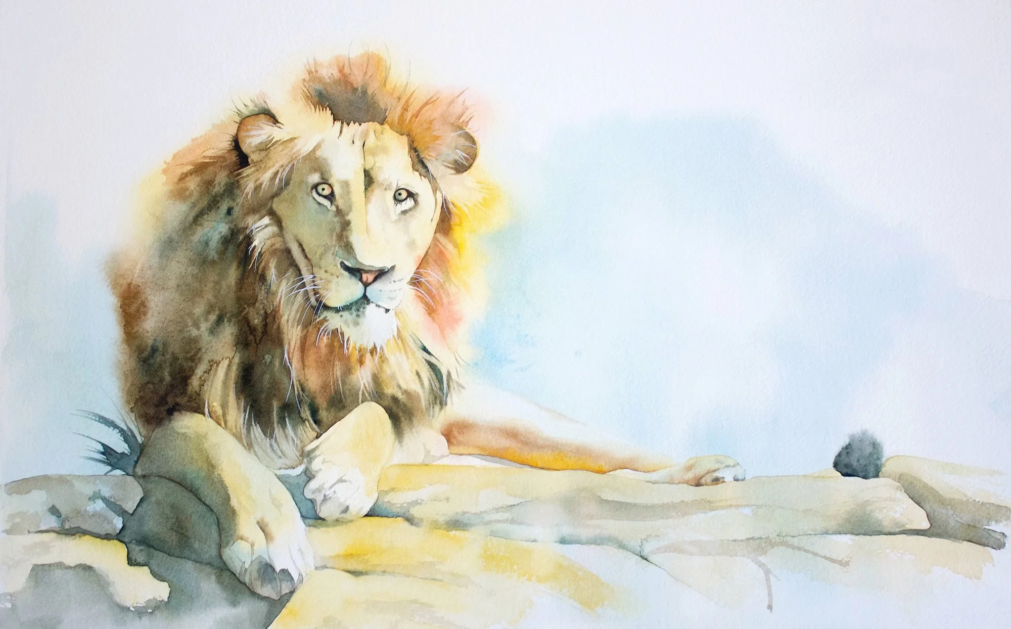
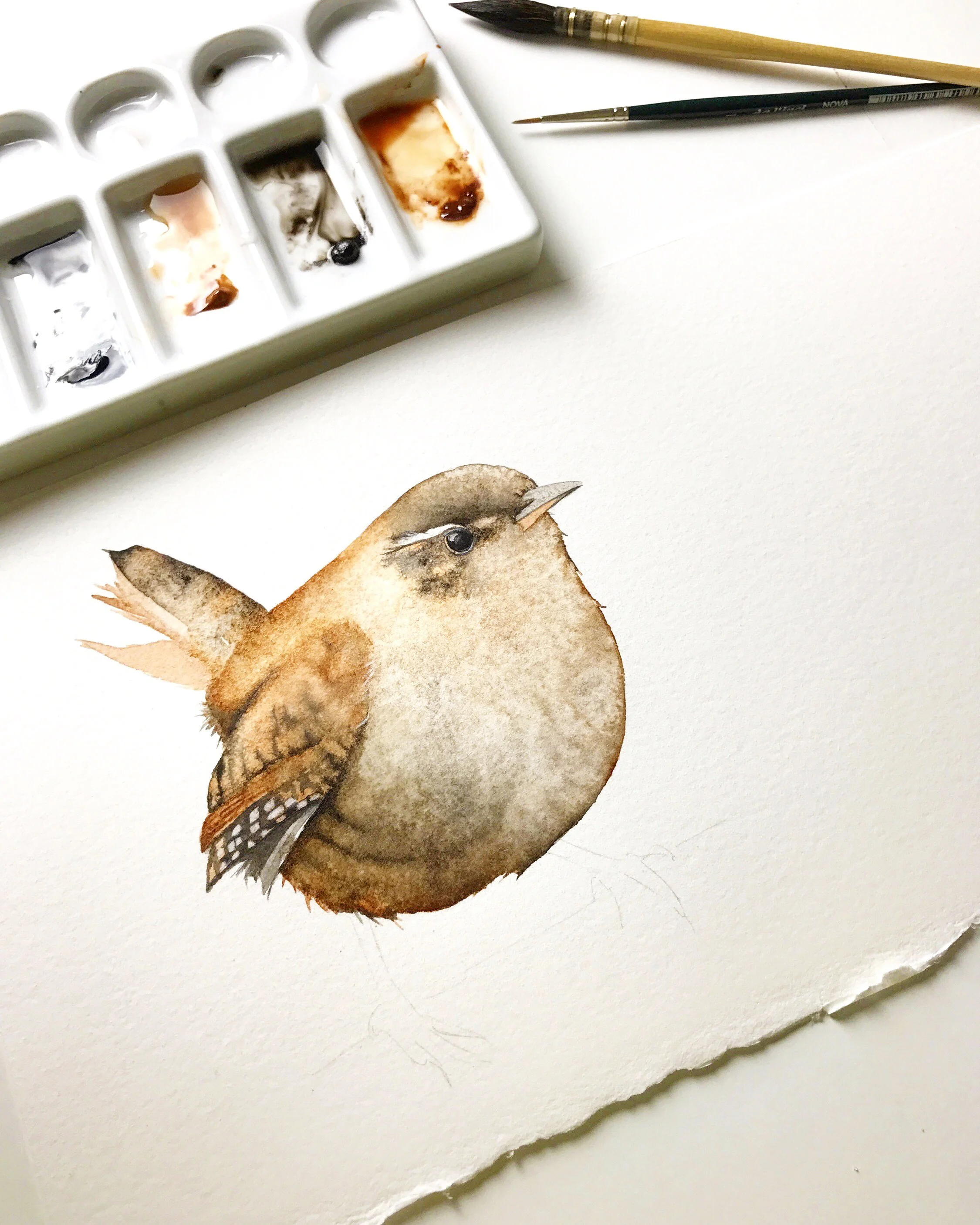
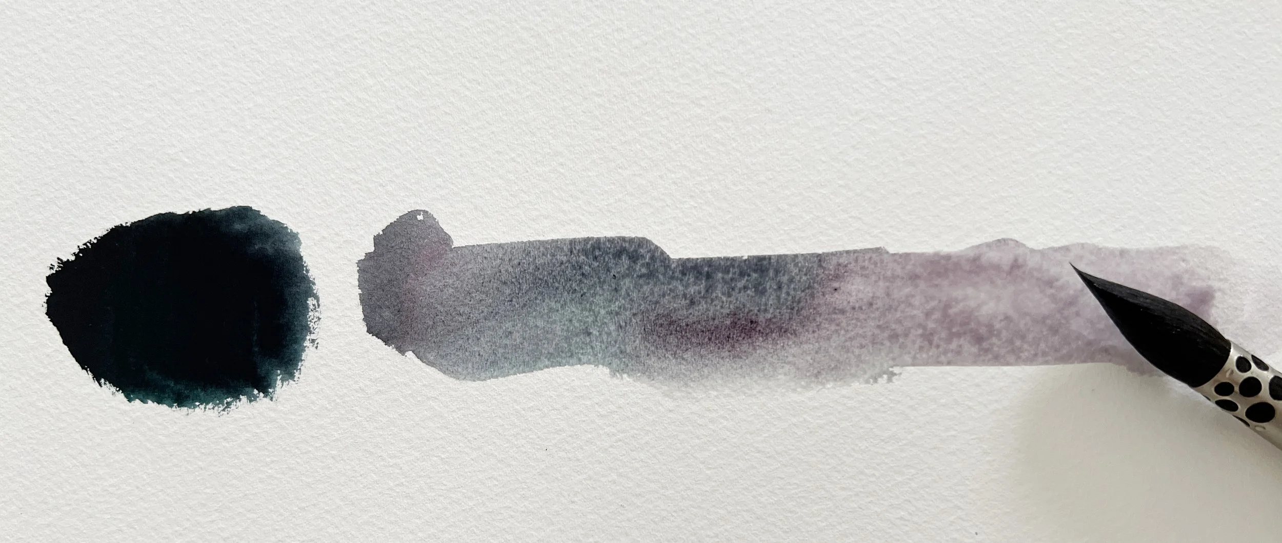
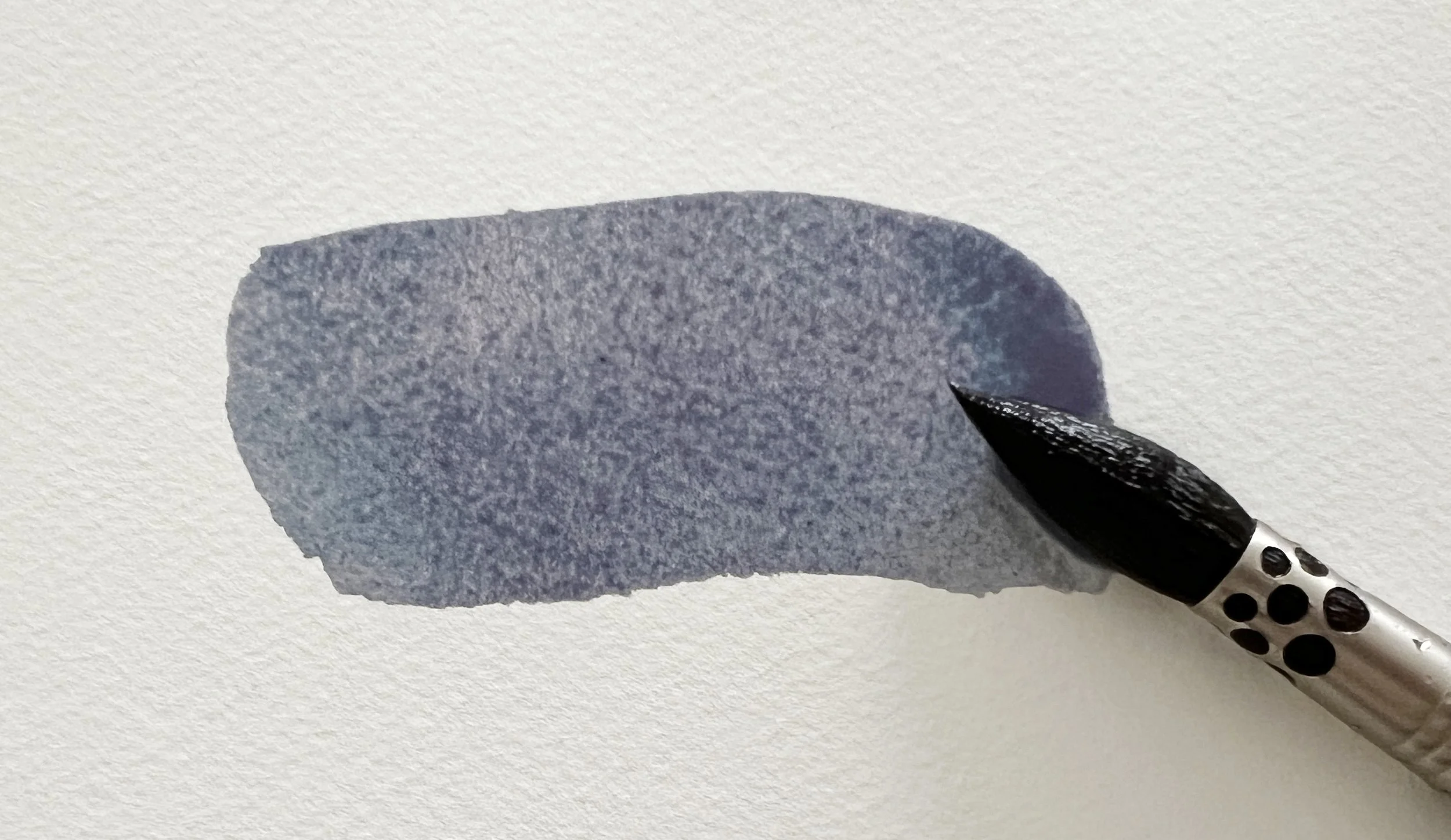
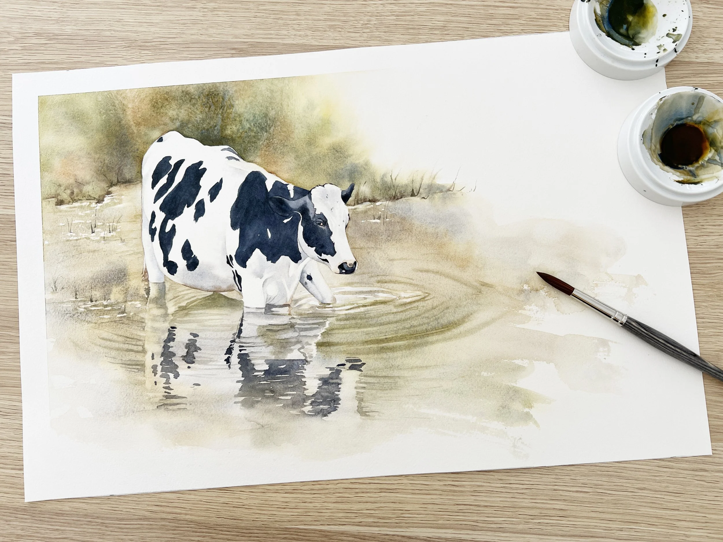
9. French Ultramarine (PB29)+ Burnt Sienna (PR101)
Grey to black, with character
A classic of mine for a reason. These two colours are probably my most used colours - on their own and combined. From soft dove greys to warm black, this pair will take you anywhere you need to go. French Ultramarine granulates beautifully, making it perfect for feathers, stone textures, soft shadows, and anything needing a natural touch. If you mix watercolour straight from the tube it creates a rich, dark black. If you add water, you get beautiful, interesting greys.
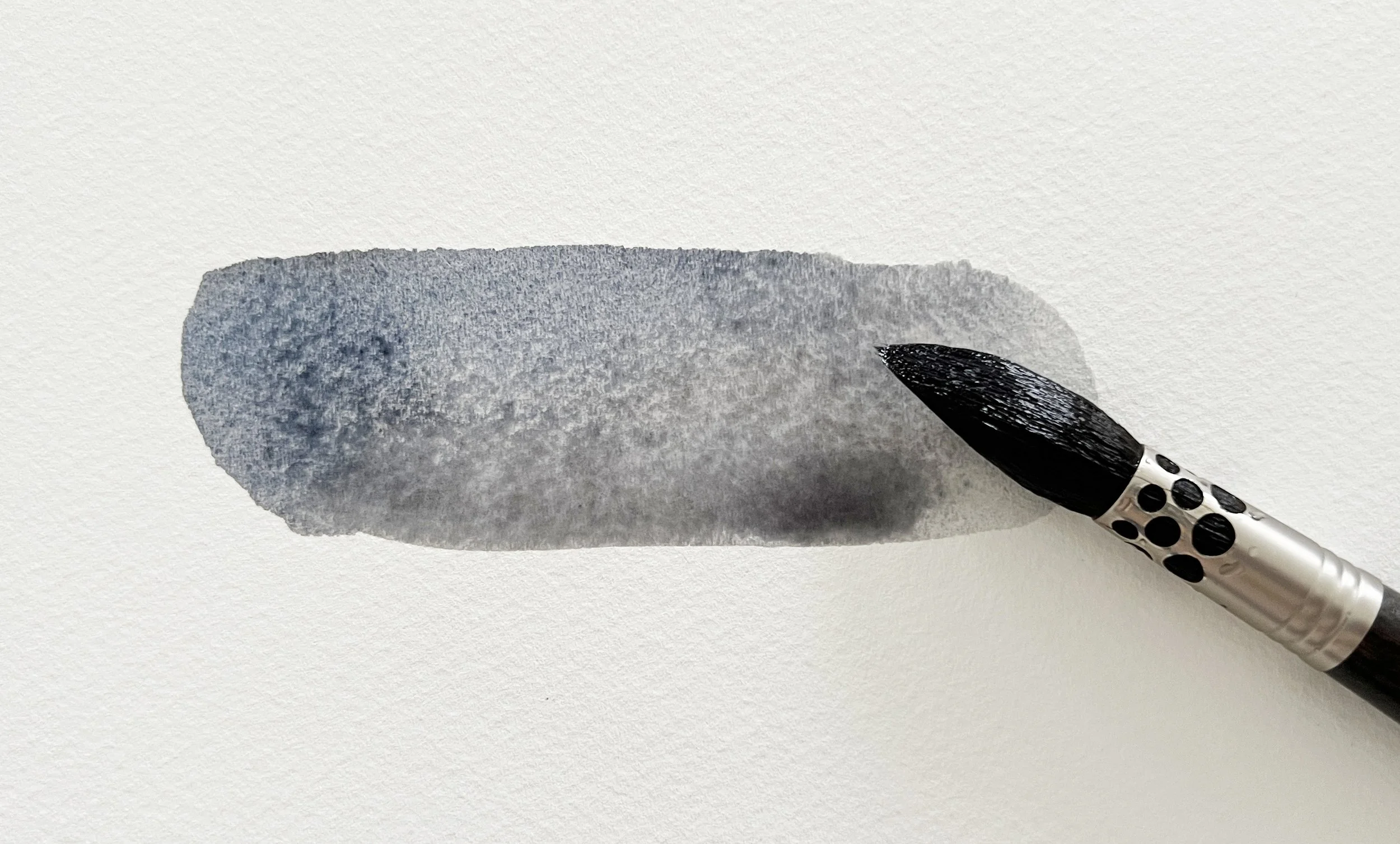
French Ultramarine mixed with Burnt Sienna.
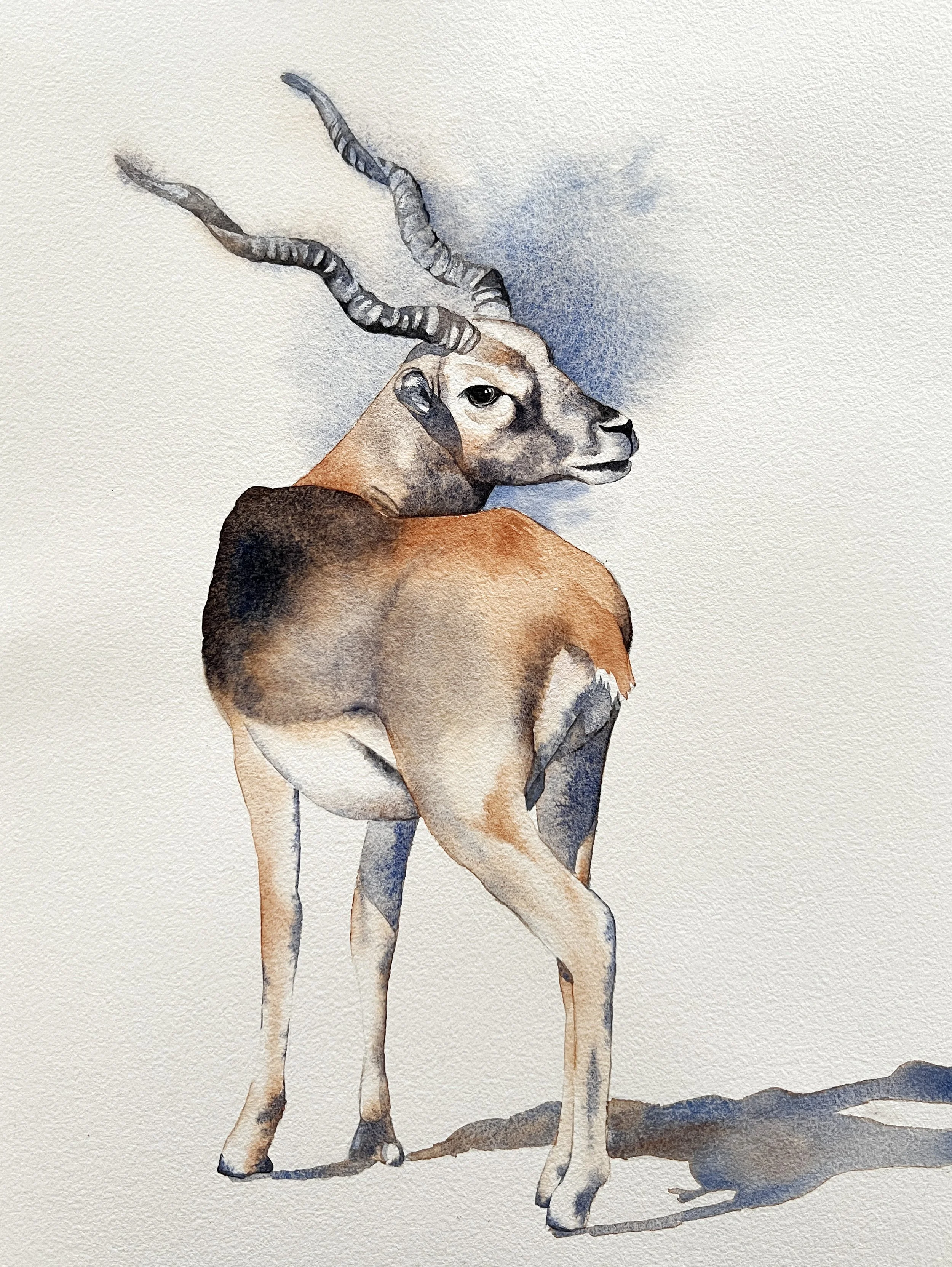
This Blackbuck was painted with just two colours: French Ultramarine and Burnt Sienna.
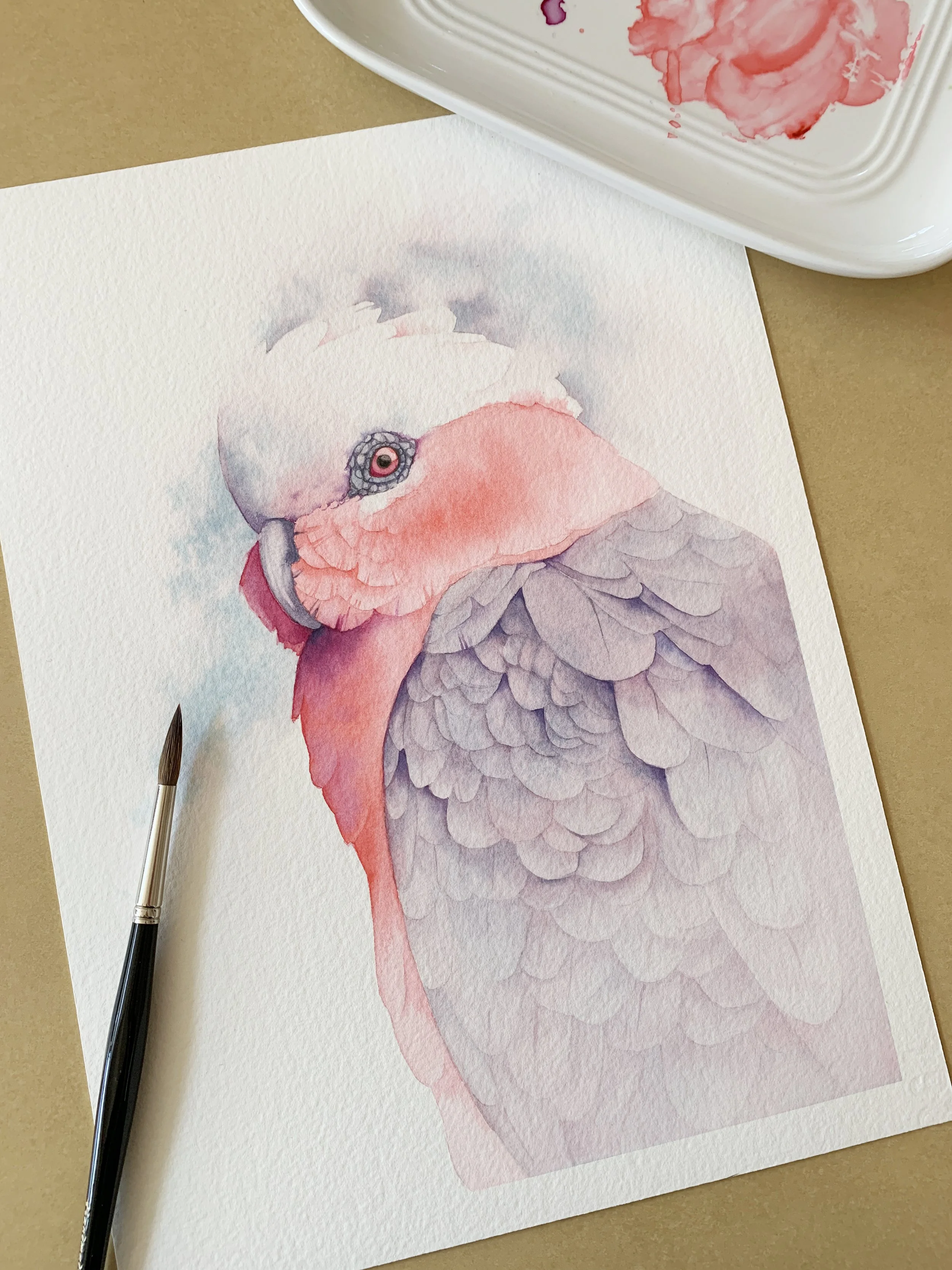
10. Quinacridone Red (PR209) + Cobalt Turquoise Light (PG50)
A delicate soft grey
These two create a gentle, ethereal grey that works beautifully in backgrounds or for the softest shadow transitions. It’s one of those colours that seems to quiet the whole painting. I used it for a lovely Galah.
Quinacridone Red mixed with Cobalt Turquoise Light.
11. Indian Yellow (PO62, PY139)+ French Ultramarine (PB29)
An earthy, muted green
Both pigments are warm, so when they combine, they produce a green that feels sun-touched and grounded. I reach for it when painting leaves that need to blend harmoniously into their surroundings. Check out this painting of cows in watercolour paint here.
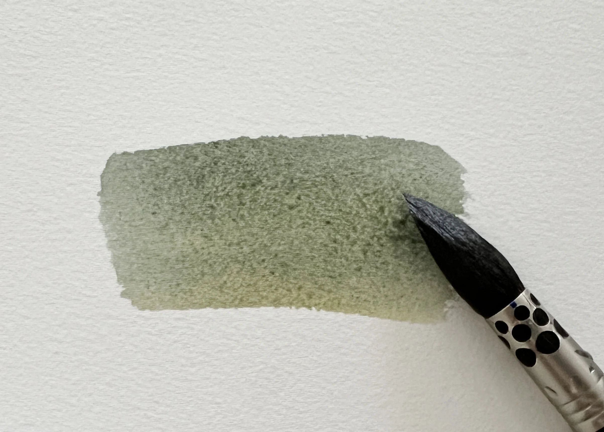
Indian Yellow mixed with French Ultramarine
Words of Wisdom About How to Mix Watercolour Paints
Over time, certain lessons have stayed with me, simple reminders that guide the way I do colour mixing paint. Understanding colour theory has certainly helped a lot.
“Let the pigments do the work.”
Some colour mixes need energy, others need restraint. When you allow water to move the pigments, the results are often more elegant than anything forced by over mixing.
“Do not search for the perfect colour in a tube, mix it.”
Tube colours are starting points, not solutions. Your most expressive shades will almost always come from thoughtful combinations on your palette.
“If your painting feels chaotic, your probably using too many colours.”
Using fewer colours helps every part of the painting feel related, like they all belong to the same story. A limited palette brings cohesion, calmness and clarity.
“Know your pigments like you know old friends.”
Their temperature, transparency, granulation and strength, the more you understand them, the more confidently you can push them into new territory.
“A beautiful mix is never accidental, it is intentional curiosity.”
Every time two colours touch, you learn something. Allow yourself to experiment, test and rediscover combinations when mixing colours. That curiosity is the heart of the craft.
Why Mixing Your Own Watercolours Matters
If you have ever felt that your paintings look a bit scattered, colours competing rather than conversing, the solution is often simpler than it seems, mix more of your own colours.
Many artists begin with a wide range of premixed tube colours because it feels convenient. But over time, those ready made hues can work against us. They may be beautiful individually, yet when placed side by side, they do not always create the quiet, natural harmony that watercolour is so loved for.
Working from a limited palette and colour mixing your own hue shifts everything. It encourages a slower, more intentional way of painting, one where each wash, each shadow, each glow of light carries the same DNA. And that is where true cohesion begins.
Here’s what happens when you start embracing your own mixes:
Your paintings immediately feel more unified.
Colours share common pigments, giving the whole work a subtle internal harmony.
You gain finer control over temperature and transparency.
Instead of accepting whatever a tube gives you, you adjust warmth, coolness, opacity, and delicacy yourself.
You create custom shades that look organic rather than synthetic.
Mixed colours have a natural, lived-in quality thats are perfect for petals, feathers, shadows, and skin.
You develop a deeper understanding of the pigments on your palette.
The more you mix, the more you learn how each one behaves, granulates, blossoms, or settles.
Your process becomes calmer and more intentional.
With fewer colours to choose from, your focus shifts to the painting itself, not the clutter around it.
In practice, this means you do not need a huge palette to create luminous, expressive work. Just a few thoughtfully chosen pigments can open up hundreds of subtle possibilities. And as your confidence grows, your paint colours start to feel like your own language, personal, intuitive and consistent from one painting to the next.
Mixing your own colours is not just a technique.
It is a mindset, one that brings clarity, harmony and a sense of quiet authorship to your watercolour practice.
Why a Limited Palette Makes Everything Easier
Working with fewer colours does not limit you, it frees you. It encourages deeper understanding of the pigments, creates more harmonious paintings and makes the process less overwhelming. When all the colours in your piece come from the same small family, the painting feels naturally unified.
With just a handful of thoughtful pigments, you can create an astonishing range of hues, from the softest greys to the richest blacks, from natural greens to glowing violets.
The magic lies not in having more, but in knowing your colours intimately and trusting what they can do together.
Your Watercolour Palette Is a Story You Build Over Time
Beautiful colour mixes are not created by accident, they are discovered through experimentation, curiosity and a willingness to learn from each pigment. By understanding how a small set of colours behaves, you gain not only skill but also confidence.
These unique colour mixes are a wonderful place to start, especially if you want to develop a painting style that feels natural, expressive and beautifully cohesive. Use a scrap paper and just watch the magic of watercolour.
Wherever you are in your painting journey, I hope these mixes bring a little more curiosity and joy to your palette. Let them be starting points, not rules. And above all, enjoy the quiet magic of watching colour come to life. So, grab your brushes, paints and colour wheels and get mixing!
I can't wait to see your swatches and unique mixes!
Louise
If you want to dive deeper into colour mixing, I have a video on YouTube about 13 essential tips for mixing watercolour paint.
If you are interested in learning to paint in watercolour, I have hundreds of online, voiced over watercolour tutorials for all skill levels.