Composition in Watercolour Painting
How to Decide Where to Add Detail in Watercolour Painting
Parts 1 and 2 of this lovely tutorial are on Patreon and at the Art School.
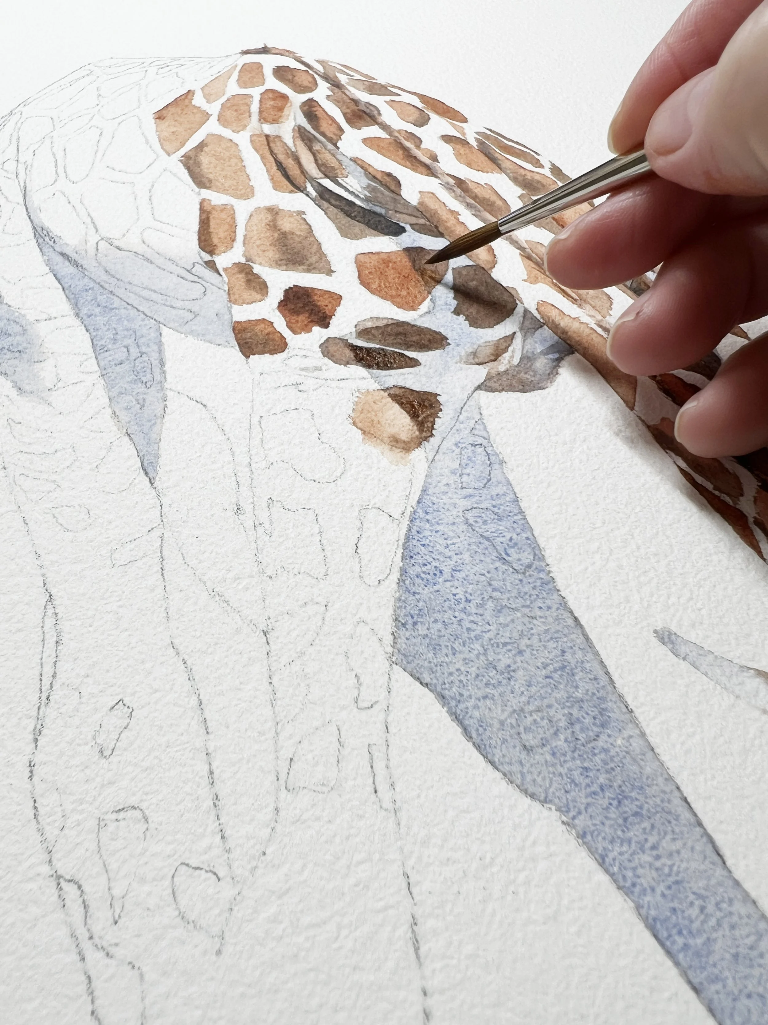
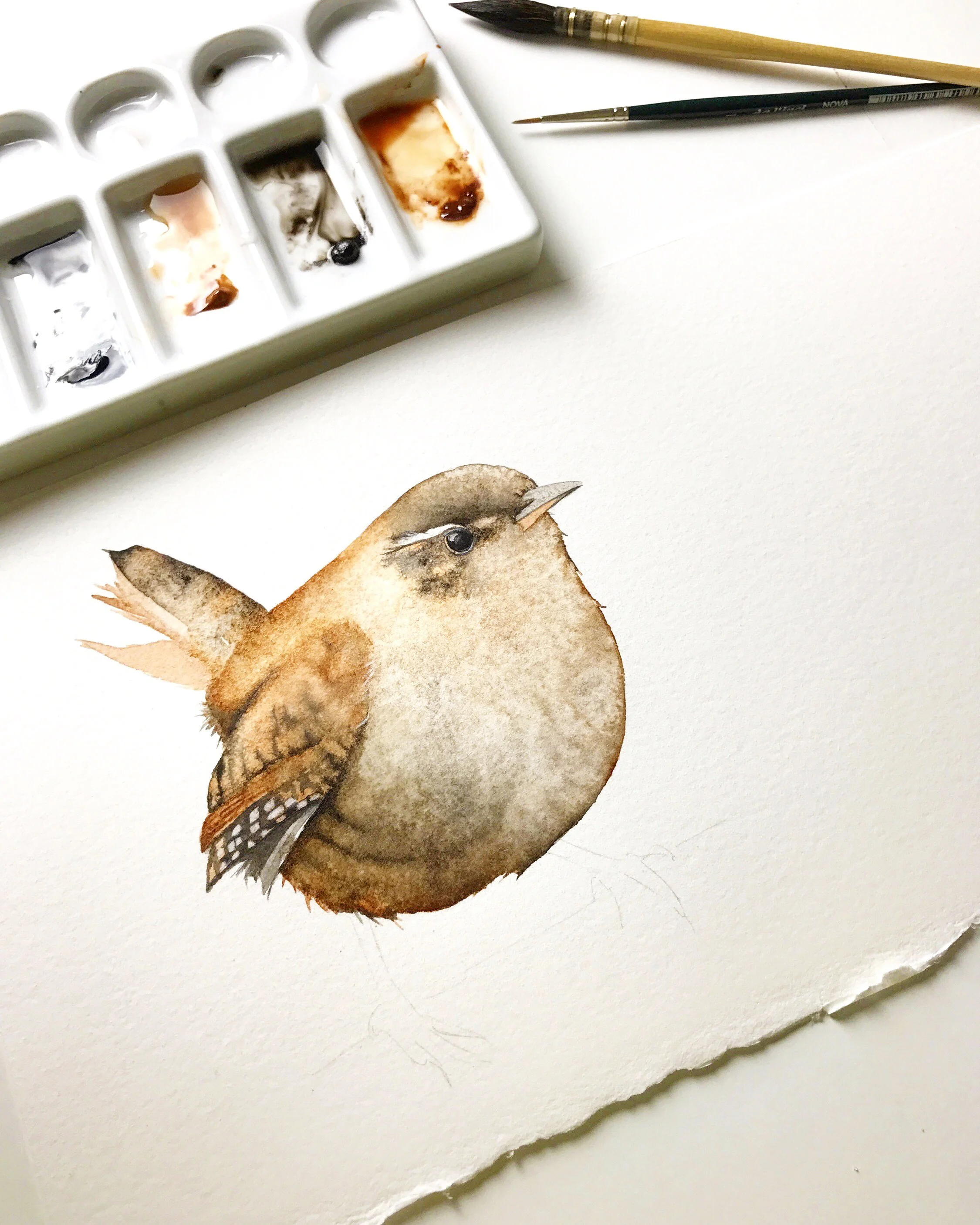
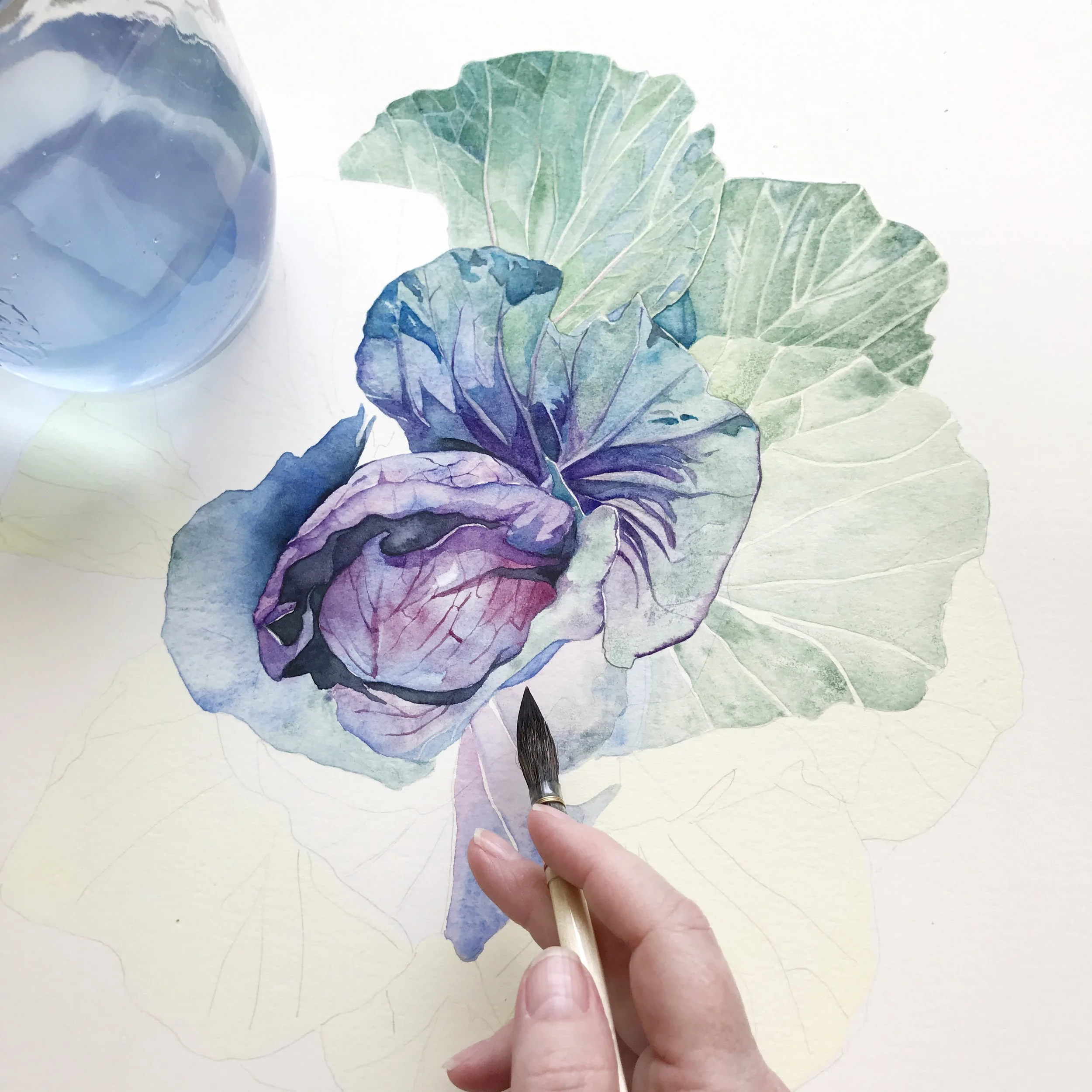
A challenge in watercolour painting isn’t learning how to add detail, it’s knowing where to add it. When everything is painted with the same level of care and finish, the result can feel flat and overworked. Thoughtful use of detail helps guide the viewer’s eye, creates a clear focal point, and allows the rest of the painting to breathe. By choosing where to add detail and where to stay loose, you give the viewer the opportunity to engage with the painting and form their own story. If deciding where to add detail feels like guesswork, I explore this step by step in my longer painting tutorials.
Start with the Focal Point
Before thinking about detail, it helps to be clear about your focal point.
The focal point is the area where you want to focus the viewer’s attention. It’s the dominant area of the painting and the part of the subject that drew you in when you decided to paint it. This might be an eye, a flower centre, a face, or a small area of strong light and contrast.
Once you know where your focal point is, decisions about detail become much easier. In a good composition that area earns the most attention. Everything else supports it.
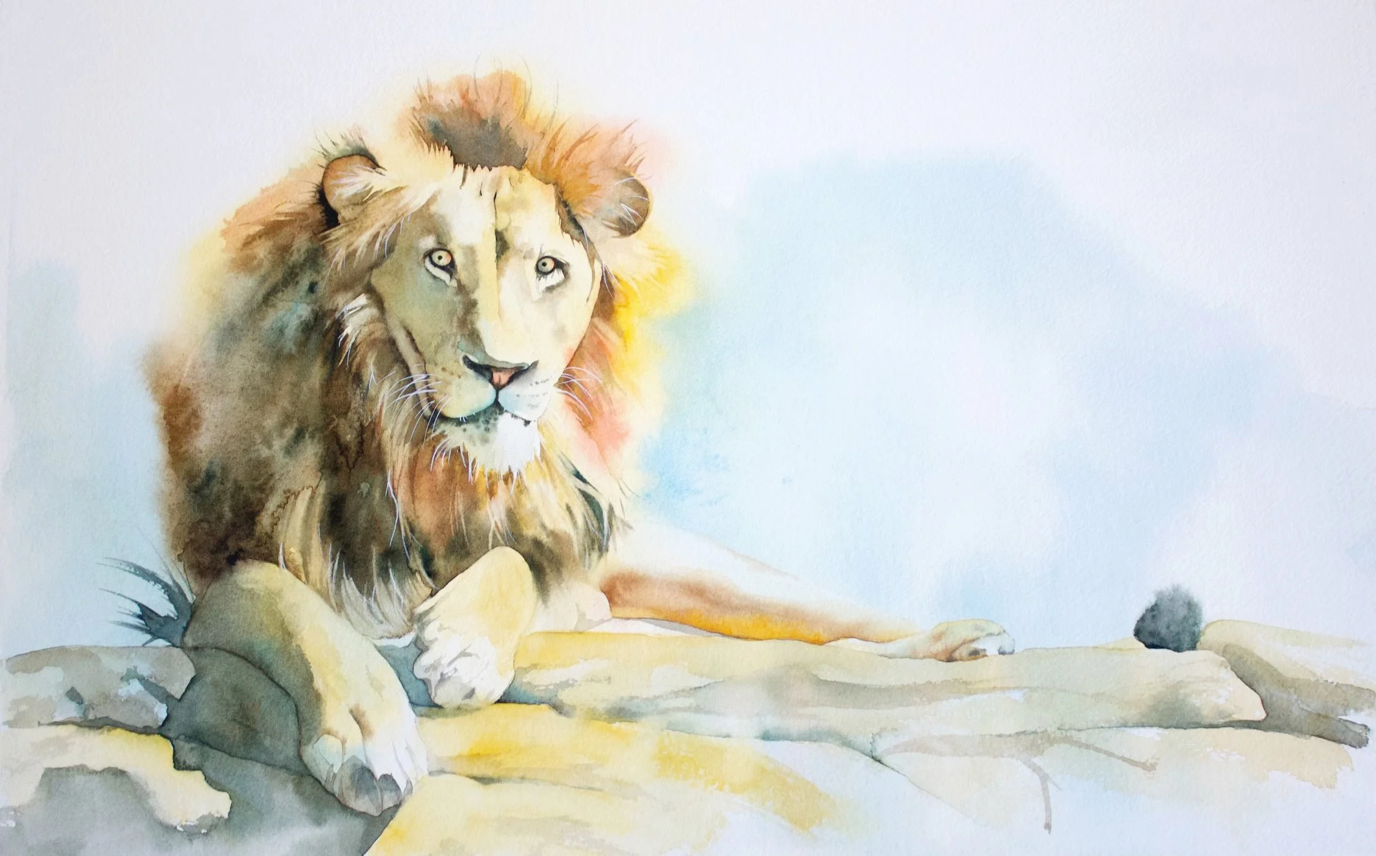
A Strong Example of a Clear Focal Point
Australian watercolour artist John Lovett is a great example of someone who understands focal points exceptionally well. His paintings almost always have a clear dominant area, with strong contrast and sharper edges, while surrounding areas are simplified and allowed to stay loose. Your eye knows exactly where to go.
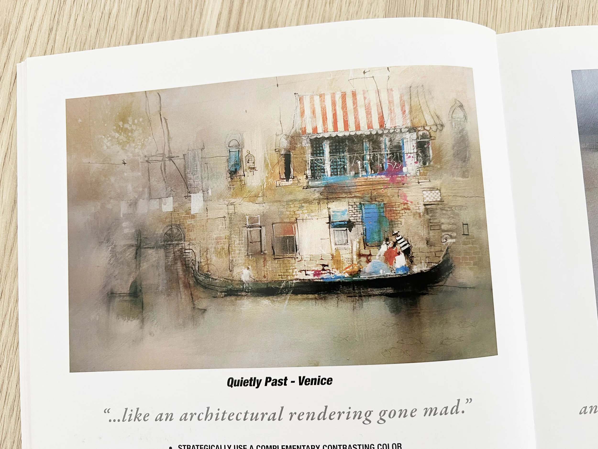
Image shown for educational discussion. From the book 'Textures, Techniques and Special Effects in Watercolor' by John Lovett.
What makes this work isn’t detail alone, but how the surrounding areas support the dominant area.
This is where many paintings start to struggle. Painters often try to solve everything with more detail, when what’s really needed is clearer contrast and stronger supporting areas. Hands up - I’ve definitely been guilty of this.
This is something I talk through while painting, not after the fact. Seeing these decisions happen in real time makes composition much easier to understand. Watch a full paint-along example.
Composition Concepts
Composition is really about how the visual elements in a painting work together. Things like space, shapes, edges, lines, and contrast all play a role in guiding the viewer’s attention and creating visual harmony.
You don’t need to consciously apply every composition concept while you paint. In practice, good composition comes from being aware of balance, knowing what to emphasise, and allowing areas of rest as well as areas of interest. When these design elements are working together, decisions about detail become clearer and more intentional.
This is something I’m often reminded of when looking at technically beautiful, highly detailed paintings on social media. The skill is obvious, but sometimes everything is given the same level of finish. With no clear dominant area, the viewer’s eye doesn’t know where to settle, and there’s nowhere for it to rest. It’s a good reminder that detail alone doesn’t create focus - composition does. When you understand composition, detail becomes a choice rather than a habit. You decide which areas deserve focus and which areas are better left simpler. Those decisions are what create clarity, balance, and a stronger overall painting.
Contrast Comes Before Detail
Detail alone doesn’t create focus. Contrast does.
What makes a focal point work isn’t detail on its own. It’s the contrast around it that allows the important element to stand out.
High contrast areas naturally attract the viewer’s attention. Strong light against dark, hard edges beside soft edges, and clear shapes set against quieter background areas all help establish a visual hierarchy. Without this contrast, even carefully painted detail can disappear into the rest of the painting.
This is where many painters run into trouble. When a painting lacks contrast, the instinct is often to add more detail. But too much detail, especially when it’s spread evenly across the painting, weakens the composition rather than strengthening it.
By simplifying supporting areas and keeping edges softer away from the main subject, you create space for the dominant area to shine. Contrast does the heavy lifting first. Detail comes later.
Practise contrast in a guided tutorial.
Positive and Negative Space
Negative space isn’t empty space. It’s active space that allows the positive space to stand out.
Positive space is the subject you’re painting. Negative space is the space around it. Both are just as important when deciding where to add detail.
Put the detail in the positive space you want to emphasise. Negative space works best when it’s quieter and less resolved. When both are treated with the same level of finish, the painting can feel busy and hard to read.
Negative space gives the eye somewhere to rest. It helps define the main subject, strengthens the focal point, and creates visual balance. Often, the best way to make an area stand out is to simplify the space around it.
When you’re unsure where to add detail, ask yourself whether you’re working in positive space or negative space. If it’s negative space, restraint is usually the better choice.
Deciding Where to Add Detail: A Practical Example
In this painting of three lambs, my initial instinct was to treat them all with the same level of care. Each lamb felt important, so detail crept in evenly across the group. The result was pleasant, but the viewer’s attention moved across the painting without settling anywhere in particular.
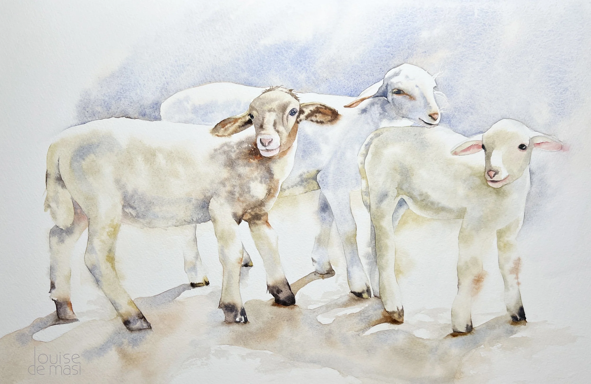
At that point, the decision wasn’t about adding more detail. It was about choosing where detail actually belonged.
Rather than sharpening one lamb or reworking features, I chose to adjust the background instead. By slightly deepening the wash behind one lamb’s head, I increased contrast in that area while leaving the lamb itself soft and understated. That small shift was enough to create a clearer focal point without overworking the subject.
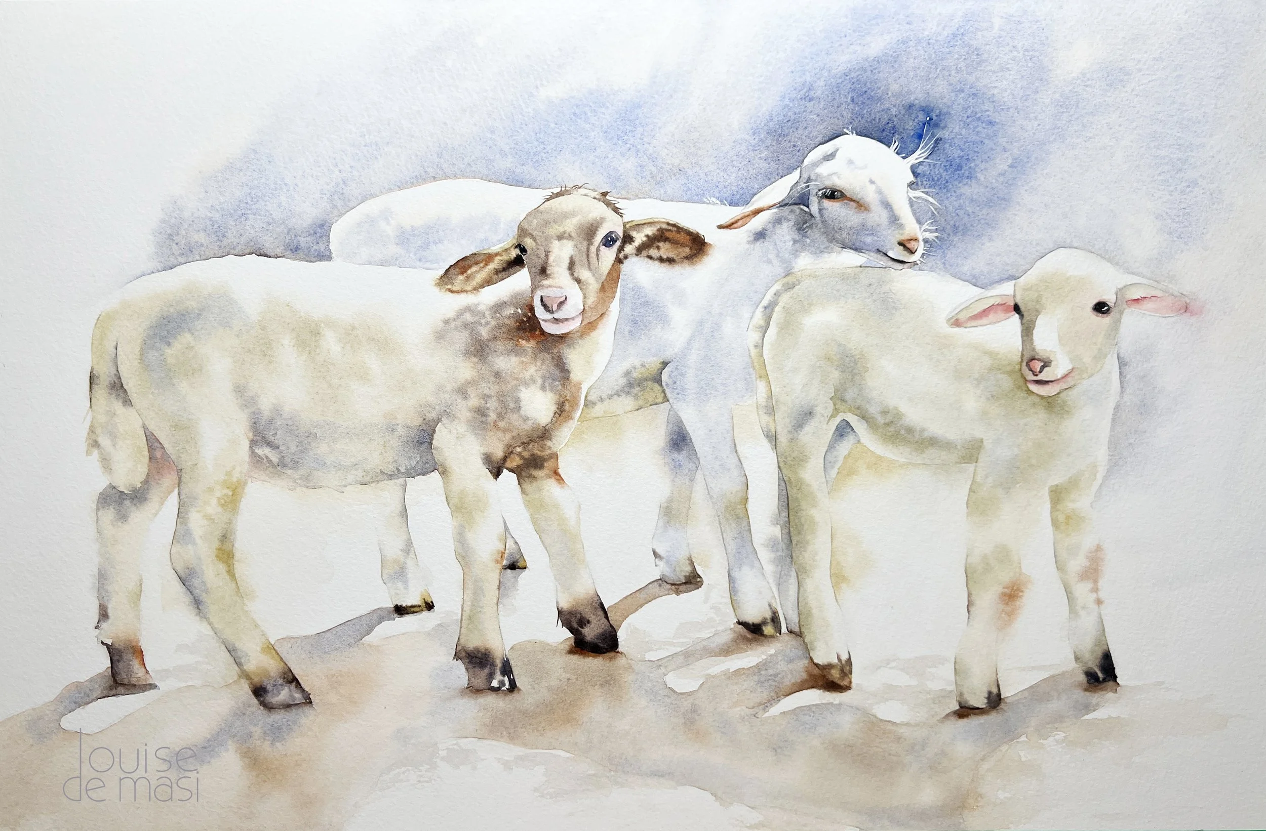
Just as importantly, I stopped there. I resisted the urge to soften or rework the other two lambs. They were already doing their job as supporting shapes. Adding or removing more would have weakened the balance.
This kind of decision making happens often in watercolour. The question isn’t always what needs more detail, but what needs less. Clear focus usually comes from restraint, not refinement.
This kind of decision making comes up again and again in watercolour. I talk through these choices out loud in my tutorials so you can see exactly why I stop, adjust, or leave something alone. Paint along with me.
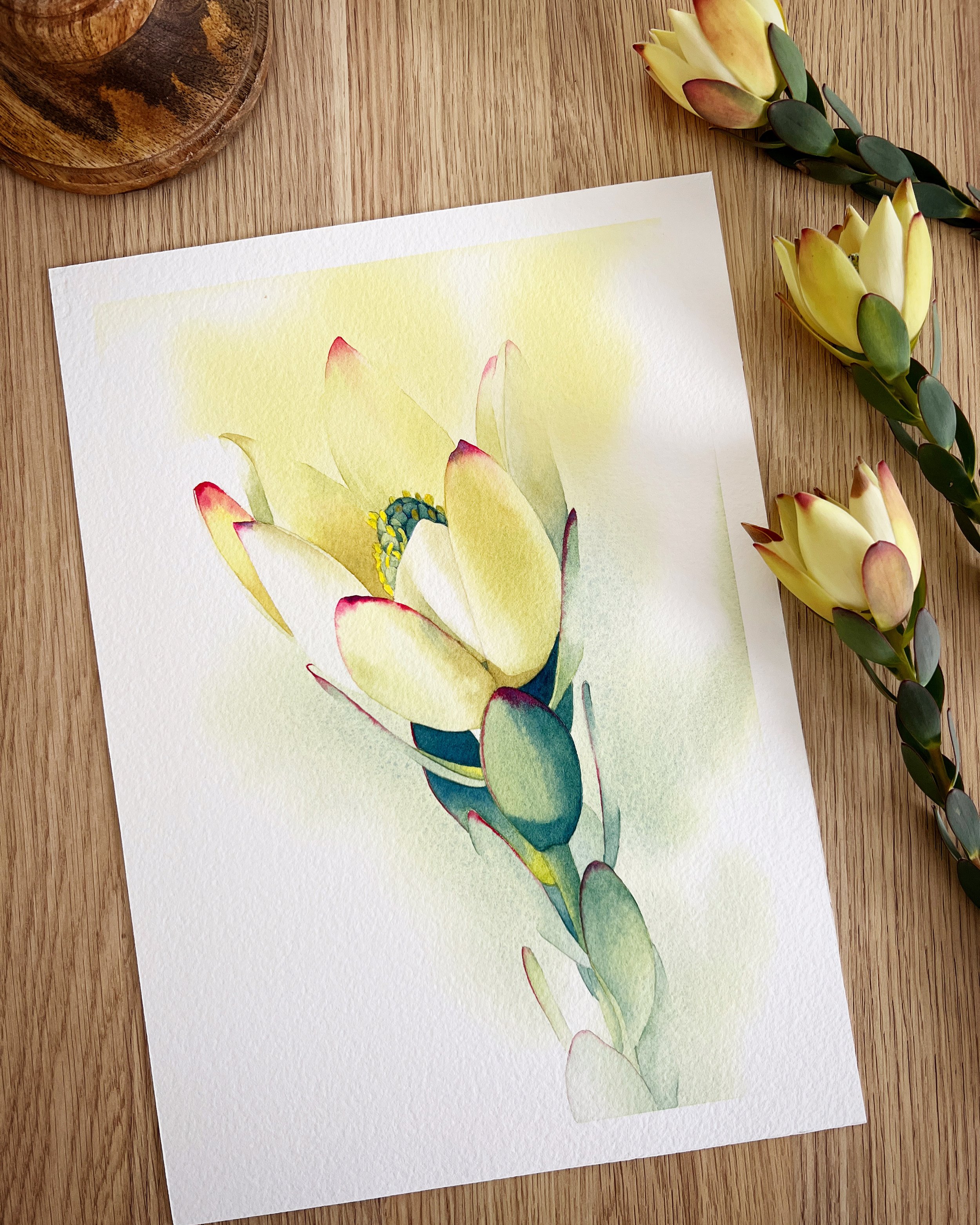
Lines and the Visual Path
Lines play a big role in how the viewer moves through a painting. They don’t need to be drawn lines. They can be implied through stems, repeated shapes, the direction of petals, or the way forms are angled.
In this orchid painting, the stem creates a clear visual path. The eye naturally follows it upward, moving from one bloom to the next. Because of that, detail doesn’t need to be applied evenly. The area where the eye slows down most becomes the logical place to add more definition.
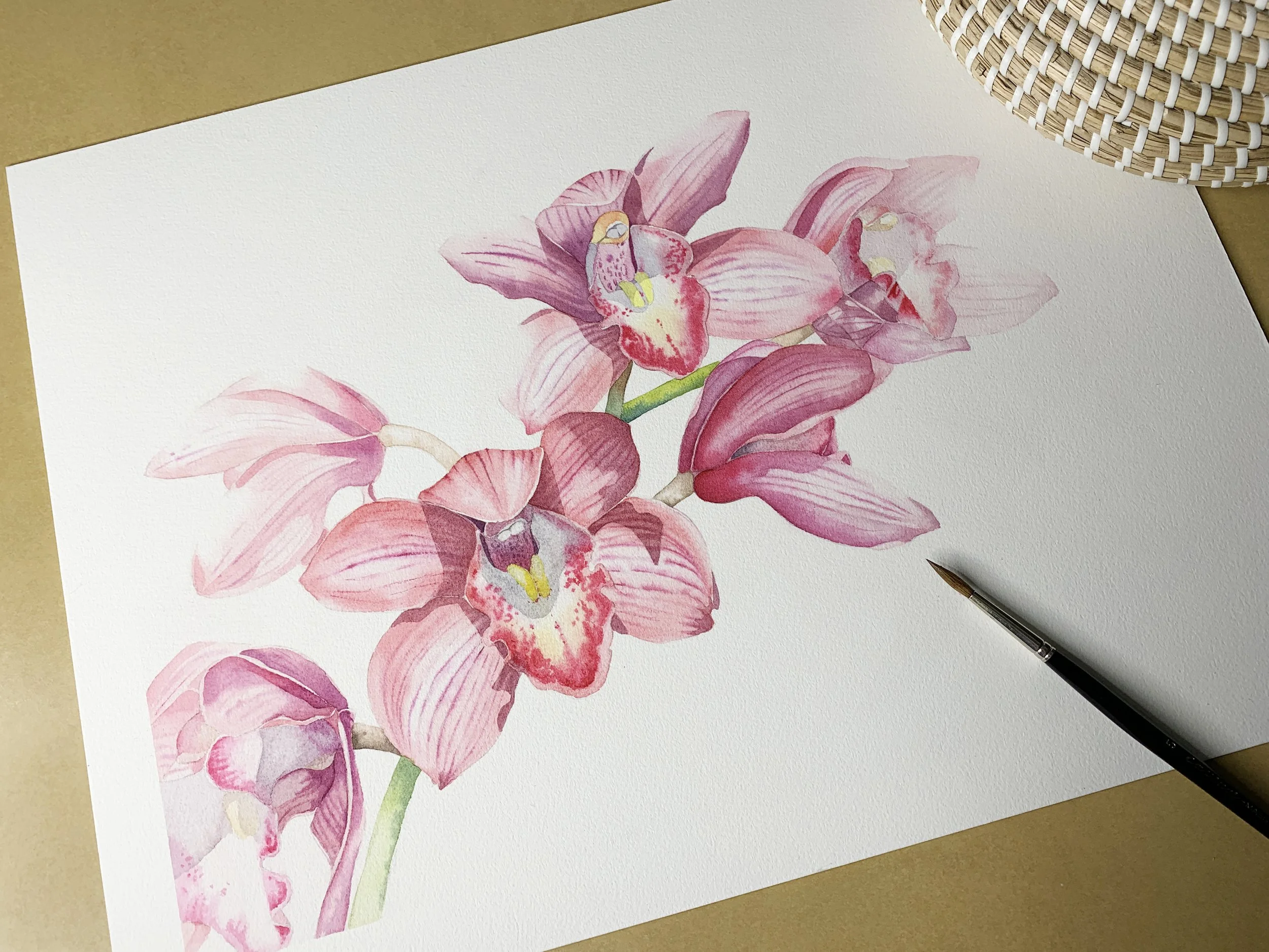
Detail is concentrated around the main flower, where the visual path pauses. Further along the stem, edges soften, shapes simplify, and colour transitions become quieter. Those decisions help maintain movement and prevent the eye from getting stuck everywhere at once.
When deciding where to add detail, it helps to ask: Where does the eye travel first, and where does it naturally come to rest? Detail belongs at those resting points. Everywhere else supports the journey.
Why Too Much Detail Weakens a Painting
Detail is powerful, but only when it’s used selectively. When everything in a painting is treated with the same level of finish, nothing stands out as more important than anything else.
Too much detail spreads the viewer’s attention evenly across the painting. The eye keeps moving, but it never settles. Without areas of rest, the painting becomes hard to read.
This often happens when detail is used to solve other problems. If contrast is weak or the focal point isn’t clear, the temptation is to keep refining and adding information. I’ve definitely been guilty of this myself. But detail can’t fix a lack of structure. It usually just makes the problem louder.
Strong paintings rely on contrast, balance, and restraint. Detail works best when it’s reserved for the main subject and supported by simpler shapes, softer edges, and quieter areas elsewhere. Knowing when to stop is just as important as knowing how to add more.
Step Back With Fresh Eyes
When you’re unsure where to add detail, the most helpful thing you can do is stop and step back. Look at the painting from a distance, or take a short break and come back with fresh eyes. Sometimes I take a photo of my painting and look at it on my computer. That small change of context makes it easier to spot where the eye goes, and where it doesn’t.
Ask yourself where your eye goes first. Does it settle anywhere, or does it keep moving? If the eye doesn’t naturally pause, the answer is rarely more detail. It’s usually clearer contrast, quieter supporting areas, or softer edges elsewhere.
These moments of pause are where the most important decisions happen.
A Simple Rule of Thumb
If everything is detailed, nothing is.
Detail is most effective when it’s earned. Decide what the painting is about, give that area the most attention, and allow the rest to stay simple. When you treat detail as a choice rather than a habit, your paintings become clearer, stronger, and more engaging.
If you’d like help applying these ideas in your own painting, I share full length watercolour tutorials where composition, restraint, and decision making are part of the process.