Muddy Colours
Why Your Watercolour Looks Muddy (And How to Fix Dull, Lifeless Colours)
One of the most common concerns I hear from artists is this:
“My watercolour looks muddy.”
It’s frustrating. We imagine vibrant, saturated colours full of light and beauty… and instead we see brown, or grey, or something that feels flat and lifeless.
The encouraging news is that dull colour is rarely mysterious. It usually comes down to a few essential principles of colour theory, water control, and timing. Once you understand the difference, you can avoid mud and begin to create fresh paint with far more confidence.
Let’s walk through the most common causes.
1. You’re Using Too Many Colours at Once
Why colours look muddy
Muddy colour usually isn’t the result of one “wrong” pigment. It happens when we unintentionally combine all three primaries in the same mixture.
For example, you might mix a cool colour like a cool blue with a warm yellow to create green. That already gives you a slightly softened, natural-looking green because the warm yellow contains a touch of red.
If you then add a little purple, which is made of red and blue, you’ve introduced green’s complementary colour into the mixture. At that point, you are effectively combining blue, yellow, and red together.
And when all three primaries meet, the result naturally moves toward brown or grey.
There is nothing wrong with that. Earthy neutrals are beautiful and essential in painting. But if you were hoping for a clear, vibrant green, the mixture will feel dull instead.
How to fix it
Limit each mix to as few pigments as possible.
Be aware of colour temperature, particularly secondary colours and notice whether your pigments lean warmer or cooler.
Avoid adding a complement unless you intend to neutralise the colour.
Test mixtures on scrap paper before committing them to your artwork.
A helpful habit is to create your own small colour chart using the exact tubes on your palette. You’ll quickly notice which combinations stay clean and which move toward earth tones.
Understanding this simple principle of colour theory makes an enormous difference. I always have a colour wheel next to me when I paint. Once you recognise how easily we slip into mixing all three primaries, avoiding mud becomes much easier and vibrant colour becomes far more predictable.
2. Muddy Colour Mixing (Without Realising It)
Why colours look muddy
Not all primary colours (reds, blues, and yellows) behave the same way. Each pigment leans slightly warmer or cooler, and that subtle temperature difference has a significant impact on your mixes.
For example, a cool blue mixed with a cool yellow will usually create a clearer, more vibrant green. Both colours lean toward each other on the colour wheel, so they combine without resistance.
But if you mix a warm blue with a warm yellow, the result often feels softer and more muted. That’s because warm yellows contain a hint of red and red is the complement of green. Even though you didn’t consciously add red, it was already present in the mixture.
Now imagine adding a touch of cadmium red to that green. You are introducing its direct complement. The mixture will neutralise almost instantly, shifting toward brown or a soft grey.
Again, this isn’t a mistake. Neutral colour is essential in painting. But when the goal is saturated colour, understanding temperature is everything. It is the quiet structure behind vibrancy.
If colour mixing feels unpredictable, it helps to see it demonstrated slowly inside a real painting rather than as theory alone. Try my free class or one of my many technique videos.
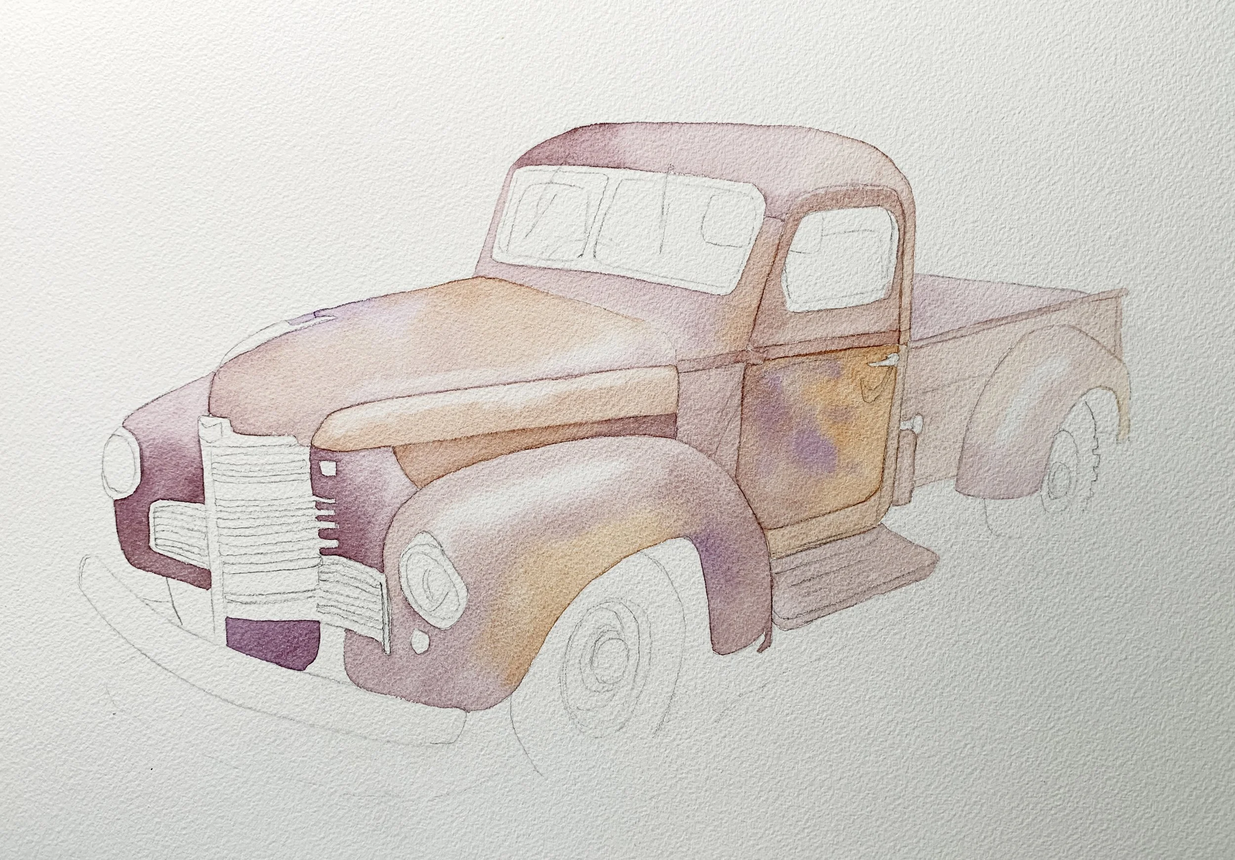
A green mixed from French Ultramarine (a warm blue) and Indian Yellow (a warm yellow). Still a useful green but not if you were wanting a vibrant green.
How to fix it
Study your pigments individually and notice whether they lean warmer or cooler.
Pay attention to which colours dominate in a mix and which soften quickly.
Create a simple colour chart from your own palette because it will teach you more than theory alone.
Avoid mixing complements unless you intentionally want to reduce saturation.
The more familiar you become with your pigments’ properties, the more predictable and luminous your mixtures will become.
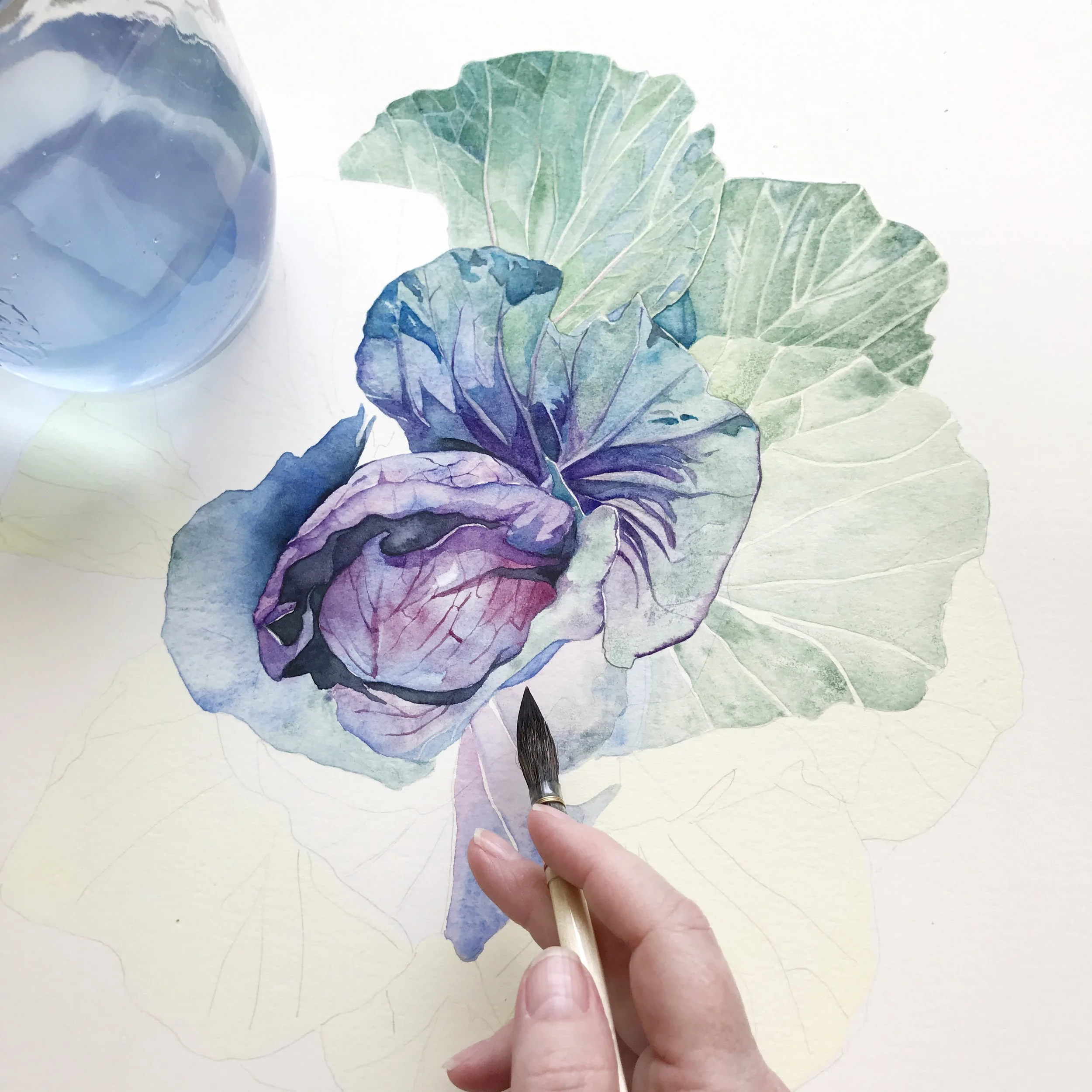
3. You’re Overworking the Surface
Why colours look dull
Watercolour is responsive. The paper surface holds pigment delicately, and repeated brushing disturbs that balance.
When we scrub, rework, or keep adjusting an area that has already begun to settle, we disturb the layer of paint. Pigment lifts unevenly. Texture becomes patchy. What was once fresh begins to look tired.
Often this happens not because we lack skill, but because we hesitate. We add one more stroke. Then another. And slowly, clarity disappears.
Watercolour rewards calm decisions. It does not respond well to panic.
How to fix it
Use fewer brush strokes than feel necessary.
Allow each layer to dry completely before revisiting it.
Step away when you feel the urge to “just fix this one small thing.”
If you hear yourself thinking, just one more touch, that is often the moment to pause.
Freshness in watercolour is usually preserved by restraint.
Many muddy passages come from hesitation rather than lack of skill. Watching how and when to stop is often more helpful than reading about it. Paint along with me.
4. Painting Into the Awkward Half-Dry Stage
Why colours look chalky
There is a delicate stage in watercolour when the surface is no longer glossy wet, but not yet fully dry. The pigment has begun to settle into the paper fibres, but it is still vulnerable.
Painting at this moment disrupts the wash. The surface breaks. Edges bloom unexpectedly. Colour lifts and resettles in uneven ways.
The result can appear chalky or patchy, not because the mixture was wrong, but because the timing was.
How to fix it
Watch the sheen on the paper carefully.
Either work while the surface is fully wet and flowing, or wait until it is completely dry.
Avoid the in-between stage whenever possible.
If you are unsure, wait a few more minutes. A short walk or a cup of tea often saves a painting.
5. Your First Layer Is Too Dark
Why colours lose vibrancy
Watercolour gains depth through layering. If the first wash is already dark and heavy, you remove the possibility of building light gradually.
Everything settles into the mid-range. There is no room for contrast, no space for glow. Even beautiful pigments can appear dull when the value structure is compressed.
Light in watercolour is preserved, not painted in later.
How to fix it
Begin much lighter than feels comfortable.
Allow the paper to carry the brightest highlights.
Build darker values slowly, layer by layer.
Think in terms of transparency rather than coverage.
When the first layer is gentle, the painting has room to breathe.
6. Too Much Water, Not Enough Pigment
Why colours look weak
Watercolour relies on water but colour still comes from pigment.
If your mixture contains too much water and too little pigment, even the most saturated colours will dry pale and lifeless. The shift from wet to dry becomes dramatic, and the painting can feel faded.
This often happens when we are trying to be cautious. We dilute to stay safe. But sometimes caution leads to dullness.
How to fix it
Load your brush generously when stronger colour is needed.
Mix to a creamy consistency for darker passages.
Adjust the water in your mixture rather than pressing harder onto the paper.
Intensity is created by pigment, not pressure.
Learning to control the water-to-pigment ratio is one of the most essential watercolour skills.
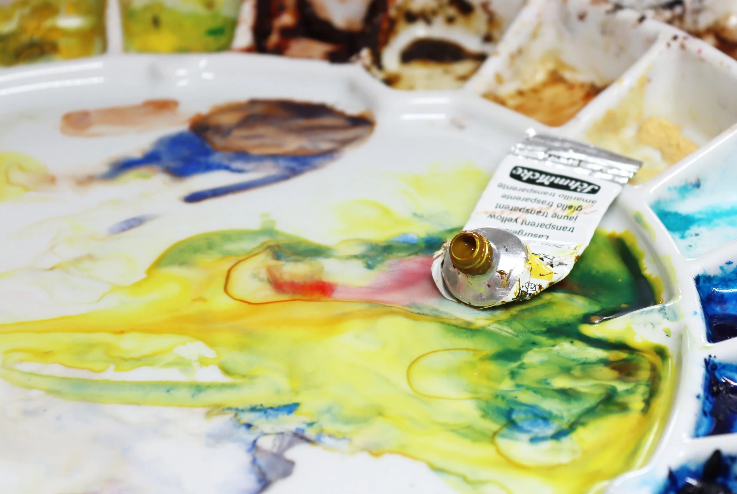
7. Paper Quality Makes a Difference
Why colours appear dull
Paper is not just a surface, it is an active participant in your painting.
Student grade paper absorbs pigment unevenly and often pulls colour into the fibres too quickly. Instead of sitting beautifully on the surface, the paint sinks and loses clarity.
Even high-quality pigments cannot perform well on a poor surface.
How to fix it
Choose 100% cotton watercolour paper whenever possible.
Cold press offers a balanced surface suitable for most subjects.
Better paper will not replace practice. But it does allow colour to remain luminous, edges to stay clean, and layers to behave predictably.
Sometimes the simplest upgrade creates the biggest difference.
Good materials help, but understanding how they behave makes the biggest difference.
8. You’re Comparing Wet and Dry Paint
Why you notice dullness
Watercolour dries lighter - often by 20 to 30 percent. What looks rich and bold when wet may soften significantly as the water evaporates.
If you judge your painting too early, it can appear dull simply because it has shifted.
This is not a flaw. It is simply the nature of the medium.
How to fix it
Expect the shift from wet to dry.
Allow layers to dry completely before evaluating colour strength.
Deepen areas gradually with glazing rather than overcorrecting immediately.
Many paintings pass through an awkward stage. That stage is not a sign of failure, it's just part of the process. Patience brings clarity.
9. Be Aware of Opaque Pigments
Knowing the qualities of your pigments really matters.
Whenever I can, I reach for transparent pigments rather than opaque ones. Transparent colours layer and mix more cleanly, which helps keep mixtures luminous. Opaque pigments, on the other hand, tend to soften and flatten a mix, and if you’re not careful, that can make it look dull or muddy.
10. No Strong Values
Why everything feels flat
Sometimes the issue is not colour at all - it is value.
If all areas of a painting sit in a similar mid-tone range, even vibrant purple, orange, or green will appear dull. Without contrast, colour has nothing to push against.
Dark values give light meaning.
How to fix it
Intentionally deepen your darkest areas.
Place dark next to light to create energy and focus.
Think in terms of value structure before refining colour.
When contrast is strong, even restrained colour feels luminous.
Dark next to light makes colour sing.
A Gentle Encouragement
If your watercolour looks muddy, it is not a failure. It is simply information.
Every mistake teaches you something about pigment temperature, mixing colours, water control, or timing. Each experiment adds to your understanding of colour theory in real, practical ways.
Even experienced artists occasionally create mud. The difference is that they recognise it quickly and know how to adjust.
So don’t lose hope. Notice what happened. Alter one variable at a time. Build your own colour chart. Learn how your primaries behave. Avoid mixing too many colours without intention.
Watercolour is sensitive, yes. But it is also generous.
With thoughtful practice, your colours will become clearer, cleaner, and more vibrant and the beauty you were hoping for will begin to appear naturally in your painting.
If you’d like to practise clean colour and confident mixing inside full step-by-step paintings, you’ll find structured tutorials inside my library.
Happy painting.