
How Much Water Should You Use with Watercolour Paint?
Too much water, too little water, or somewhere in between? Learning to recognise different paint consistencies will give you much more control over your watercolour paintings.
In this blog post, I’ll show you the three paint consistencies I use in my watercolour paintings, how to recognise each one and when to use them.
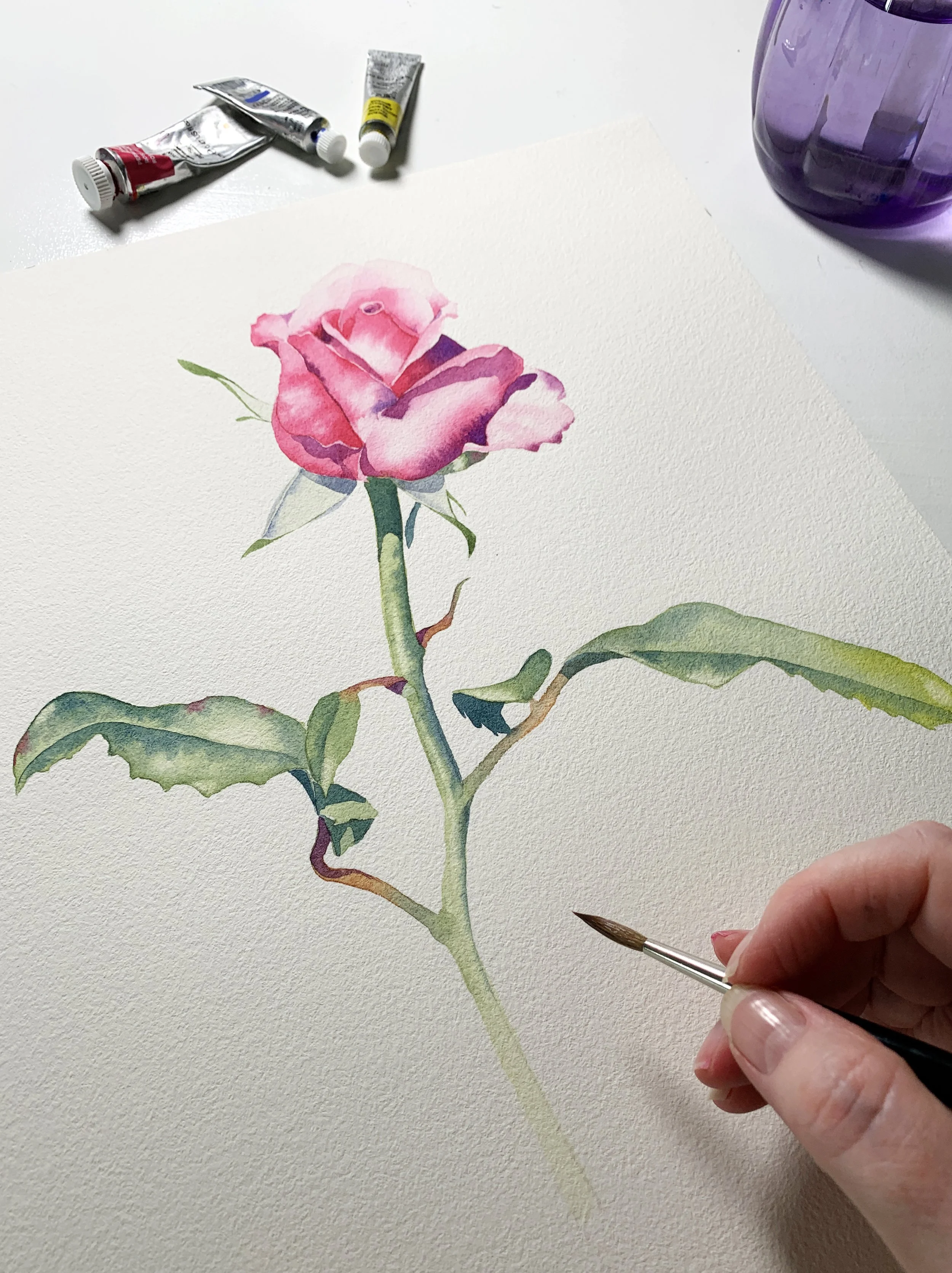
One of the things that can take a little while to get used to when you first start painting with watercolour is knowing how much water to mix with your paint. Sometimes the colour looks beautiful on your palette but disappears almost completely when it dries. Other times, the paint refuses to move across the paper, or it spreads much further than you intended.
I've found that understanding paint consistency makes a big difference to the way I approach a painting. I don't use the same paint-to-water ratio throughout a painting. Instead, I gradually change the consistency as I work, depending on what I'm trying to achieve.
If I used the same mixture from the beginning to the end, my paintings would lack depth and look rather insipid. I need pale, watery washes for my initial layers, stronger mixtures to build up colour and detail, and much thicker paint for those final dark accents.
I generally work with three different paint consistencies. They're not rigid measurements, and they can vary slightly from one painting to another, but they give me a useful starting point.
Let's have a look at each one.
1. Watery paint consistency: Start with a light wash
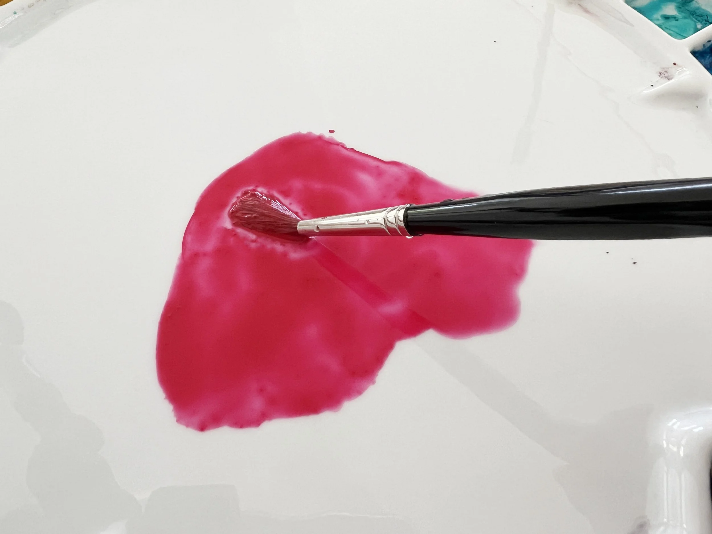
My first paint mixture is quite watery. It contains plenty of water, so the colour is pale and the mixture flows easily across my palette.
If I tilt my palette, the puddle of paint moves around quite freely. That's a good indication that there's plenty of water in the mixture.
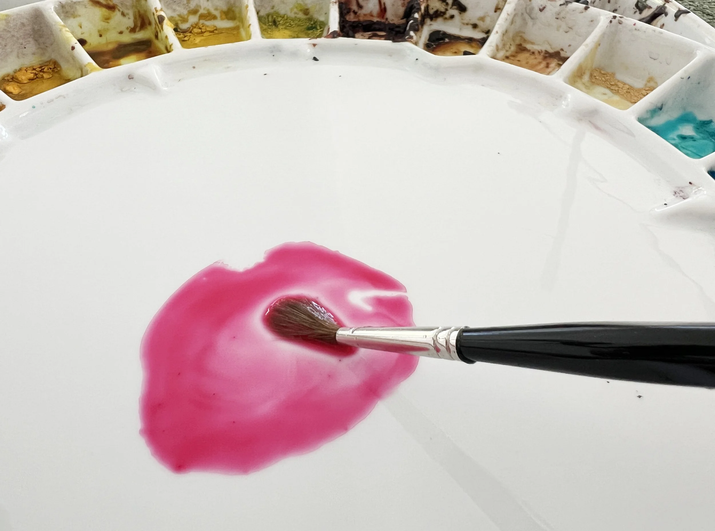
A watery mixture of Permanent Rose on my palette. The paint is diluted with plenty of water, creating a pale, fluid wash.
I mainly use this consistency at the beginning of a painting when I want to establish the initial colours and lightest tones.
For example, when I painted my rosebud, I started by wetting the petals with clean water. After absorbing any excess puddles with my brush, I applied a pale mixture of Permanent Rose over the entire flower.
This first wash is important because it establishes the lightest areas of the petals. Once it's dry, I can gradually build up the darker areas without losing those initial light tones.
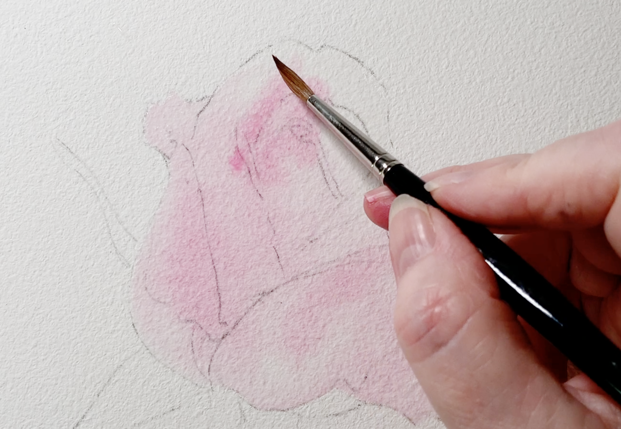
Remember that watercolour dries lighter than it looks when it's wet.
Your initial wash may appear quite pale on the paper, but it will become even lighter as it dries. That's perfectly fine at this stage. I'm not trying to achieve all my colour and depth in one go.
Should you paint watery mixtures on wet or dry paper?
You can use a watery paint mixture on either wet or dry paper. The choice depends on the size of the shape you're painting and the effect you want.
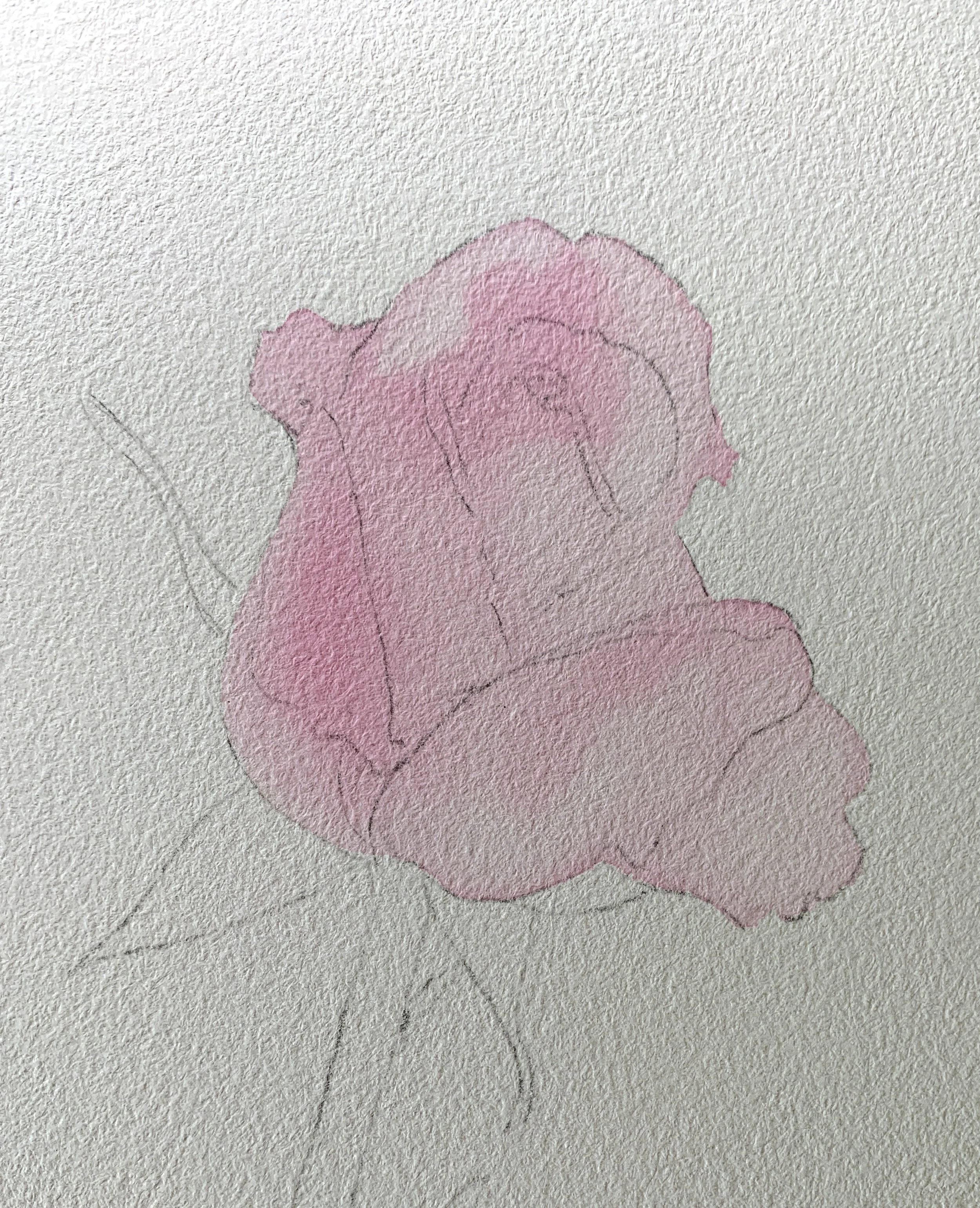
I often prefer to work on wet paper when I'm painting larger or unusually shaped objects. It gives me more time to apply the paint before it starts drying, which helps me avoid unwanted hard edges and paint lines.
It's particularly useful when I want to introduce more than one colour into an area or create soft, lost edges around a shape.
Sometimes I also choose wet paper because I want a slightly patchy wash rather than a completely even one. When I painted my rosebud, for example, the damp paper allowed the colour to settle in subtle variations. Some areas dried slightly lighter than others, which helped me capture the differences between the petals.
Smaller shapes are usually quicker to paint, so I'll often work on dry paper for those.
There's no single rule you need to follow. Think about the size of the shape, how quickly you can paint it and whether you want soft or hard edges.
2. Medium paint consistency: Build colour and depth
My second consistency contains more pigment and less water. The colour is stronger and darker, but the mixture is still quite fluid.
If I tilt my palette, the paint will still move, although it won't run quite as freely as the first, watery mixture.
This is the consistency I use when I begin adding depth and detail to my paintings.
A medium consistency mixture of Permanent Rose. With more pigment and less water, the colour is stronger but the paint is still fluid enough to move easily across the paper.
Going back to my rosebud, I allowed the initial pale wash to dry before starting to work on the individual petals. I mixed a fresh puddle of Permanent Rose, this time adding more pigment and less water.
I often mix a new puddle rather than simply trying to use the watery mixture from the first wash. After using the first puddle, it may contain too much water for the stronger colour I need.
I still want some water in the mixture, though. If the paint is too thick, it won't move easily across the paper.
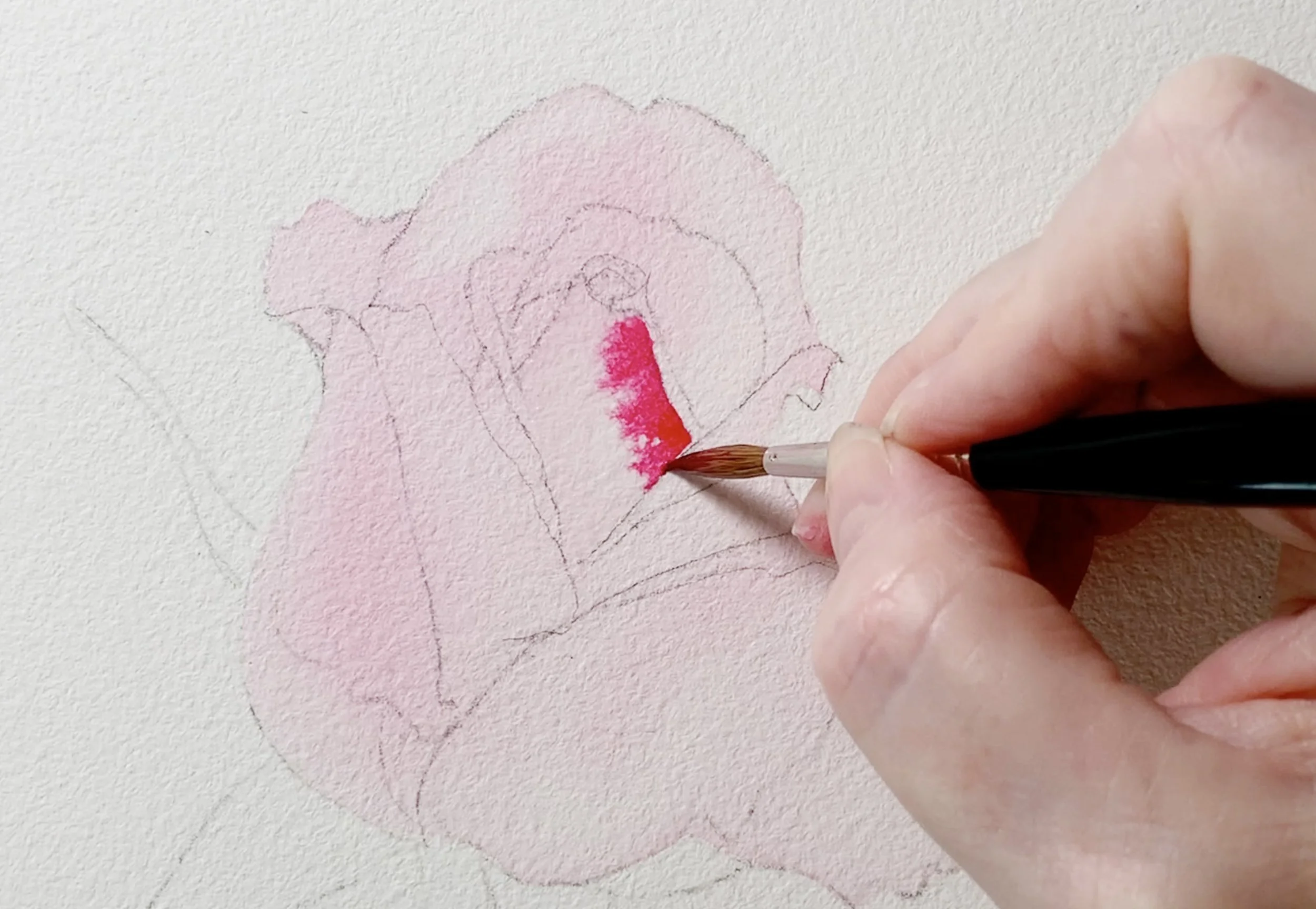
For one of the petals, I wet the middle section with clean water because I wanted soft paint edges. I then picked up the stronger Permanent Rose mixture and applied it along the side where the reference photo showed the darkest colour.
The pigment began to bleed gently across the damp paper, but it didn't spread out of control. I could still guide it with my brush and keep it where I wanted it.
Medium consistency also works on dry paper
Although I often use this mixture on wet paper, I also use it on dry paper when I want a more defined edge.
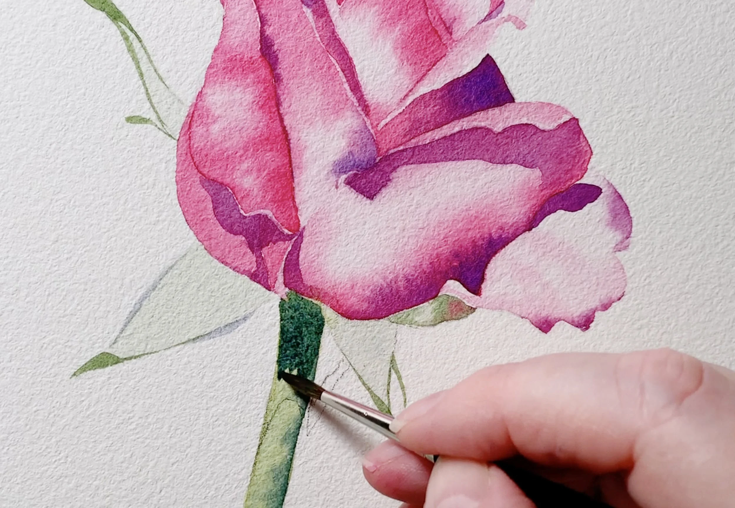
The cast shadow on the stem of my rosebud is a good example. I mixed French Ultramarine with yellow to create a dark green, added a little water and painted the shadow directly onto the dry paper.
I didn't need soft edges here. The shadow had a distinct, hard edge in my reference photo, so painting on dry paper was the right choice.
The important thing is to match your paint consistency and the condition of your paper to the effect you're trying to create.
3. Thick paint consistency: Save your darkest darks until last
My third consistency contains a lot of pigment and very little water.
This mixture is thicker than the first two. It doesn't move around on my palette when I tilt it. Instead, it stays where I've put it.
The only moisture in this mixture usually comes from my brush when I pick up the pigment. I don't normally dip my brush into my water container to add more water.
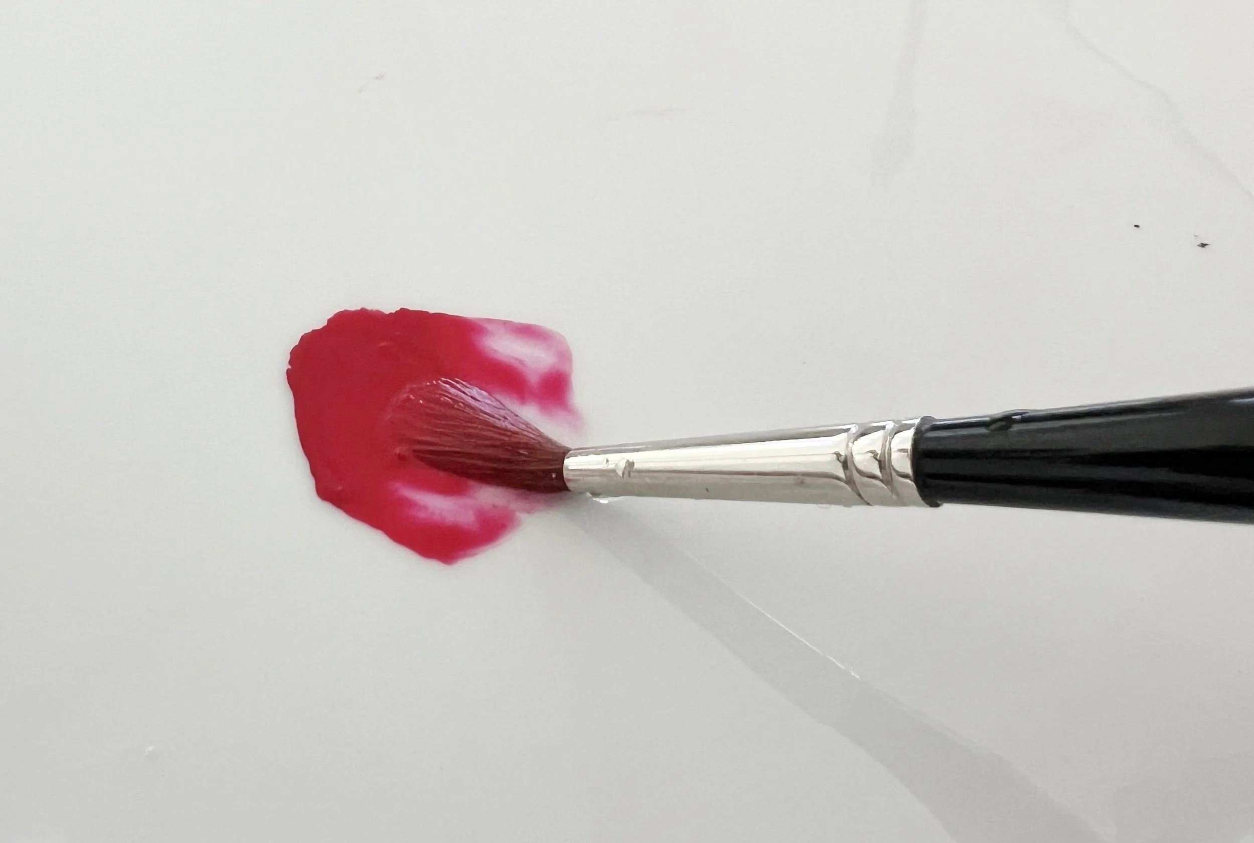
A thick mixture of Permanent Rose containing very little water. Notice how the concentrated paint holds its shape on the palette rather than spreading into a puddle. This consistency is ideal for adding the darkest tones and final details.
I use this consistency towards the end of a painting when I want to establish the darkest tones and add those final details. I find it helps to use fresh pigment when I want this consistency of paint particularly if I am mixing more than one colour.
When I painted my little crab, I wanted to darken its eyes. I'd already applied an initial watery layer of yellow and allowed it to dry. I then added a watery layer of black.
For the final dark layer, I simply wiped my slightly damp brush over the dried black pigment on my palette. This reactivated the paint and gave me a very concentrated mixture.
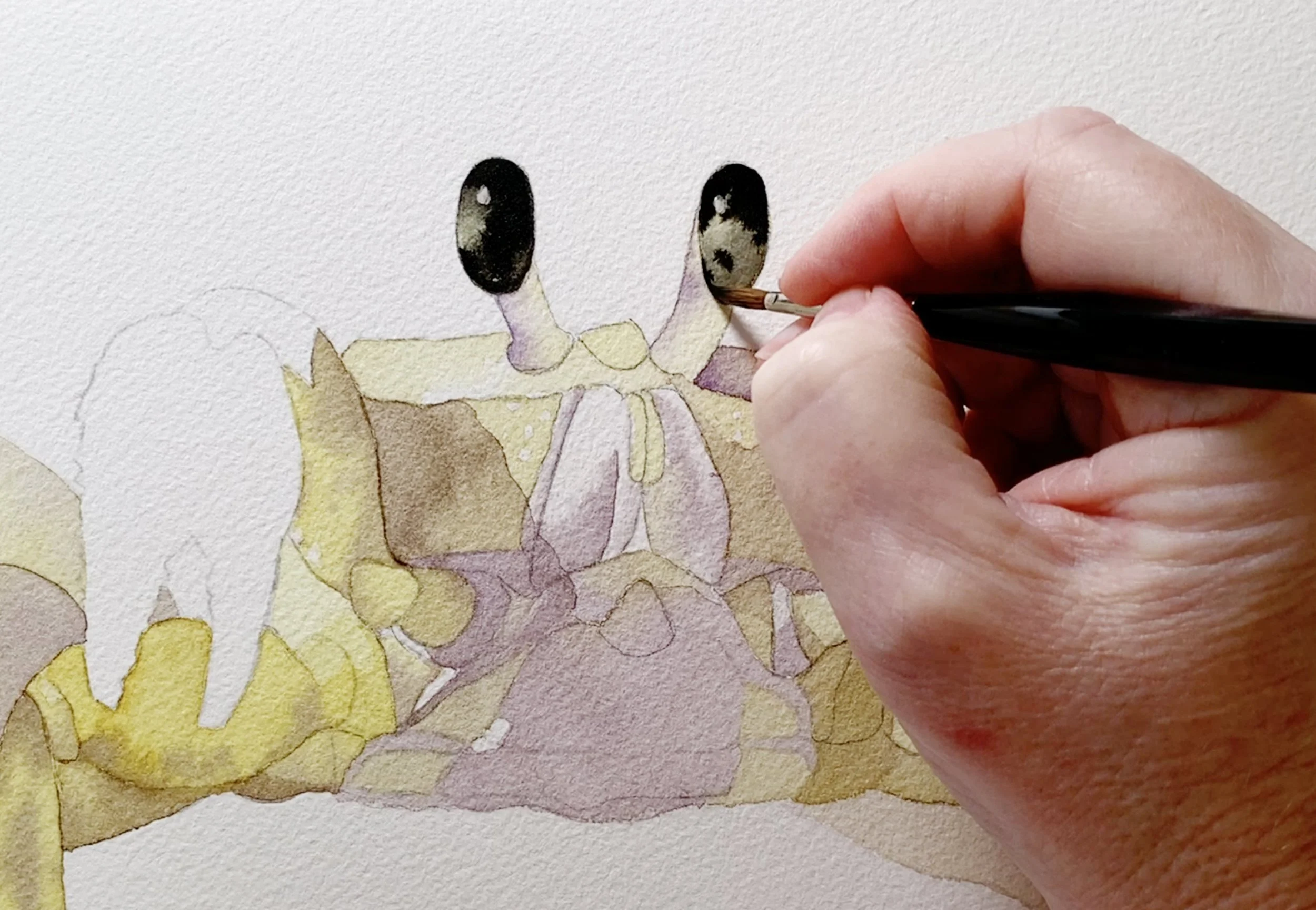
When I applied it, the paint stayed more or less where I put it. It was thick enough to give me the deep, dark colour I wanted without spreading across the paper too much.
I try to leave this sort of work until the later stages of a painting. If I apply more watery washes over these dark areas, the pigment can lift off and make a mess. It's much easier to preserve those darkest accents if I add them once I'm happy with the rest of the painting.
Wet paper, paint consistency and brush moisture: Getting the balance right
There's something else that's important to understand when you're working with watercolour. Your paint consistency isn't the only thing that determines how the paint behaves.
You also need to consider how much water is on your paper and how much water is in your brush.
All three things work together.
I've had people tell me they're having trouble getting their paint to behave on wet paper. Sometimes the paint spreads everywhere, sometimes it barely moves at all. Often, the problem comes down to one of these three things.
Here are a few situations you might encounter.
When there's too much water on your paper
If you apply paint to a paper surface covered with puddles of water, the pigment will float around on top rather than absorbing into the paper.
You can lose control of where the paint goes, particularly if you tilt your board.
When I wet my paper, I don't want any puddles sitting above the surface. Instead, I use my brush almost like a sponge to absorb the excess water.
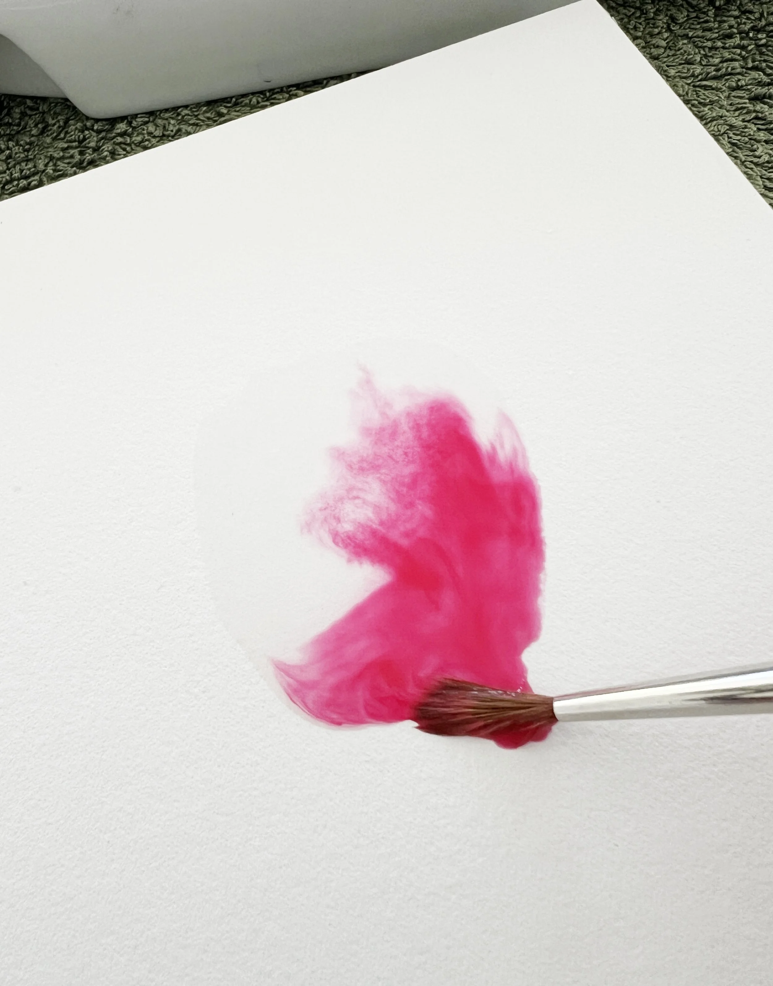
There is too much water on the paper. The paint floats on top of the water and you have no control over it.
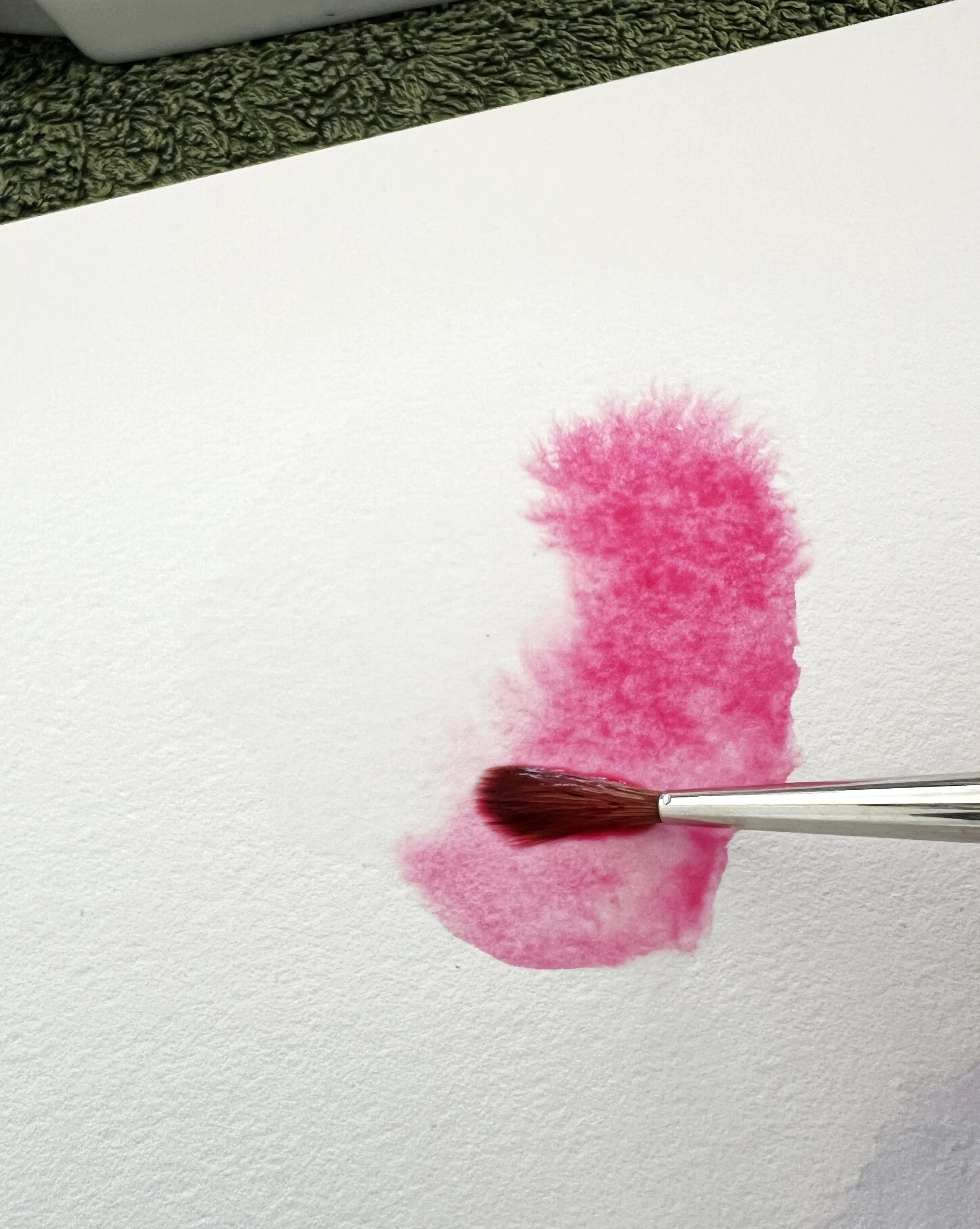
Excess water puddles are removed from the paper before applying the paint. The paper is evenly wet with a glossy sheen.
I dab my brush on a towel first, then gently run it over the paper to pick up the extra moisture.
The surface should have an even sheen of water, without any obvious puddles. It reminds me of the surface of a freshly cut juicy orange.
That's the sort of dampness I usually aim for when I'm working wet on wet. The paint can still move and bleed across the paper, but I have much more control over it.
When your paint is too thick to move
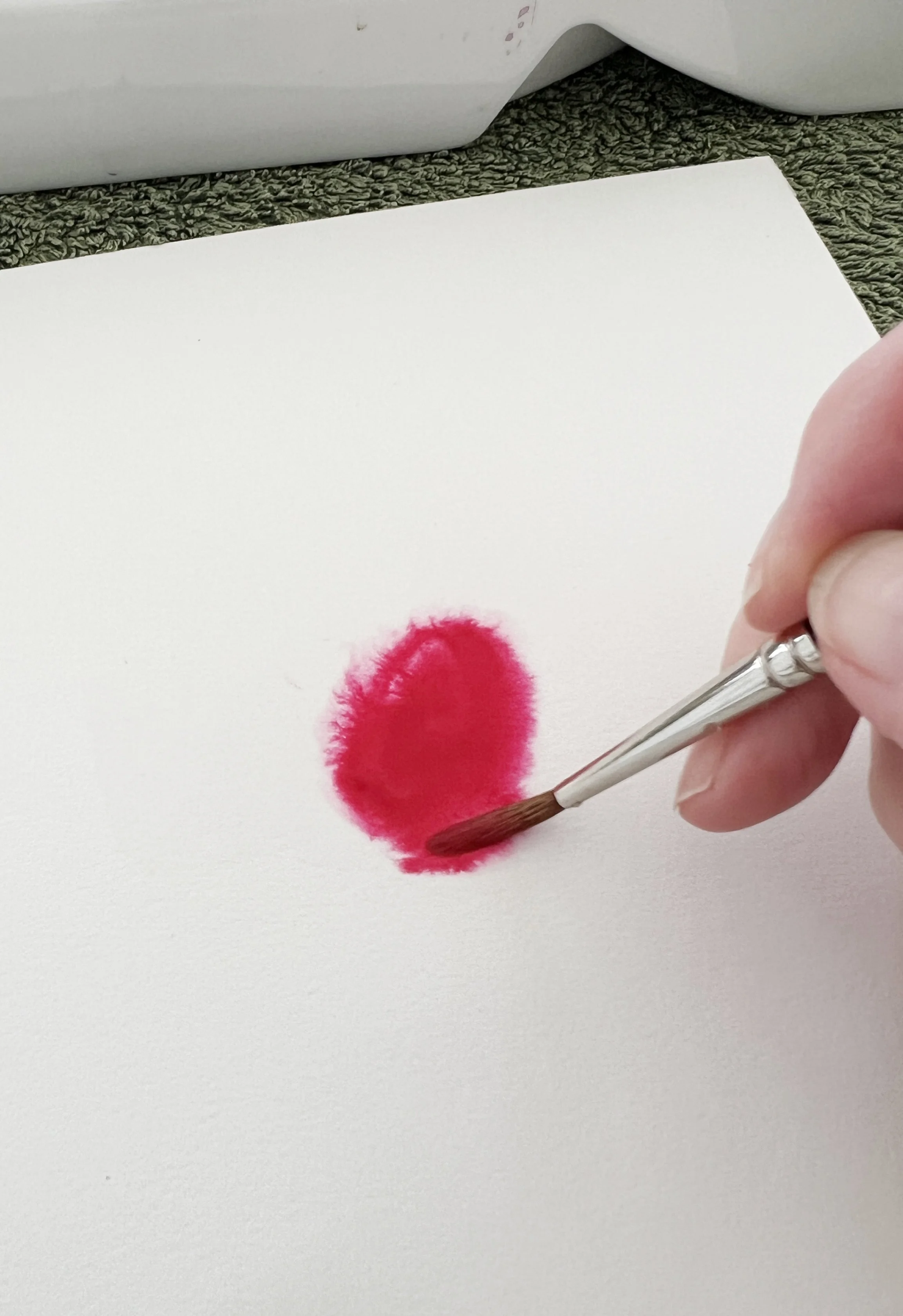
Sometimes your paper is evenly wet, but the paint stays in one spot rather than spreading across the surface. This could mean your paint mixture is too thick. Try adding a little more water to help the pigment flow.
You might have prepared your paper perfectly, but your paint still refuses to spread or travel as much as you'd like.
In this case, the paint mixture may be too thick.
If you want the pigment to travel further across the damp paper, try adding a small amount of water to your paint mixture. You don't need much. Just enough to make it a little more fluid.
Test it on a scrap piece of paper if you're unsure. You can also tilt your board slightly to see how the paint moves.
When your paint spreads too far
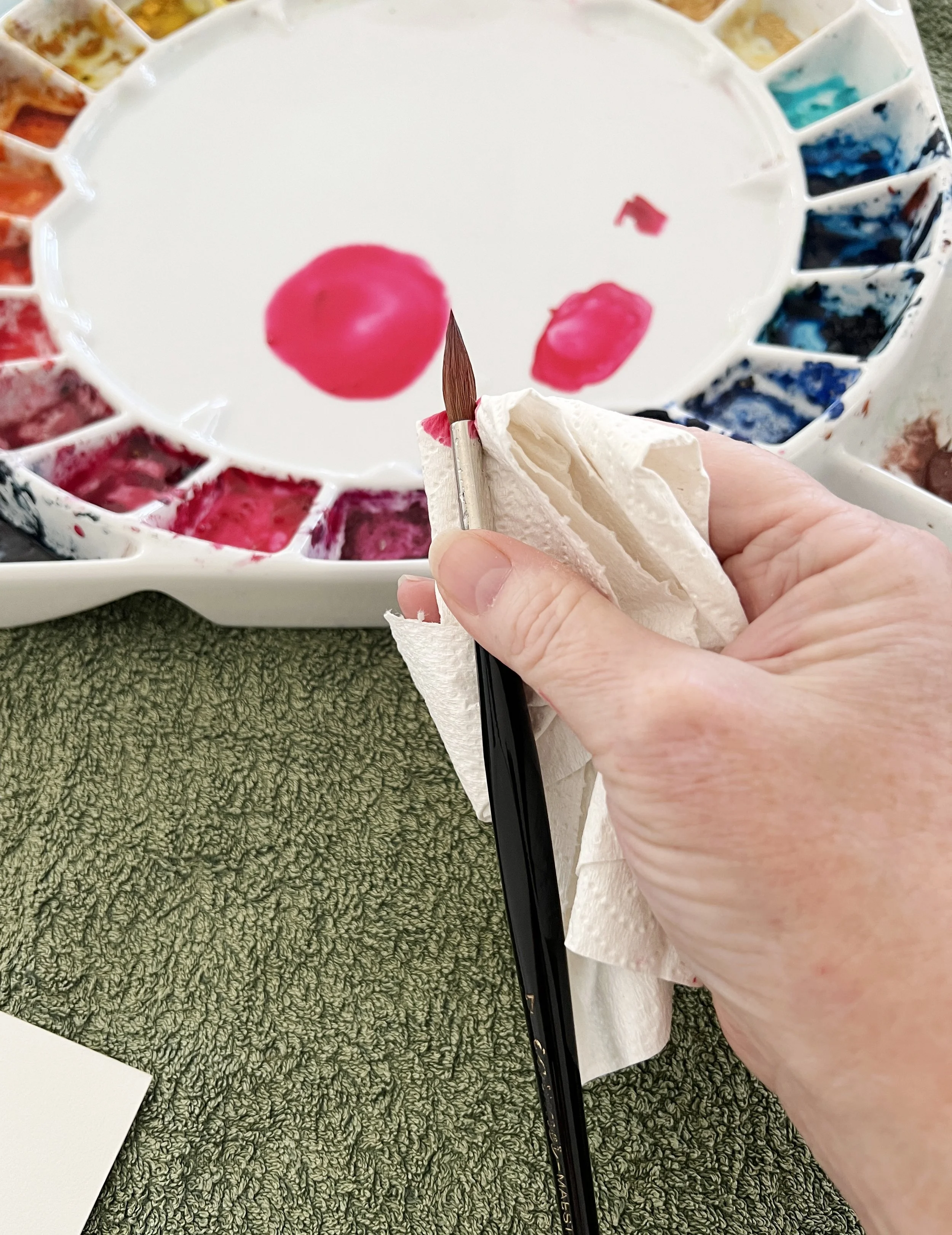
Sometimes your paint consistency is just right and the water on your paper is fine, but the pigment still spreads further than you intended.
This can happen when there's too much water in your brush.
I simply dab my brush gently on a towel to remove a little of that excess moisture, then pick up the paint again.
It's a small adjustment, but it can make a big difference.
If you’ve already loaded your brush with paint and think it might be too wet, gently touch a piece of paper towel against the bristles near the ferrule. This will absorb some of the excess moisture without removing too much paint.
Whenever you're having trouble with wet-on-wet painting, take a moment to consider these three things:
How much water is on your paper?
How much water is in your paint mixture?
How much water is in your brush?
You may only need to adjust one of them to get the result you're looking for.
When your watercolour pigments separate
Here's something else that sometimes worries beginner painters, although I actually think it's one of the lovely qualities of watercolour.
When you mix two or three colours together, you may notice that they separate once you apply them to the paper.
This isn't necessarily a problem. In fact, it can produce some beautiful effects.
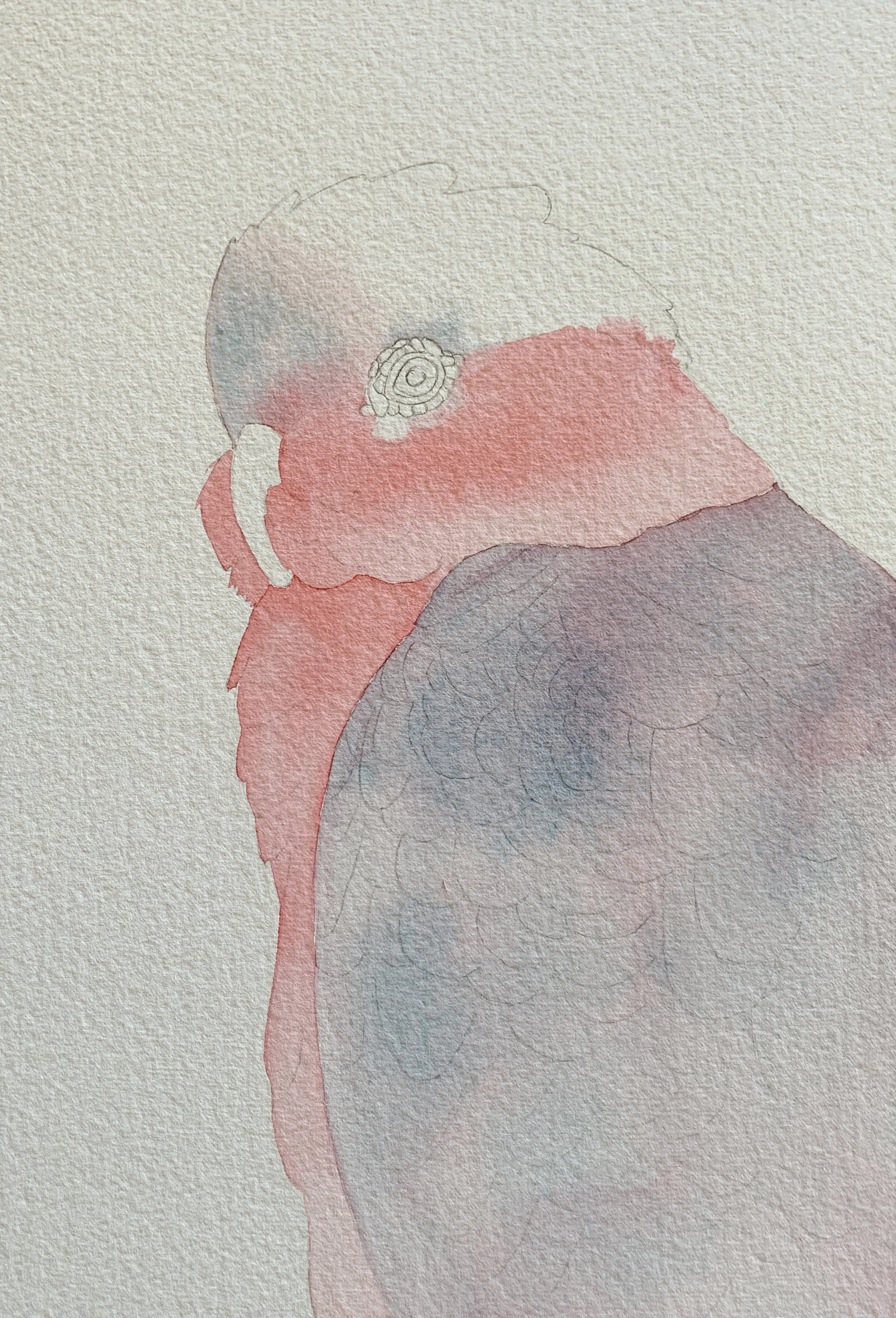
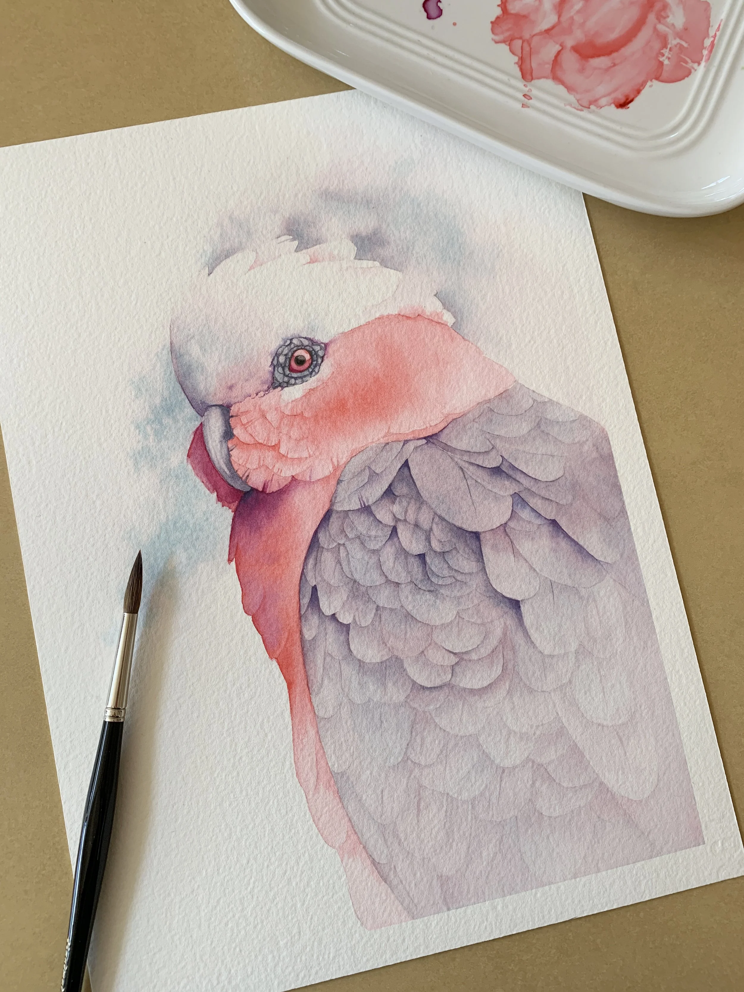
When I painted the wings of my galah, I wanted a grey mixture, so I combined Quinacridone Red with Cobalt Turquoise Light.
I mixed the two pigments together fairly evenly before adding water. When I applied the mixture to the wet paper, something interesting happened. The turquoise and pink began to separate, and I could see both colours moving independently across the surface.
I hadn't deliberately created that effect. It happened naturally as the pigments spread.
I actually wanted to keep the pink in the mixture because I'd used the same colour on the pink feathers of the bird. The separation gave the wings some lovely subtle colour variations without me having to paint them individually.
So, if your colours separate on the paper, don't automatically assume you've done something wrong. Sometimes it's worth letting the paint do its own thing.
Learning to recognise paint consistency takes practice
When you're starting out, getting the balance between paint and water right can feel like a bit of a guessing game.
You might mix a beautiful puddle of colour, pick it up with your brush and then discover that it's either too watery or much too thick for what you want to achieve.
But this does become easier with practice.
Eventually, you'll start to recognise the consistency of the paint as soon as you pick it up with your brush. You'll know instinctively whether it needs a little more water or whether you should dab your brush on your towel to remove some of the moisture.
I don't think there's any shortcut to developing that instinct. You simply need to spend time painting and experimenting.
And don't worry about making mistakes. I've had countless failed paintings over the years. I learn something from nearly all of them, and I certainly don't throw them away. I use the backs of my old paintings as scrap paper to try out new colours and techniques.
So, next time you sit down to paint, try mixing three different paint consistencies. Tilt your palette and watch how each mixture moves. Try them on wet and dry paper and see how differently they behave.
The more familiar you become with your paint, the easier it will be to control it.
Put These Watercolour Tips into Practice
Would you like to try these techniques for yourself?
In my Rose for Beginners watercolour tutorial, I'll guide you step by step through painting a beautiful pink rose. It's a lovely opportunity to practise working with watercolour washes, controlling your paint and creating soft transitions between colours.

New to watercolour? Start with the free class.
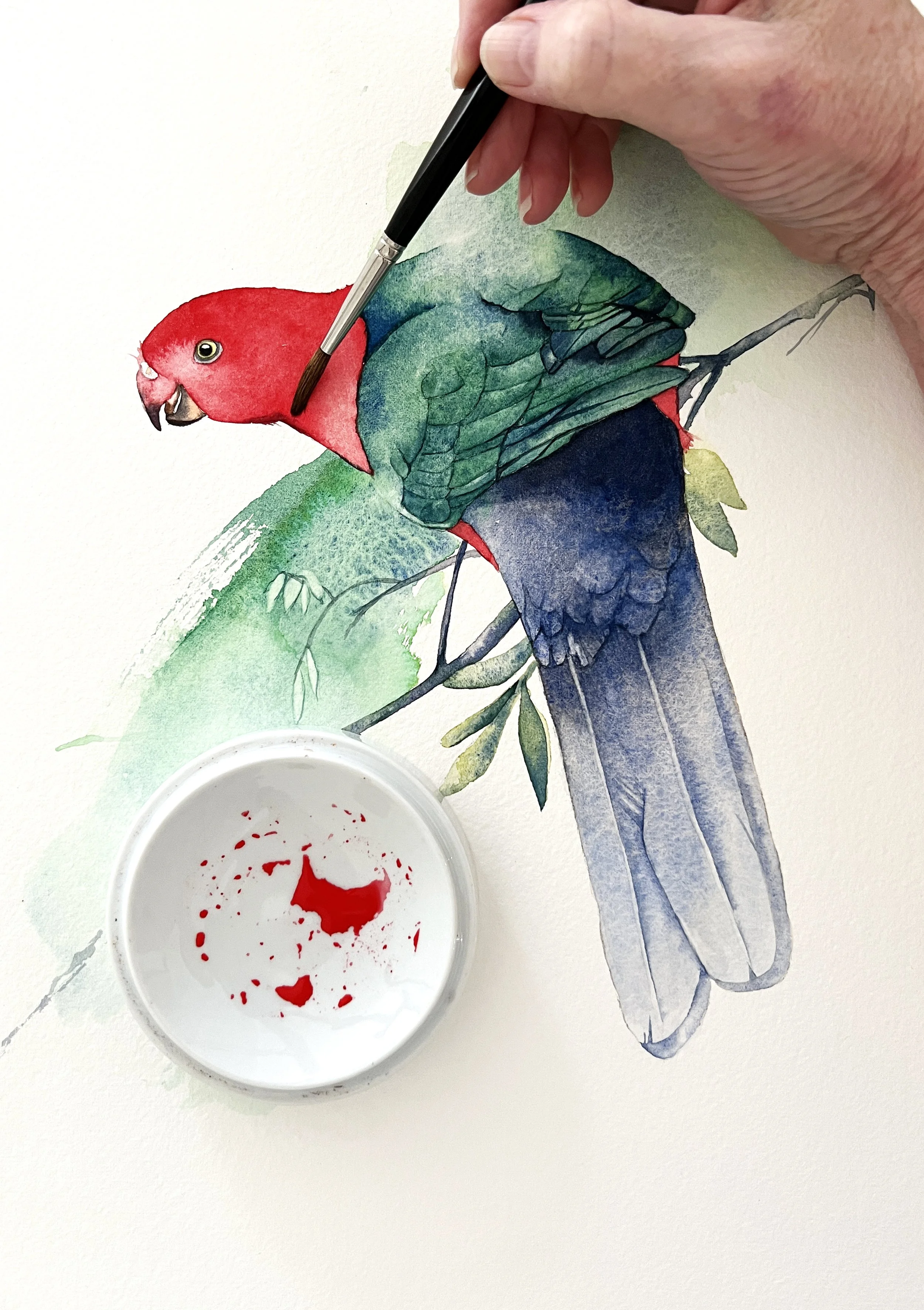
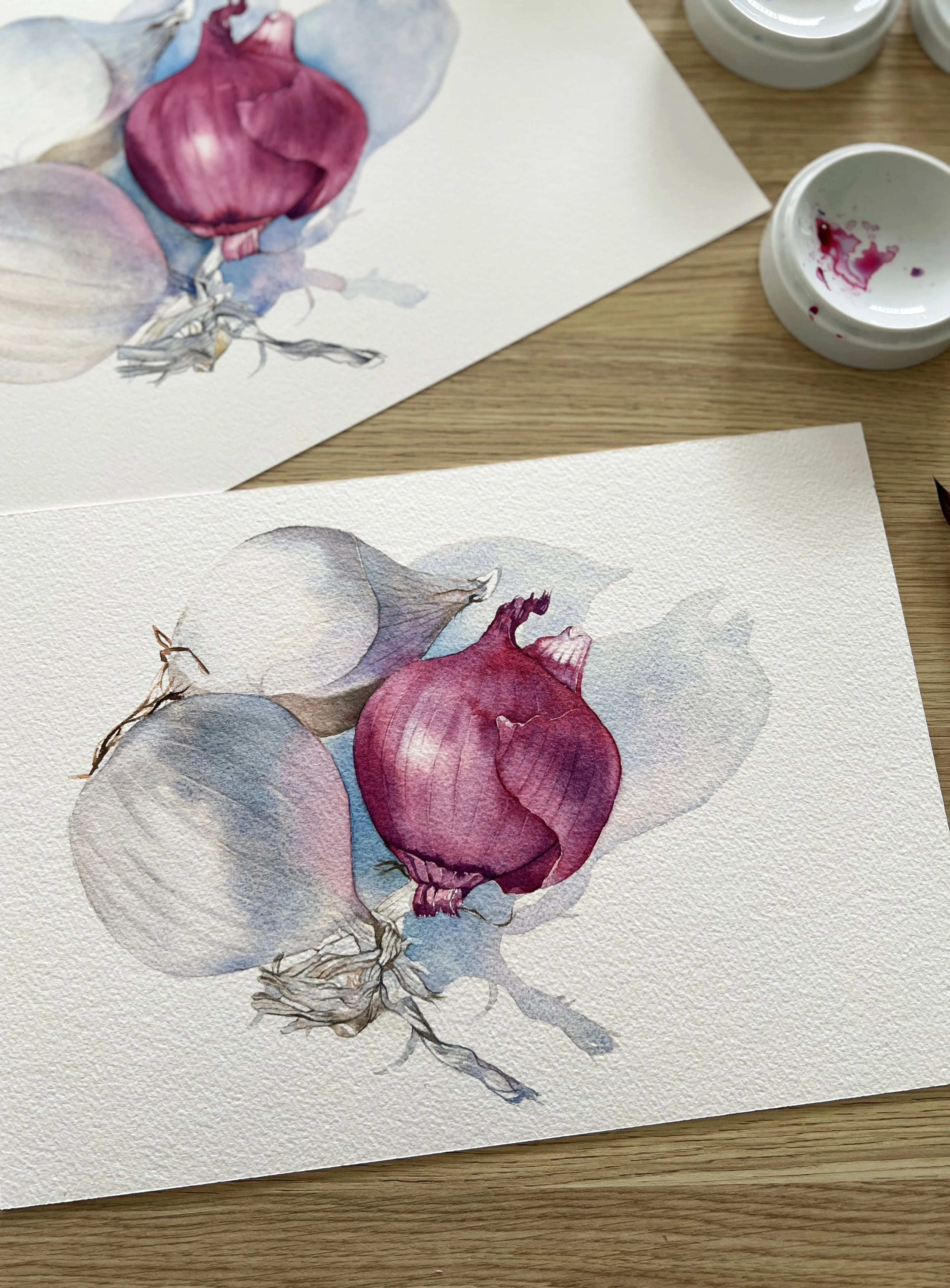
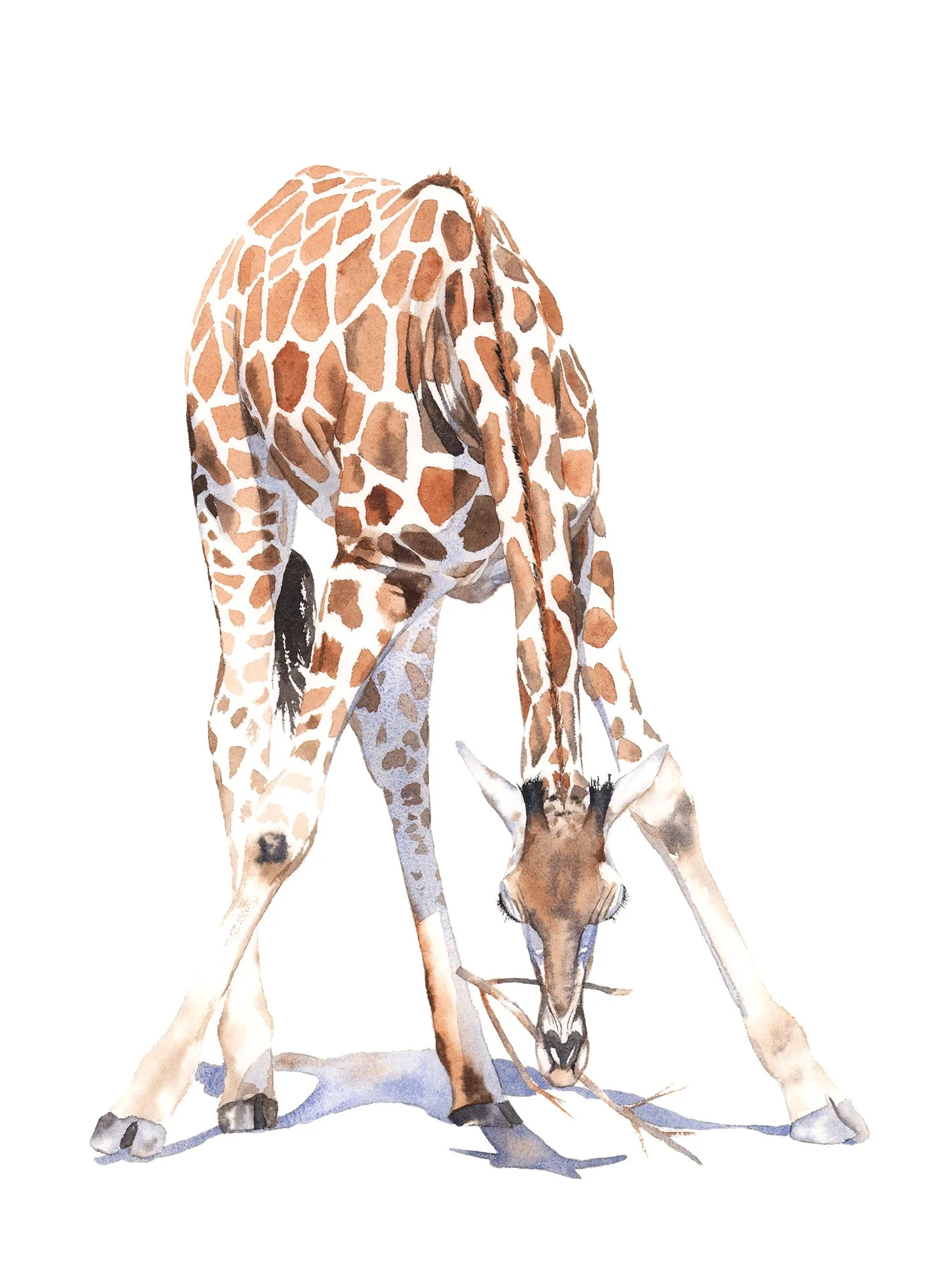
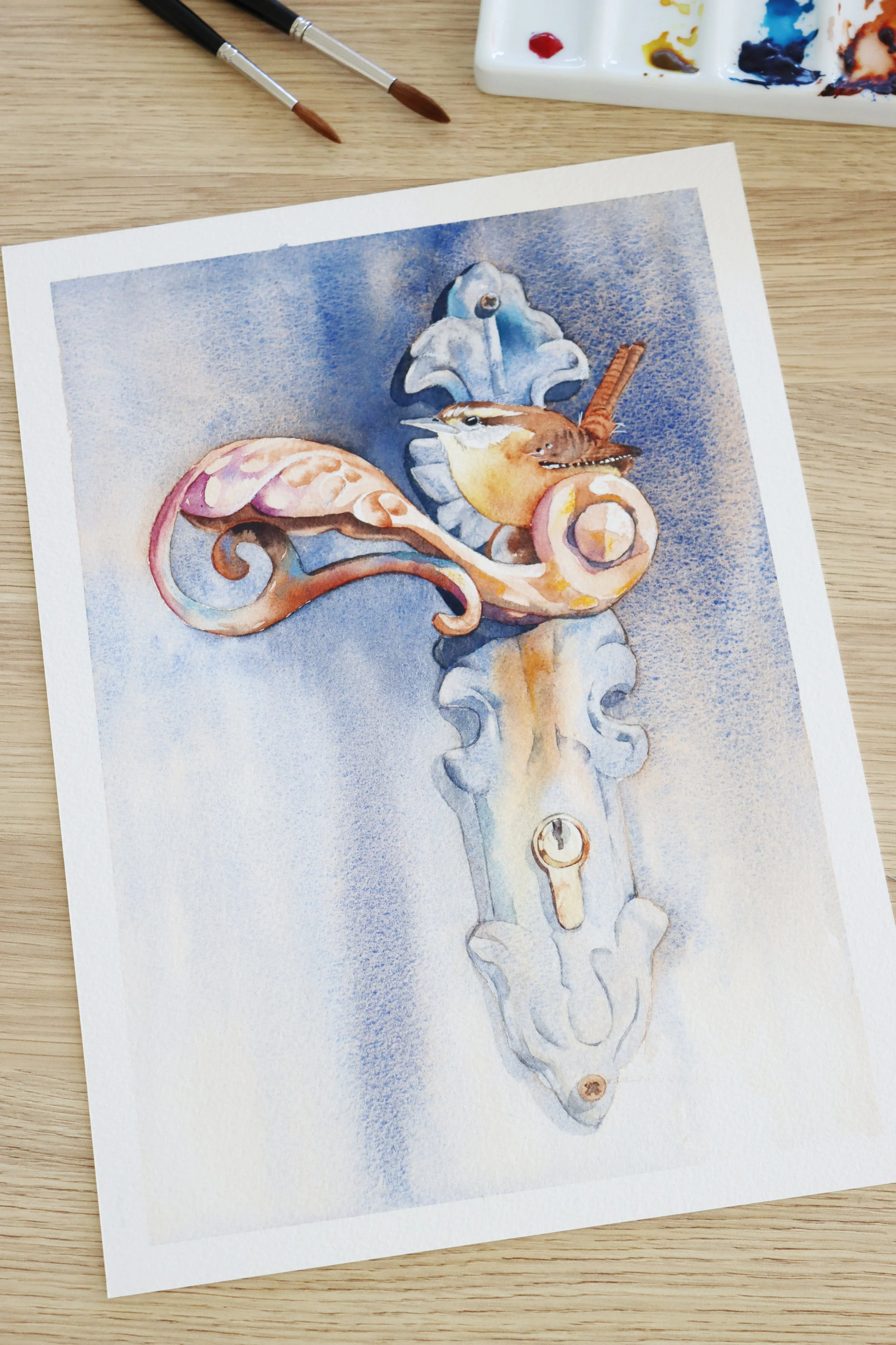
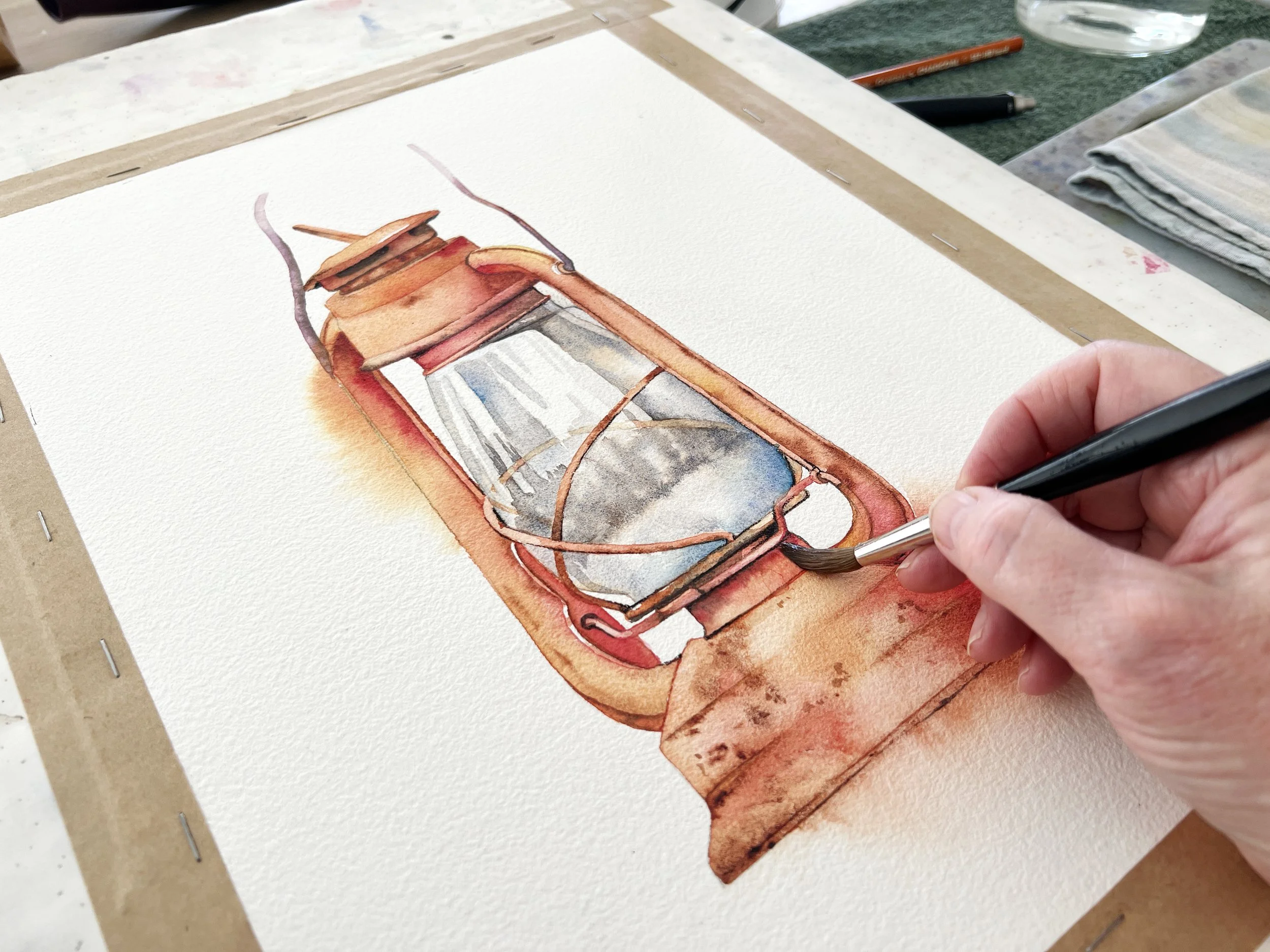
You can use a watery paint mixture on either wet or dry paper. The choice depends on the size of the shape you're painting and the effect you want.
I often prefer to work on wet paper when I'm painting larger or unusually shaped objects. It gives me more time to apply the paint before it starts drying, which helps me avoid unwanted hard edges and paint lines.
It's particularly useful when I want to introduce more than one colour into an area or create soft, lost edges around a shape.